Author Archives: patkar

Patricia: July

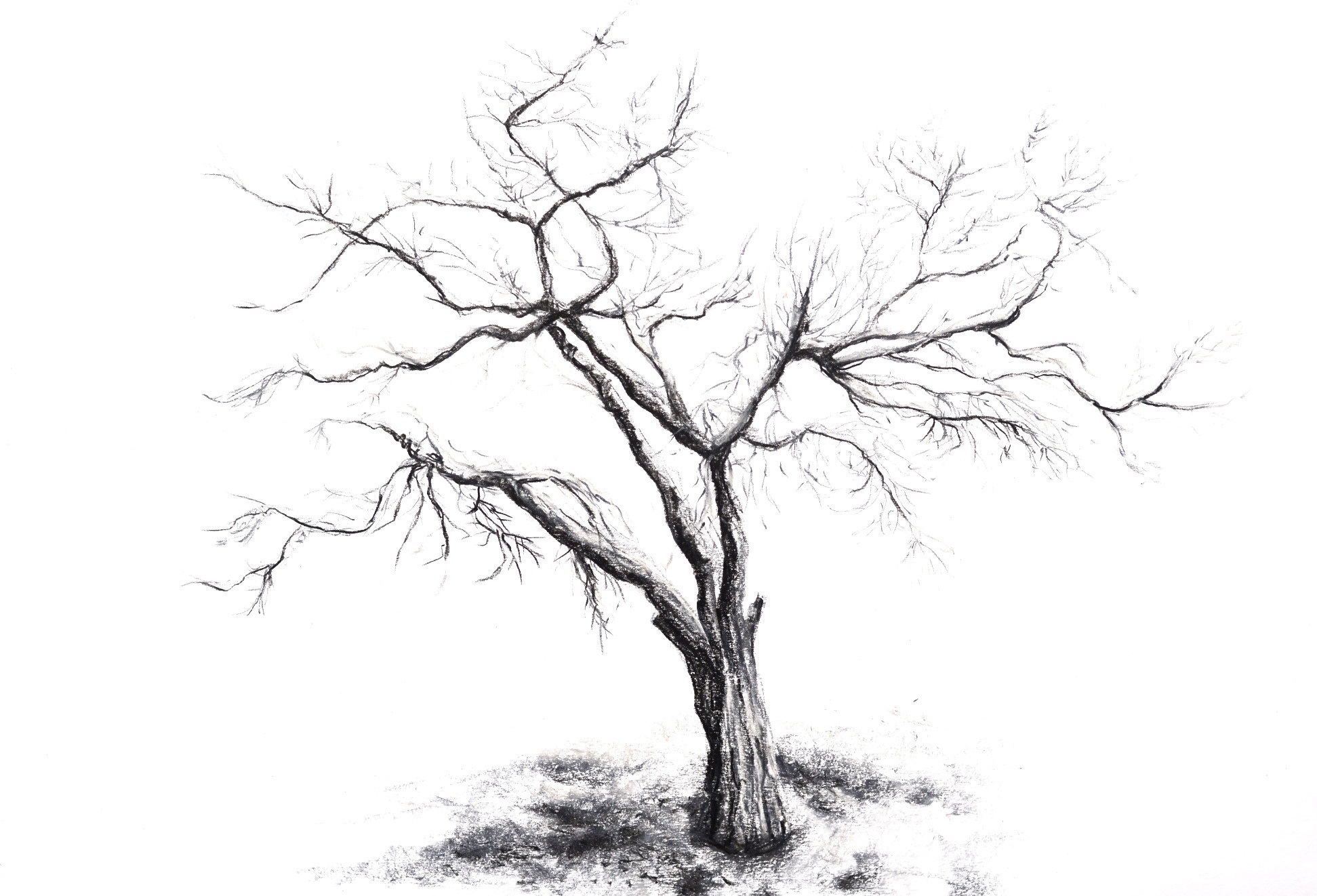
Twigs

IMG_5823
Ink and Watercolour on paper, 21 x 14.5 cm

The summer draught has killed my blueberry plants. Of course it’s my fault because I did not water them enough. The dried leaves are all that’s left of them.


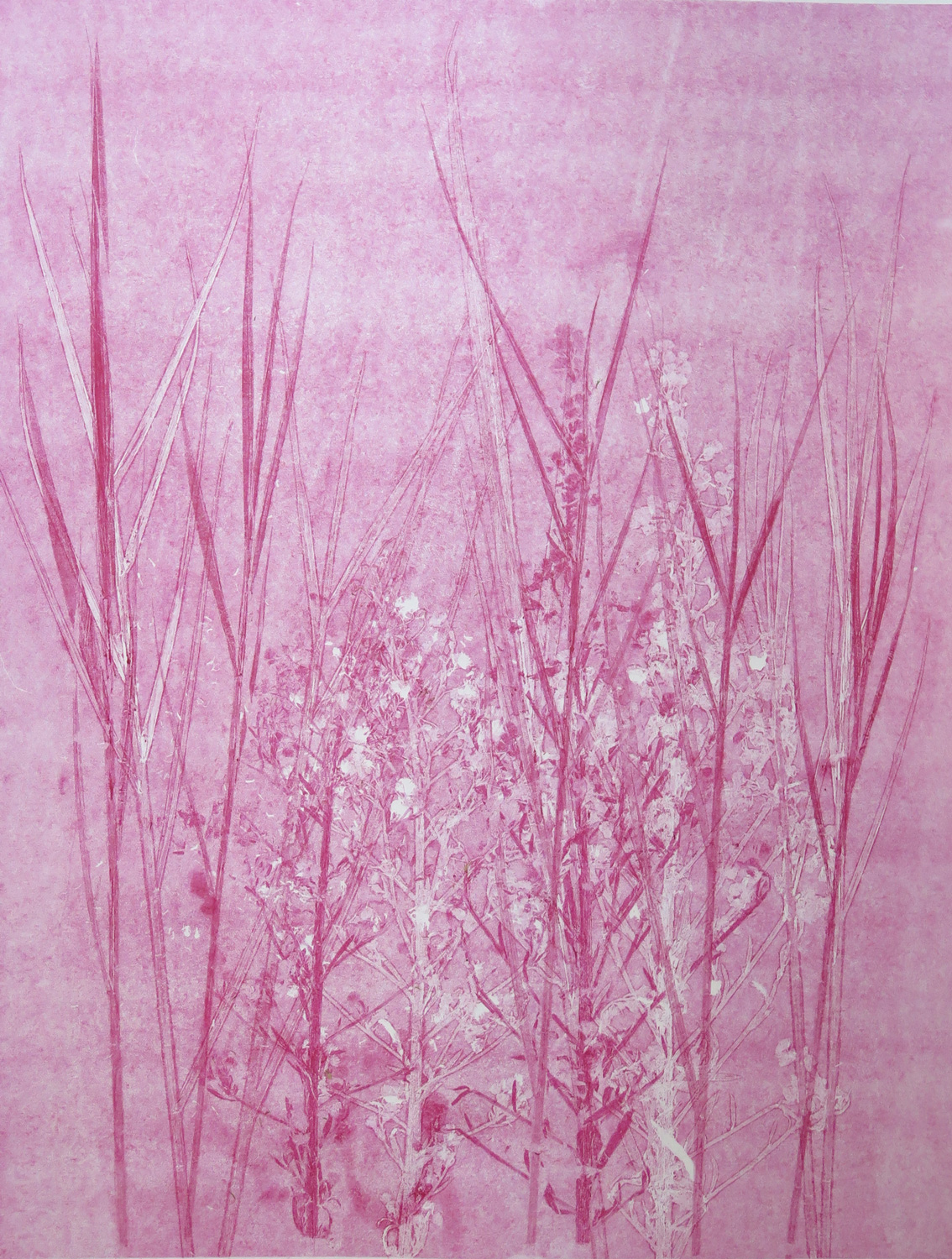
Grasses
IMG_5830
Monoprint, 46 x 33.5 cm

Experimenting with textures created from plant materials. I used plants to texture an inked plate and took a print of it. Then I used the plants themselves to print a second layer in the same red colour, creating the deeper tones.


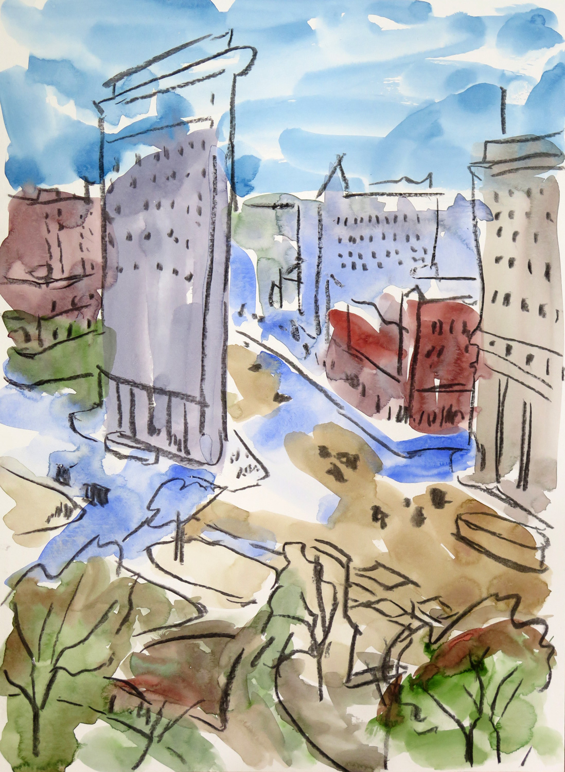
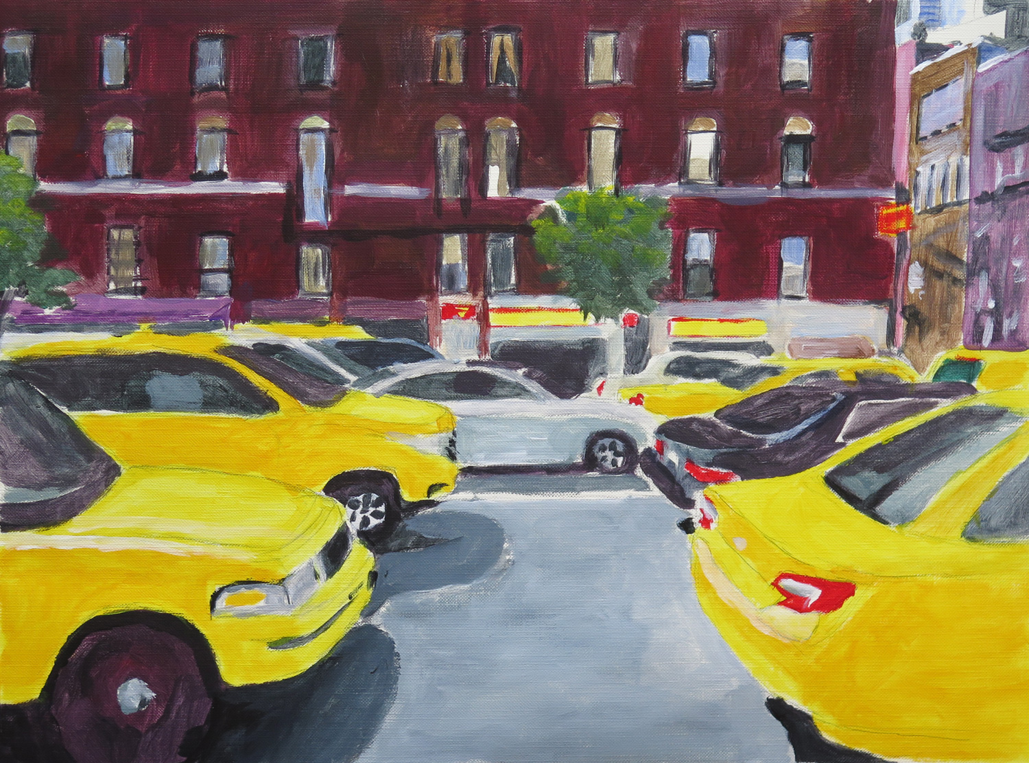
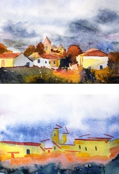
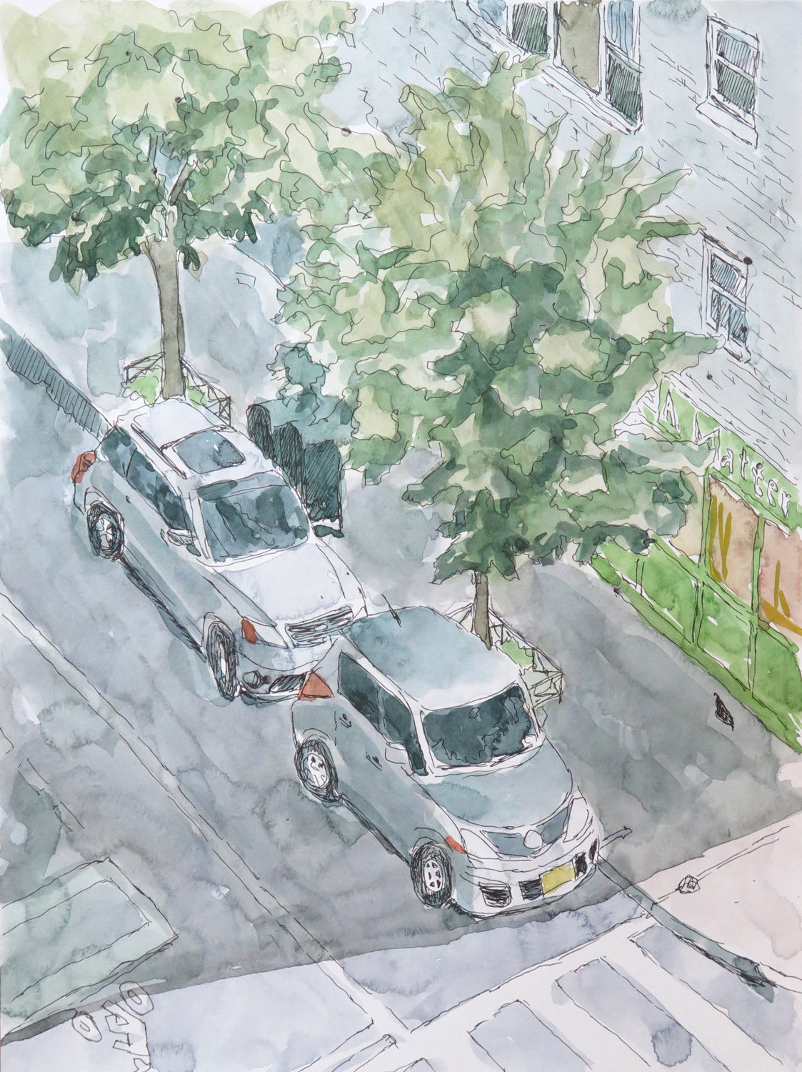
77th Street
IMG_5826
Ink and Watercolour on paper, 30 x 21 cm

A view from my terrace down to the street:


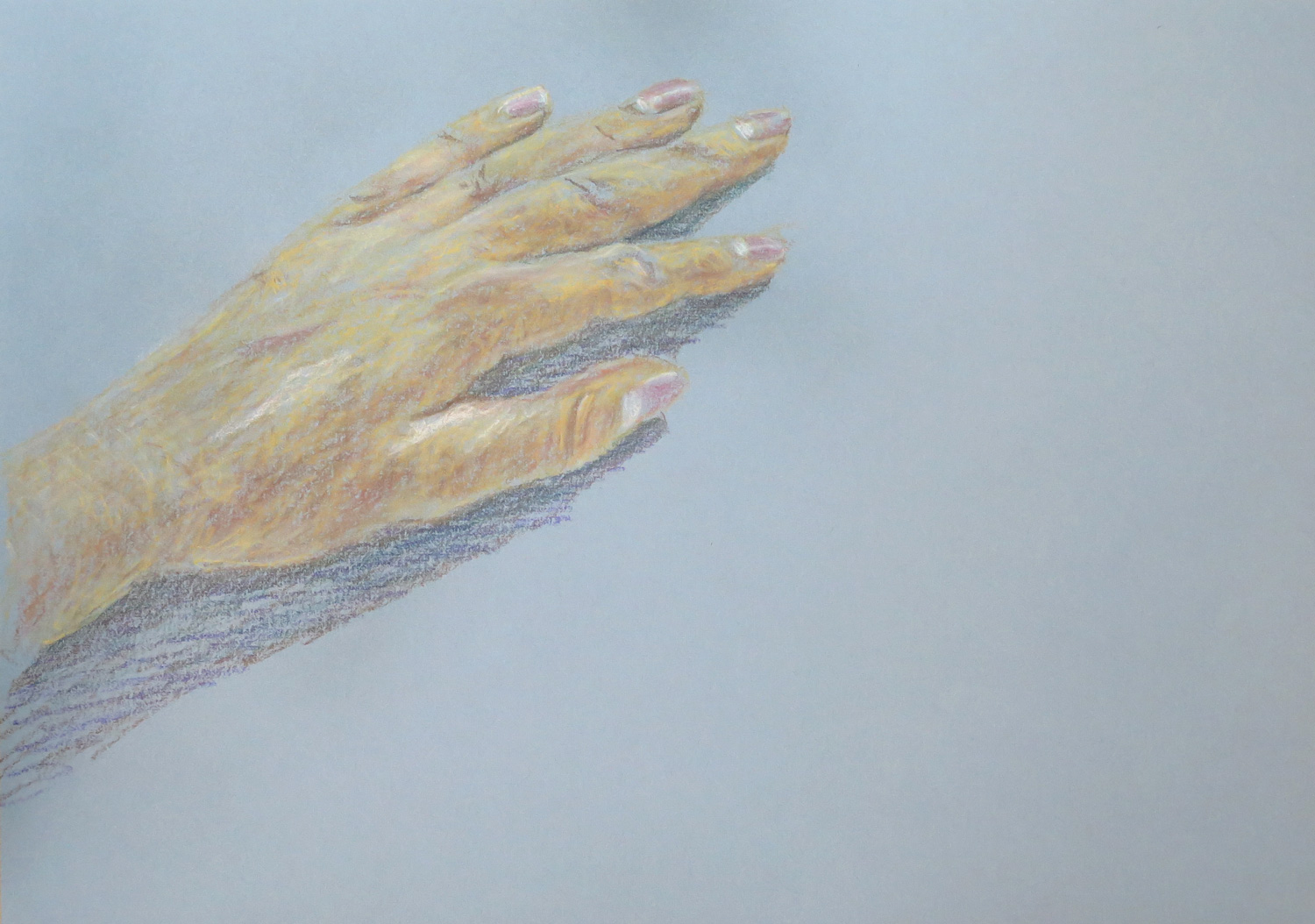
My Hand (R)
IMG_5831
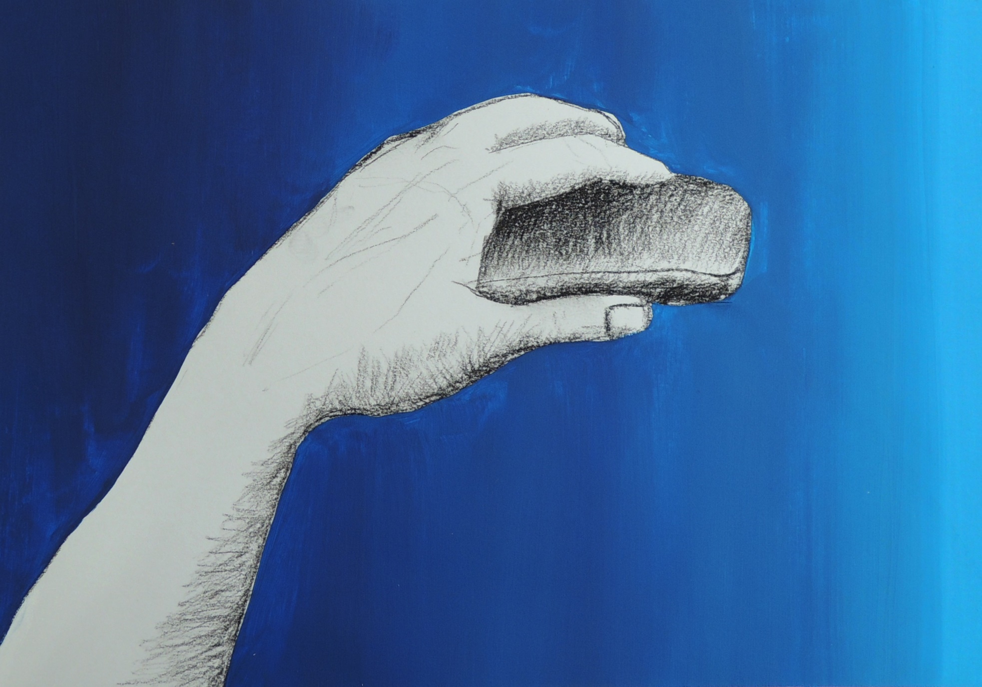
Chalk pastel on paper, 21 x 30 cm

Inspired by Natalie’s ‘Creation of God Box’ (June), I tried a painterly depiction of my left hand.


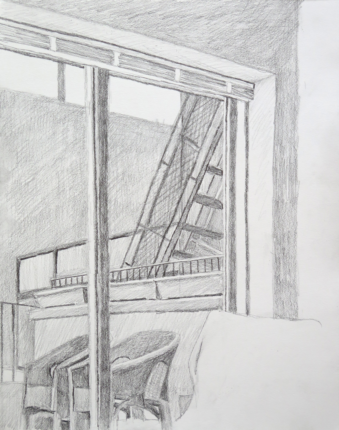
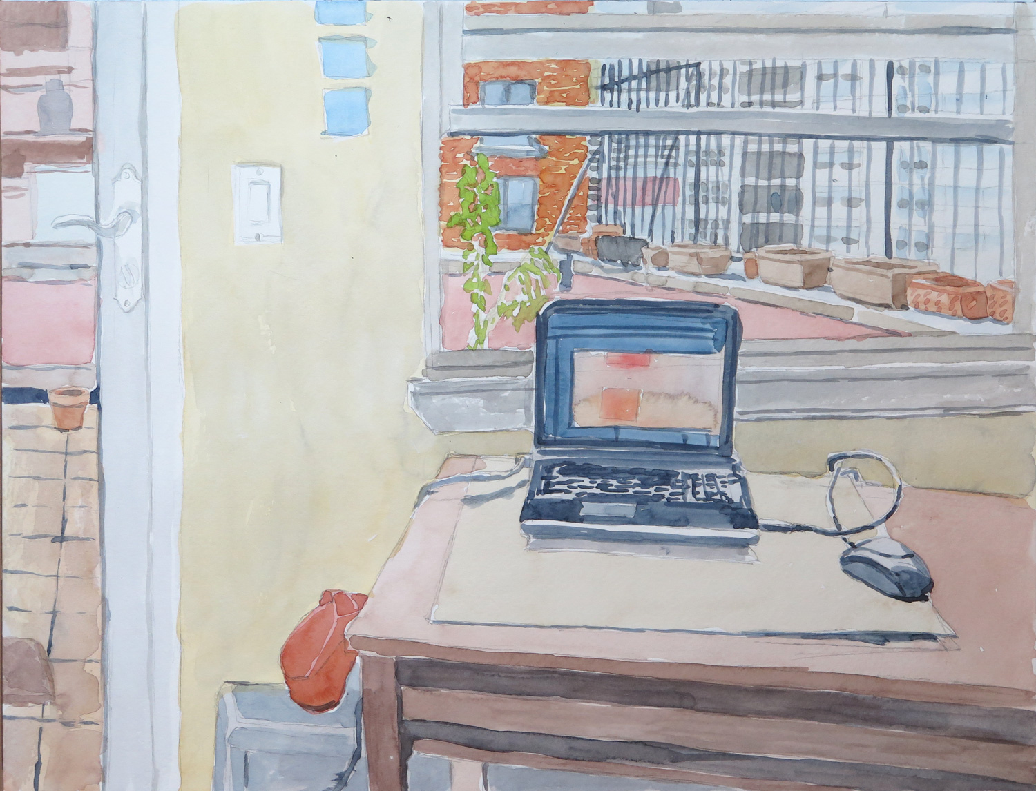
The Studio (R)
IMG_5828
Pencil and watercolour on paper, 33 x 43 cm

Inspired by Natalie’s ‘In the Room’ (June), I set out to draw a simplified and abstract version of a view in my studio. But then I took off towards a more realistic depiction of the actual view.


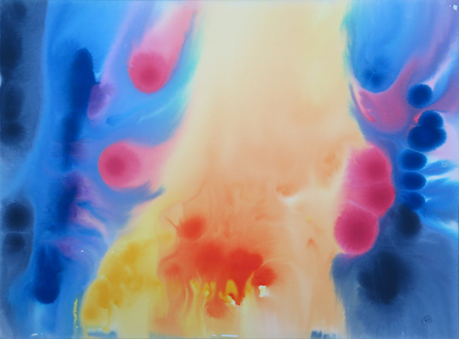
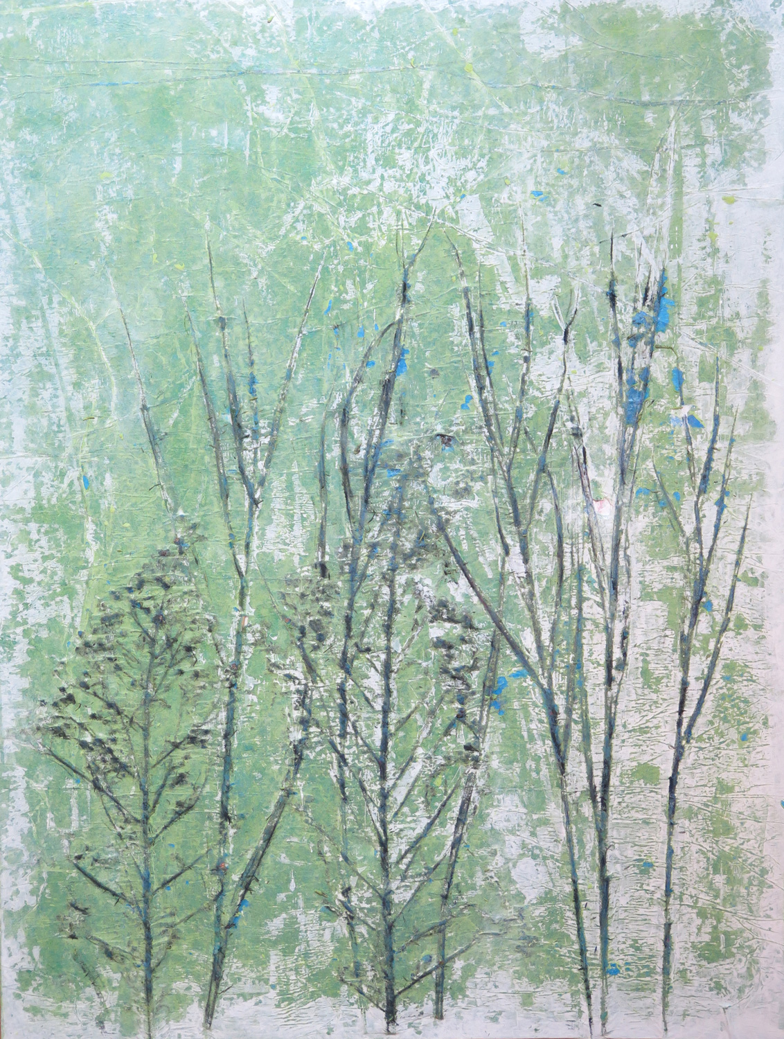
Grasses II (R)
IMG_5834
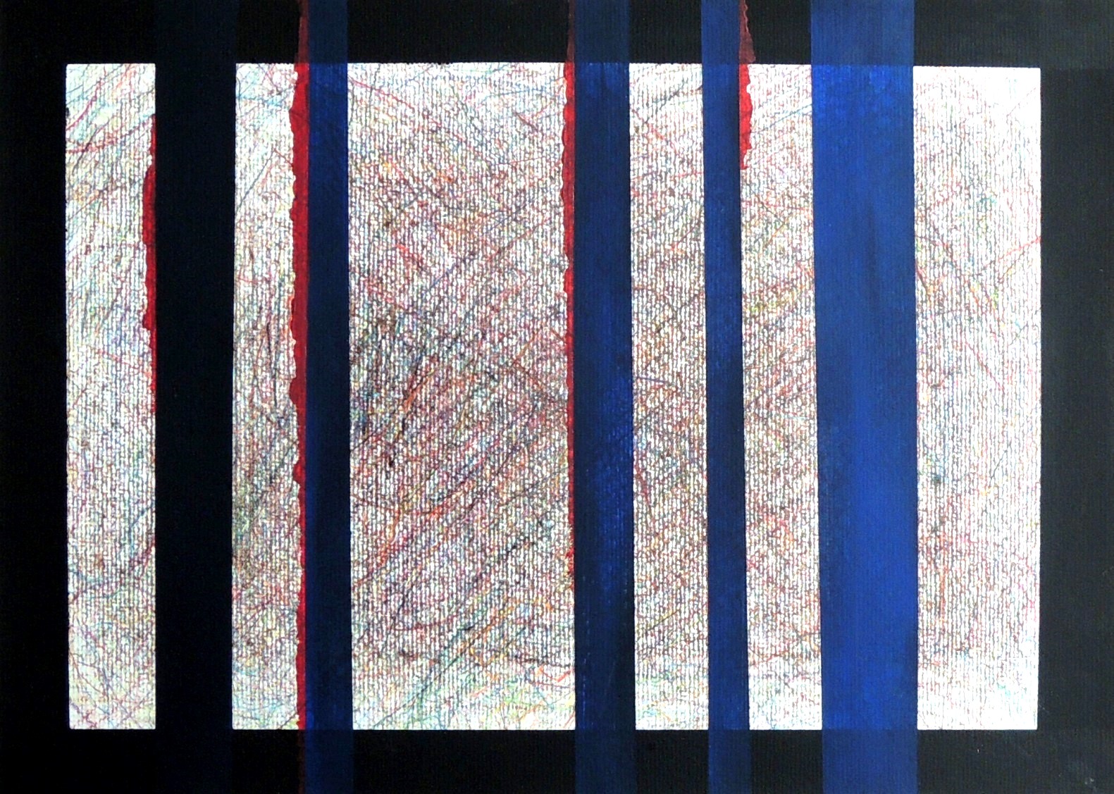
Mixed Media on board, 51 x 38 cm

Inspired by Natalie’s ‘Under Control’ (June). I was attracted by the chaotic linework in the background of that piece. I used the pressed plant materials from the monoprint for this piece, covering it with tissue paper and painting with acrylics and charcoal on top.
Save

Natalie: July

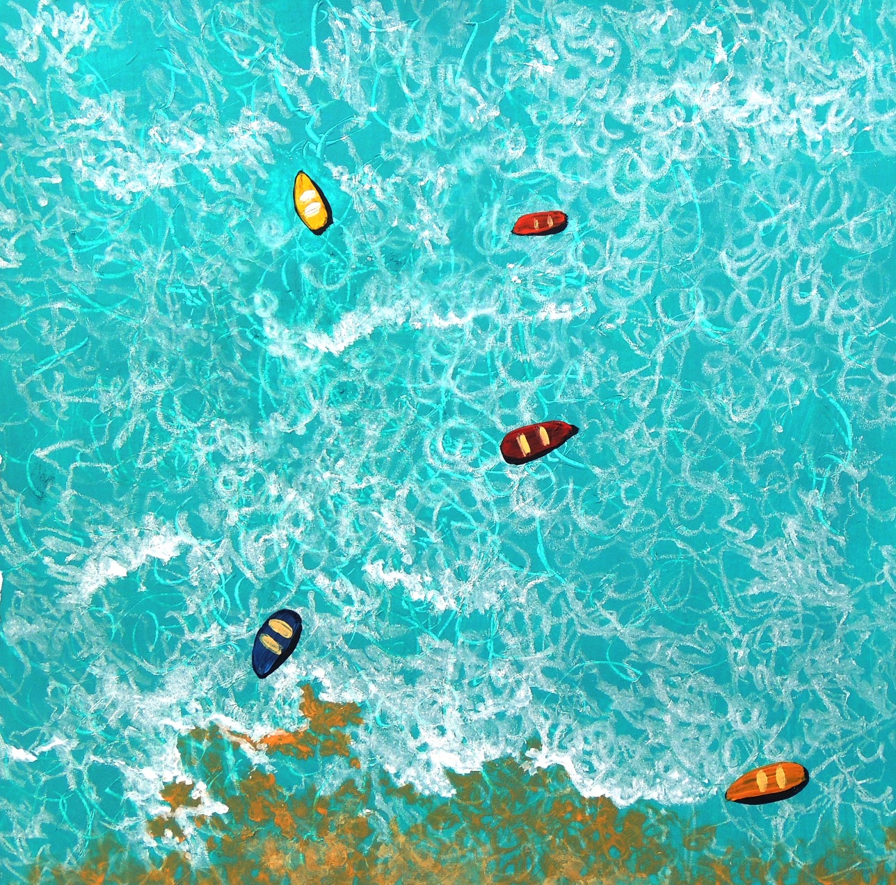
Drifting boats 2

July 4
Acrylic on paper, 23 x 39,5 cm

This is a continuation of my previous submission of Drifting Boats (March, 2016).  I wanted to experiment with the same subject and see what else could be done.
 

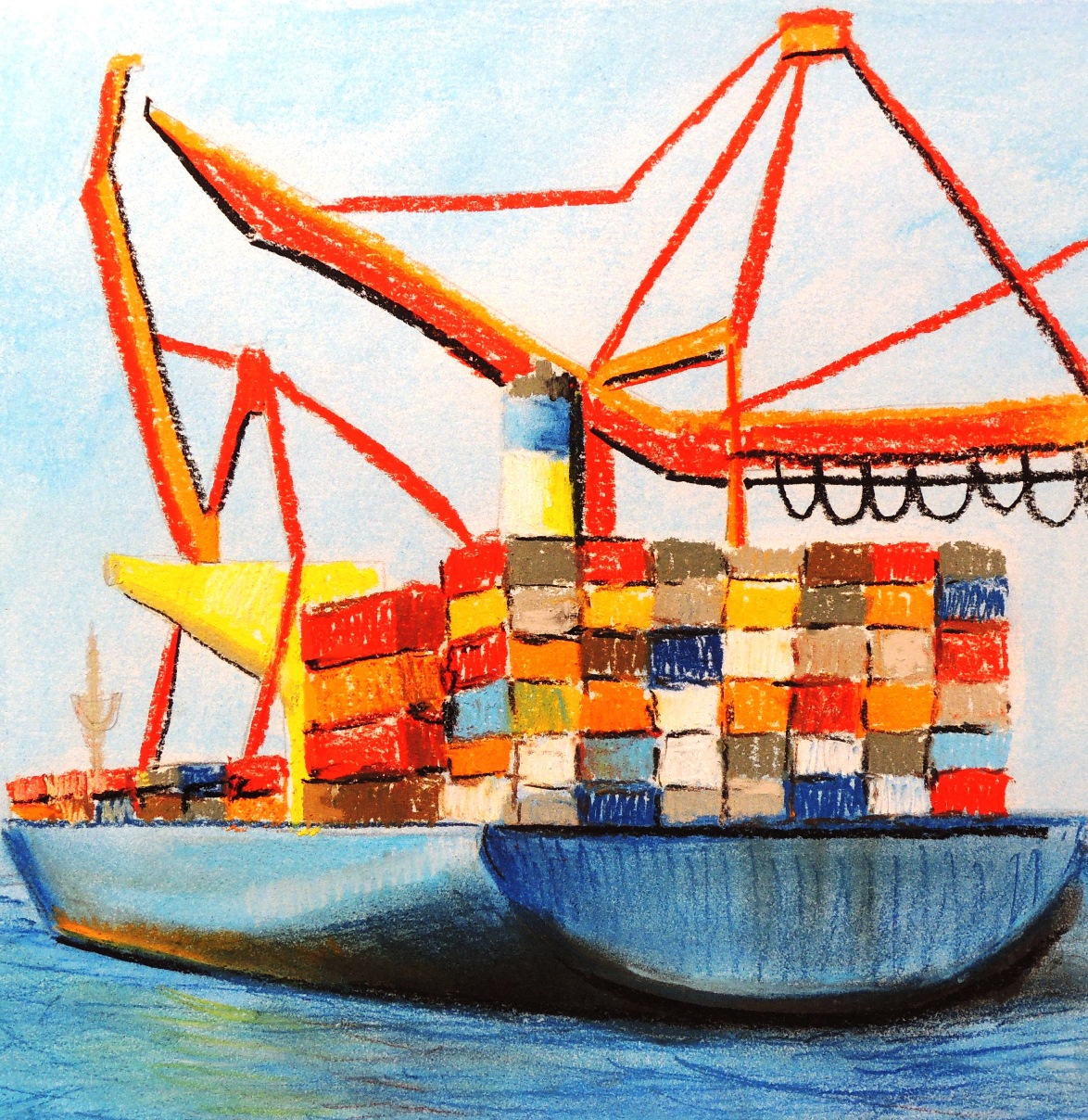
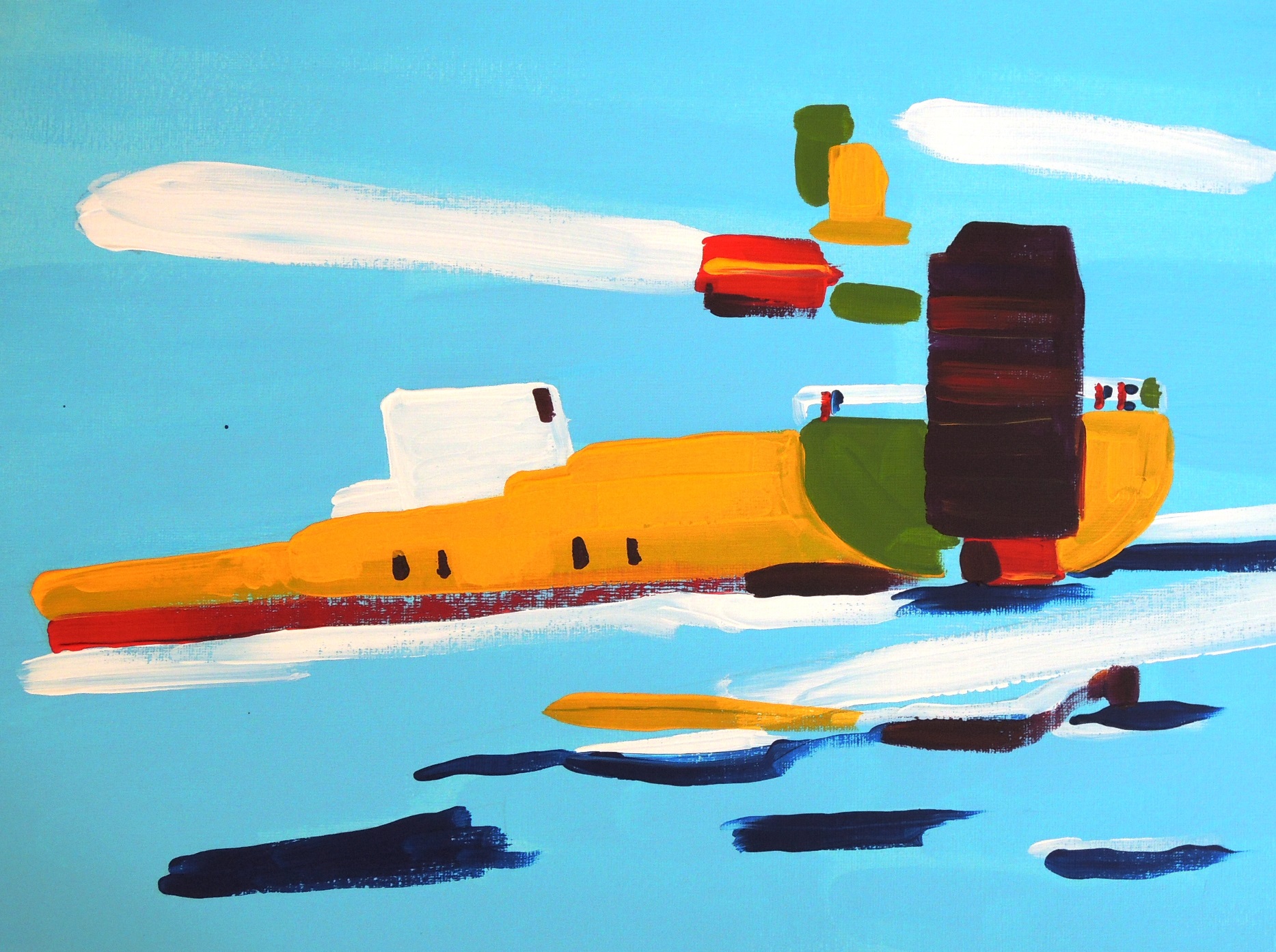
The Caspian Tanker

July 5
Acrylic on paper, 27,5 x 37,5 cm

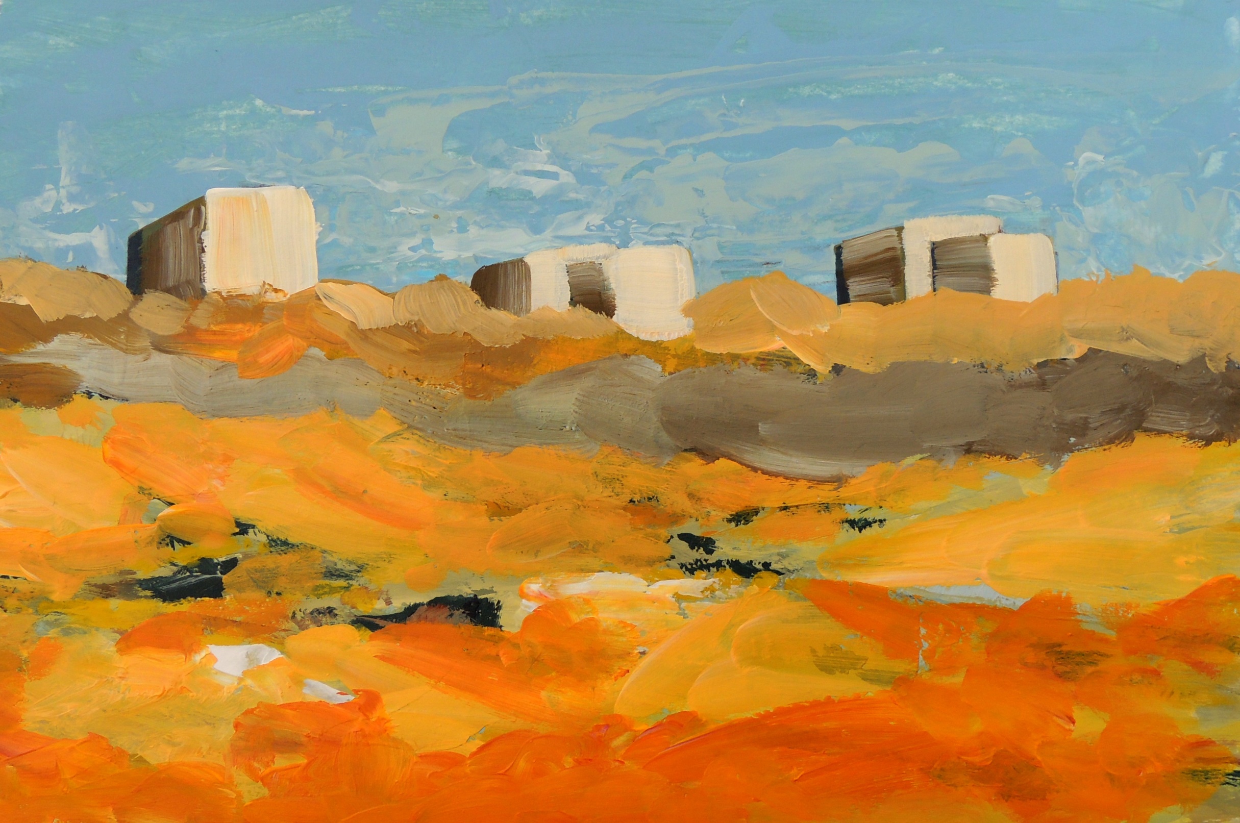
This is part of my ‘’Caspian sea port’’ studies where I explore complicated images via  simplified shapes and lines.


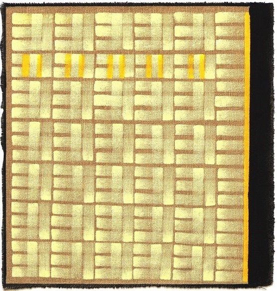
An abstract composition with yellow 2

July 6
Acrylic on paper, 28 x 25 cm

This paintng is part of experimental studies in abstract compositions.


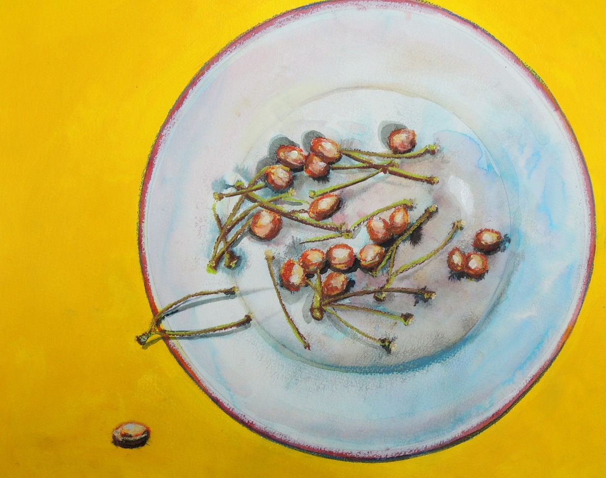
Cherry Stones (R)

July 3
Acrylic, soft pastels on paper, 33 x 40 cm

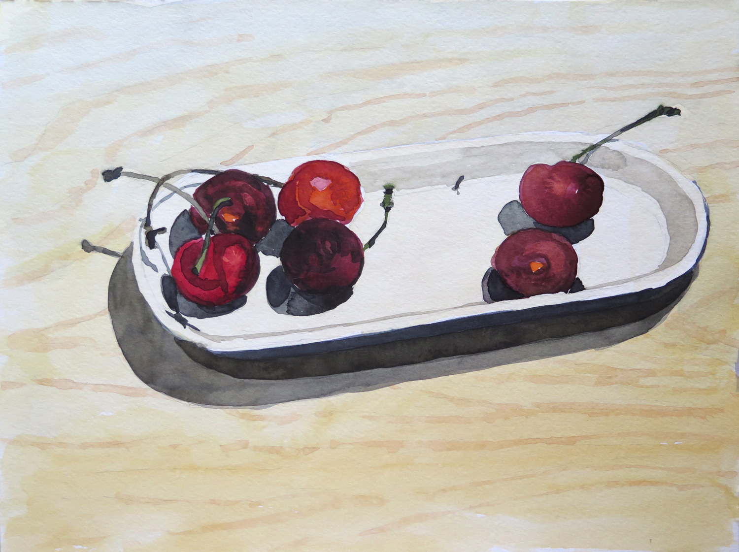
This is my response to Patricia’s Cherries (June). I simply could not resist to eat them! :o)


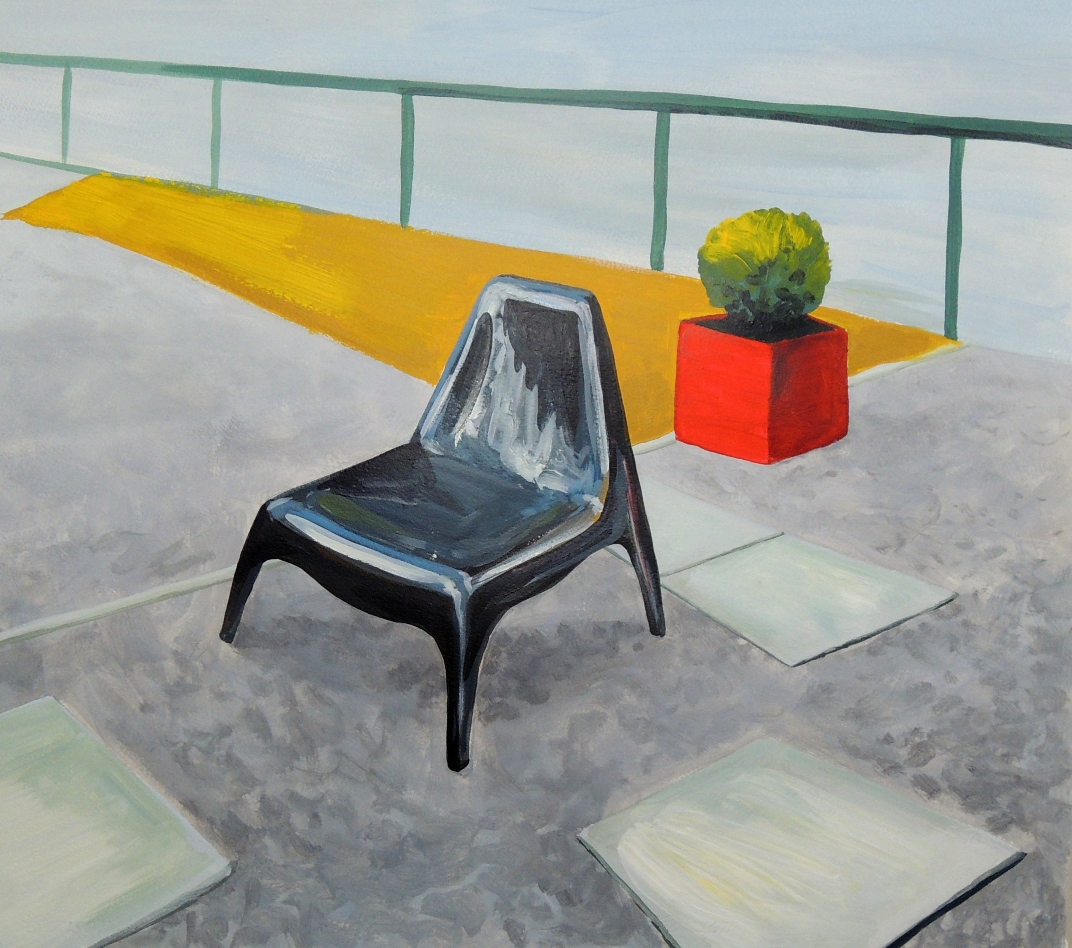
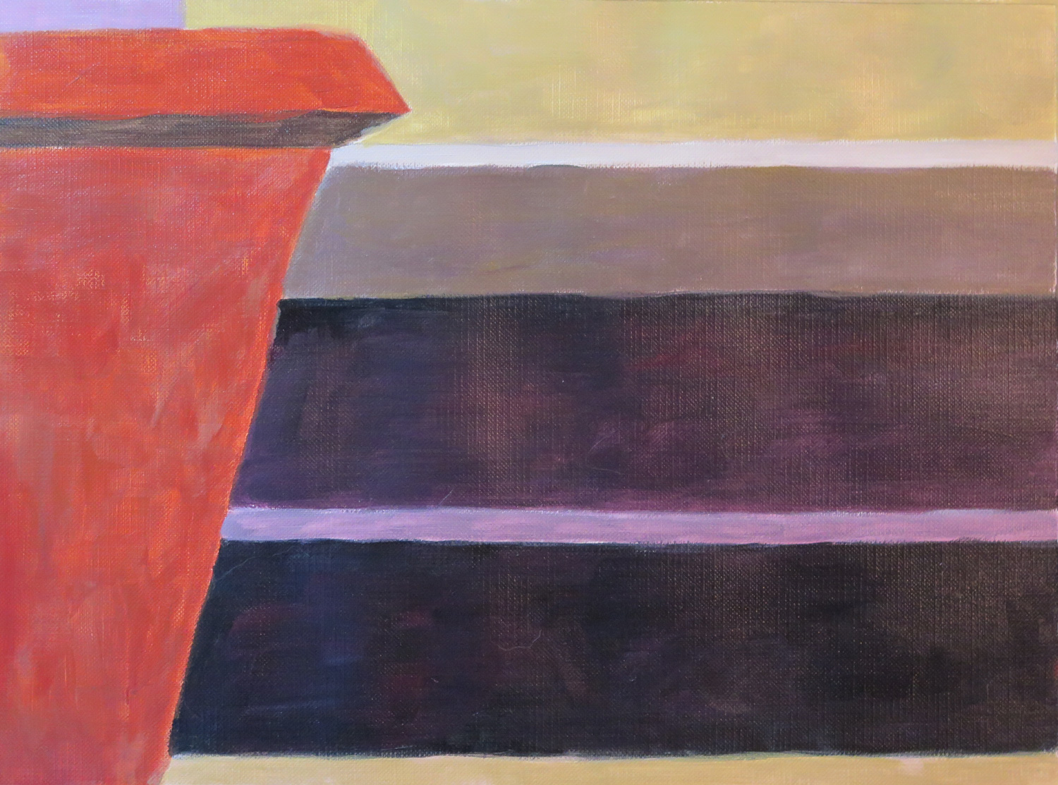
Red pot and Chair (R)

July 2
Acrylic on paper, 50 x 55 cm

This is my response to Patricia’s Chair on the Terrace (June).  Patricia depicted a wooden chair so brilliantly and the sunshine of the day was just screaming out that it was impossible to ignore. I wanted to carry on with the idea of depicting different textures and shapes of the similar items in our households. Therefore, a plastic chair in my garden had its spotlight moment too. However, I feel that I need to be back to this painting and work on my shadows a bit more.


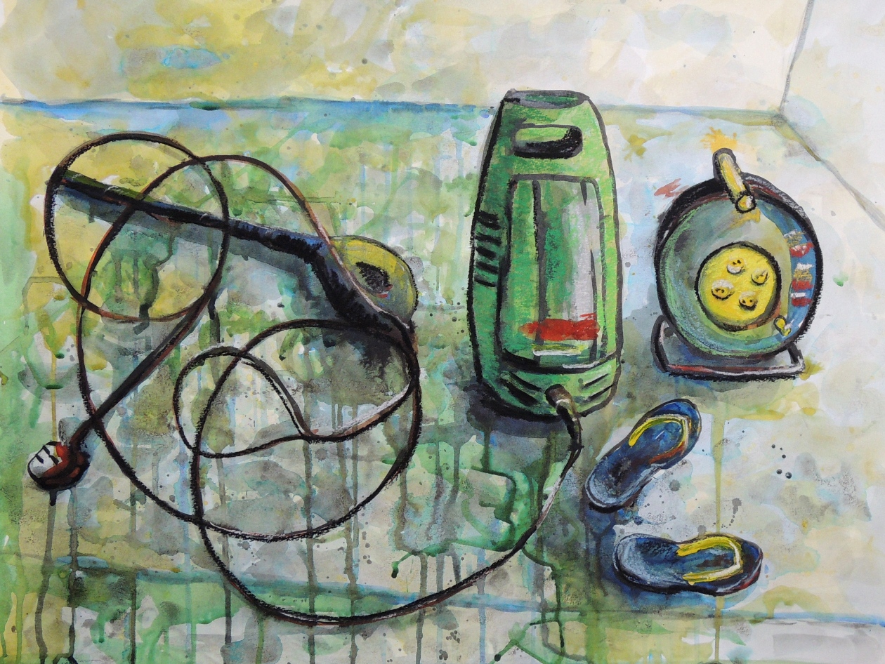
Jet Washer (R)

July 1
Ink, watercolours and soft pastels on paper, 50 x 65 cm

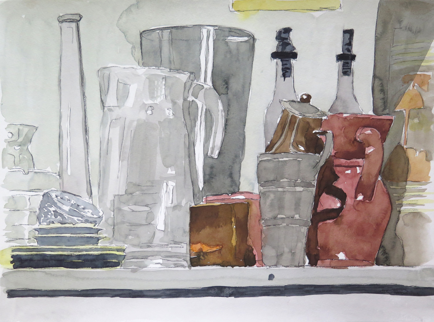
This is my response to Patricia’s Still life with Pitchers (June). As Patricia demonstrated so well the delicacy of glass wear and clay pots, which looked like just been washed, I wanted to demonstrate an unavoidable water splashes during the actual wash.  A few days ago I washed some slabs in the garden with a help of water jet and yes, the water was everywhere…including the places it was not supposed to be.

Patricia: June


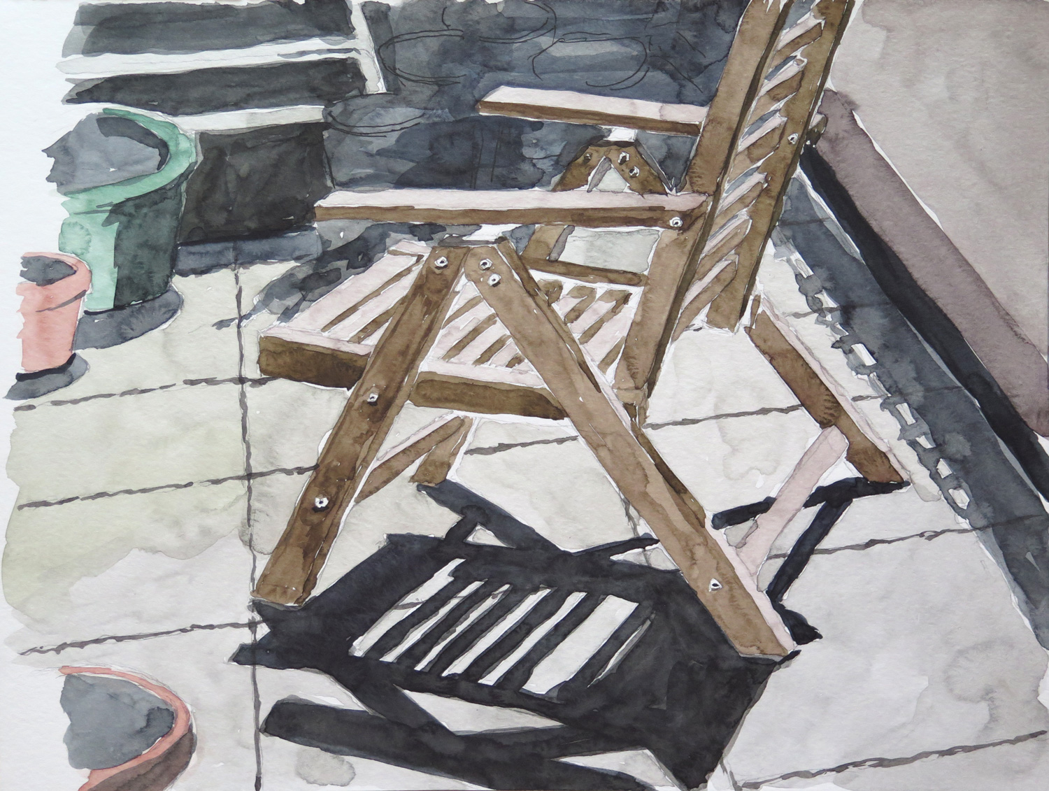
Chair on the Terrace

IMG_5666
Watercolour on paper, 23 x 30 cm

The shadow pattern on the floor and the strong contrasts in this view of the terrace were my main interest in this study.

Planters on the terrace

IMG_5668
Watercolour on paper, 23 x 30 cm

Normally I’m not so willing to depict the unorderly collection of things on my terrace, but I liked the composition of this view.

Still life with pitchers

IMG_5670
Watercolour on paper, 30 x 46 cm

The transparency and reflections on the glass objects caught my attention. It was a found still life, not arranged. I tried to depict the different materials: glass, metal, and ceramics.

Cherries (R)

IMG_5672
Watercolour on paper, 23 x 30 cm

Inspired by Natalie’s Collage with fruits (May 2016), where I particularly liked the dark purple grapes, I chose a few cherries for a close-up study.

Staten Island Ferry Station (R)

IMG_5665
Oil on paper, 40 x 50 cm

A view from the boardwalk area behind the ferry station. I liked the bold colours of the ferry boat next to the blue water and was also attracted by the industrial character of the backyard which isn’t directly accessible to the public. (Inspired by Natalie’s Shipyard 2, May 2016)

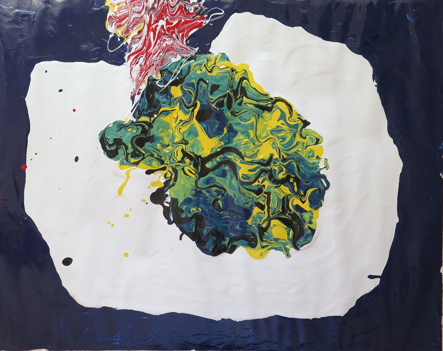
Abstract composition (R)

IMG_5674
Latex enamel paint on paper, 40 x 50 cm

I was attracted by the wiggly lines and the yellow to green to dark blue colours in Natalie’s Salad on a table (May 2016). It inspired me to do a poured paint abstraction using a spoon and knives to spread out and mix the thick paint directly on the support.

Save

Save

Natalie: June

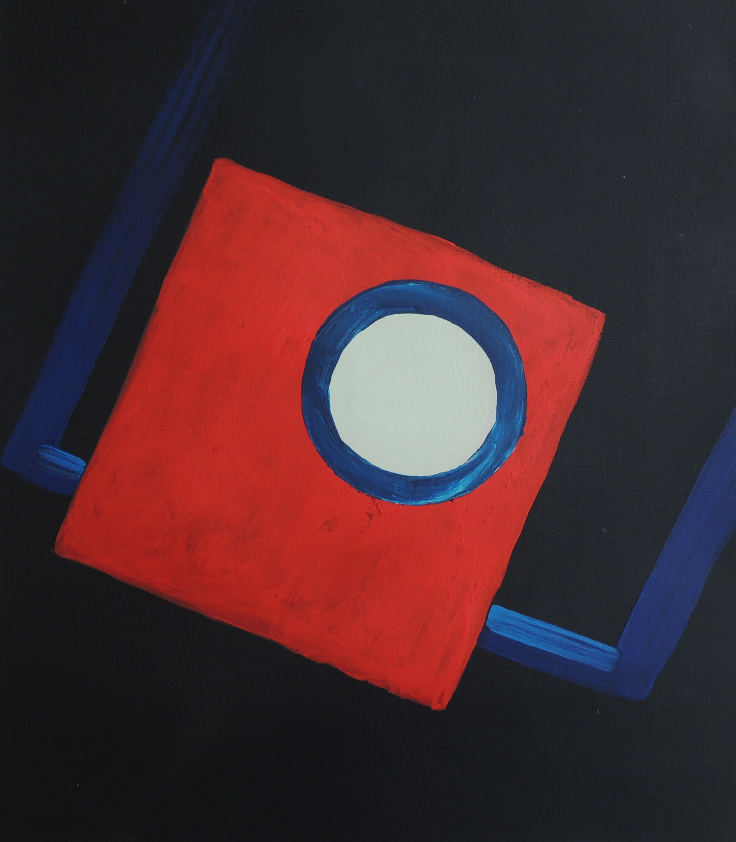
Dark Room

June 3
Acrylic on paper, 25,5 x 29 cm

This painting is concerns the expression of my childhood memories. My father used to take a lot of family photographs, which he developed himself (as a hobby). We are talking about the 70’s. He used to teach me how to use the equipment when I was about 7-8 and I wanted to recreate a sense of the developing room. The red square represents red light of the dark room, the white circle is the photographic enlarger’s lens and the blue rectangle represents the trays containing the liquids where the actual images are developed.


Under control (R)

June 2
Colour pencils, acrylic on paper, 29,7 x 42 cm

This is a response to Accident (Patricia, May, 2016). I wasn’t sure whether Patricia’s title referred to an ‘’accidental/experimental’’ outcome using paint or to the presentation of the actual life event. The title itself took over the visuals for the first time in my response, and towards the its most extreme meaning. I wanted to represent human suffering under the fully controlled and manipulative actions of others, i.e. no accidents, but a fully controlled events.


Dead bird 2

June 1
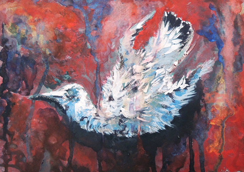
Watercolours, soft pastels, gouache on grey paper, 21 x 29 cm

This is a continuation of the Dead Bird study (March, 2016), but in colour, to emphasise the dramatic events of life and death.


Repeat (R)

June 6
Acrylic, oil pastels on paper, 27 x 28 cm

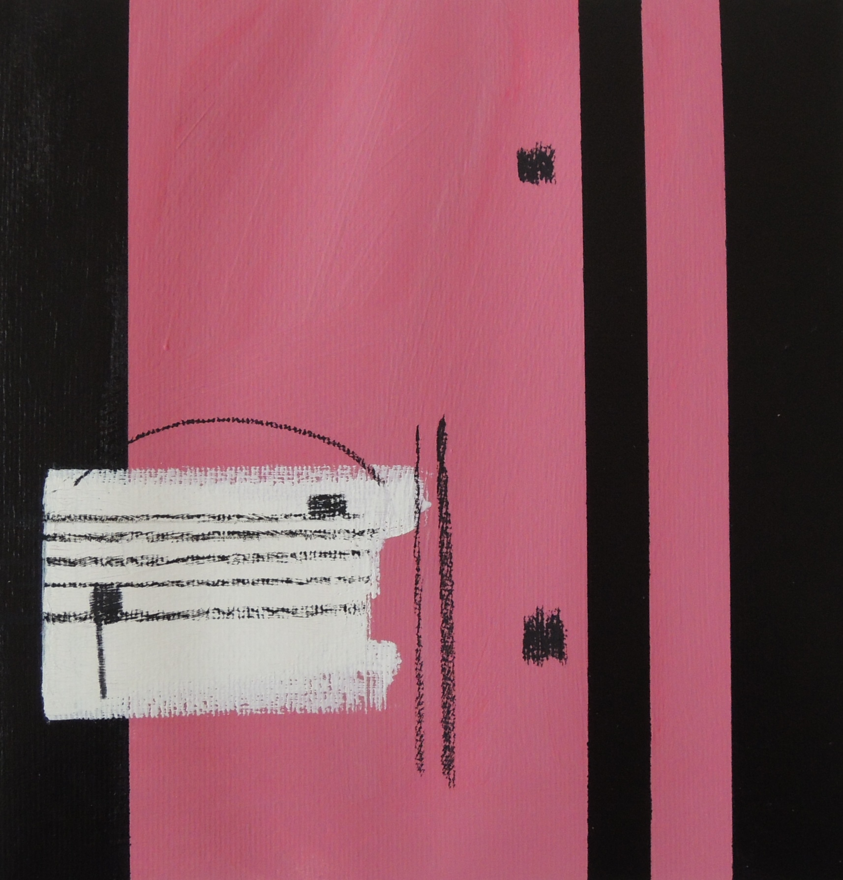
This is my response to Patricia’s Saxophone (May, 2016). If a musical instrument is present then the sheet music is never far from it. The two dots and the vertical lines next to them (on the right) is a musical sign for ‘repeat’. It is usually placed at the end of a particular section that the composer wants to be repeated one more time (sometimes twice or more).


‘’The creation of God Box’’

June 4
Charcoal, acrylic on paper, 21 x 30 cm

The initial idea was to study a hand with a small remote control in it but soon it was turned into a pop art. The title came afterwards and part of it was borrowed from Michelangelo’s Creation of Adam painting (fresco).


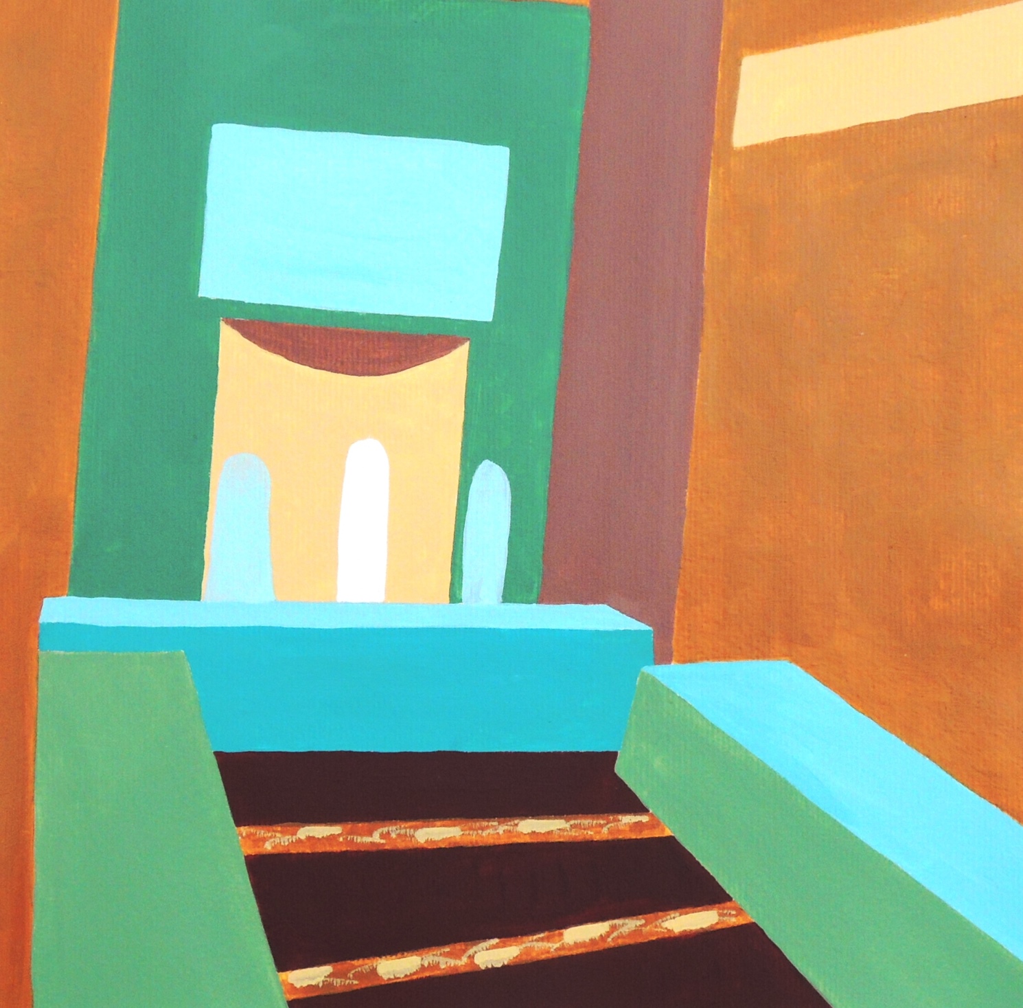
In the room (R)

June 5
Acrylic on paper, 28 x 28 cm

This is my response to Patricia’s New York, Flatiron Building (May, 2016). I used an image from the local news as a source of inspiration. It represents an interior in one of the local mosques and I found its colour scheme quite fresh and calming. I would like to mention that the original colours of the place are much lighter and with a white background instead of the yellow ochre, and in general it’s far more delicate than my study attempt. I would like to come back to this subject later again.


Natalie: May

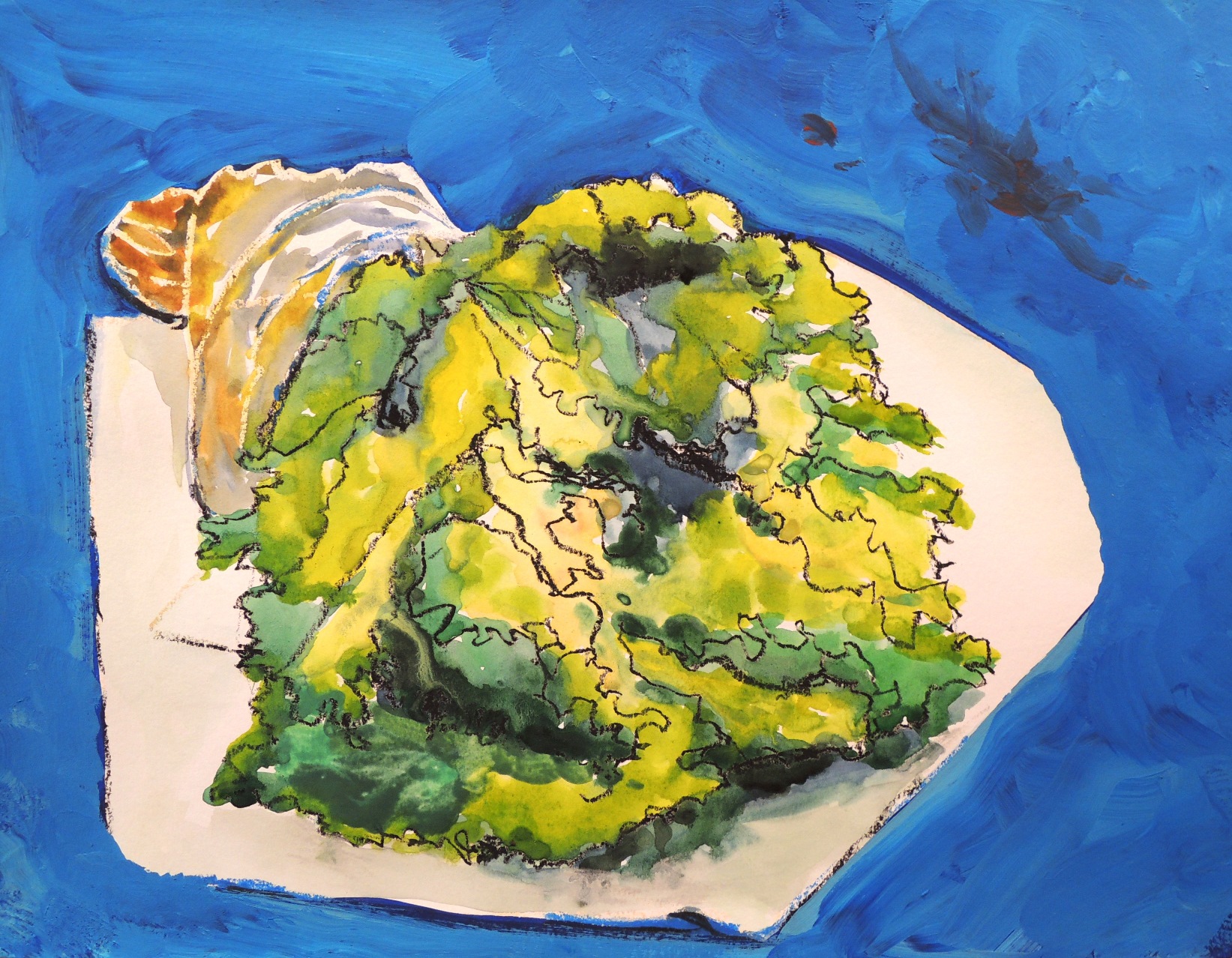
Salad on a table (R)

My6
Watercolour, acrylic ad soft pastels on paper, 30 x 40 cm

This is my response to Patricia’s Twiggs (May, 2016) submission as a continuation of natural object studies.


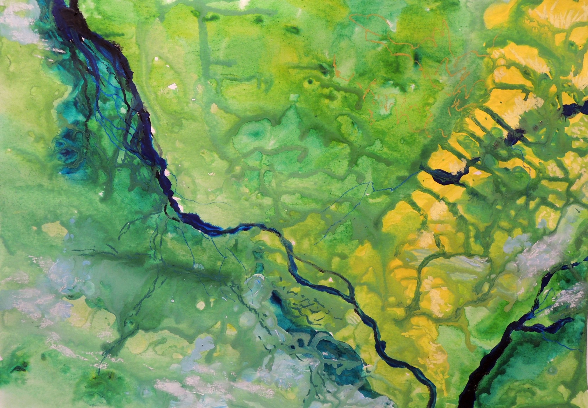
View from space

My2
Watercolour, acrylic and soft pastels on paper, 30 x 40 cm

When I came across NASA’s photos of Earth, it was hard not be influenced by their beauty.


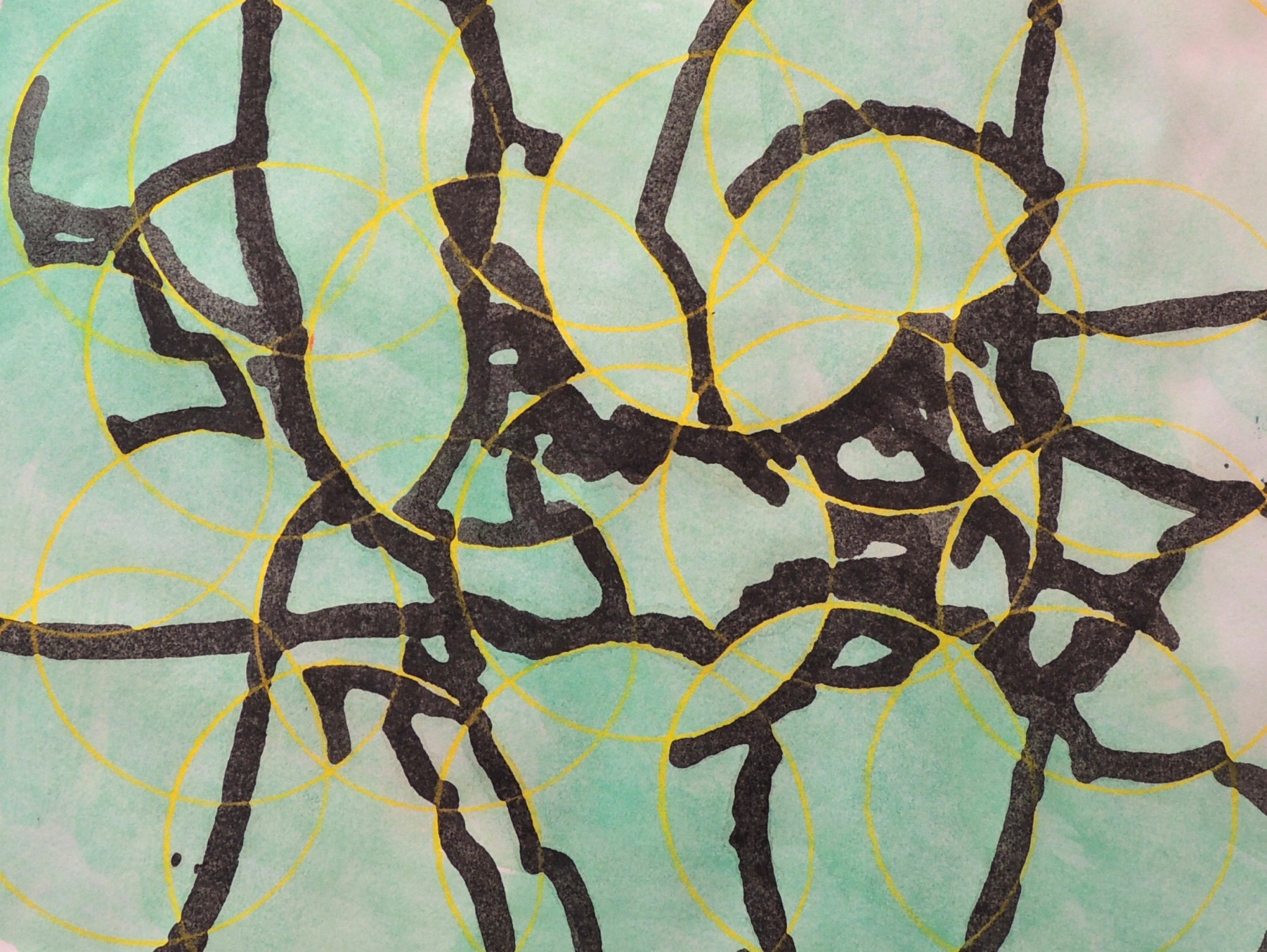
Under the microscope (R)

My3
Watercolour and colour pencil on paper, 20 x 26 cm

This is my response to Patricia’s Saxophone detail (May, 2016) submission. I wanted to experiment with the rigid and overlapping circles (to represent some saxophone details) mixed with a free flow of black colour (to represent sound). The results were a bit unexpected as the circles started to remind me a little of the petri dishes used in research laboratories and the black shapes turned into look alike images of the dishes seen under the microscope.


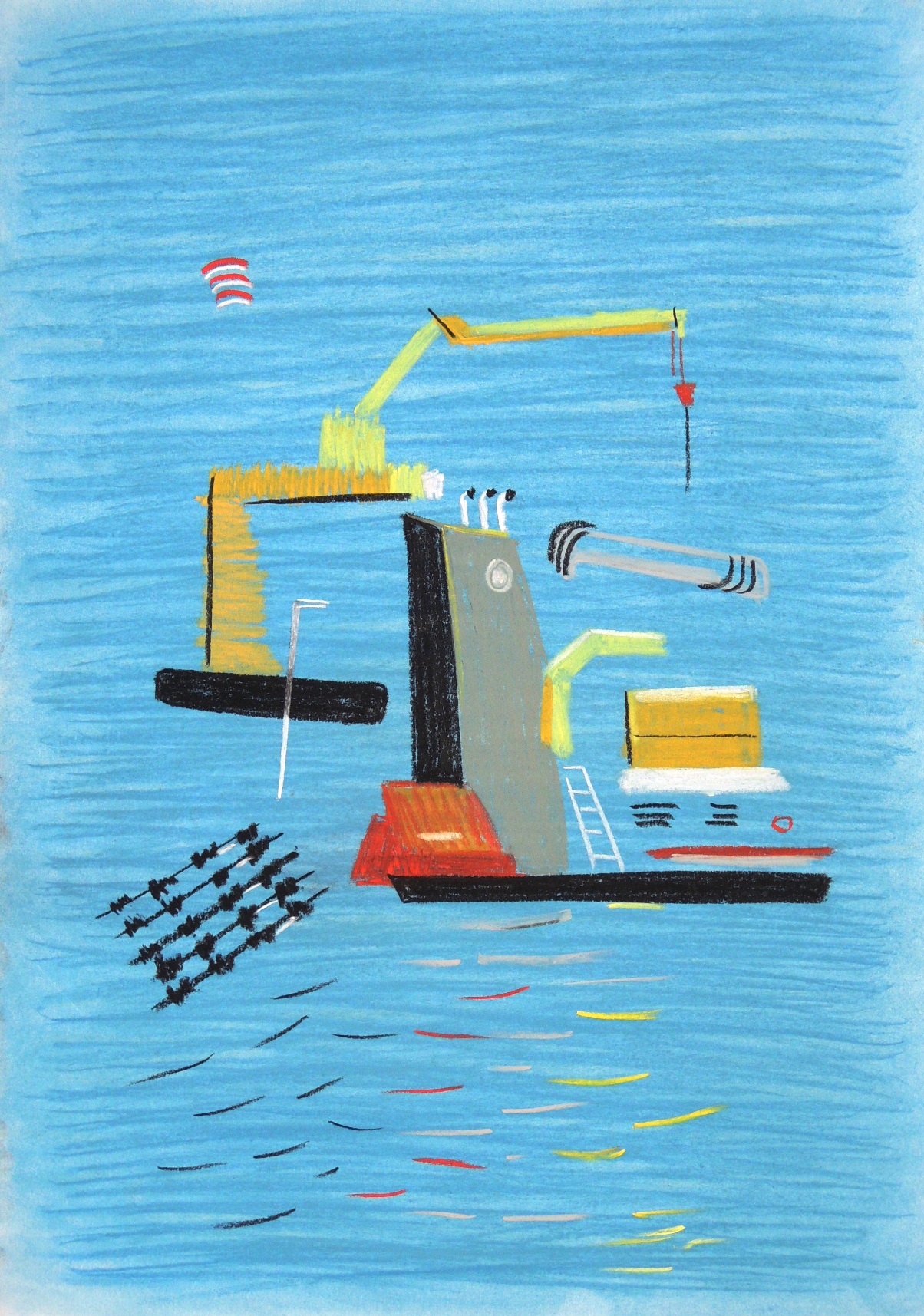
Shipyard (R)

My4
Soft pastels on paper, 26 x 28 cm

This is a response to Patricia’s High-Rise Pattern (May, 2016) submission. I simply felt like responding with a “zoomed out” image. Admittedly, I find Patricia’s composition far more interesting!


Shipyard 2

My5
Soft pastels on paper, 49 x 59 cm

Living by the sea and the desire for simplification makes its visible impact. At the moment I enjoy the idea of focusing on the major lines and colour that would represent an object of interest. I have a selection of photos of the local sea port and I find it difficult to ignore them … meaning more studies on this subject matter will likely occur!


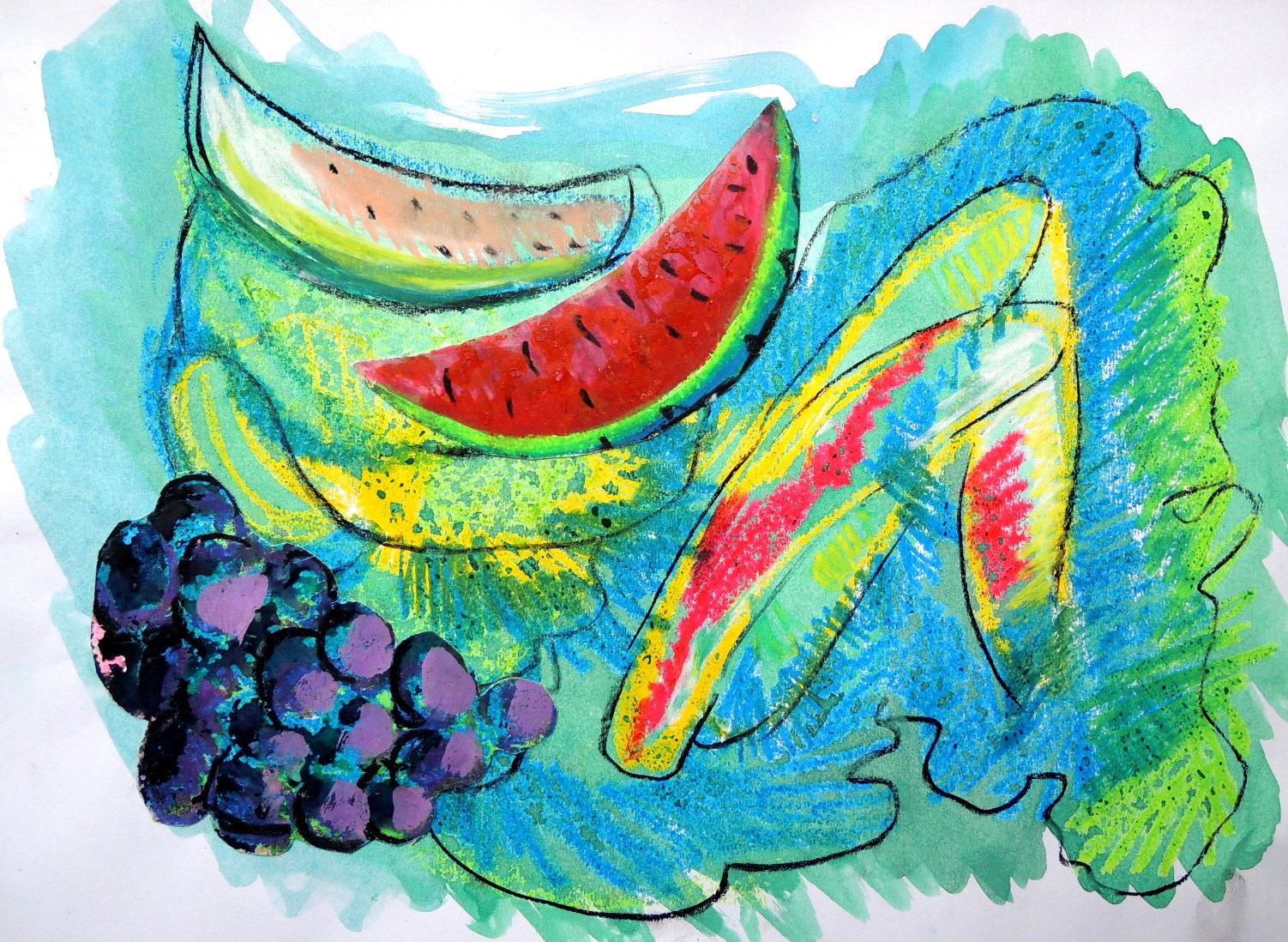
Collage with fruits

My1
Watercolour, oil pastels and soft pastels on paper, 26 x 37,5 cm

As with any experiments, things tend to go in all sorts of directions. I ended up cutting fruits from my own paintings and making them part of a new mixed medium composition.

Patricia: May

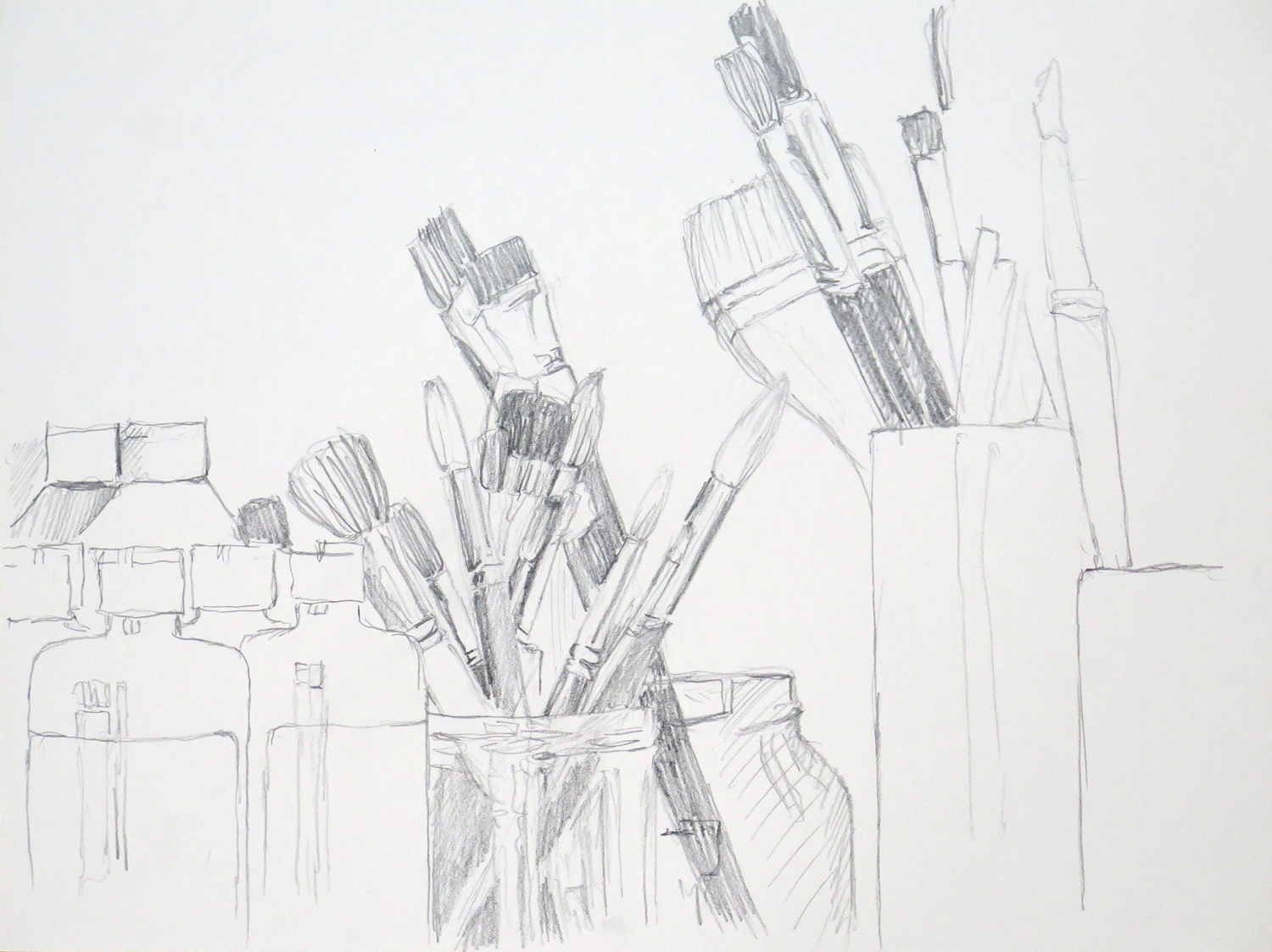
Paint and Brushes

IMG_5377
Pencil on paper, 23 x 30 cm

A view on my painting utensils in the cupboard. I used a viewfinder to determine the composition. I wish I had stronger emphasized the contrasts to achieve darker blacks.


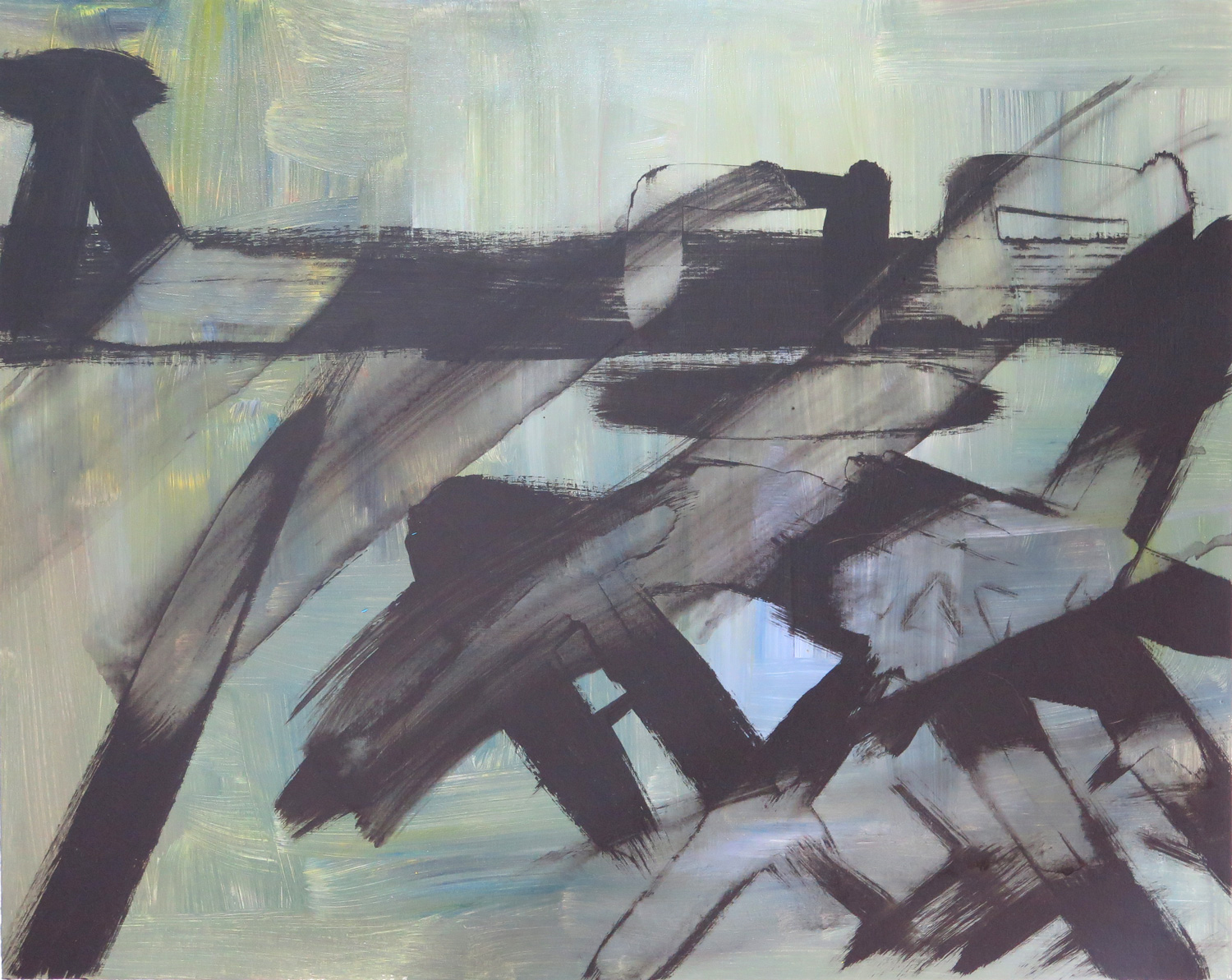
Accident

IMG_5379
Acrylics on canvas, 40.5 x 51 cm

This piece was inspired by Franz Kline. I was thinking of his huge black and white paintings that look as if they were made with strokes of a single, huge brush. I wasn’t satisfied with my black marks and attempted to wash them away, which resulted in an interesting visual effect.


New York, Flatiron Building

IMG_5382
Watercolor and charcoal on paper, 38 x 28 cm

This was made after Samuel Halpert, The Flatiron Building, 1919. I wanted to stay very loose in approach and also took care to not rework into the watercolour brushstrokes. The charcoal lines on top give the painting structure and hold it together.


The boy (R)

IMG_5383
Colored charcoal on paper, 35.5 x 28 cm

A pice made after a photo on a psychological magazine issue that focused on race relations and the perspectives of young black people. The expression of the boy fascinated me – so much skepticism in his attitude, and somehow I sense that same thing in the portrait. Using charcoal was inspired by Natalie’s dead bird (April submission). I responded to the atmosphere of that piece.


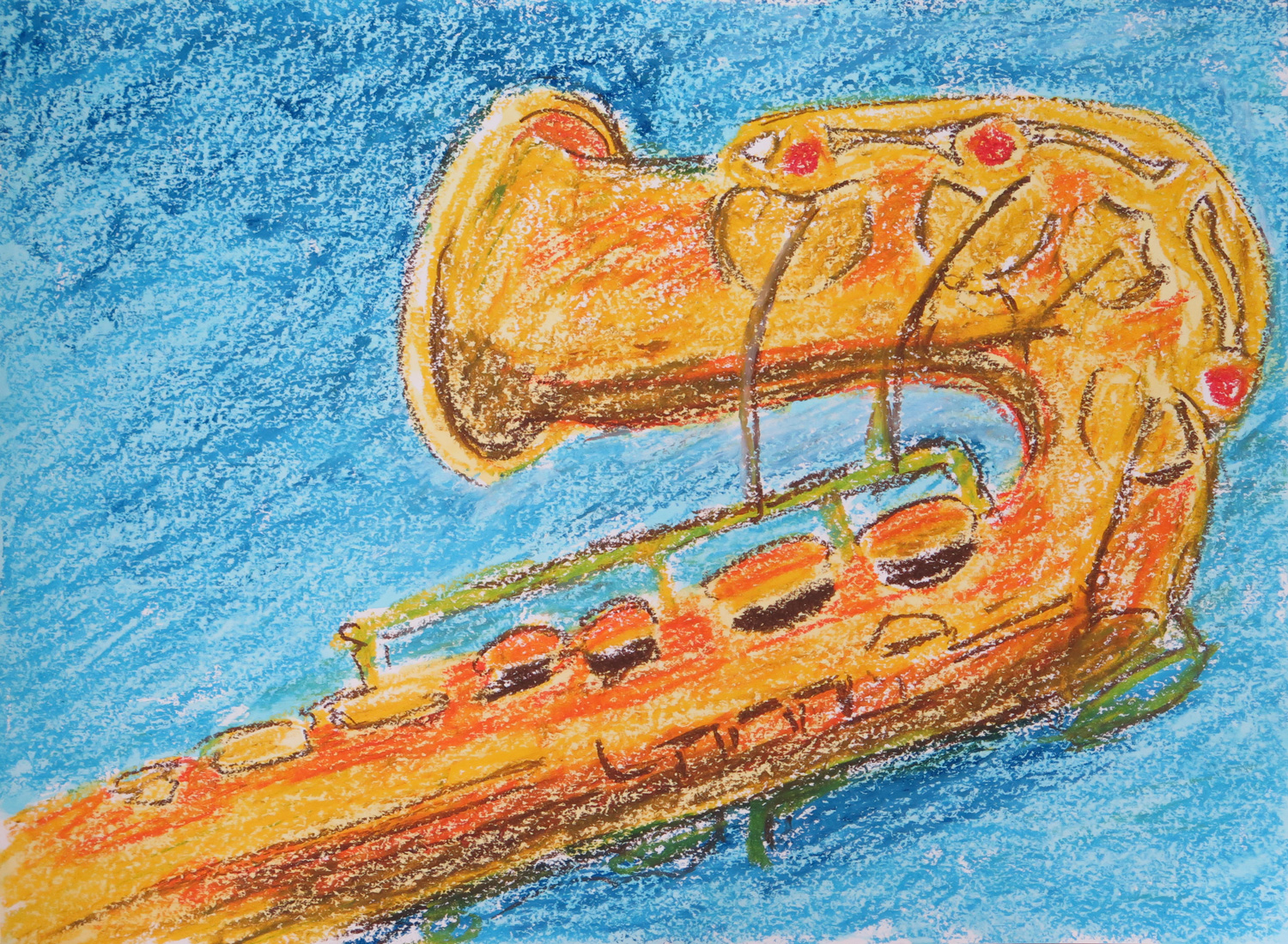
Saxophone (R)

IMG_5385
Oil pastels and watercolor on paper, 34 x 46 cm

I was inpired by the color choices in Natalie’s Entrance piece (April submission) and got back to the topic of my saxophone. I would like to develop this topic further towards abstraction – I’m very attracted by the technical details of the  instrument which reminds me of an era where elaborate steel constructions like the Eiffel Tower were created.


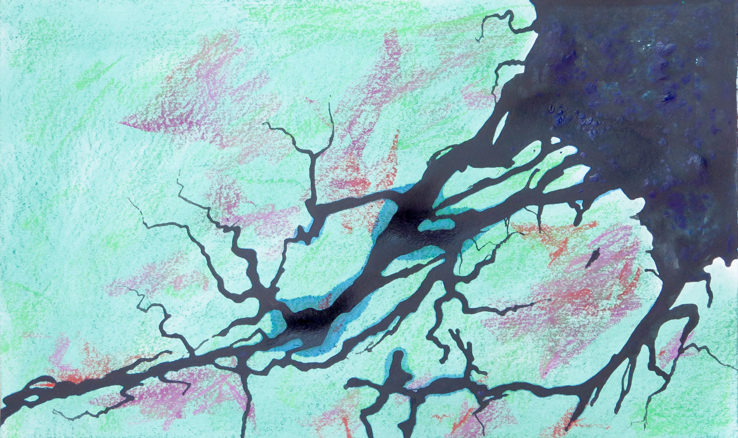
Amazonas (R)

IMG_5388
Dry pastels, ink and acrylics on paper, 28 x 46 cm

A response to Natalie’s Drifting Boats (April submission) I took the idea of a view from above as if from a satellite and worked after a satellite image of the Amazonas delta in Brazil. What fascinated me was the meandering of the intensely black-blue water into the landscape.


Save

Patricia: April


Geometrical composition

IMG_5344
Acrylics on paper, 30.5 x 40.5

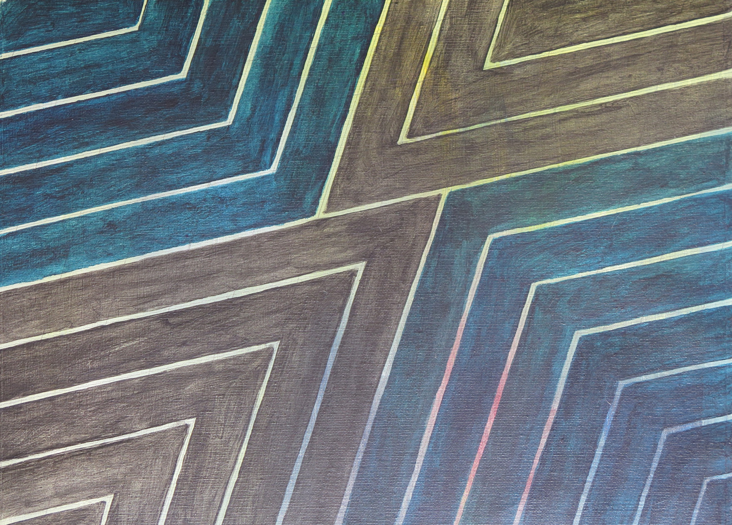
The painting took up an idea I developed while working through MoMA’s abstract expressionism course on Frank Stella. It was inspired by the geometrical structure of Stella’s “Empress of India” (1965). I was interested in the transparency of my paint which permitted the coloured background to shine through.


Terrace textures

IMG_5363
Coloured graphite on paper, 45.5 x 60.5 cm

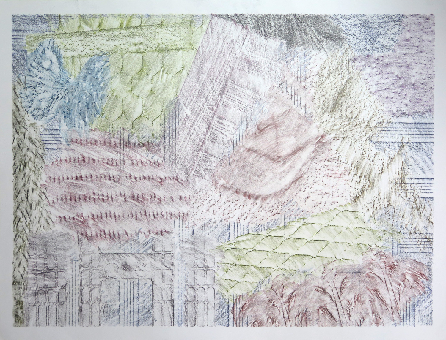
This piece features the frottage technique. I went out on the terrace and rubbed off all kinds of textures I found: Stone, wood, terracotta, basket, plastic, wire mesh. Using different graphite colours, a kind of abstract composition developed.


Saxophone detail

IMG_5364
Pencil on paper, 35.5 x 43

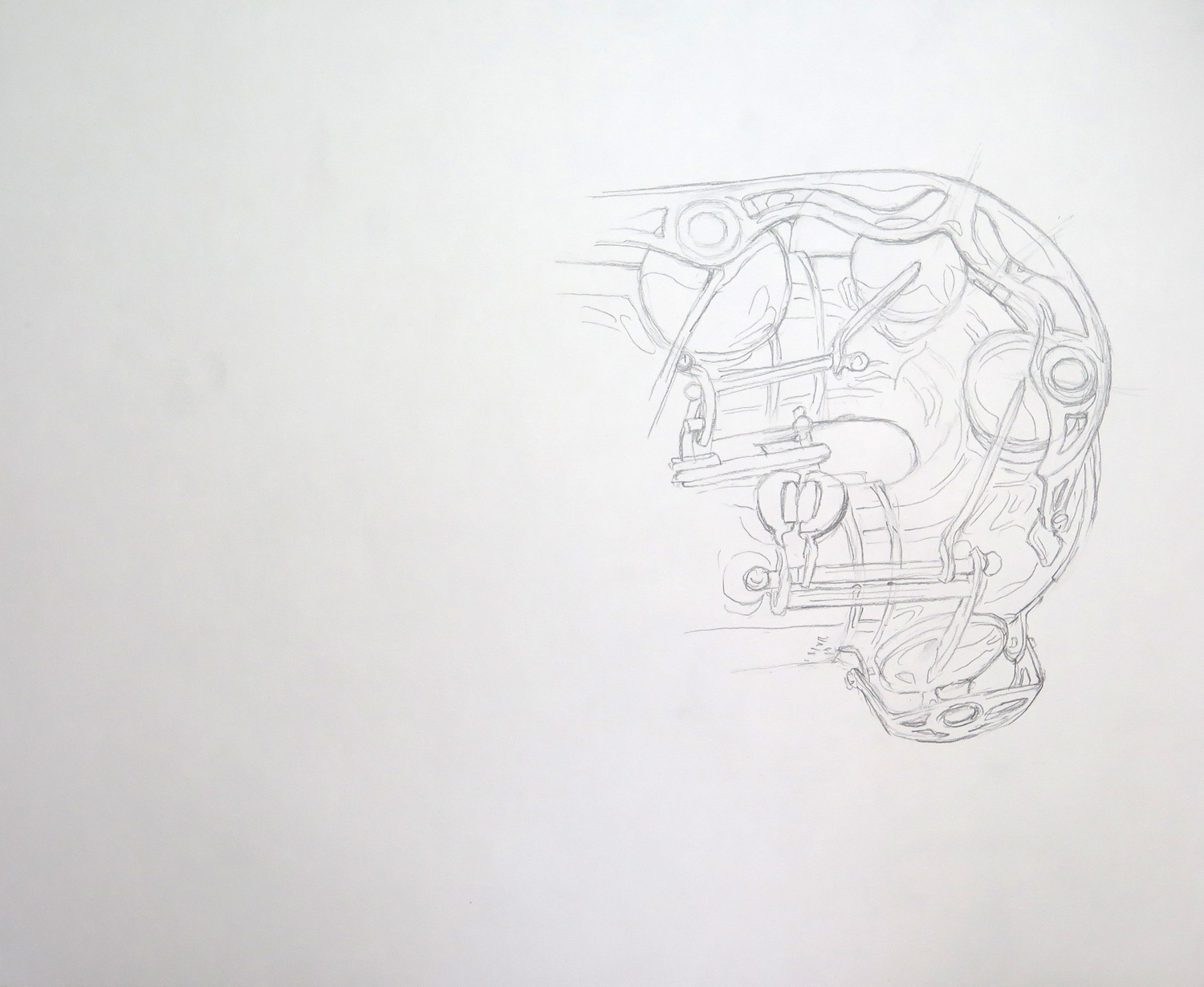
The saxophone is a really complicated object by its construction, and it comes with a very shiny/reflective surface. I attempted only a section and focused on line, trying to capture both constructive details and some of the reflections without recurring to shading.


Dark texture (R)

IMG_5366
Monoprint on paper, 39 x 56 cm

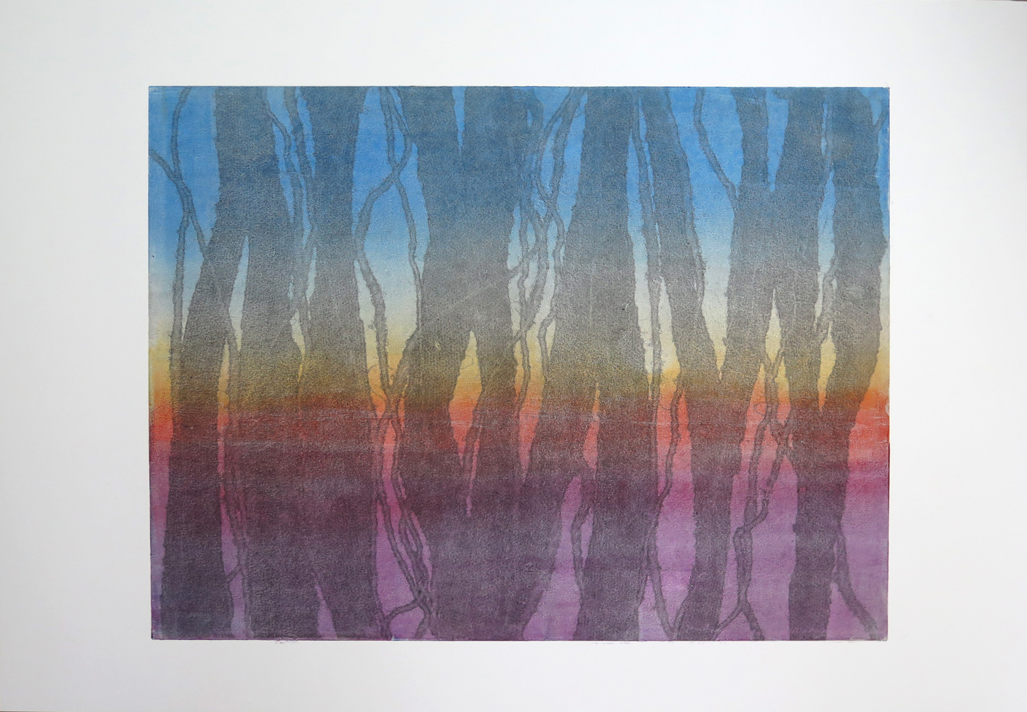
The piece was inspired by Natalie’s ‘Colour relations’ (March 2016), which I perceived as influenced by Jackson Pollock in the elements of dripping and strong primary colour contrasts. I started with the idea of having a black texture over coloured ground and developed a two-layer monoprint. The process was relatively complex and I wished the black ink would have come out somewhat stronger.


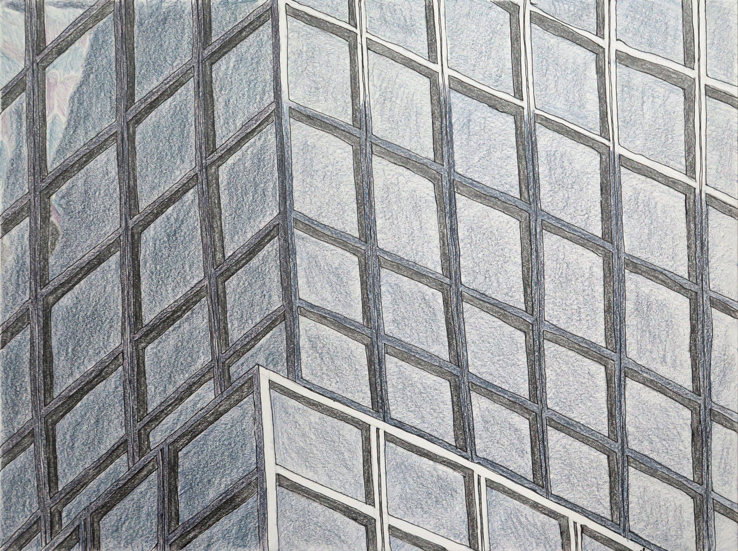
Highrise pattern (R)

IMG_5369
Ccoloured graphite on paper, 22.5 x 30 cm

This piece was inspired by Natalie’s Architecture study 1 (March 2016), which reminded me of my obsession with the glass and steel facades of the highrises in New York City. I had approached the topic earlier with the more comprehensive image of a skyscraper skyline (January 2016, Manhattan Highrise surface fabric), but my fascination is more with the detail patterns of individual buildings. This piece focuses on the geometric pattern in a section of a larger building.


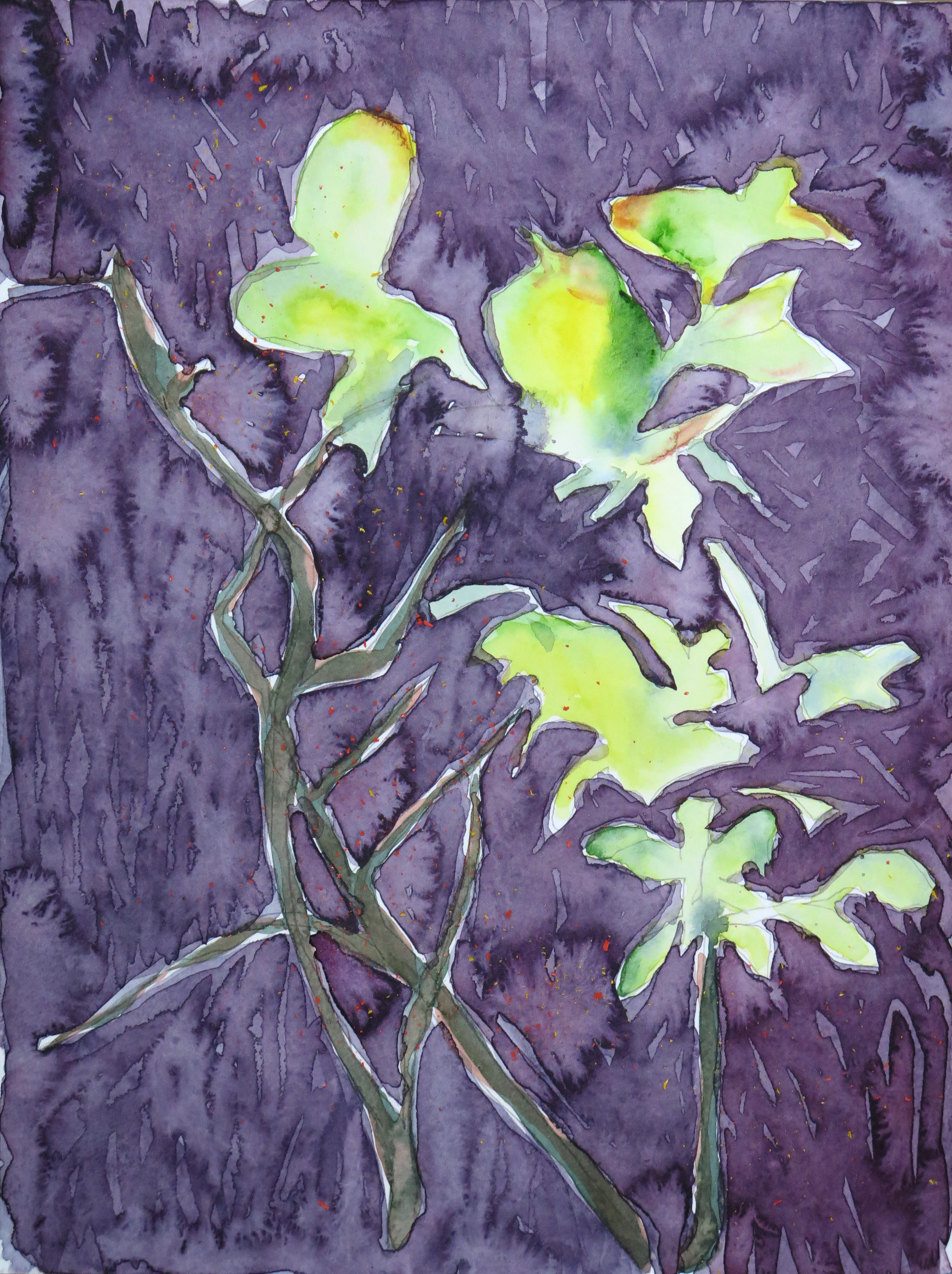
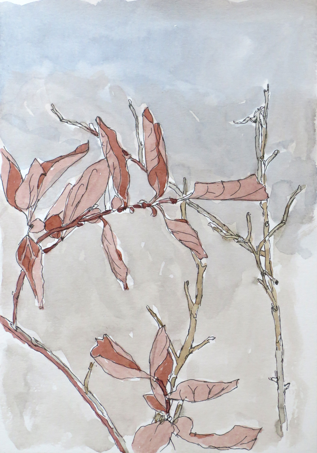
Twigs (R)

IMG_5370
Watercolour on paper, 30 x 22.5 cm

The twigs are based on a quick continuous line drawing of a plant on my terrace. The piece is a response to Natalie’s ‘Sunshine’ watercolour landscape (March 2016). My main focus was on watercolour effects and experimenting with wet-in-wet and wet-over-dry techniques.


Natalie: April

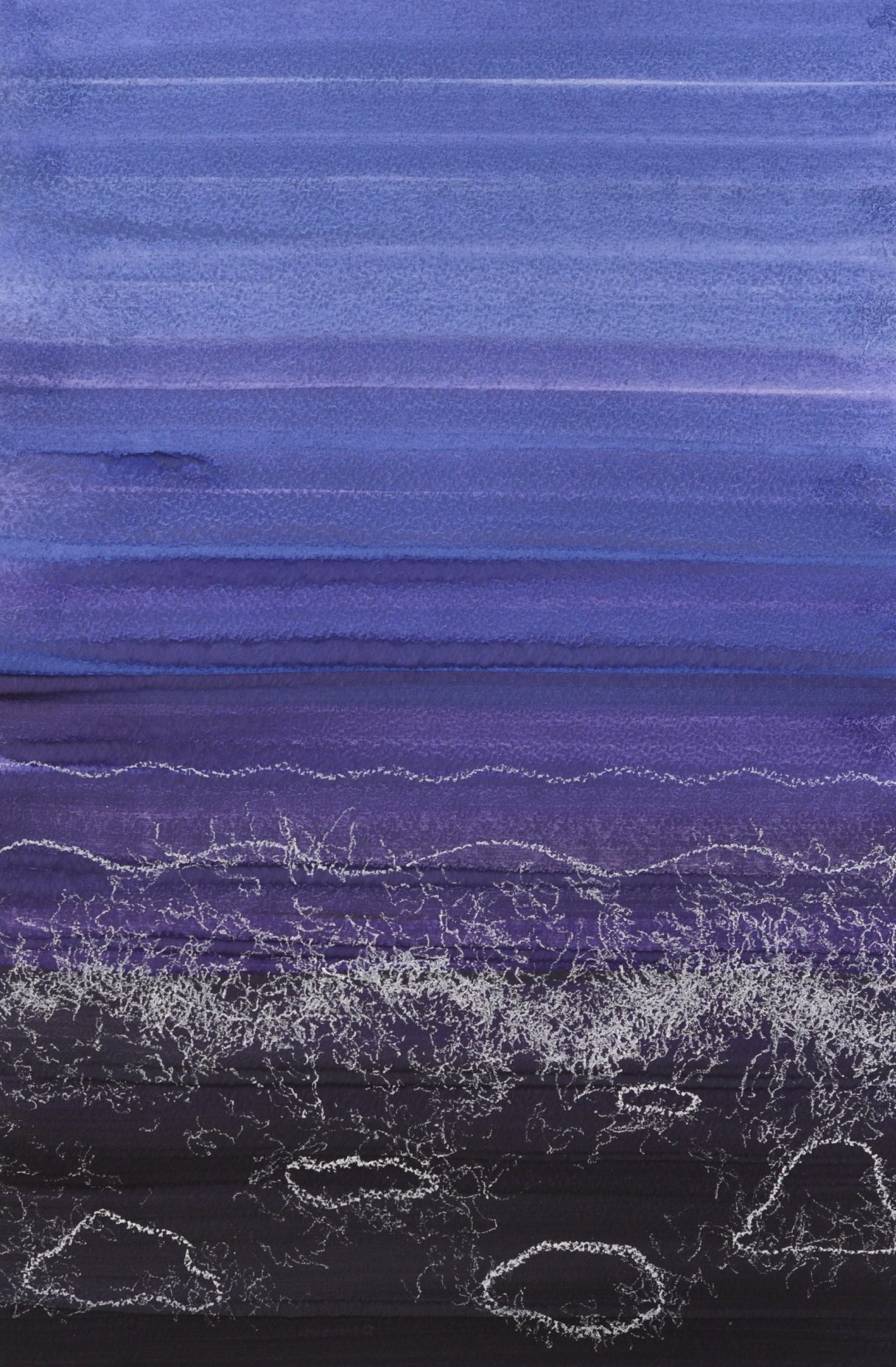
Seashore (R)

A3
Gouache, soft pastels on paper, 30 x 42 cm

This was a response to Patricia’s Deep Water (April) which has an incredibly organic appearance. I immediately wanted to form a rejoinder to continue the sea theme. I decided to create an abstract sense of waves and water bubbles, but through a fully controlled dry medium.


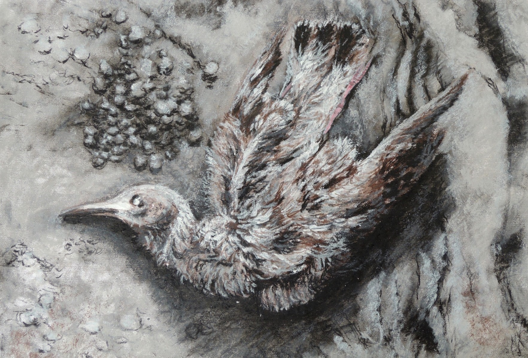
Dead bird

A4
Charcoal, soft pastels on paper, 21,5 x 29 cm

Whilst walking on the beach I saw a dead bird which I wanted to use for a more detailed study at home. I accordingly worked from a photograph and decided to use a limited pallet only.


Drifting boats (R)

A3
Acrylic, soft pastels on paper, 20 x 20 cm

After seeing Patricia’s Floating Shapes (April), the first thing that came into my mind was a continuation of something swimming in the space. Since I was already working on one of the responses related to the sea theme, it was a rather natural progression to carry on with the subject matter. I really enjoyed working on these two in particular and I might come back to it again at a later time.


In the park

A2
Acrylic on paper, 21,5 x 29 cm

This study was in particurar a real struglle for me. I wanted to capture some dominant colours in the local park, but in a more realistic style. However, I didn’t like my first result as I found it too dull (colour wise). In the end I completey covered the original (dark) layers with, perhaps too bright and not entierly realistic (for this actual park) colours, but I was satisfied with the ‘’artistic license’’ that helped me to finish this work.


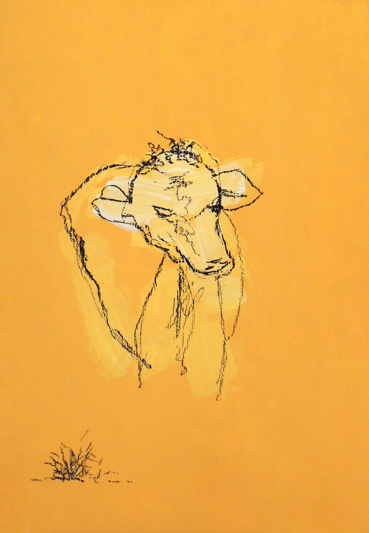
Cow’s head

A1
Acrylic, charcoal on paper, 14,5 x 21 cm

This study was one of the experimental line drawings, which I would like to develop further. I deliberately used a one colour pallet in order to maintain my focus on the actual subject itself.


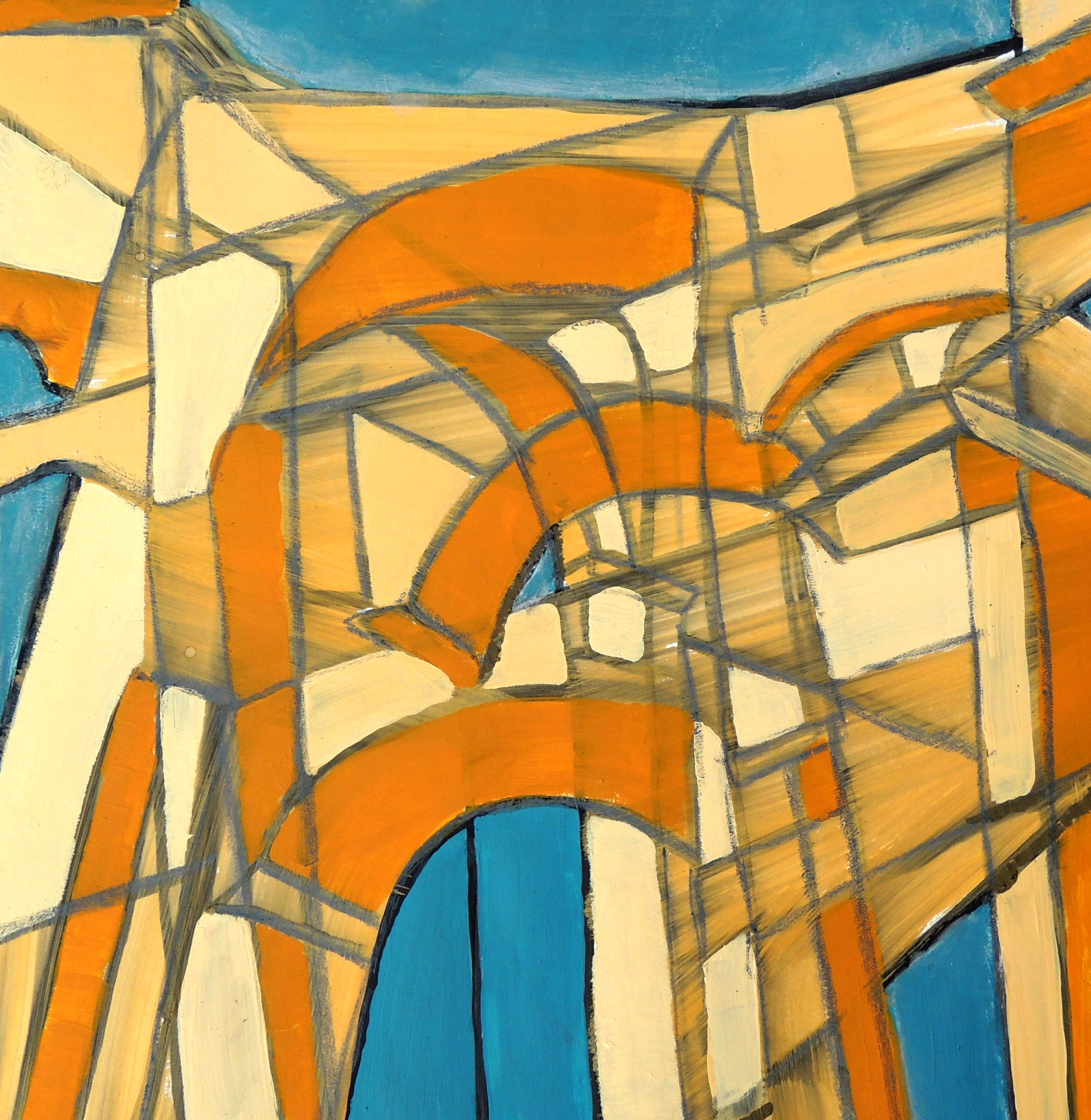
Entrance (R)

A6
Gouache, acrylic, soft pastels on paper, 20 x 20 cm

This small study was inspired by Patricia’s Terrace (April) drawing. I took several photographs of the Arch that serves as the main entrance into one of the local parks and then merged its different angles into one image in order to achieve a sense of eye movement when looking at the construction whilst approaching and passing under it.

Patricia: March

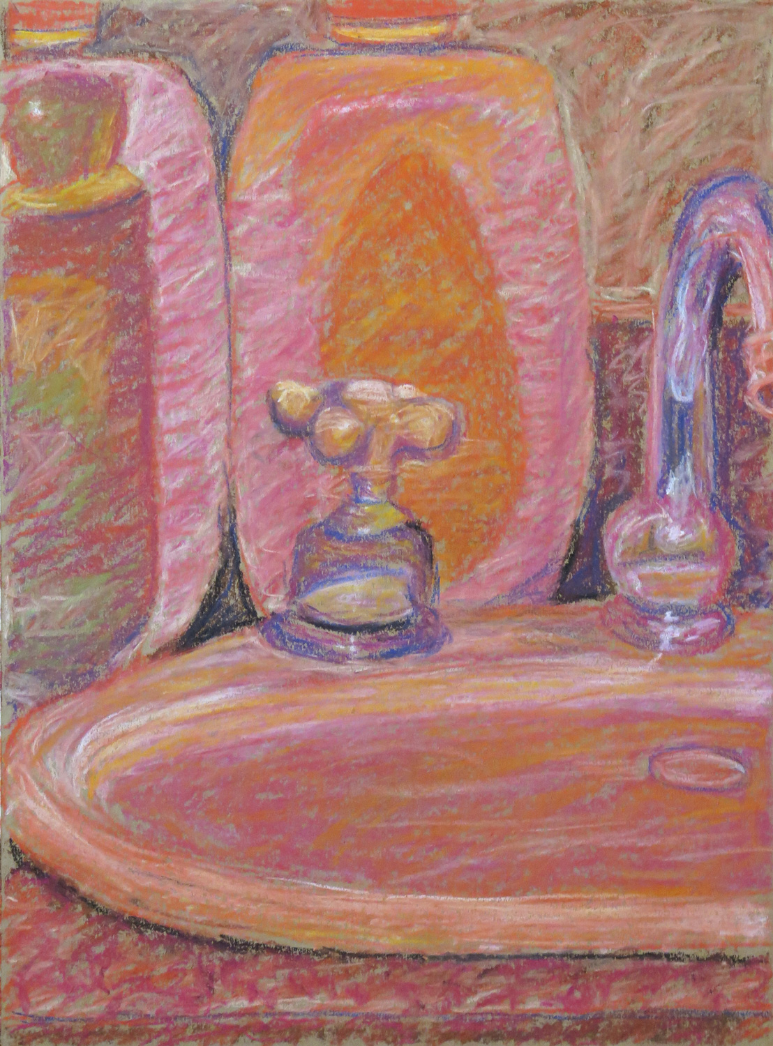
Bathroom still life

IMG_5295
Pastel on paper, 41.5 x 30 cm

Inspired by Ad Reinhardt, I was working towards the idea of making a monochrome red painting. In this sketch I tried to depict the actual colours and the values of the objects in different red tones.


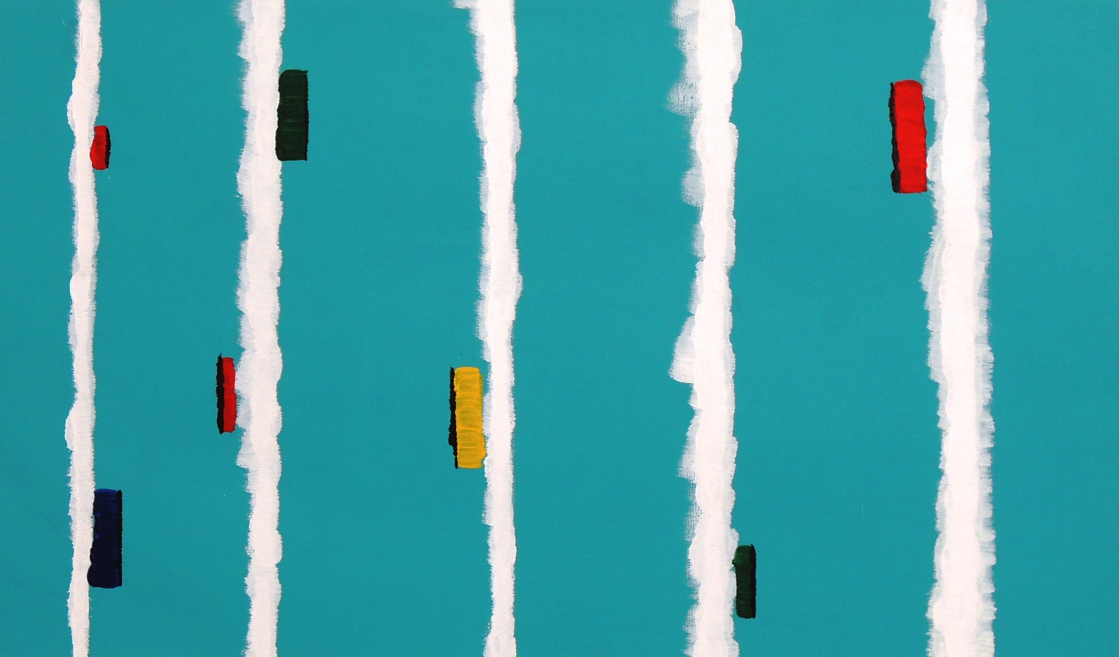
At the bus stop (R)

IMG_5297
Acrylics on paper, 31 x 31 cm

Response to Natalie’s A little walk around the town (Aktau, February 2016). I liked the casual treatment of the cars and went from there to make a painted sketch of a city view. Initially I wanted to capture the movement of the cars through blurring the painting, but then liked it as it was and retained the clear outlines.


Terrace

IMG_5300
Pencil on paper, 35.5 x 28 cm

A study for a possible later painting where I’m aiming at abstracting from the objects towards a focus on the geometrical nature of the composition..


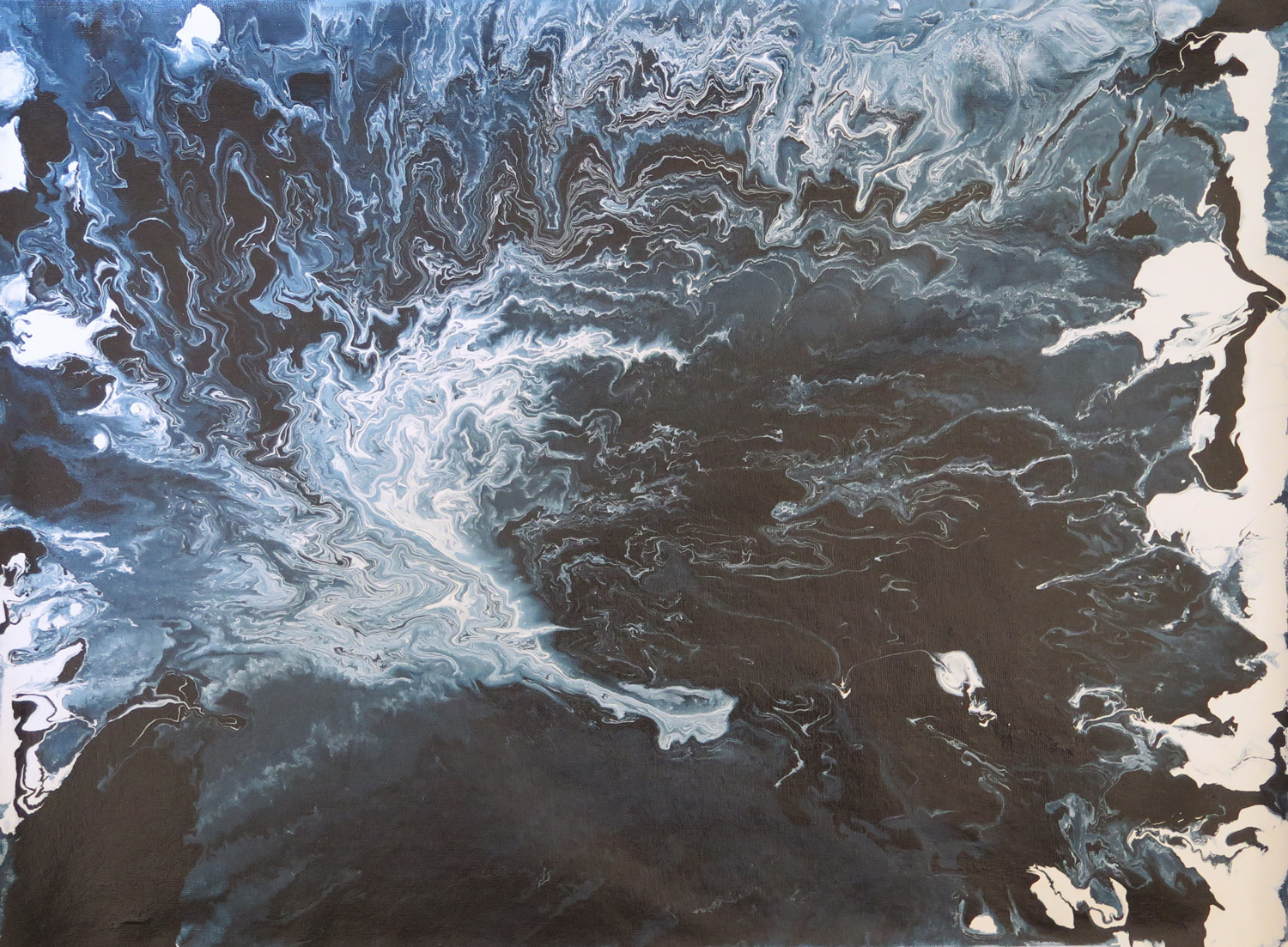
Deep water

IMG_5301
Latext enamel paint on canvas, 45 x 60 cm

Taking up an earlier idea to depict fluidity by pouring paint, I experimented with enamel paint thinned down to different degrees. Pouring on a flat surface and lifting the canvas to an angle made the paint follow gravity and move across the canvas.


Looking out (R)

IMG_5306
Acrylics on paper, 23 x 30.5 cm

Responding to Natalie’s painting ‘Abandoned site’  (February 2016) and bringing further the idea of abstracting from an outdoor view. The painting is also related to the ‘Terrace’ sketch as it is a first step towards the idea of geometrical abstraction from real objects.


Floating shapes (R)

IMG_5308
Watercolour on illustration board, 38.5 x 51 cm

This piece is a response to Natalie’s sunset painting (February 2016). I took up the idea of a gradation in colour which I wanted to achieve through a wet-in-wet technique. The paint behaved differently from what I expected but I found the effects interesting. The shapes look like cells from a living organism.

Natalie: March


A tree (R)


Soft pastels on paper, 42 x 59 cm

This is my response to Patricia’s Potted plant (February). I just wanted to draw something natural and organic.


Sunshine


Watercolour on paper, 29 x 42 cm

The main focus of this study was to capture the sunlight of a mainly stormy looking day and make some progression towards a more abstract presentation of it.


Managing the lights (R)


Oil on unprimed canvas, 23 x 24 cm

This is my response to Patricia’s New York Light (Male figure, February). This time I was under Rymann’s influence as well as Newman’s Zips (…still!). The idea was to pursue the study of medum in the same manner as Rymann did and see where it would lead me. It was much harder than I anticipated. Keeping the light lines straight was a real feat! I finished my study with Newman’s yellow and black Zips to represent the man from Patricia’s painting. It is not central but still dominant. I used unprimed cavas this time for the sake of experimentation, as I wanted to create a sense of light reflections on the otherwise untouched and clear ground.


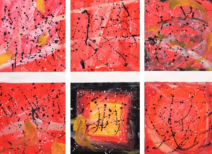
Colour relations (R)


Gouache on paper, 42 x 59 cm

This is my response to Patricia’s Abstract composition (February). It was pure indulgence in experimenting with red and letting my brushes and hands experience absolute freedom. This absolute freedom by the way was not entirely achieved, since Pollock and Rothko just wouldn’t leave me alone! I was essentially doomed, as any undergraduate art student who hasn’t yet developed their own style would most certainly be.


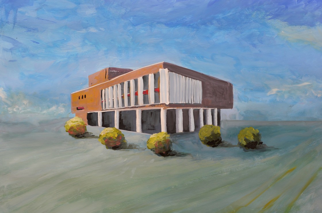
The architecture study 1

M1
Gouache on paper, 42 x 59 cm

This administration building is located on one of the central squares not far from my place of residence and I wanted to capture its almost proud setting, standing on its own. The square itself is very spacious and quite open and I aimed to encapsulate its essence accordingly. When you stand there you are completely surrounded by the sky and feel incredibly small… but not intimated though, as many large constructions can often induce you to feel.


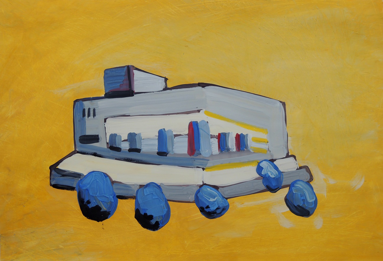
The architecture study 2

M2
Gouache on paper, 42 x 59 cm

This is an abstract progression from the Architecture Study 1 on the following day. This time I used yellow for the ground (sky) to represent the sunshine and to give a hint of the temperature in Kazakhstan… erm… to say that it can be hot wouldn’t even describe it!