Category Archives: September

Natalie: September

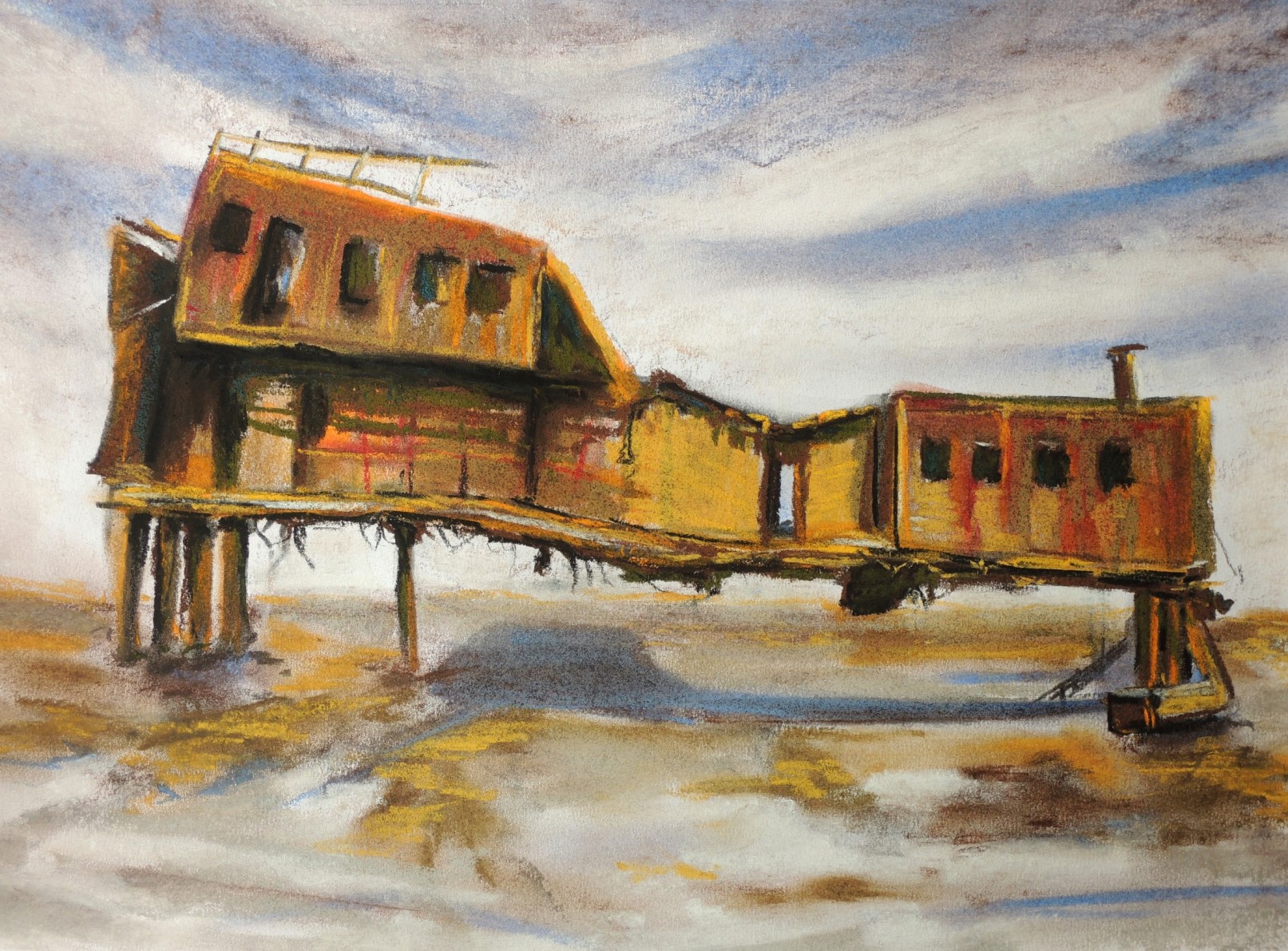
Old ship structure (R)
s1
Soft pastels on paper, 26 x 37,5

This is a response for Patricia’s View Towards Queensborough Bridge (August). What attracted me the most in Patricia’s study is the cleanliness and simplicity of the quite ambitious scenery, together with the pleasing sense of depth. I wanted to keep the ‘’marine’’ theme going but for my subject, so I choose an old and rusted ship. It is hardly recognisable as such as it looks more like an old house on stilts but in reality, that what was left of it. I was drawn by its colours and positioning, as well as the calm surroundings.


Pouring milk

s6
Soft pastels on paper, 23 x 26

The inspirational image was taken from the local newspaper in Kazakhstan, during the national celebrations. There is a custom here to install traditionally decorated Yurtas on the central streets where they serve some local dishes that are made specifically for such days. In order to create a very special atmosphere, food, treats and many other goods are sold by sellers dressed in the national dress. It’s a truly special experience for everyone, i.e. not just for the tourists, but for the local people too.


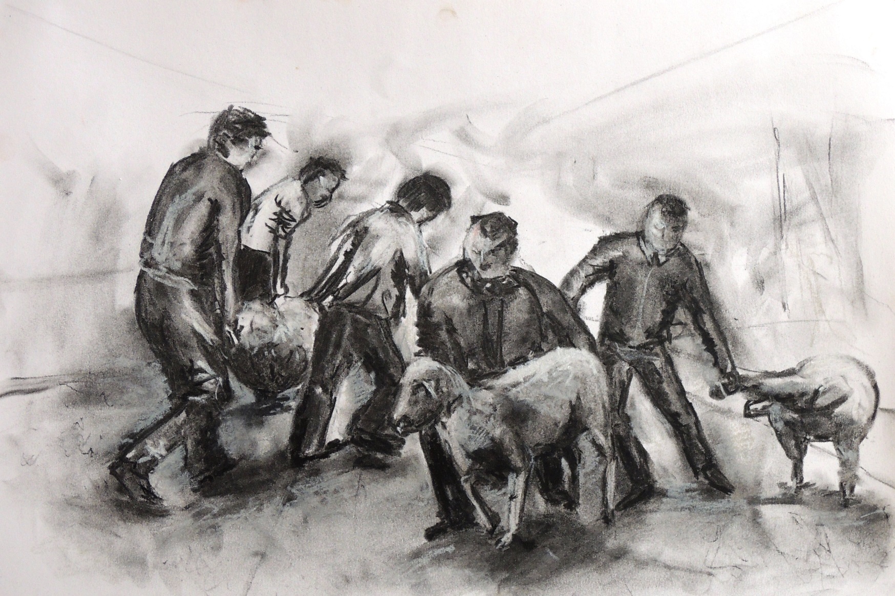
Catching a lamb
s7
Charcoal on paper, 26 x 37,5 cm

This is a continuation of the local traditions and celebrations depiction. This time I was after the fast movements and motions, thus people’s faces are not developed.


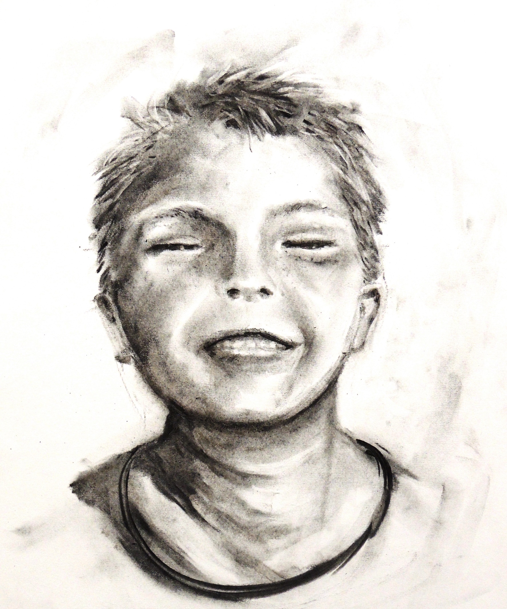
Happy boy (R)
s2
Charcoal on paper, 26 x 37,5 cm

This is my response for Patricia’s Girl from the 1950 (August). I simply wanted to respond with a smile in return.


Imaginary landscapes (R)
s4   s3
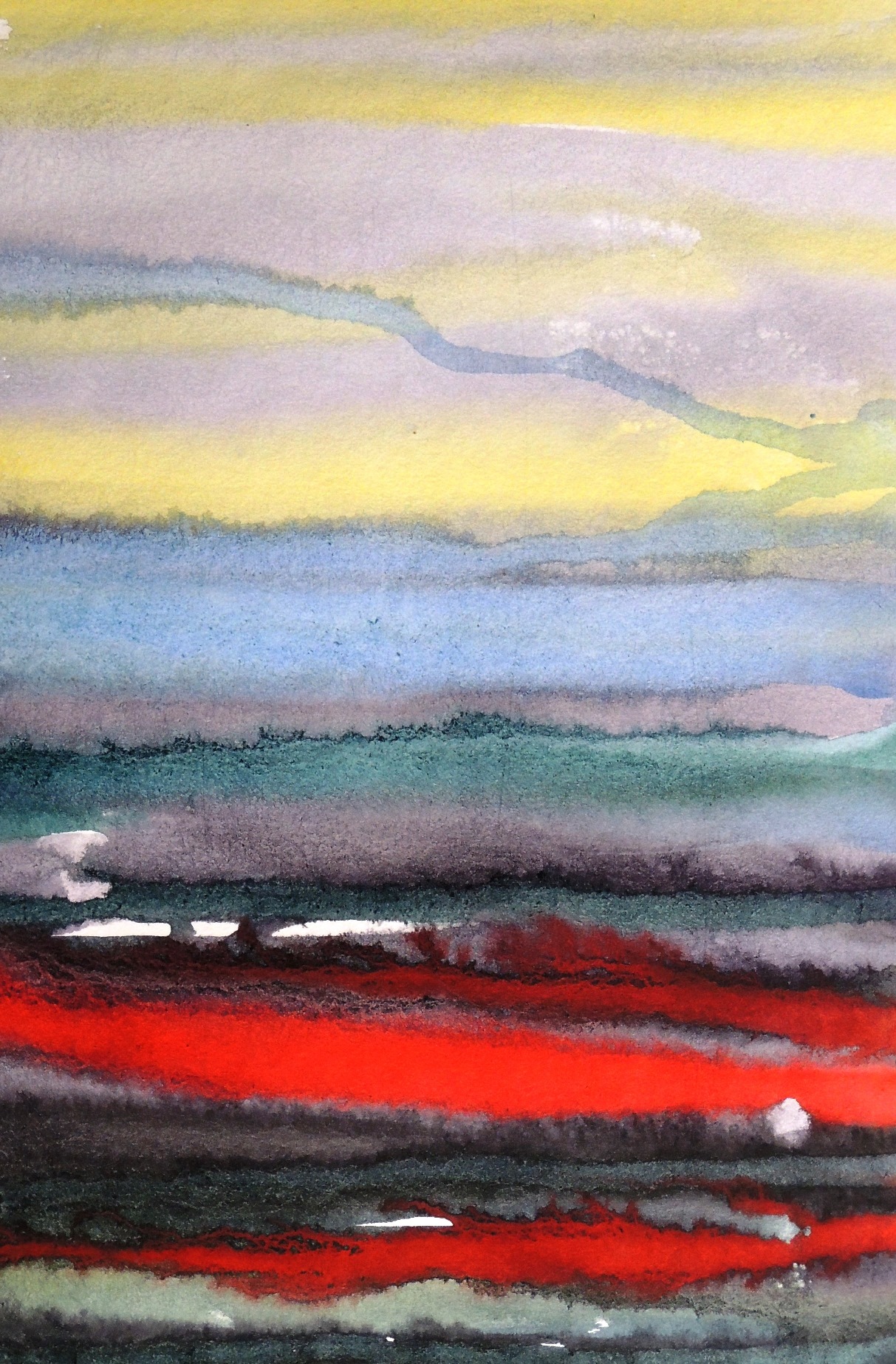
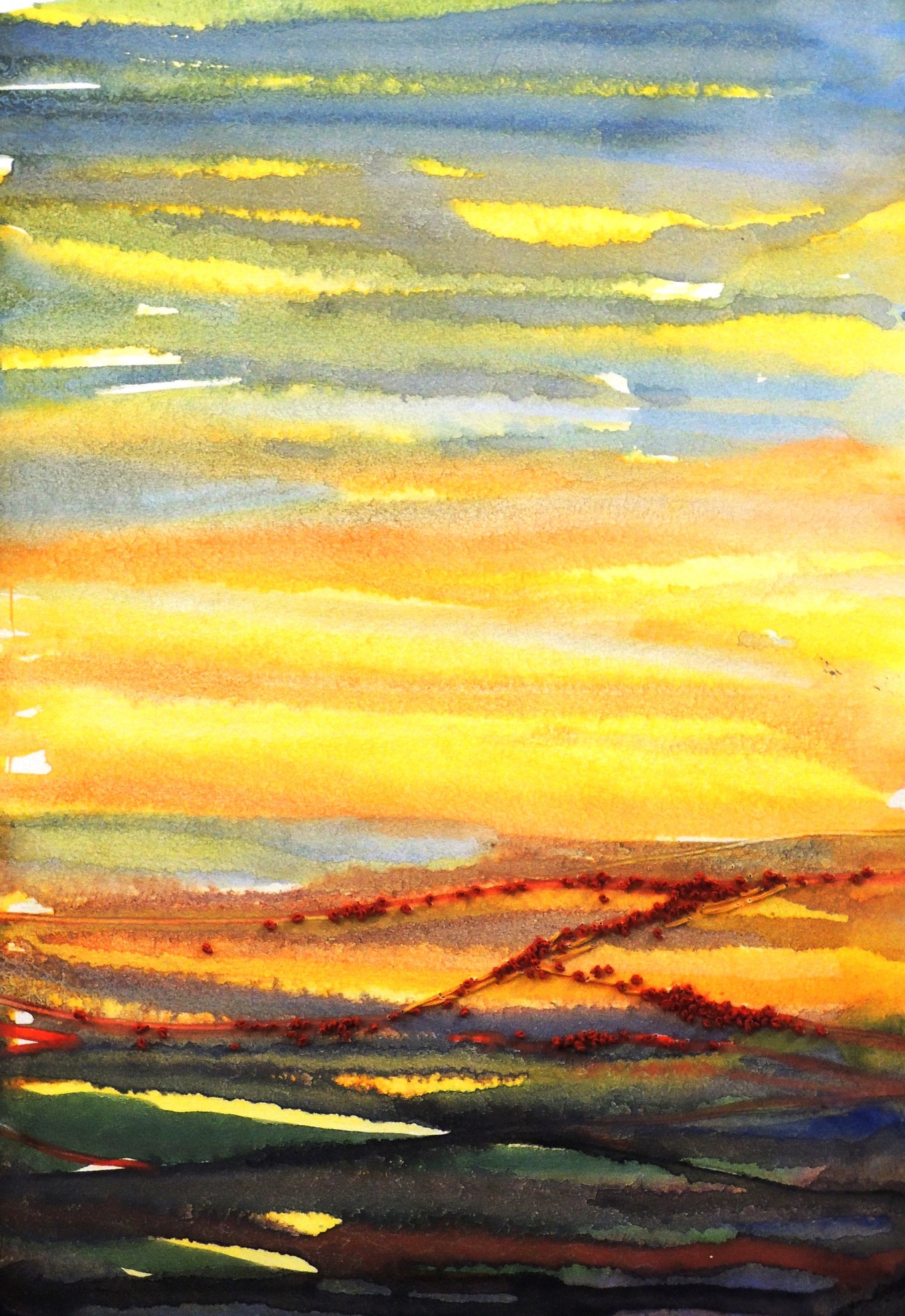
Watercolour and hand embroidery on paper, 20,5 x 30

This is my response for Patricia’s Stripes (August). Patricia’s lines reminded me of a map that is displayed at any Underground and I wanted to experiment with such lines, but in a less controlled manner. I used watercolours and let them run in order to form natural and organic shapes. I had no particular idea what I wanted to achieve as I hoped to be surprised by the result. I manipulated the way I applied the shades though, i.e. I worked wet on wet, as well as wet on dry.


Imaginary trees

s5
Watercolour and hand embroidery on paper, 20,5 x 30

This is another freestyle and experimental study. The trees became trees by pure surprise (i.e. due to medium leaks and finding their own way). All I had to do in the end is to add some hand embroidery to intensify and suggest the elements of tree.
Patricia: September

Fantasy Aquarium I

img_5994
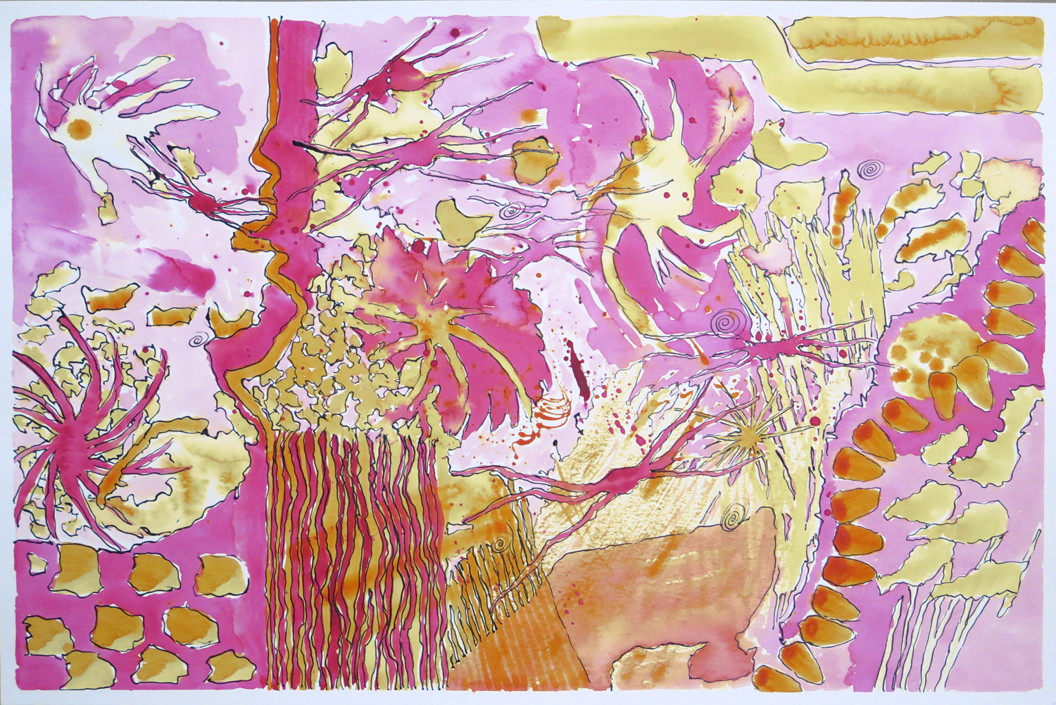
Watercolour and ink on paper, 30 x 46 cm

This started as a watercolour doodle where I explored mark-making using just the two colours magenta and yellow in liquid watercolours. Then I followed the shapes and forms that developed with ink lines to create a sense of definition. The result reminded me of strange underwater creatures foating in water, hence the title.


Fantasy Aquarium II

img_5995
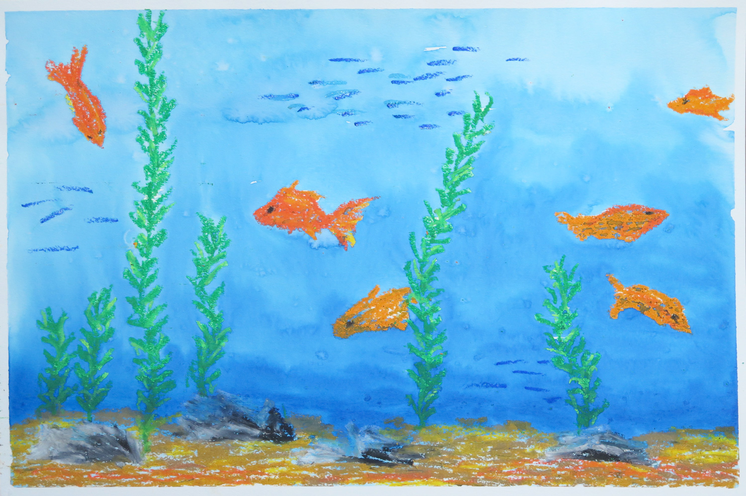
Oil pastel and watercolour on paper, 30 x 46 cm

Taking up the aquarium topic from the first painting, I took a different and more literal approach. I remembered the goldfish aquarium I used to have as a child and created an underwater scenery with different kinds of fish and some sand and stones. The oil pastel elements served as a resist when I painted the blue wash on top to represent the water.


Self Portrait

img_5997
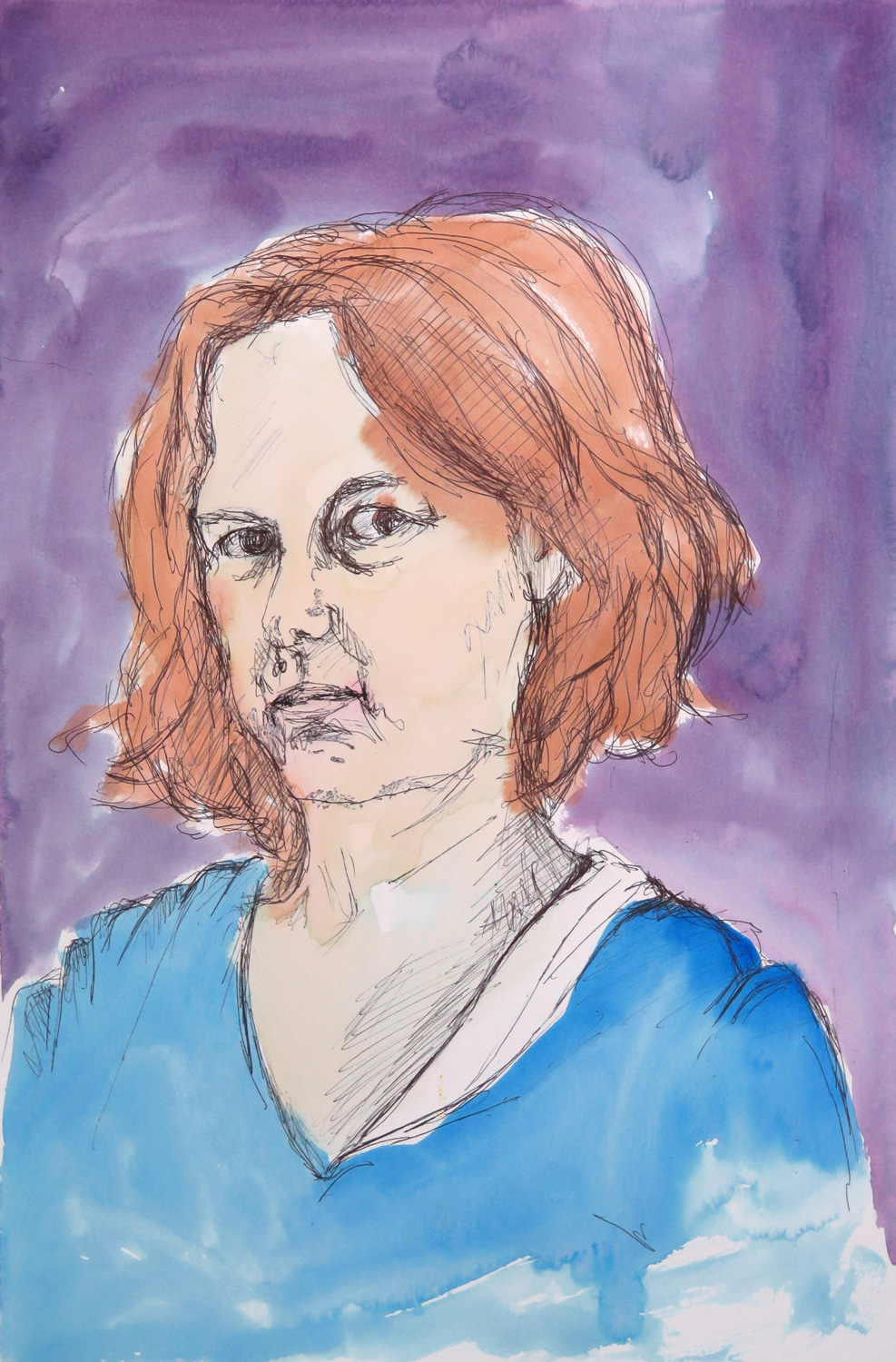
Pen and watercolour on paper, 46 x 30 cm

Self-portraits tend to be a difficult subject for me, both technically and emotionally. The idea was to overcome the hesitation by making a quick and unpretentious sketch, not worrying too much about likeness.


Rejection of Identity (R)

img_5991
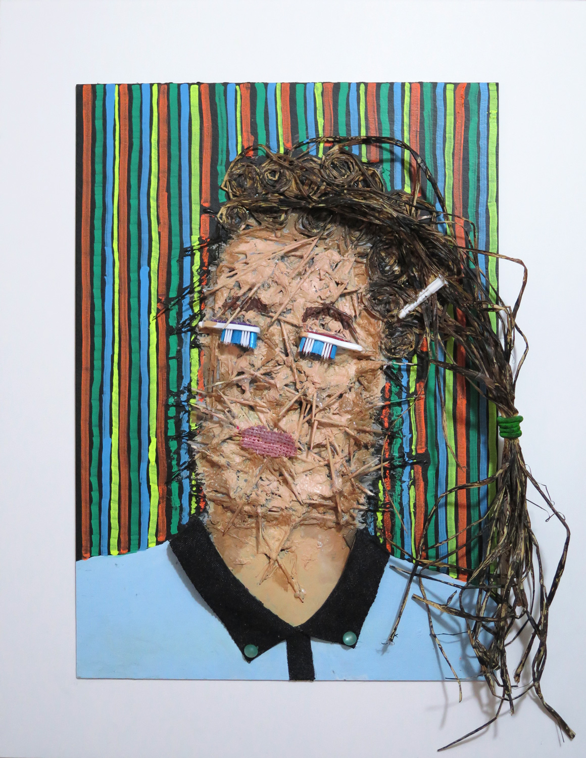
Painted materials collage on board, 54 x 42 cm

This self-portrait was inspired by Natalie’s ‘Expectations’ portrait (August 2016). I took on the idea of emotional expression and developed the piece intuitively as a materials collage which was then painted. The face was created from toothpicks and paper machée, then overpainted for a more human-like appearance. It’s a visual representation of how uncomfortable I feel in my skin in my current professional identity, while trying to pretend that I’m playing the game.


The Friendly City (R)

img_5990
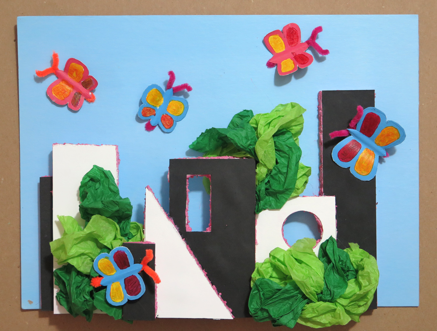
Painted materials collage on cardboard, 28 x 38 cm

This piece was inspired by the visual elements in Natalie’s ‘White house’ (August 2016). Geometric paper shapes were glued on styrofoam, then cut out and assembled into a citiscape. They were decorated with green tissue paper for trees and bushes, and with painted paper butterflies, to create a friendly and joyful environment around the austere geometry. It is my response to being in the big city of New York, always searching out the spaces with greenery which make the city livable.


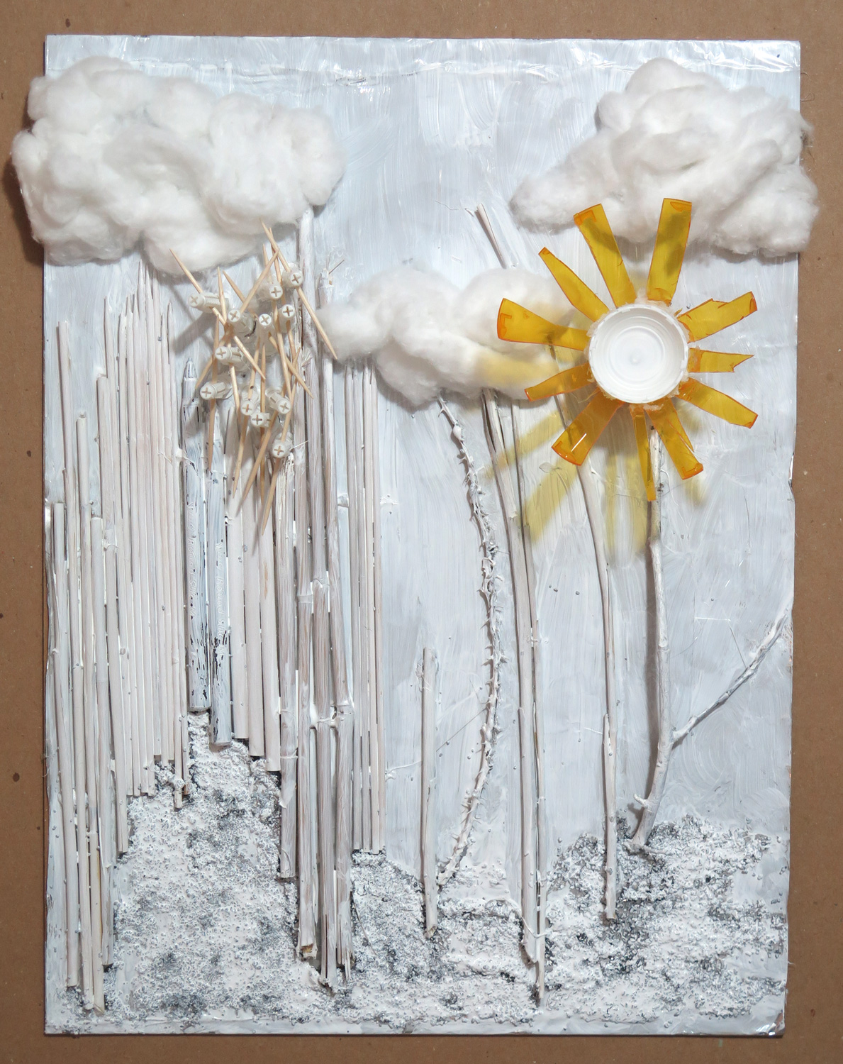
Landscape with tubular elements (R)

img_5987
Painted materials collage on cardboard, 41 x 30.5 cm

I responded to the visuals of the long tubular shapes in Natalie’s ‘Inside the cupboard’ (August 2016) and transferred the abstract concept into an imaginary landscape. In my piece, I focused on shapes and textures and tried to include interesting visual and haptic contrasts.

Save

Save