Category Archives: _Natalie

Natalie: December

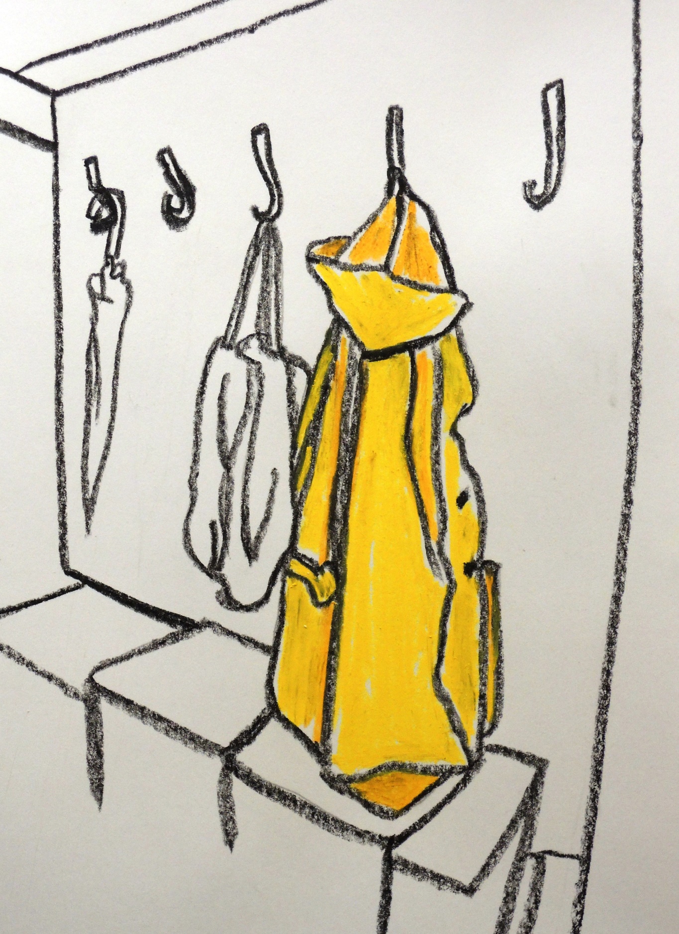
Yellow coat

d3
Charcoal, soft pastels on paper, 21 x 25 cm

This drawing is my symbolic statement about the end of this project. It was great and thus the yellow colour that I associate with happiness and the image of the coat hinting at the end and time to go.


Flying balloons
d1
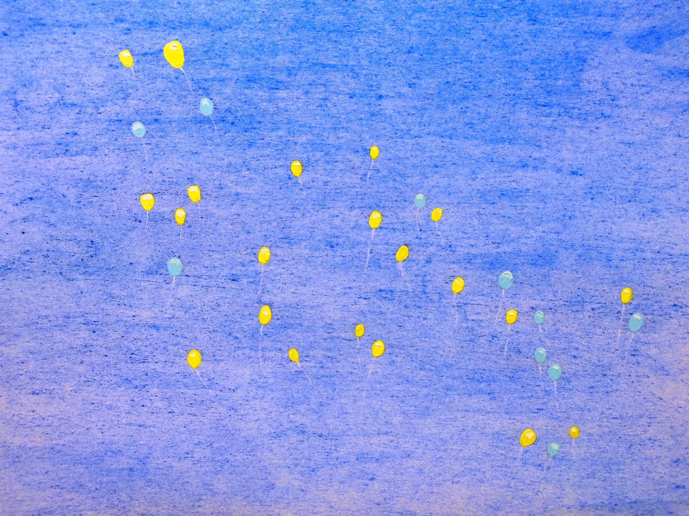
Soft pastels, acrylic on paper, 21 x 29,5 cm

A few days ago the whole country was celebrating Independence Day. The image of the flying balloons (taken by a local reporter) caught my eye for their absolute random and beautiful composition in the air. I simply wanted to depict this composition with paint without any changers, as I find it rather organic and unpretentious.


First snow
d2
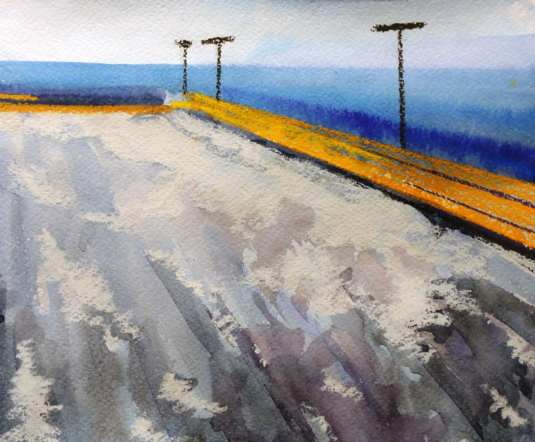
Watercolour, soft pastels on paper, 21 x 23,5 cm

We had a first snow last week and ta-dah…. a small impressionist study.


Keep it warm (R)
d4
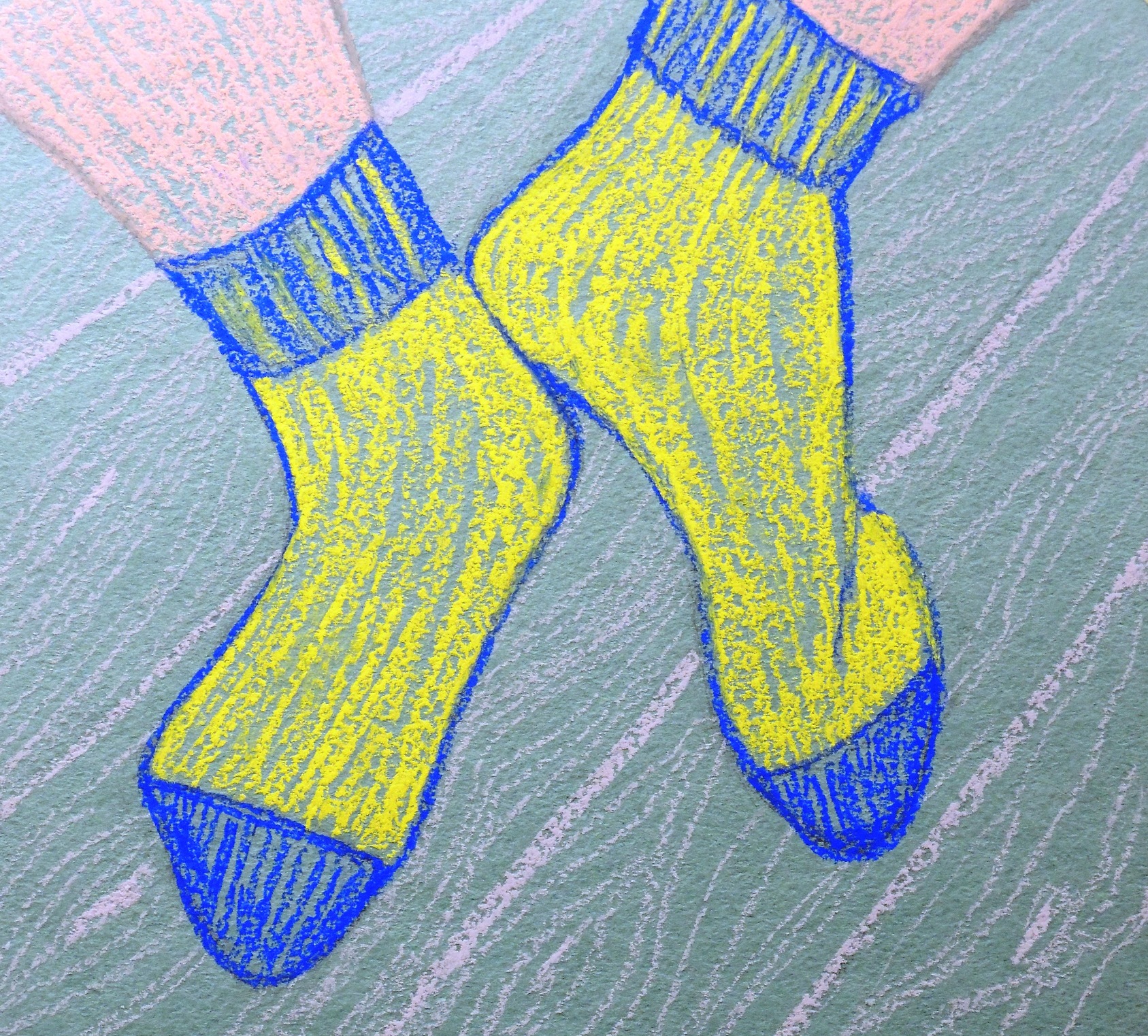
Soft pastels on coloured paper, 19 x 21 cm

This is my response to Patricia’s Home (November). I simply could not resist to offer up some socks! Maybe because we are in the winter season at the moment. :o)


Staring at the sea (R)
d5
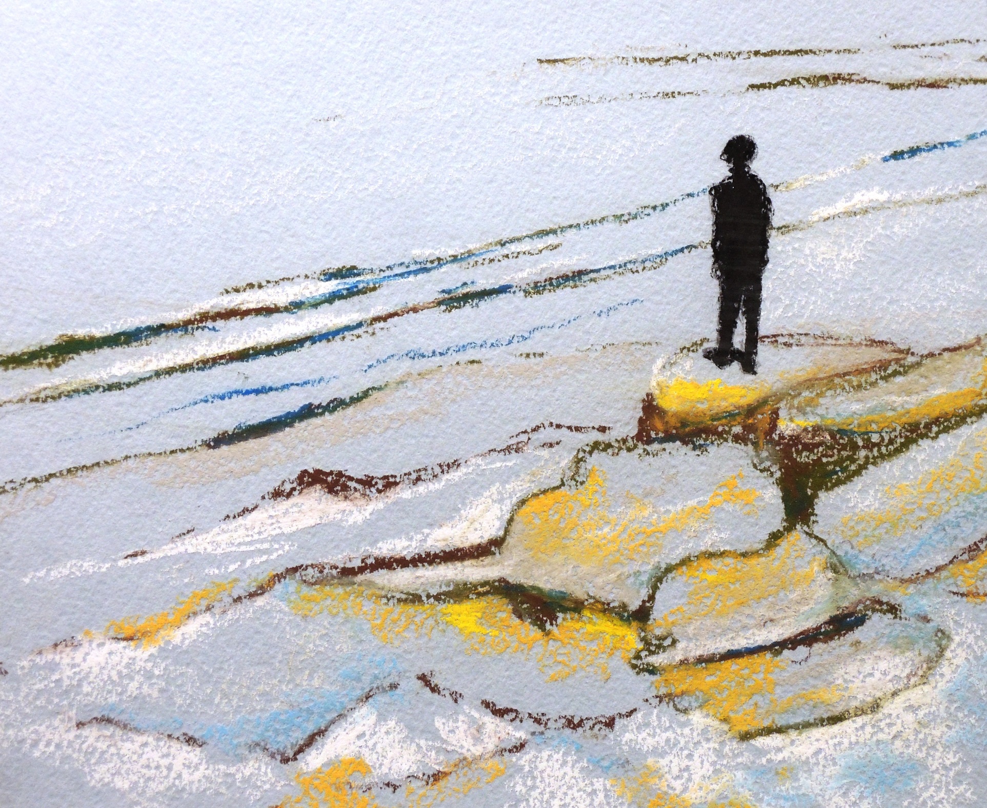
Soft pastels on coloured paper, 21 x 24 cm

This is my response for Patricia’s Autobahn (November). The little black figures were quite charming and I wanted to focus on the same subject in my response. I wanted to depict peace and a “deep in thought” moment… no urban life, no traffic, no fear for pedestrians.


Fist aid (R)
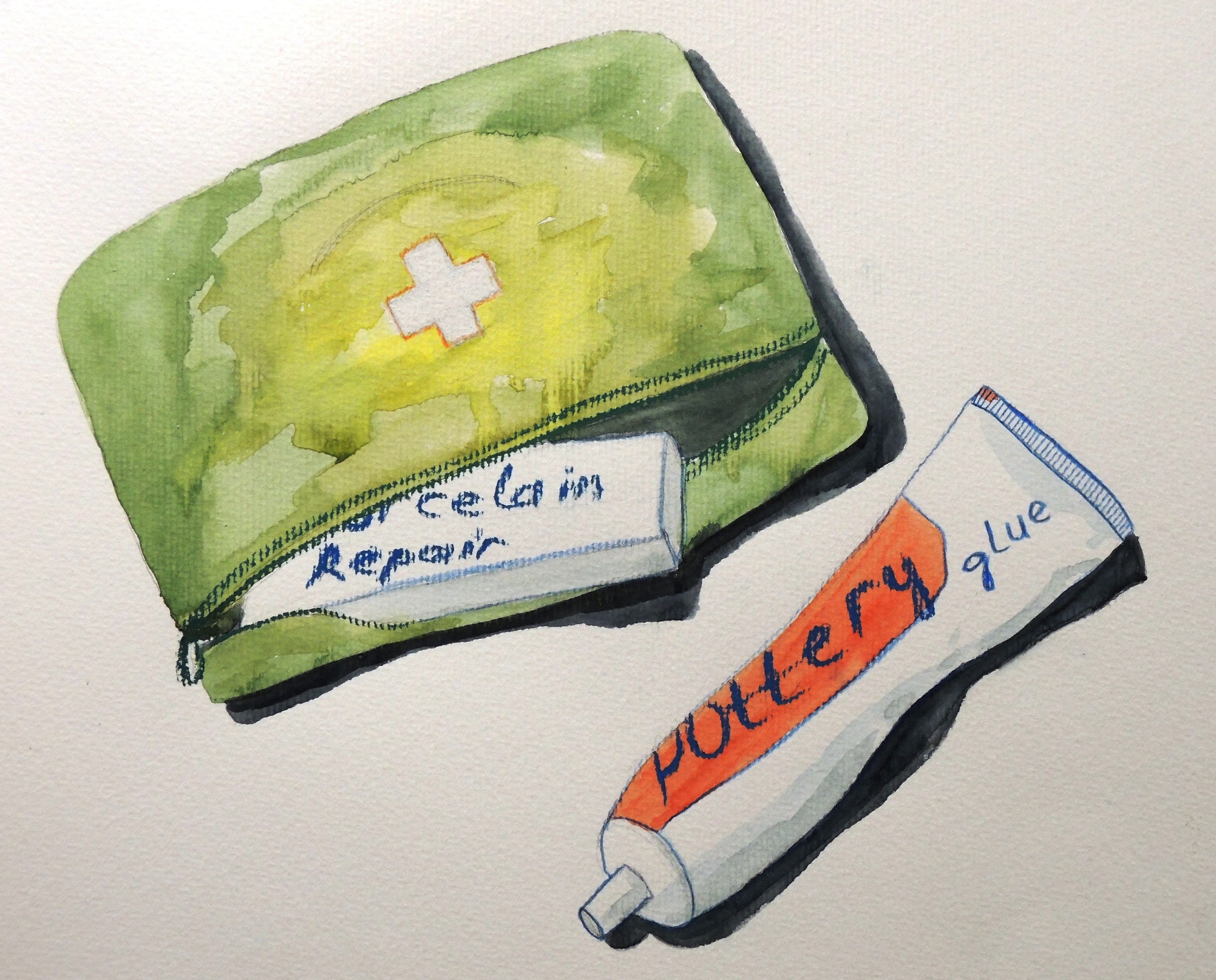
d6
Watercolour, soft pastels on paper, 29,5 x 31 cm

This is my response to Patricia’s I love my broken pot (November). ‘’Let’s save this pot!’’ was my immediate reaction, so I re-produced some useful tools.
Natalie: November

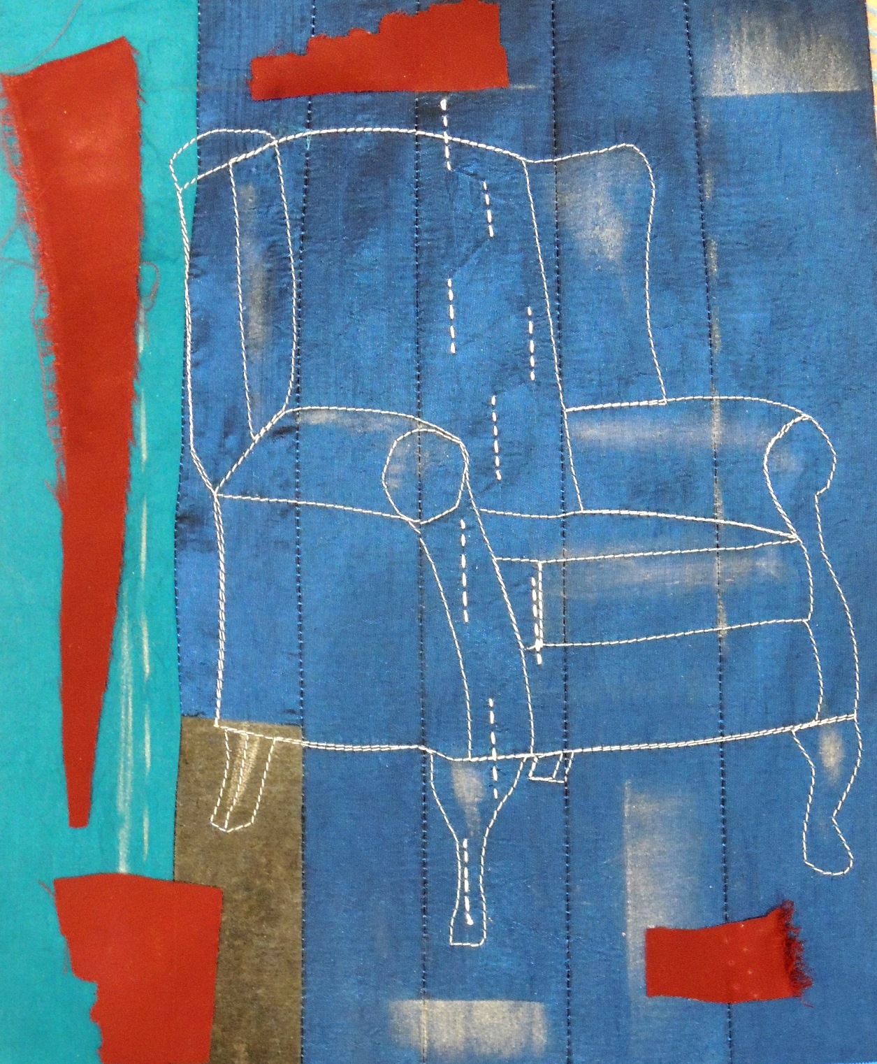
Armchair (R)

nov4
Textile, 21 x 27 cm

This is my response to Patricia’s The high bed (October). As I was deep into sewing during that time I wanted to recreate something with lines and stitches to imitate a simplified line drawing of the armchair.


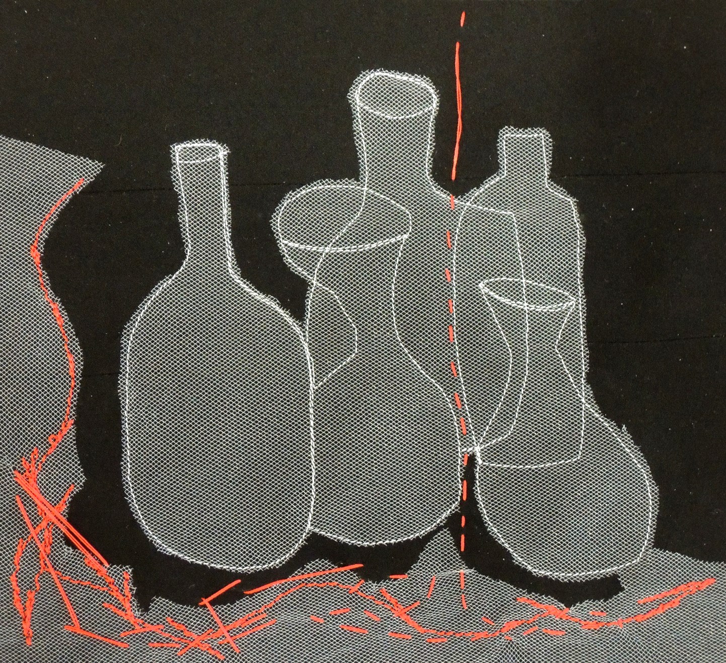
Jars (R)

nov5
Textile, 22 x 24 cm

This is my response to Patricia’s Bottles (October), where I focused on the figure/ground presentation exercise by using textile and hand stitching.


Sewing tools (R)

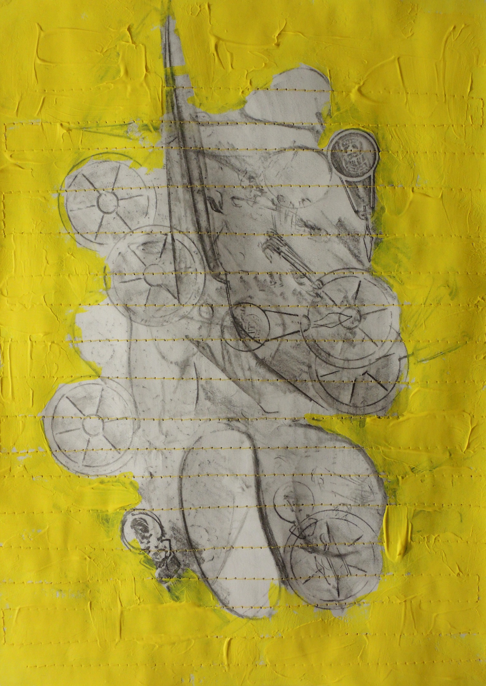
nov66
Frottage, acrylic on paper, 20 x 28 cm

This is my response to Patricia’s Keeping thing together (October). My sewing activities could not be more appropriate for undertaking such a response… besides sewing is by definition, for keeping things together! I used the frottage technique to highlight my sewing tools and at the final stage, I put the whole paper through the sewing machine to create the fundamentally important lines.


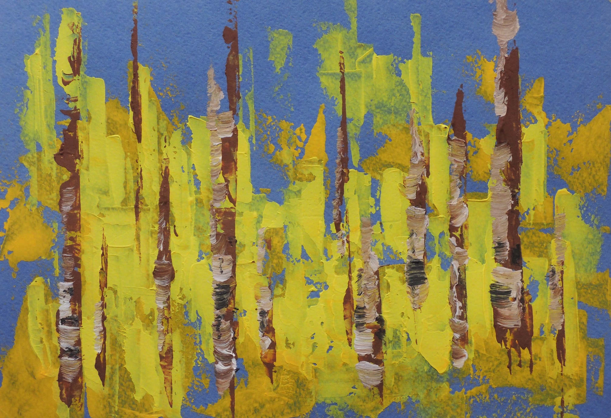
Yellow forest

nov2
Acrylic on coloured paper, 21 x 30 cm

This is an abstract composition representing a yellow forest. I’ve just realized that my focus on yellow in general is getting a bit obsessive lately. My only explanation is that we are surrounded by the yellow trees at the moment and I am quite an obsessive person! :o)


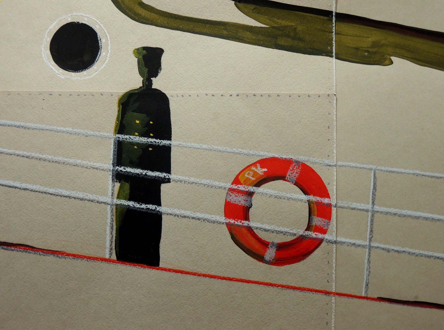
Mariner

nov3
Acrylic on coloured paper, 29 x 41,5 cm

Living by the sea will inevitably influence the choice of subject… and this image is no exception.


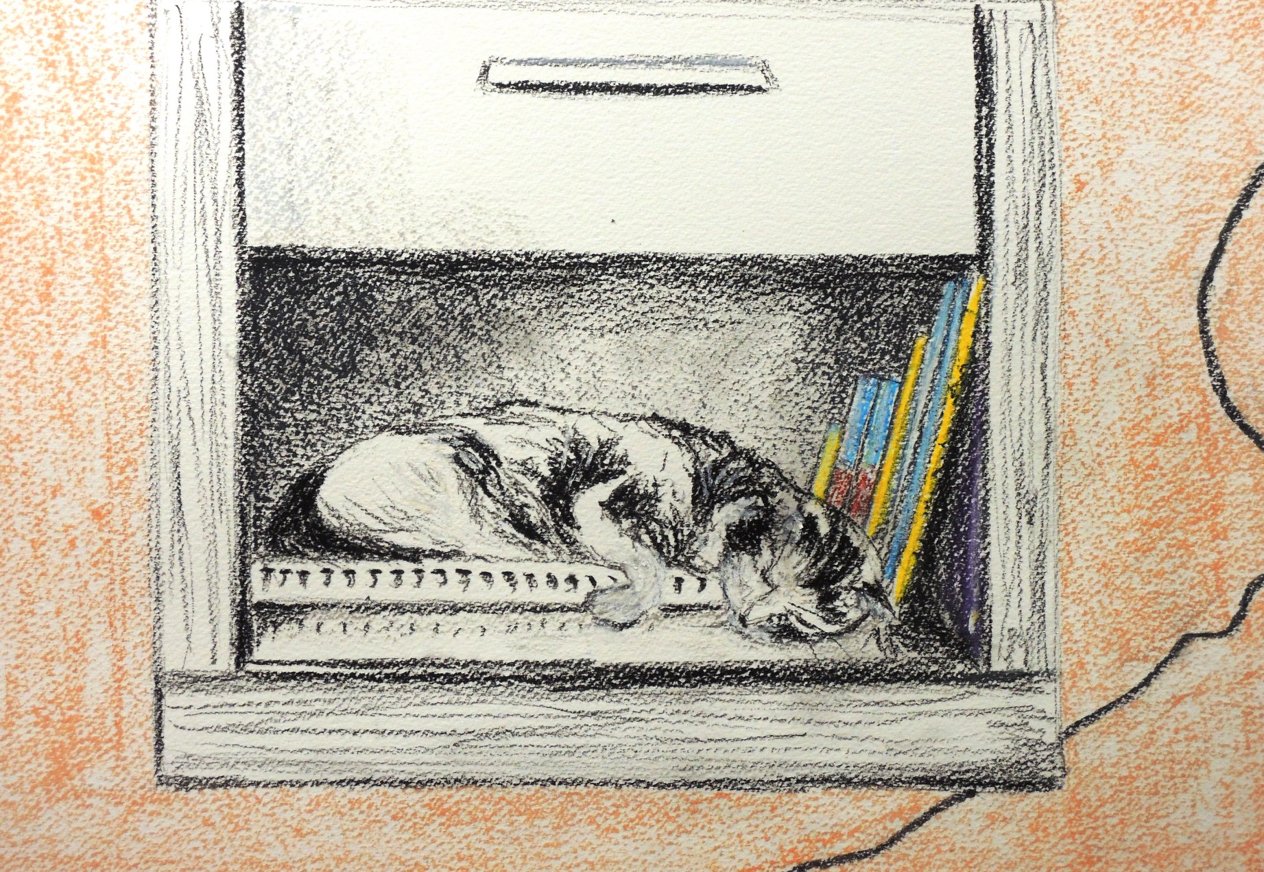
A little nap  

nov1
Soft pastels on paper, 32 x 40 cm

This is my cat, squeezed into a narrow space for a little nap. What can you do… draw her!

Natalie: October

Anonymous (R)

october-2
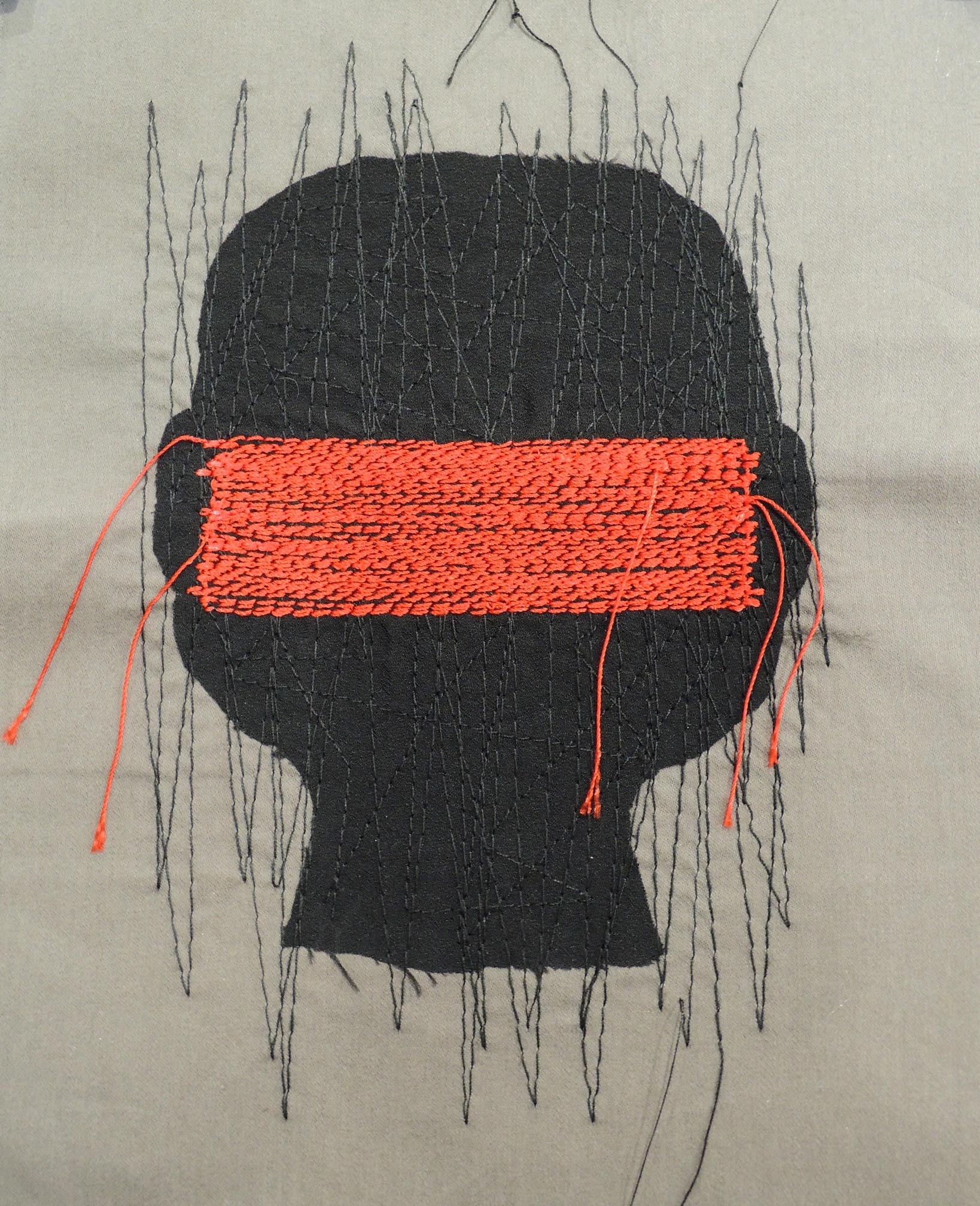
Textile, 17 x 19 cm

This is a response to Patricia’s Rejection of identity (September). The piece was so powerful that it could not be ignored. In my response I wanted to tackle anonymity which I wanted to represent in the most symbolic manner as possible. The subject of anonymity has two sides and could be controversial, i.e. it could equally be used for protection and for damaging actions at the same time. I used red block to represent two signs in one presentation simultaneously, i.e. ‘’hiding the identity’’ and ‘’not allowed to hide the identity’’.


Gold fish (R)

october-6
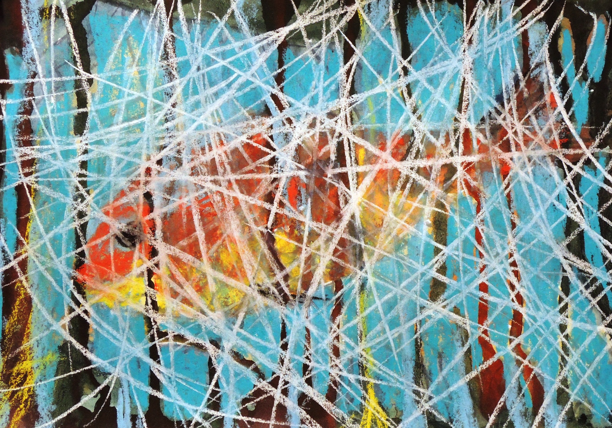
Watercolour and soft pastels, 21 x 30 cm

This is a response to Patricia’s Fantasy Aquarium II (September). It reminded me of a children’s story called Gold Fish by the Russian poet, novelist and writer Alexander Pushkin (18th century). The story is based on the moral of ‘’stop being so greedy’’. It’s about a poor couple, where the man went fishing  and caught a Gold fish who promised to fulfill any of his wishes if he would let it go. He let it go free, but his wife was not amused and sent him back in order to ask for a new washing bowl (translation for the 21st century – a new washing machine!). The bowl was delivered, but the wife was not happy. So, long story short, she sent him a few more times… keep in mind the fish gave her a huge palace, made her a royal, but the woman was still unsatisfied! This time she wanted to become a Queen of the Sea and demanded the Gold fish become her servant forever… i.e. so she doesn’t need to send her husband for requests anymore. It was too much for the Gold Fish to deal with and it decided to teach her a lesson. So, it asked the ma, at this point no less abused by his wife, go home in peace… the end of the story… it gave back his wife her shabby house and broken bowl asked her to get lost. The moral is obvious, one needs to know when to stop and appreciate what one already has. This is Pushkin (!) and the longest description ever for my response! I guess I got a bit carried away…


White forest 2

october-5
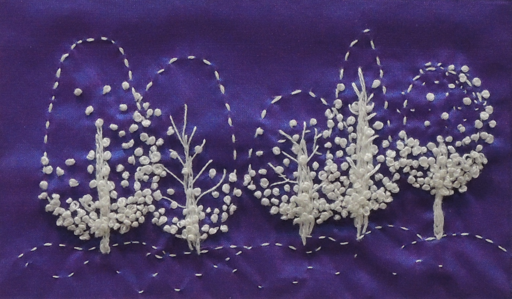
Hand embroidery, 8 x 13 cm

Once I finished White forest (R) it sparked the whole range, which naturally turned out to be a series of different forests. I love when such moments occur as they turn out to be the most productive and exciting times.


White forest (R)

october-4
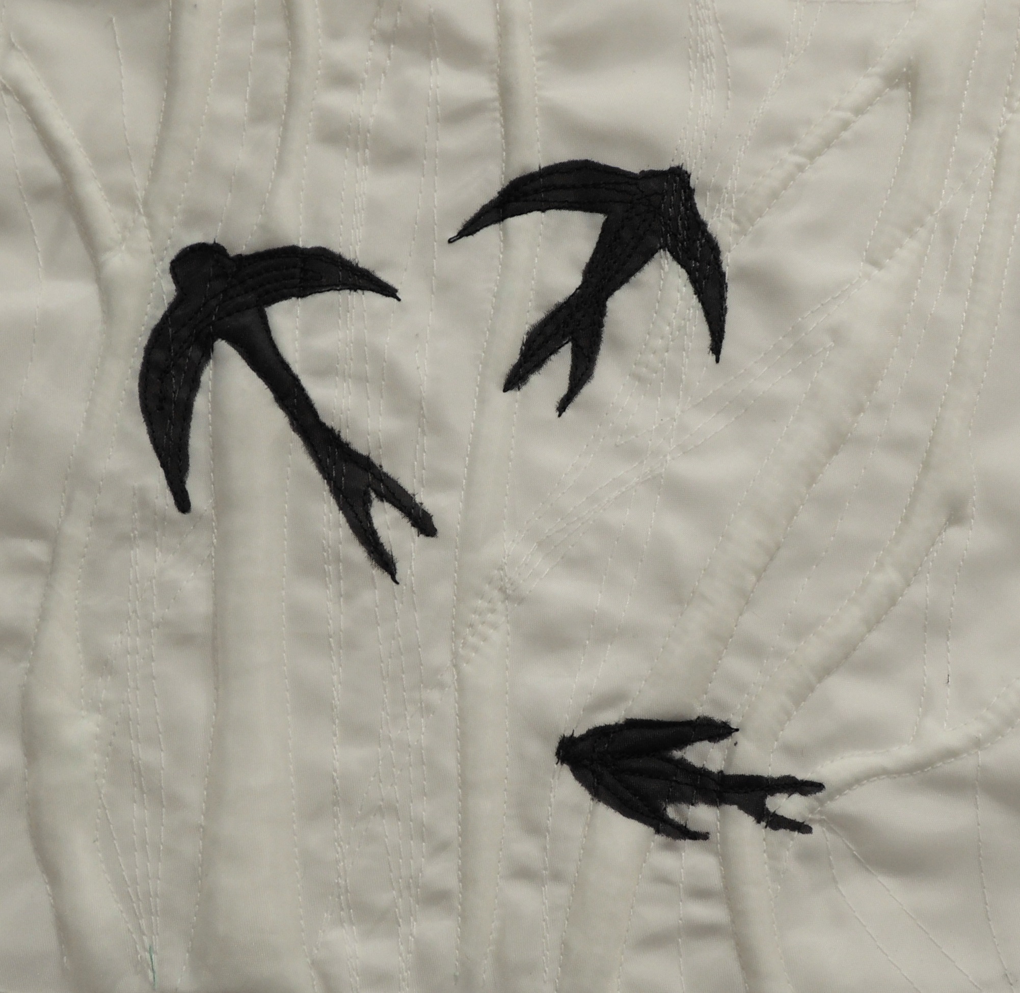
Textile, 18 x 19 cm

This is a response to Patrica’s Landscape with Tubular Elements (September). No moral story, no symbols this time just a reponce based on pure visuals. Perhaps “I just felt like it” would be the closest and best description. Now looking back, the three birds I guess were a subconsciously driven need to represent pure freedom.


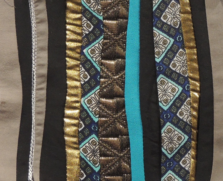
Dark forest

october-3
Textile, 14 x 17 cm

This is part of the ‘’Forests’’ series that was completed in one day. With this piece I let myself to be as relaxed and experimental as possible combining textiles that I wouldn’t even think to sew together for a garment. The element of being surprised paid off (well, for me anyway). However, it wasn’t an absolutely chaotic procedure. I kept in mind a representation of the deep forest with some sunshine fighting through mature and thick tree trunks.


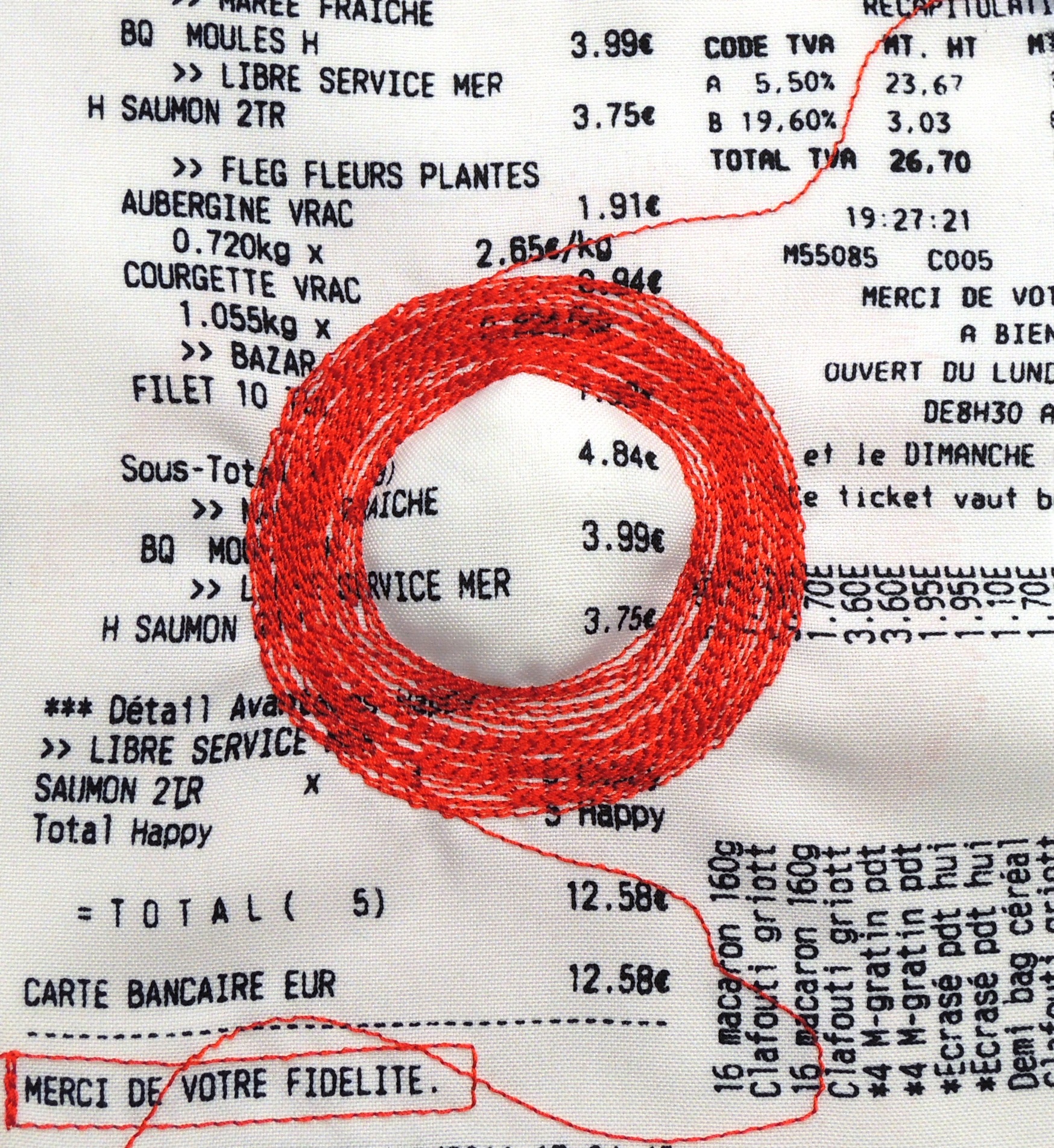
Consumerism or Merci de Votre Fidelite

october-1
Textile, 17 x 19 cm

…It’s a vicious circle… it’s emotional… let’s talk about shopping… I hate it… full stop.
Natalie: September

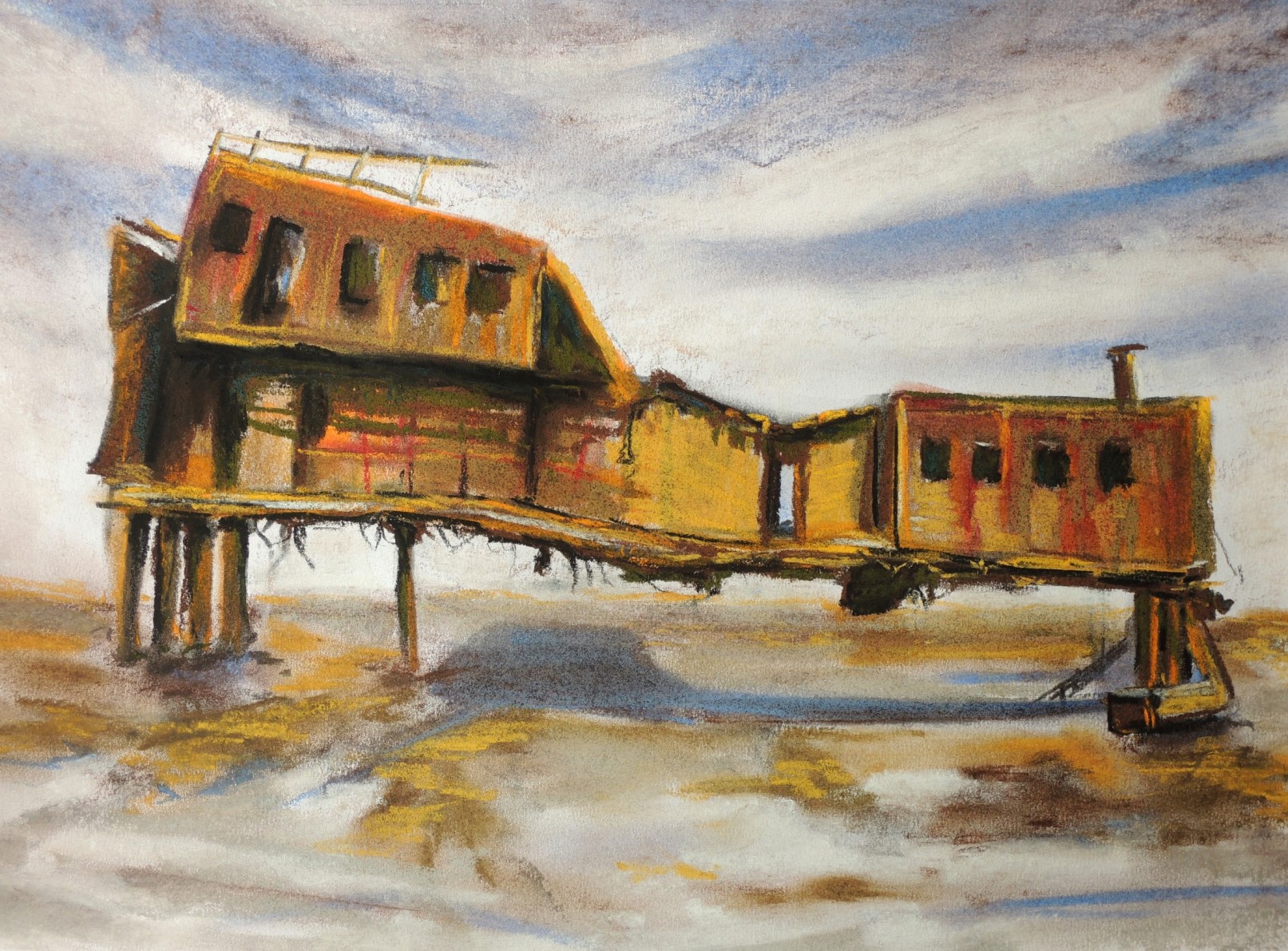
Old ship structure (R)

s1
Soft pastels on paper, 26 x 37,5

This is a response for Patricia’s View Towards Queensborough Bridge (August). What attracted me the most in Patricia’s study is the cleanliness and simplicity of the quite ambitious scenery, together with the pleasing sense of depth. I wanted to keep the ‘’marine’’ theme going but for my subject, so I choose an old and rusted ship. It is hardly recognisable as such as it looks more like an old house on stilts but in reality, that what was left of it. I was drawn by its colours and positioning, as well as the calm surroundings.


Pouring milk

s6
Soft pastels on paper, 23 x 26

The inspirational image was taken from the local newspaper in Kazakhstan, during the national celebrations. There is a custom here to install traditionally decorated Yurtas on the central streets where they serve some local dishes that are made specifically for such days. In order to create a very special atmosphere, food, treats and many other goods are sold by sellers dressed in the national dress. It’s a truly special experience for everyone, i.e. not just for the tourists, but for the local people too.


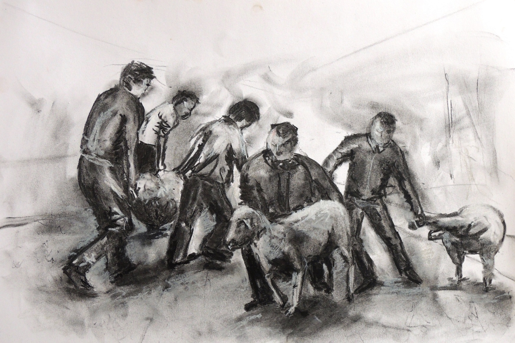
Catching a lamb

s7
Charcoal on paper, 26 x 37,5 cm

This is a continuation of the local traditions and celebrations depiction. This time I was after the fast movements and motions, thus people’s faces are not developed.


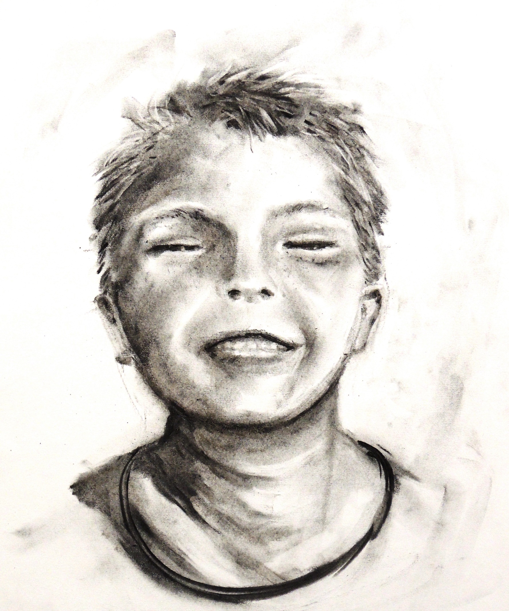
Happy boy (R)

s2
Charcoal on paper, 26 x 37,5 cm

This is my response for Patricia’s Girl from the 1950 (August). I simply wanted to respond with a smile in return.


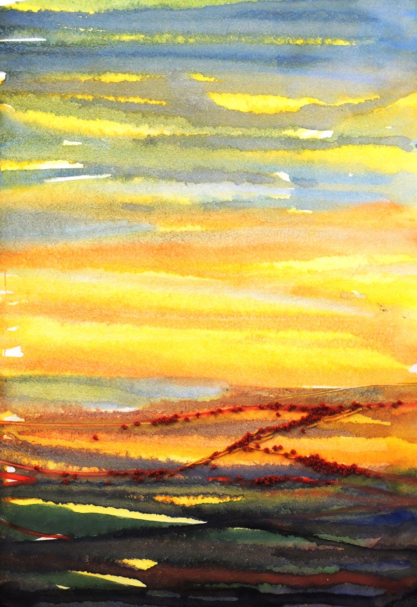
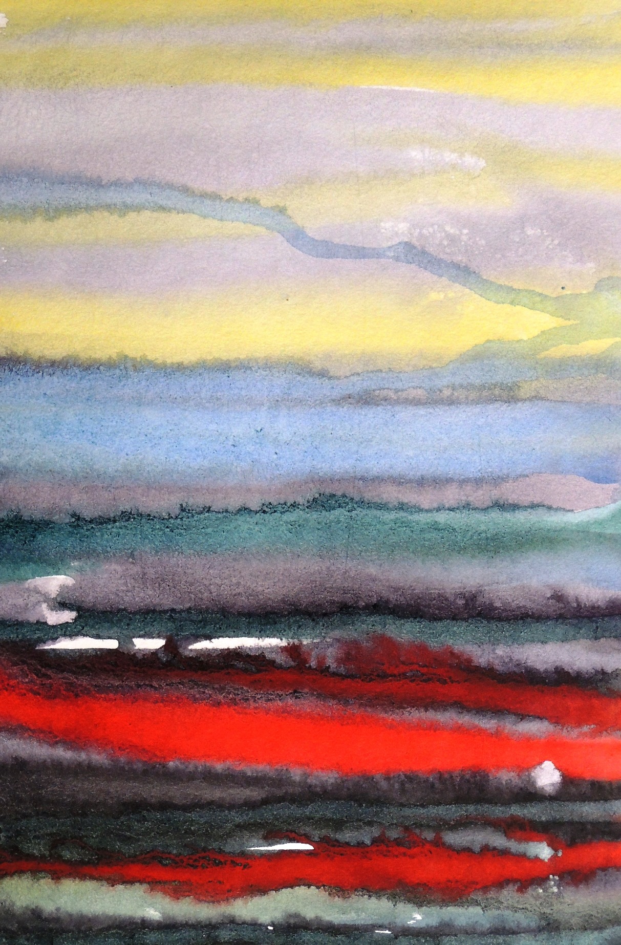
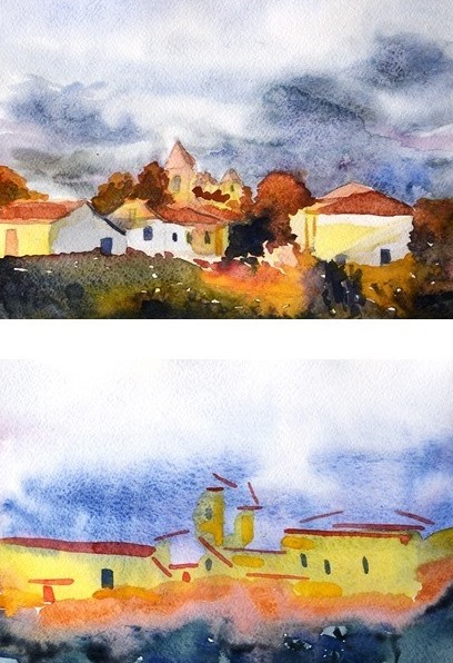
Imaginary landscapes (R)

s4   s3
Watercolour and hand embroidery on paper, 20,5 x 30

This is my response for Patricia’s Stripes (August). Patricia’s lines reminded me of a map that is displayed at any Underground and I wanted to experiment with such lines, but in a less controlled manner. I used watercolours and let them run in order to form natural and organic shapes. I had no particular idea what I wanted to achieve as I hoped to be surprised by the result. I manipulated the way I applied the shades though, i.e. I worked wet on wet, as well as wet on dry.


Imaginary trees

s5
Watercolour and hand embroidery on paper, 20,5 x 30

This is another freestyle and experimental study. The trees became trees by pure surprise (i.e. due to medium leaks and finding their own way). All I had to do in the end is to add some hand embroidery to intensify and suggest the elements of tree.

Natalie: August

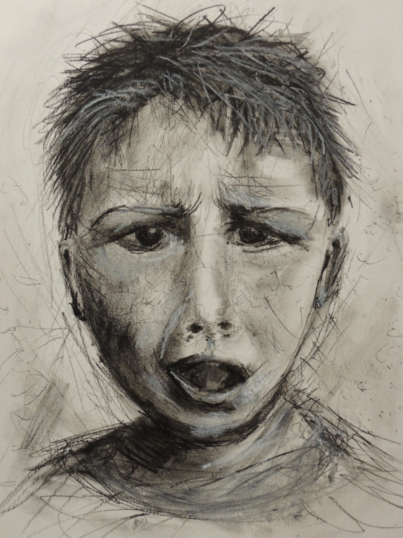
Tragedy

Au6
Charcoal and soft pastels on paper, 21 x 29 cm

There is no particular story for this sketch other than a study of emotions. I wanted to depict a real devastating state of horror with simple lines, but it turned out to be a real struggle. The mouth area proved to be the most difficult task. I ended up with certain features all over the place…just like my mood at that time! By the way, this is not a self-portrait as I worked from a photograph of a stranger.


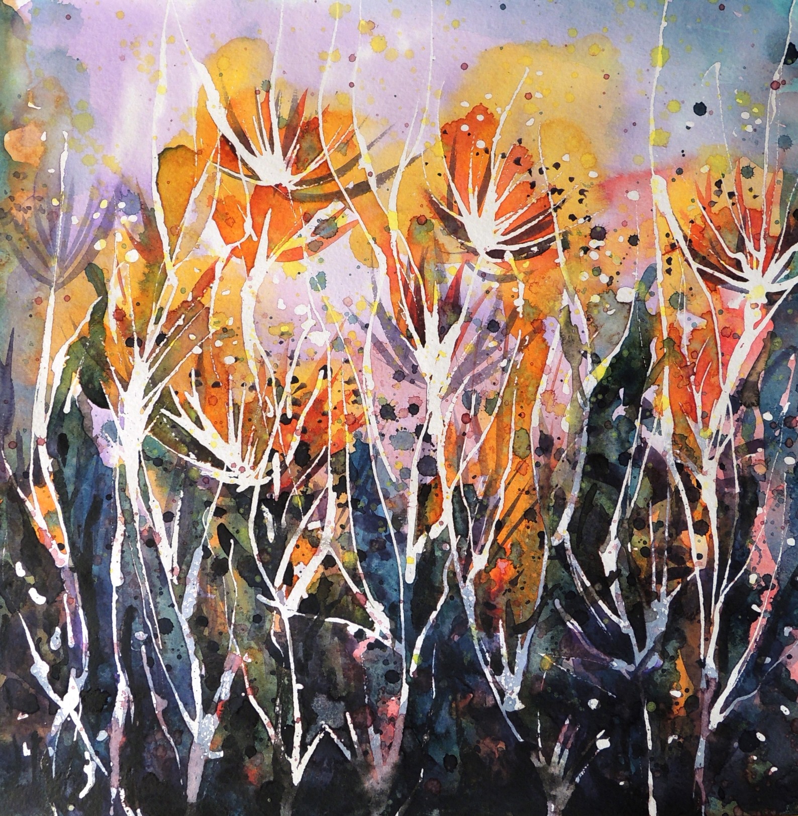
Imaginary flowers (R)

Au1
Watercolour on paper, 27 x 27 cm

This is a response for Patricia’s Grasses Studies (August). I gave myself absolute freedom and almost doodled the watercolours. It was a most enjoyable activity.


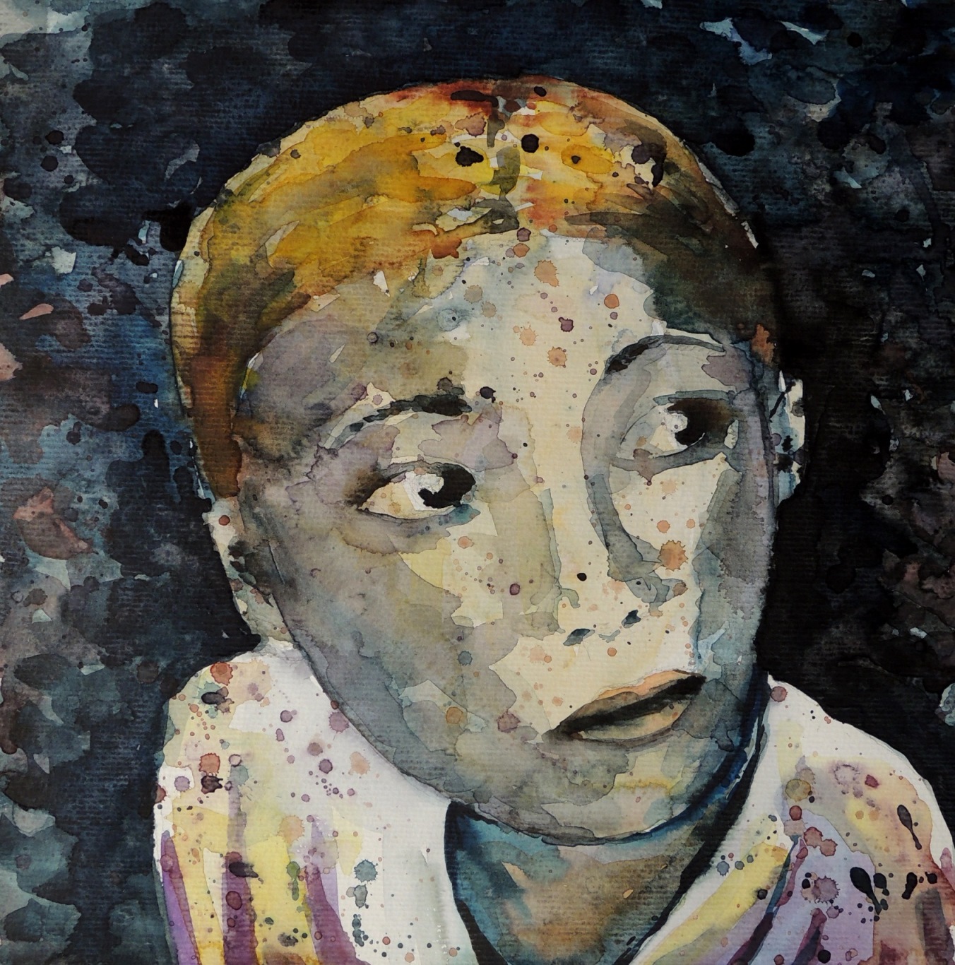
Expectations

Au2
Watercolour on paper, 27 x 28 cm

After having the joy of working with watercolours for the Imaginary Flowers, I decided to try the same approach as for the facial expressions study and see where such free marks approach would take me. I think I ended up with a face full of expectations…coincidence? I will certainly come back to such approach, as I find it rather exciting.


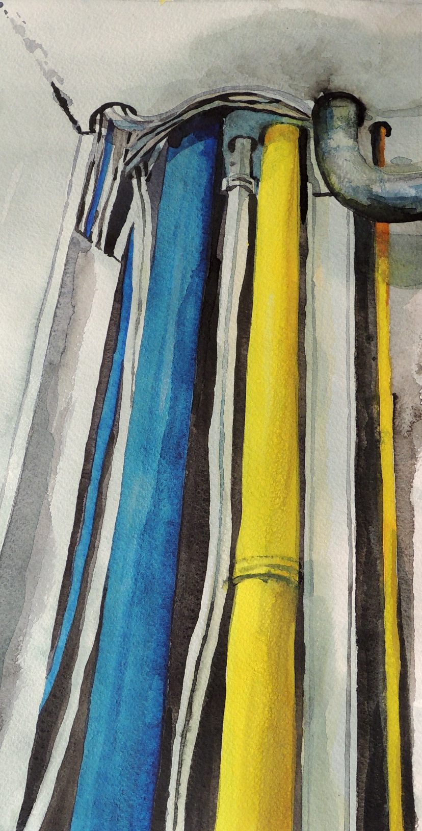
Inside the cupboard

Au3
Watercolour on paper, 18 x 36 cm

This is a study of the domestic environment, which is usually hidden from the eye, and yet some hidden structures are the most important installations of our daily life, e.g. rain water and WC pipes! These pipes are in my house and I actually painted them in different colours in real life.


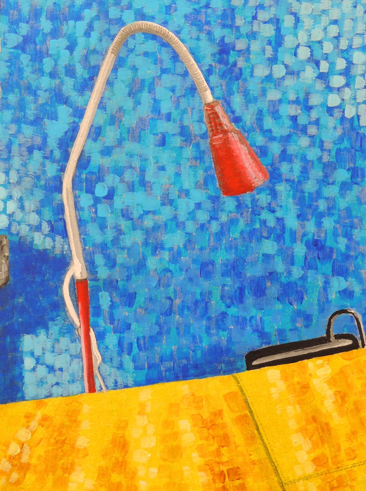
Reading corner (R)

Au4
Acrylic on paper, 13 x 18,5 cm

This is a response for Patricia’s The Studio (August) study. A small area of my reading corner, amidst my favouirite blue wall and the yellow sofa.


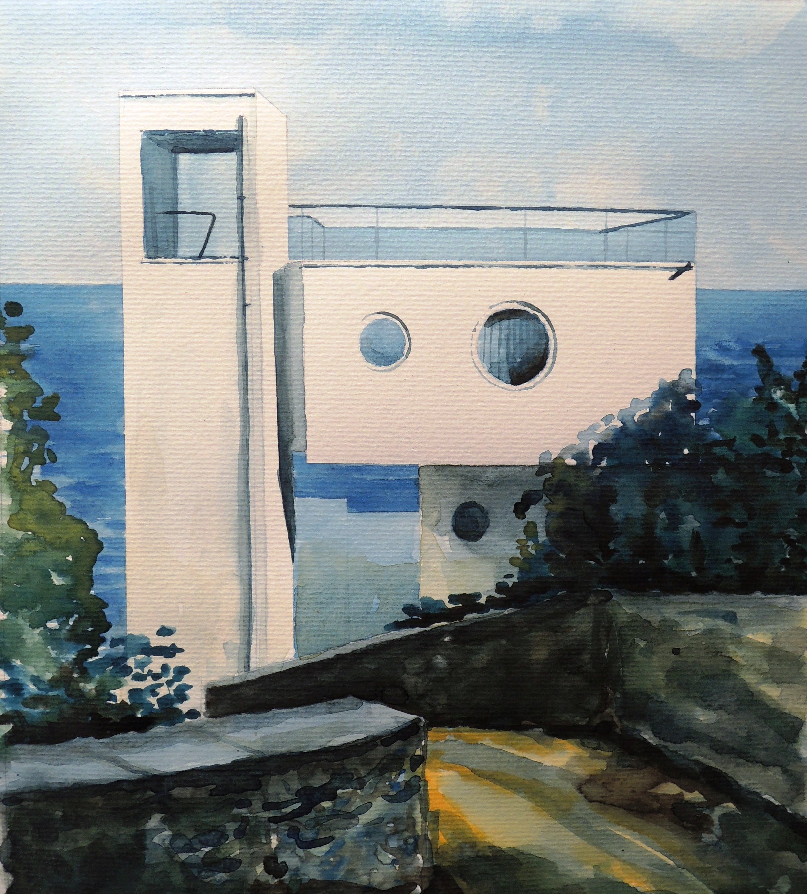
Yacht house (R)

Au5
Watercolour on paper, 26 x 30 cm

This is a response for Patricia’s 77th Street (August). The view is not from my window though. I came across this beautiful house while I was searching for the Modern Architecture a few years ago and I fell in love with this property since. It is located right on the beach in the Crimea. There is no way I could possibly afford it as we are talking about several millions…what a pity.

Natalie: July

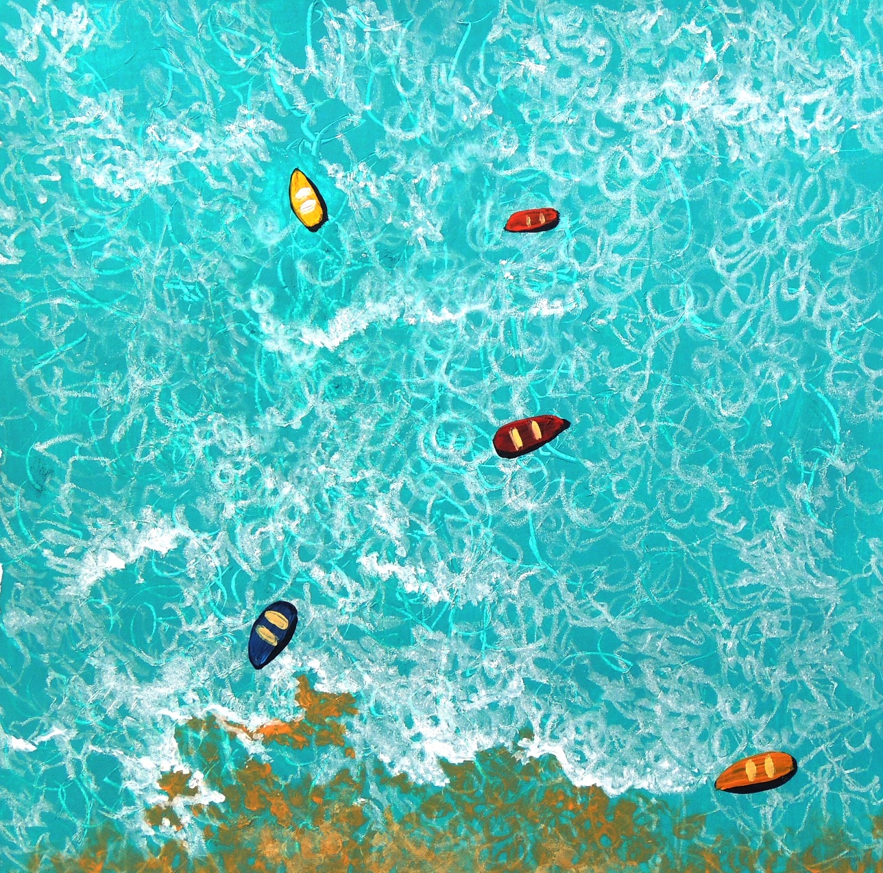
Drifting boats 2

July 4
Acrylic on paper, 23 x 39,5 cm

This is a continuation of my previous submission of Drifting Boats (March, 2016).  I wanted to experiment with the same subject and see what else could be done.


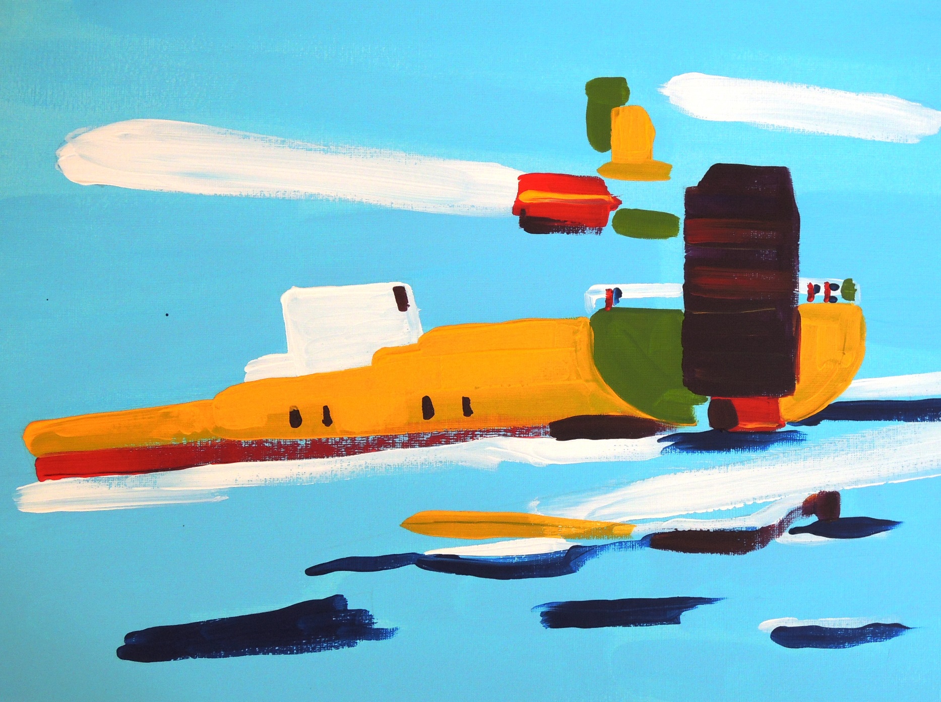
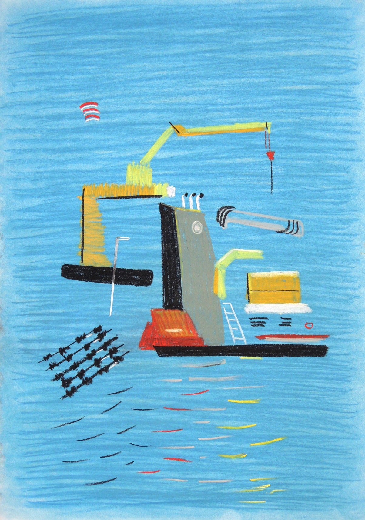
The Caspian Tanker

July 5
Acrylic on paper, 27,5 x 37,5 cm

This is part of my ‘’Caspian sea port’’ studies where I explore complicated images via  simplified shapes and lines.


An abstract composition with yellow 2

July 6
Acrylic on paper, 28 x 25 cm

This paintng is part of experimental studies in abstract compositions.


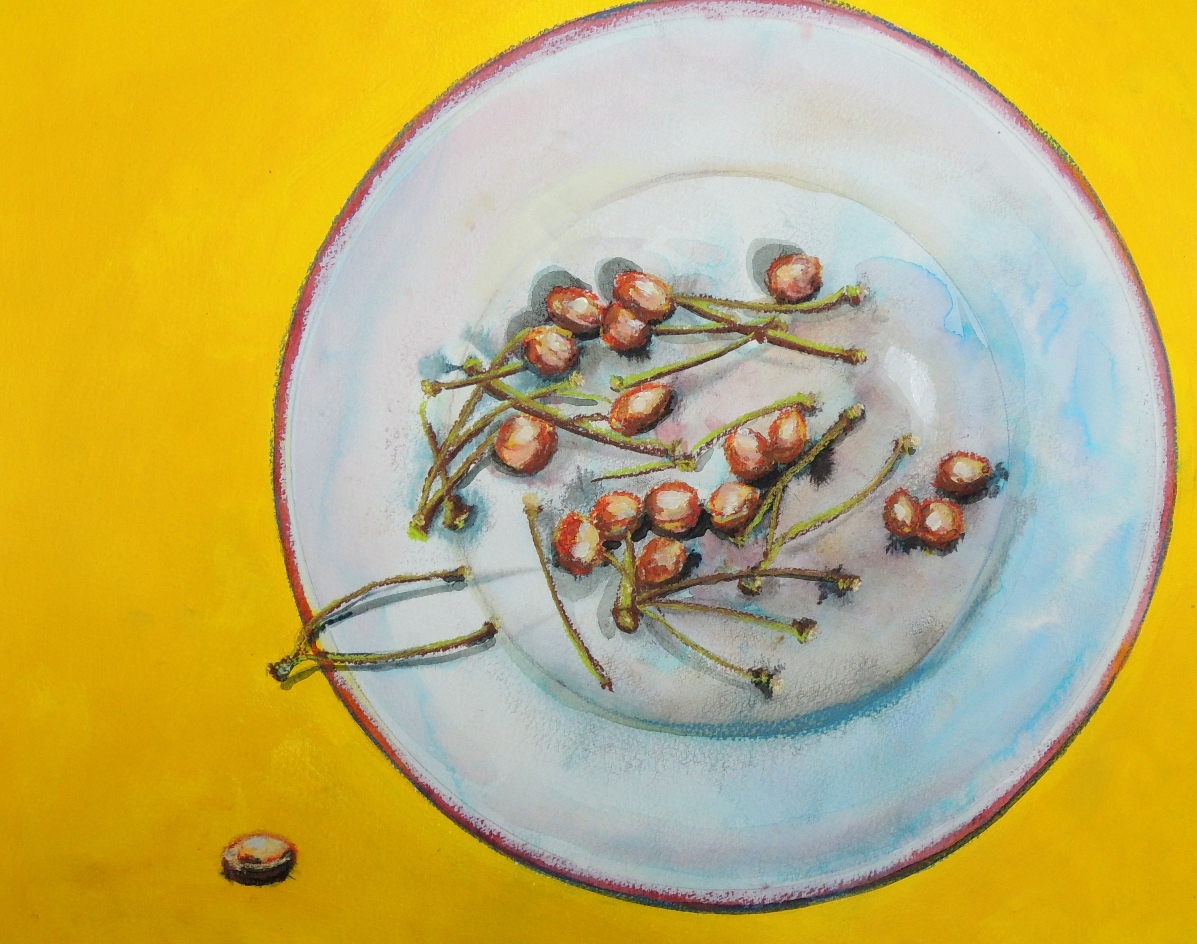
Cherry Stones (R)

July 3
Acrylic, soft pastels on paper, 33 x 40 cm

This is my response to Patricia’s Cherries (June). I simply could not resist to eat them! :o)


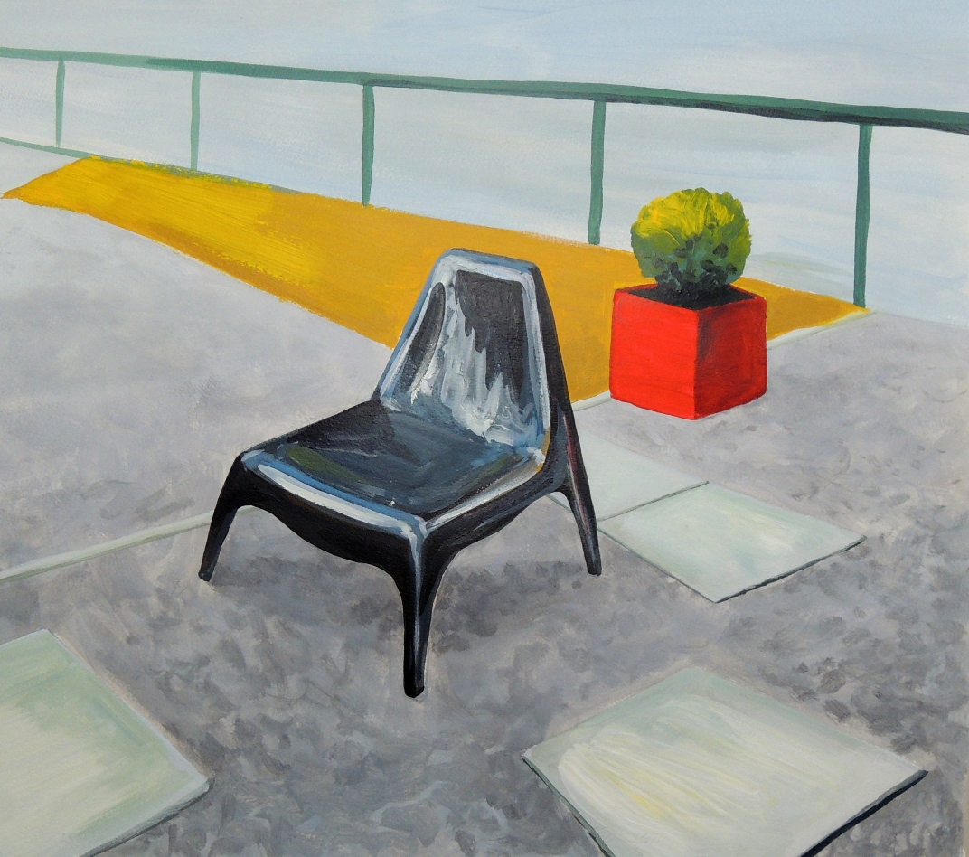
Red pot and Chair (R)

July 2
Acrylic on paper, 50 x 55 cm

This is my response to Patricia’s Chair on the Terrace (June).  Patricia depicted a wooden chair so brilliantly and the sunshine of the day was just screaming out that it was impossible to ignore. I wanted to carry on with the idea of depicting different textures and shapes of the similar items in our households. Therefore, a plastic chair in my garden had its spotlight moment too. However, I feel that I need to be back to this painting and work on my shadows a bit more.


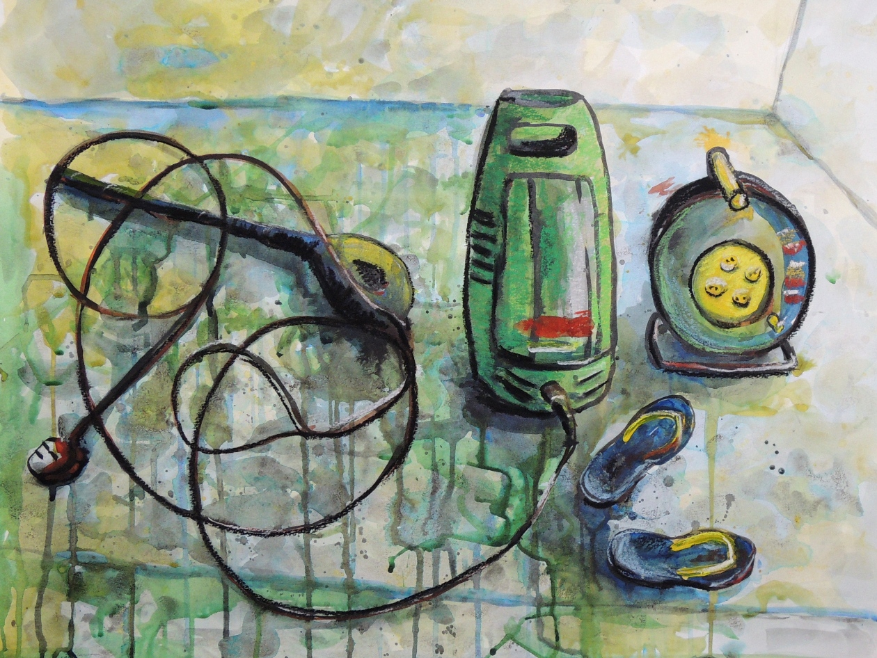
Jet Washer (R)

July 1
Ink, watercolours and soft pastels on paper, 50 x 65 cm

This is my response to Patricia’s Still life with Pitchers (June). As Patricia demonstrated so well the delicacy of glass wear and clay pots, which looked like just been washed, I wanted to demonstrate an unavoidable water splashes during the actual wash.  A few days ago I washed some slabs in the garden with a help of water jet and yes, the water was everywhere…including the places it was not supposed to be.

Natalie: June

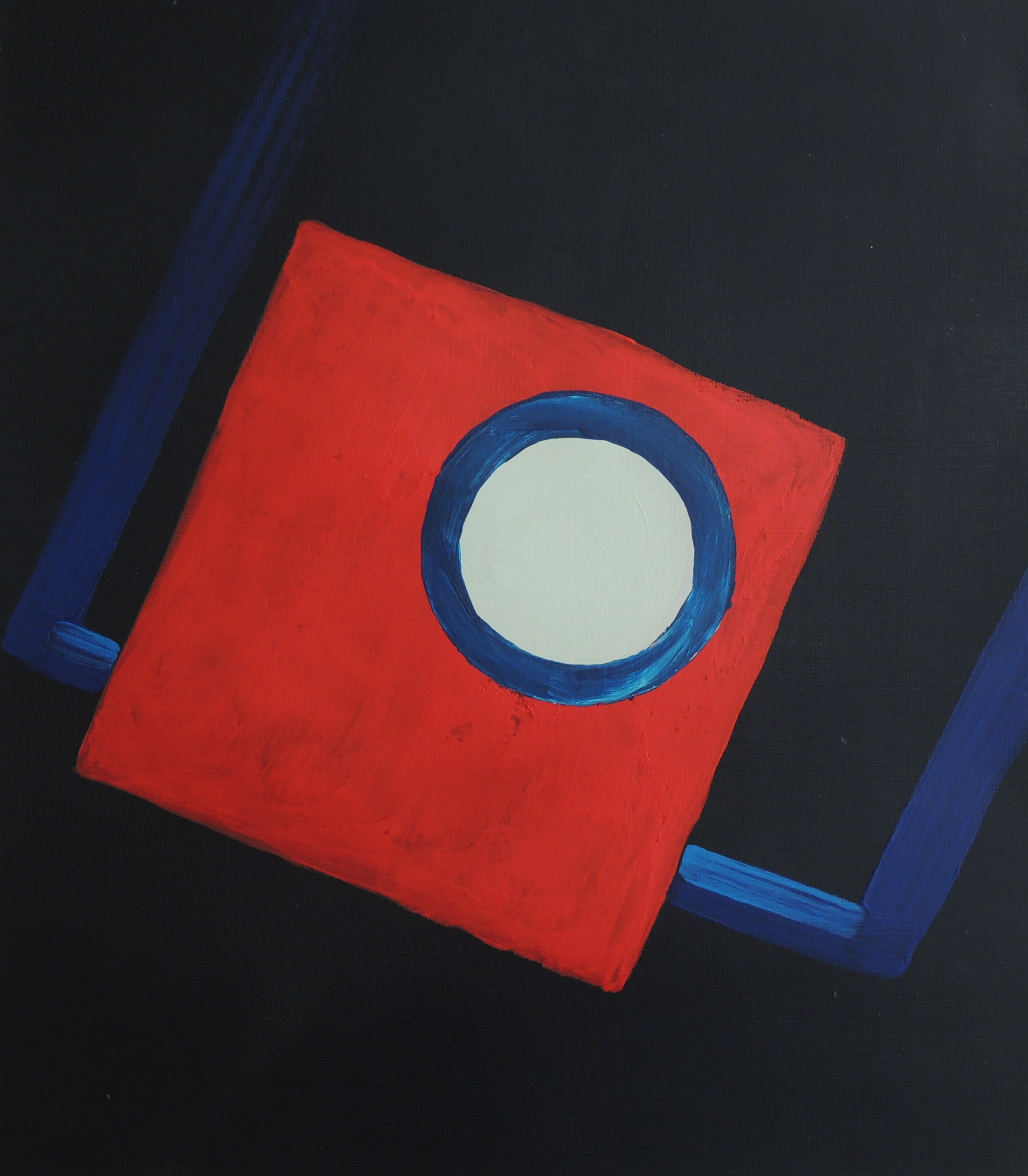
Dark Room

June 3
Acrylic on paper, 25,5 x 29 cm

This painting is concerns the expression of my childhood memories. My father used to take a lot of family photographs, which he developed himself (as a hobby). We are talking about the 70’s. He used to teach me how to use the equipment when I was about 7-8 and I wanted to recreate a sense of the developing room. The red square represents red light of the dark room, the white circle is the photographic enlarger’s lens and the blue rectangle represents the trays containing the liquids where the actual images are developed.


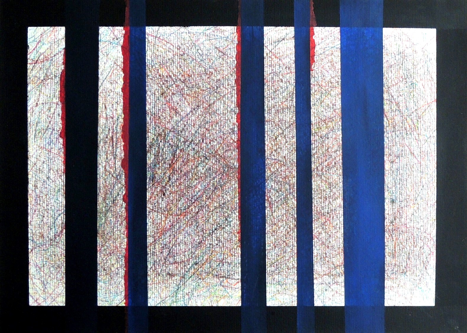
Under control (R)

June 2
Colour pencils, acrylic on paper, 29,7 x 42 cm

This is a response to Accident (Patricia, May, 2016). I wasn’t sure whether Patricia’s title referred to an ‘’accidental/experimental’’ outcome using paint or to the presentation of the actual life event. The title itself took over the visuals for the first time in my response, and towards the its most extreme meaning. I wanted to represent human suffering under the fully controlled and manipulative actions of others, i.e. no accidents, but a fully controlled events.


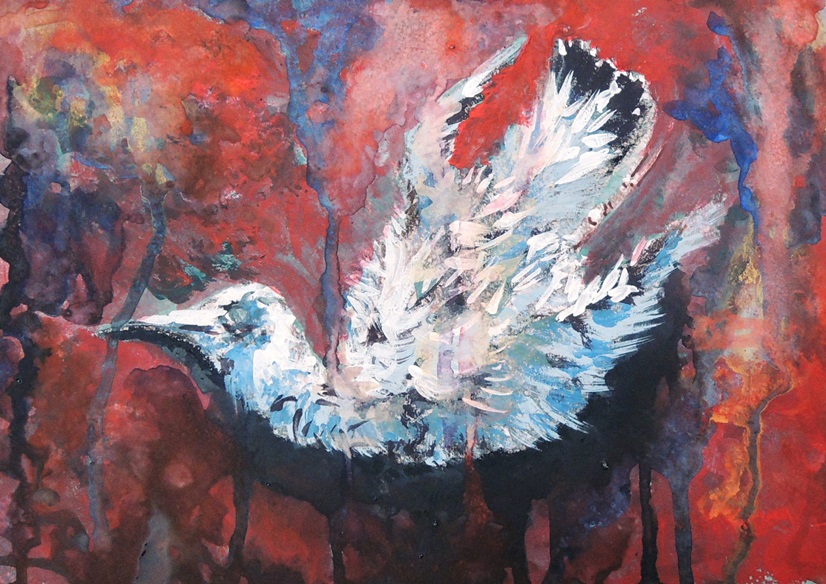
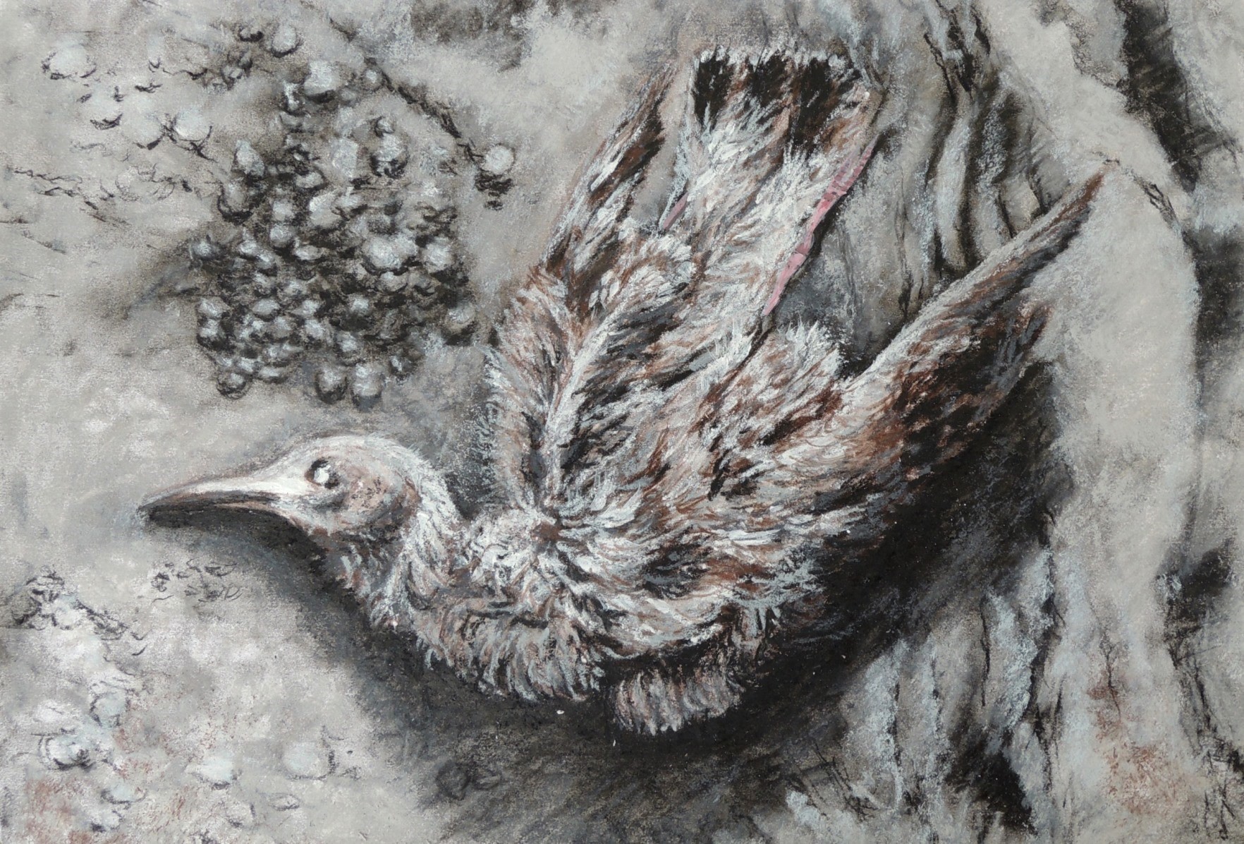
Dead bird 2

June 1
Watercolours, soft pastels, gouache on grey paper, 21 x 29 cm

This is a continuation of the Dead Bird study (March, 2016), but in colour, to emphasise the dramatic events of life and death.


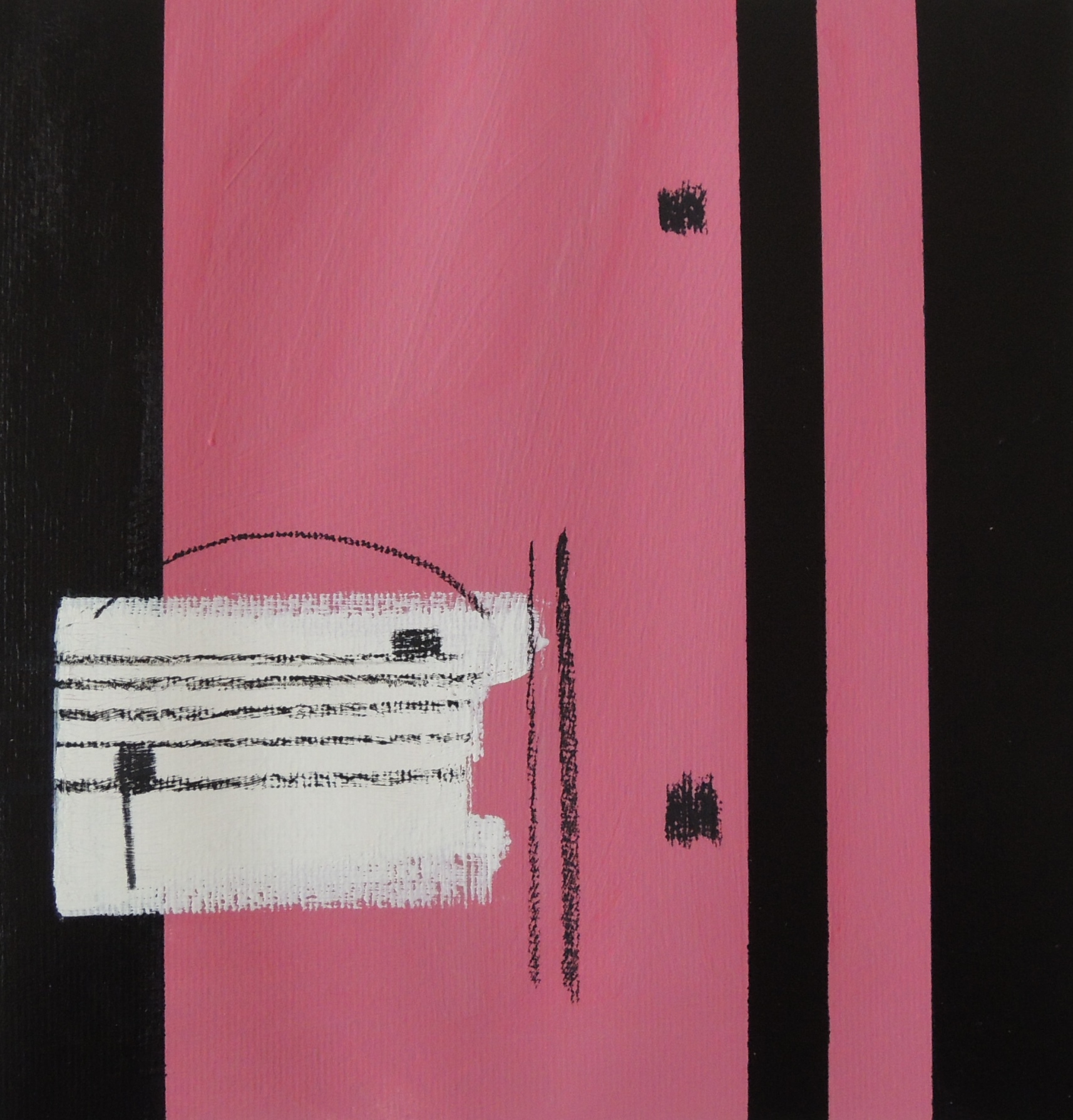
Repeat (R)

June 6
Acrylic, oil pastels on paper, 27 x 28 cm

This is my response to Patricia’s Saxophone (May, 2016). If a musical instrument is present then the sheet music is never far from it. The two dots and the vertical lines next to them (on the right) is a musical sign for ‘repeat’. It is usually placed at the end of a particular section that the composer wants to be repeated one more time (sometimes twice or more).


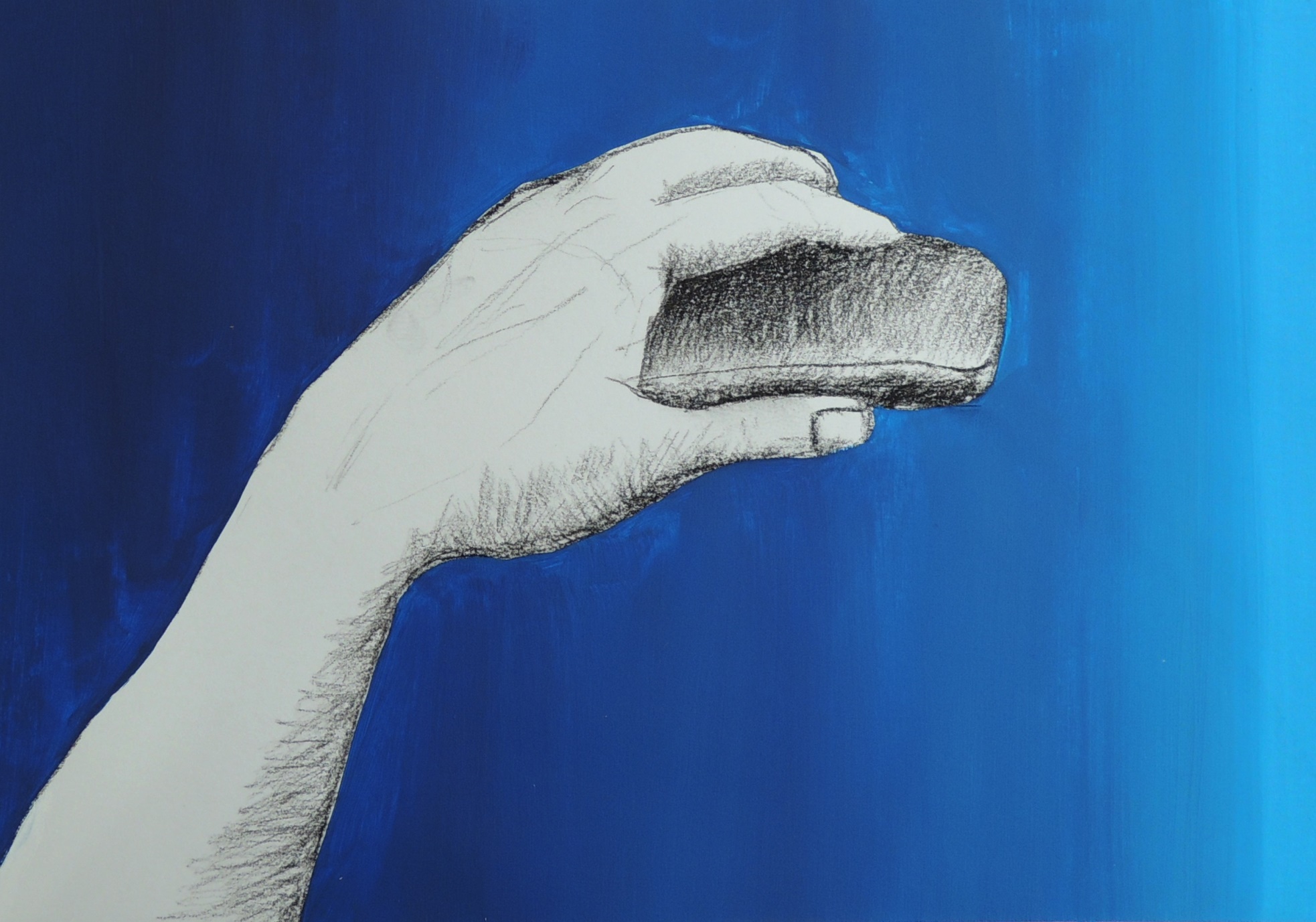
‘’The creation of God Box’’

June 4
Charcoal, acrylic on paper, 21 x 30 cm

The initial idea was to study a hand with a small remote control in it but soon it was turned into a pop art. The title came afterwards and part of it was borrowed from Michelangelo’s Creation of Adam painting (fresco).


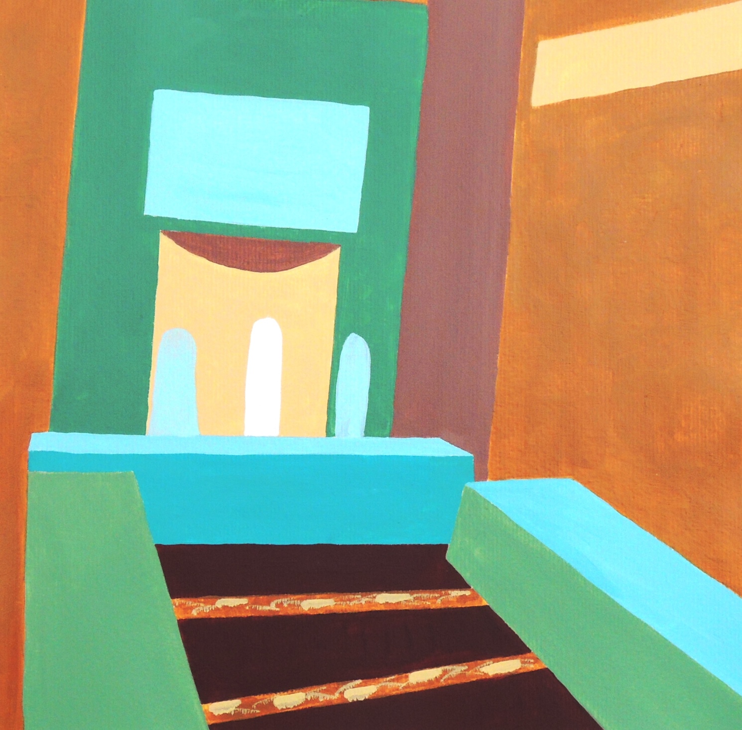
In the room (R)

June 5
Acrylic on paper, 28 x 28 cm

This is my response to Patricia’s New York, Flatiron Building (May, 2016). I used an image from the local news as a source of inspiration. It represents an interior in one of the local mosques and I found its colour scheme quite fresh and calming. I would like to mention that the original colours of the place are much lighter and with a white background instead of the yellow ochre, and in general it’s far more delicate than my study attempt. I would like to come back to this subject later again.


Natalie: May

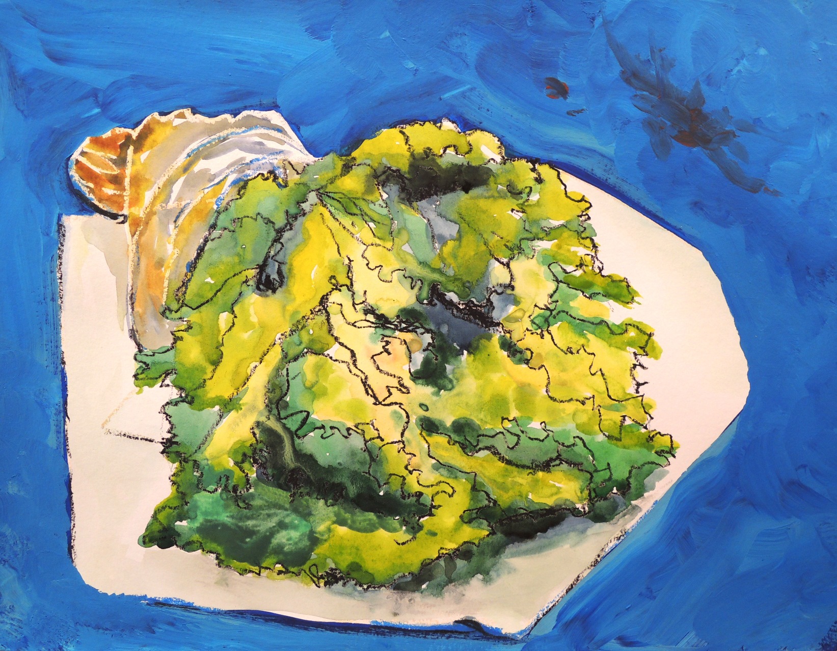
Salad on a table (R)

My6
Watercolour, acrylic ad soft pastels on paper, 30 x 40 cm

This is my response to Patricia’s Twiggs (May, 2016) submission as a continuation of natural object studies.


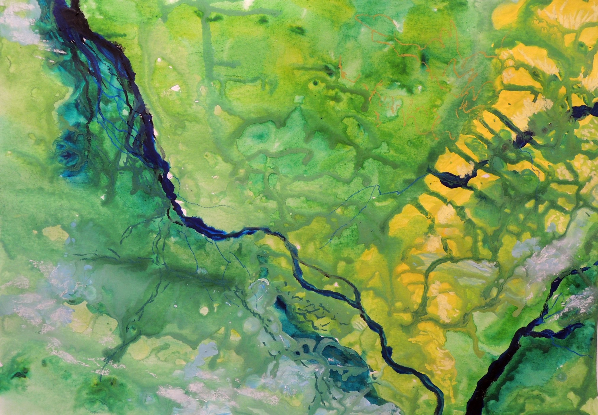
View from space

My2
Watercolour, acrylic and soft pastels on paper, 30 x 40 cm

When I came across NASA’s photos of Earth, it was hard not be influenced by their beauty.


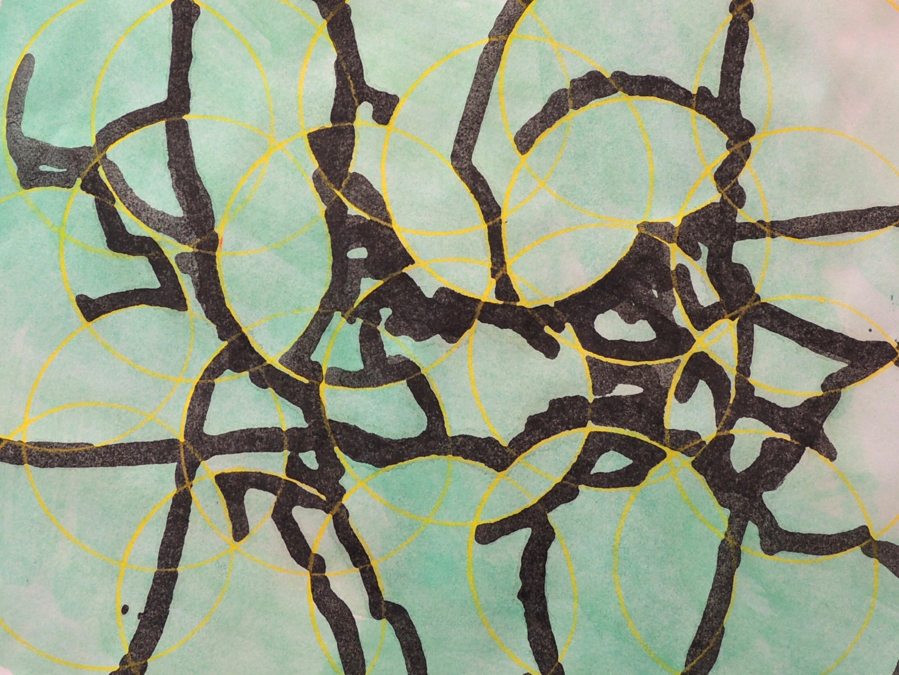
Under the microscope (R)

My3
Watercolour and colour pencil on paper, 20 x 26 cm

This is my response to Patricia’s Saxophone detail (May, 2016) submission. I wanted to experiment with the rigid and overlapping circles (to represent some saxophone details) mixed with a free flow of black colour (to represent sound). The results were a bit unexpected as the circles started to remind me a little of the petri dishes used in research laboratories and the black shapes turned into look alike images of the dishes seen under the microscope.


Shipyard (R)

My4
Soft pastels on paper, 26 x 28 cm

This is a response to Patricia’s High-Rise Pattern (May, 2016) submission. I simply felt like responding with a “zoomed out” image. Admittedly, I find Patricia’s composition far more interesting!


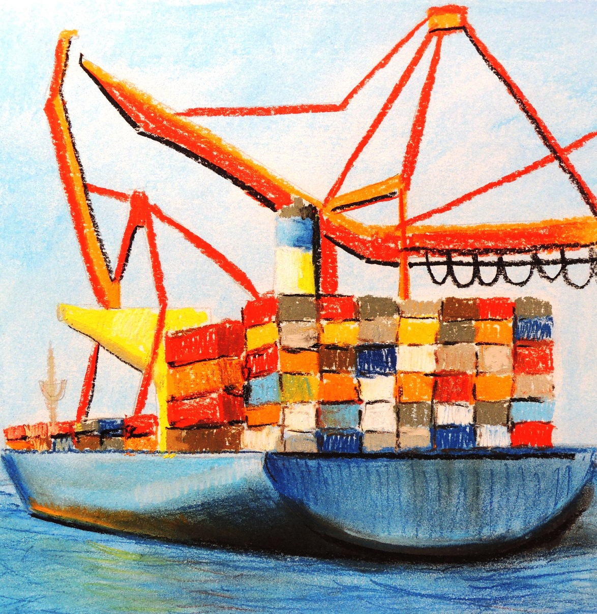
Shipyard 2

My5
Soft pastels on paper, 49 x 59 cm

Living by the sea and the desire for simplification makes its visible impact. At the moment I enjoy the idea of focusing on the major lines and colour that would represent an object of interest. I have a selection of photos of the local sea port and I find it difficult to ignore them … meaning more studies on this subject matter will likely occur!


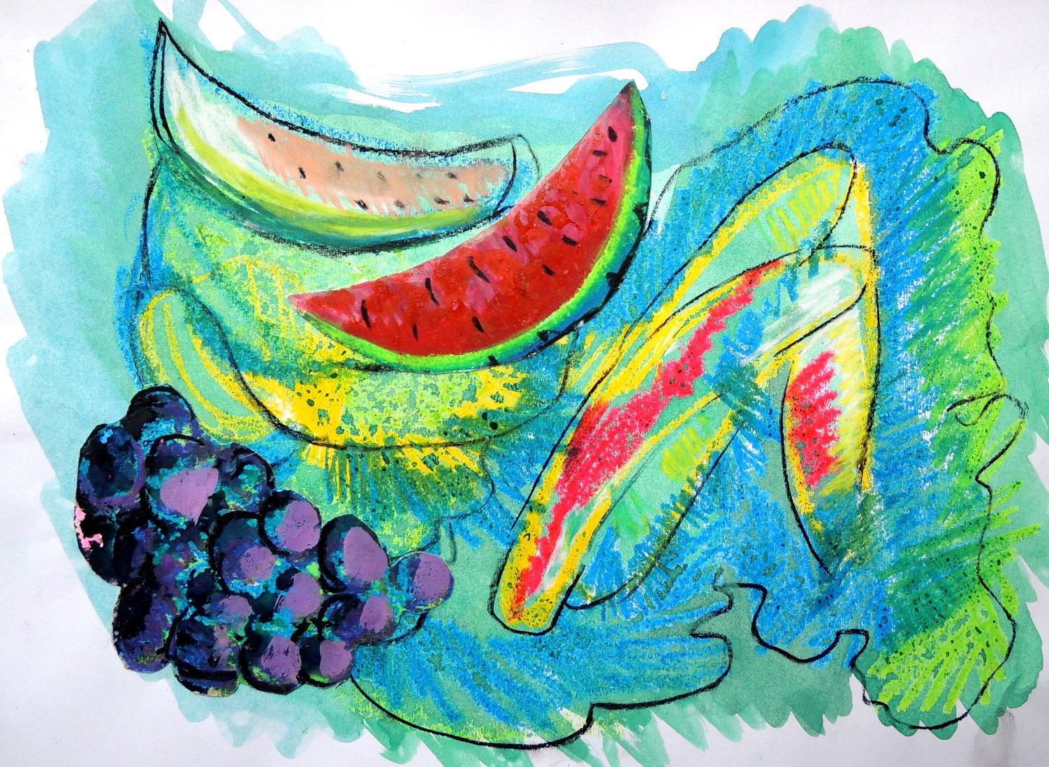
Collage with fruits

My1
Watercolour, oil pastels and soft pastels on paper, 26 x 37,5 cm

As with any experiments, things tend to go in all sorts of directions. I ended up cutting fruits from my own paintings and making them part of a new mixed medium composition.

Natalie: April

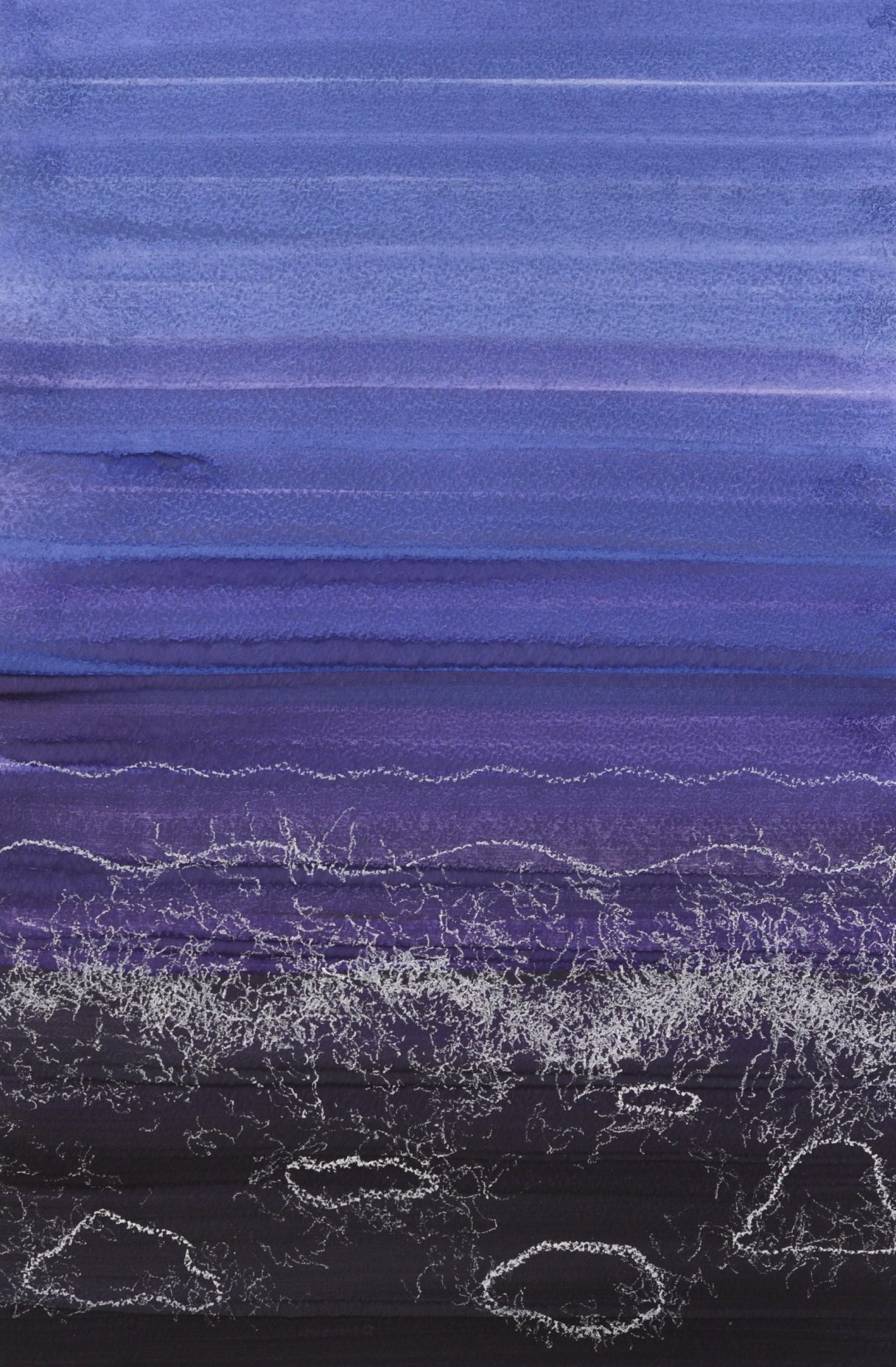
Seashore (R)

A3
Gouache, soft pastels on paper, 30 x 42 cm

This was a response to Patricia’s Deep Water (April) which has an incredibly organic appearance. I immediately wanted to form a rejoinder to continue the sea theme. I decided to create an abstract sense of waves and water bubbles, but through a fully controlled dry medium.


Dead bird

A4
Charcoal, soft pastels on paper, 21,5 x 29 cm

Whilst walking on the beach I saw a dead bird which I wanted to use for a more detailed study at home. I accordingly worked from a photograph and decided to use a limited pallet only.


Drifting boats (R)

A3
Acrylic, soft pastels on paper, 20 x 20 cm

After seeing Patricia’s Floating Shapes (April), the first thing that came into my mind was a continuation of something swimming in the space. Since I was already working on one of the responses related to the sea theme, it was a rather natural progression to carry on with the subject matter. I really enjoyed working on these two in particular and I might come back to it again at a later time.


In the park

A2
Acrylic on paper, 21,5 x 29 cm

This study was in particurar a real struglle for me. I wanted to capture some dominant colours in the local park, but in a more realistic style. However, I didn’t like my first result as I found it too dull (colour wise). In the end I completey covered the original (dark) layers with, perhaps too bright and not entierly realistic (for this actual park) colours, but I was satisfied with the ‘’artistic license’’ that helped me to finish this work.


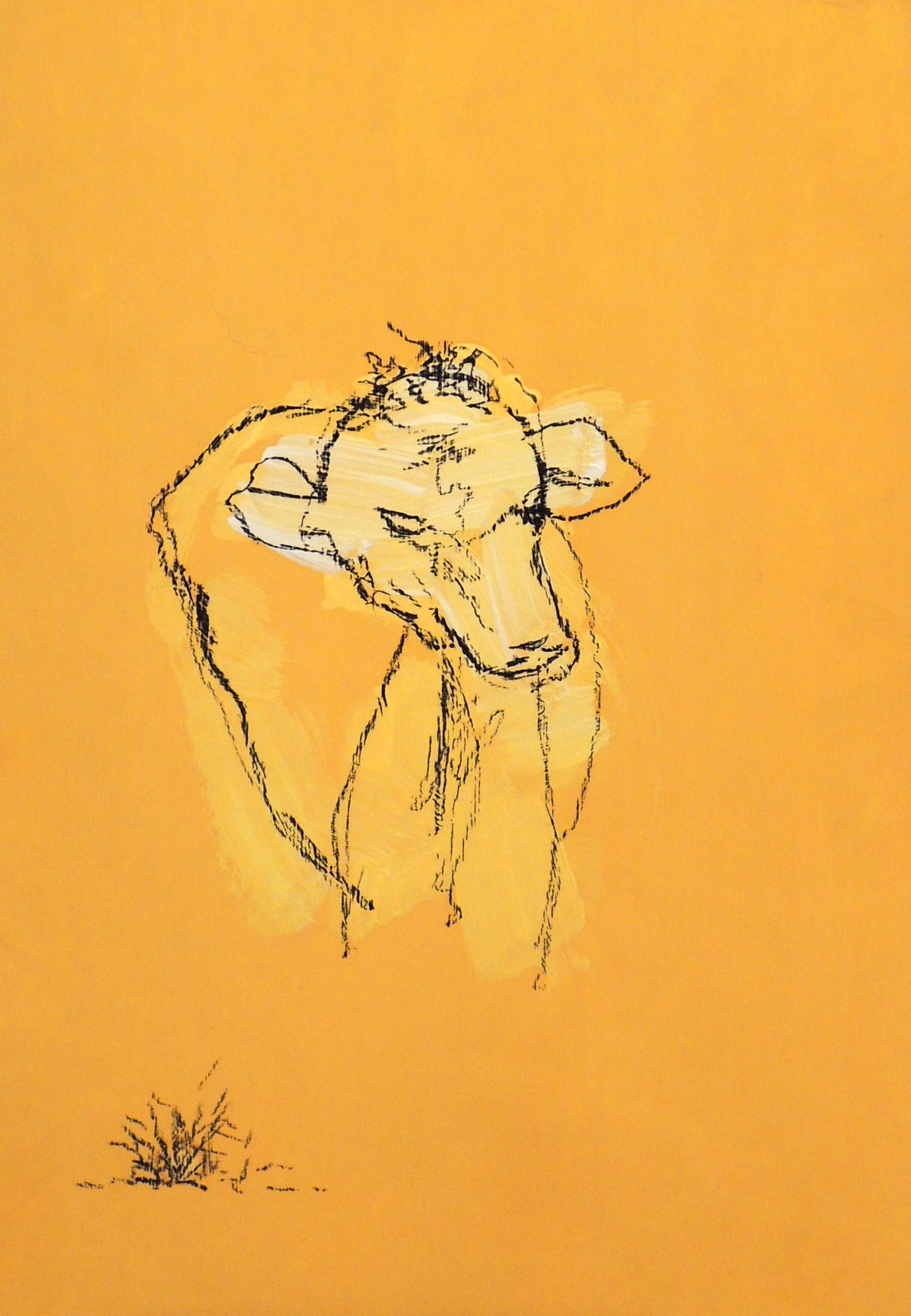
Cow’s head

A1
Acrylic, charcoal on paper, 14,5 x 21 cm

This study was one of the experimental line drawings, which I would like to develop further. I deliberately used a one colour pallet in order to maintain my focus on the actual subject itself.


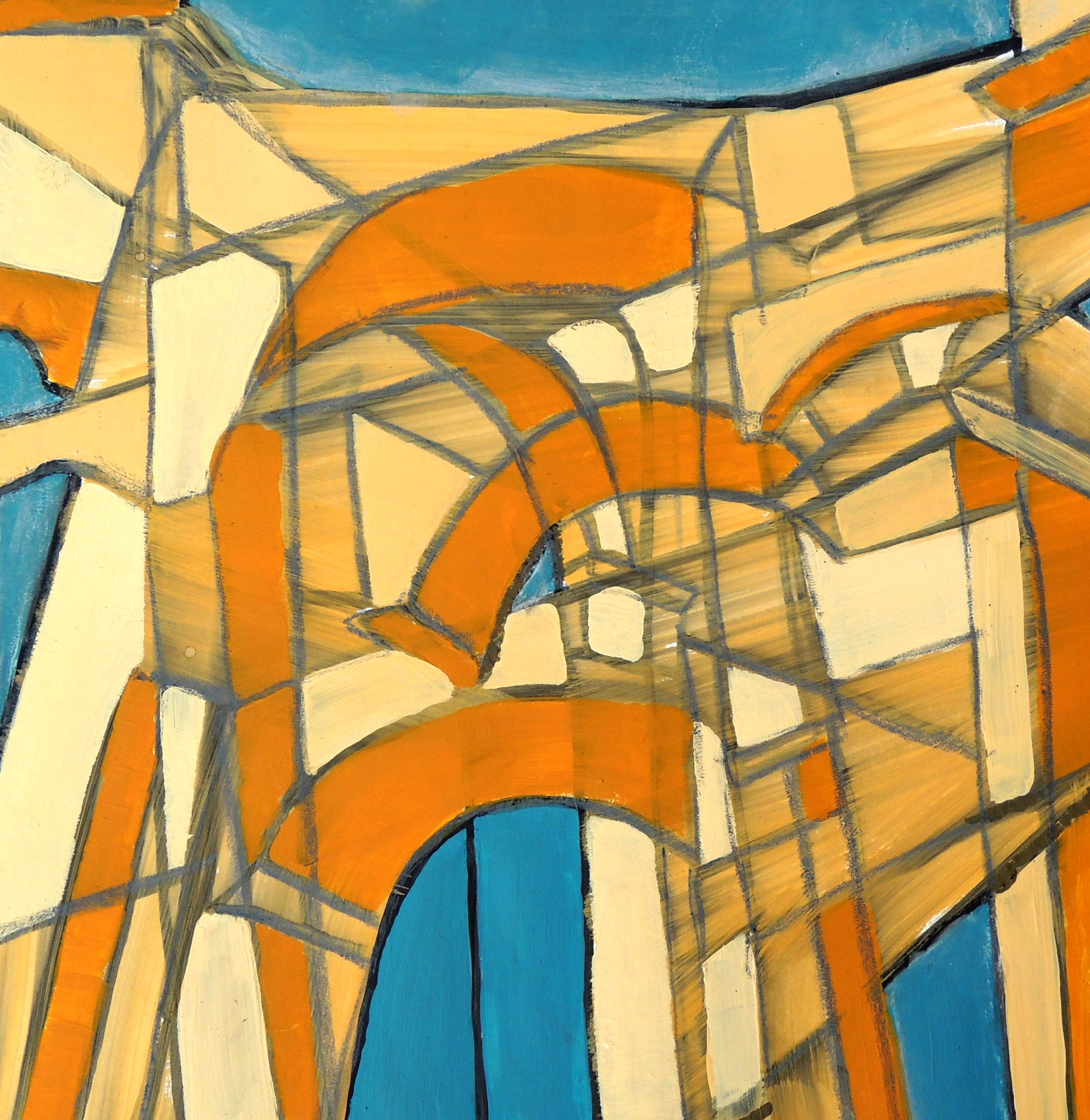
Entrance (R)

A6
Gouache, acrylic, soft pastels on paper, 20 x 20 cm

This small study was inspired by Patricia’s Terrace (April) drawing. I took several photographs of the Arch that serves as the main entrance into one of the local parks and then merged its different angles into one image in order to achieve a sense of eye movement when looking at the construction whilst approaching and passing under it.

Natalie: March


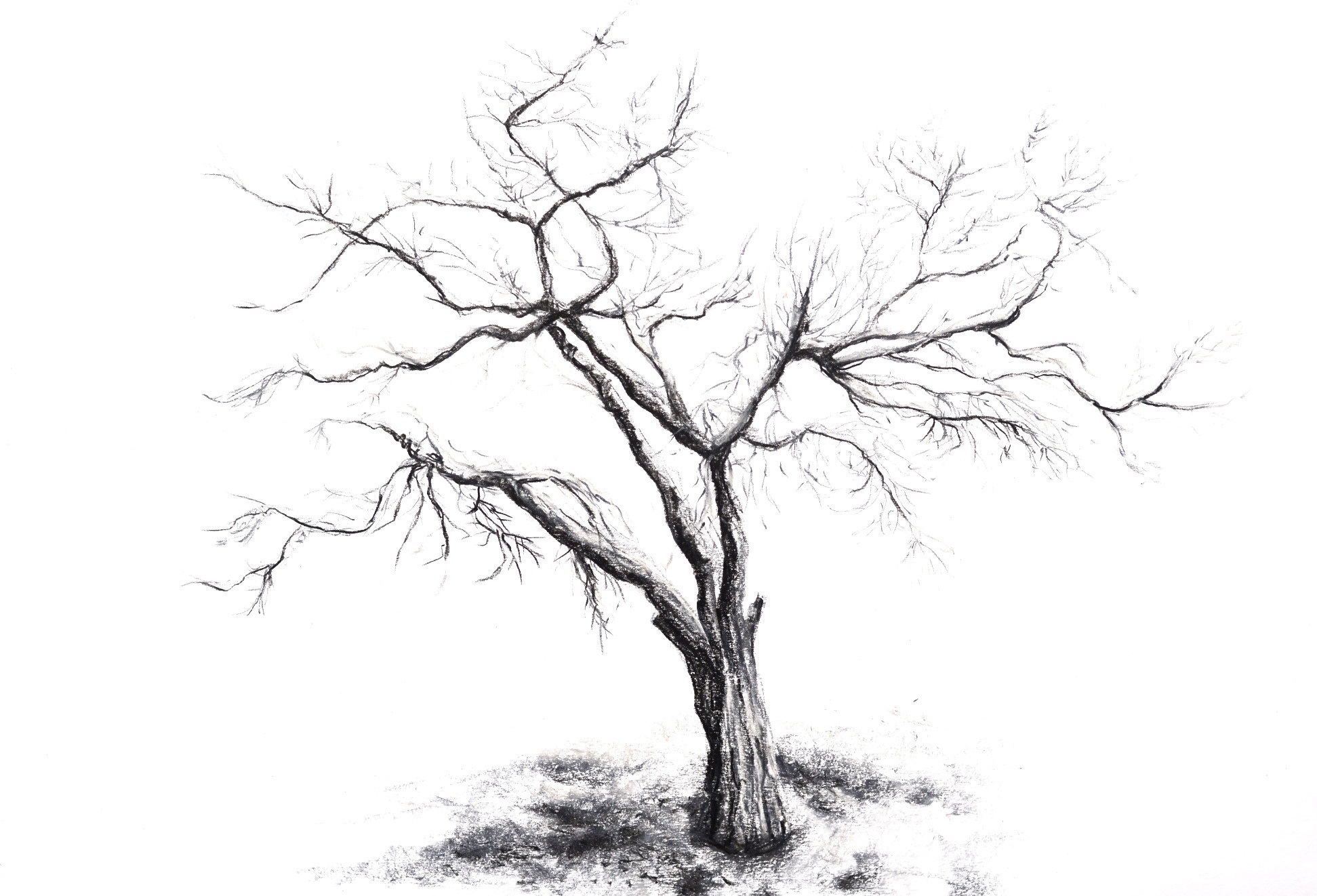
A tree (R)


Soft pastels on paper, 42 x 59 cm

This is my response to Patricia’s Potted plant (February). I just wanted to draw something natural and organic.


Sunshine


Watercolour on paper, 29 x 42 cm

The main focus of this study was to capture the sunlight of a mainly stormy looking day and make some progression towards a more abstract presentation of it.


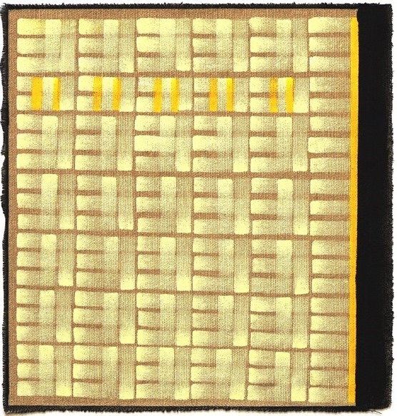
Managing the lights (R)


Oil on unprimed canvas, 23 x 24 cm

This is my response to Patricia’s New York Light (Male figure, February). This time I was under Rymann’s influence as well as Newman’s Zips (…still!). The idea was to pursue the study of medum in the same manner as Rymann did and see where it would lead me. It was much harder than I anticipated. Keeping the light lines straight was a real feat! I finished my study with Newman’s yellow and black Zips to represent the man from Patricia’s painting. It is not central but still dominant. I used unprimed cavas this time for the sake of experimentation, as I wanted to create a sense of light reflections on the otherwise untouched and clear ground.


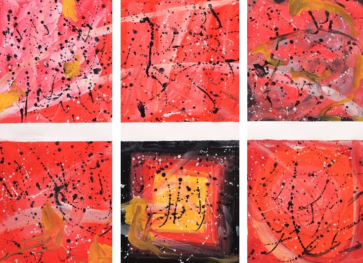
Colour relations (R)


Gouache on paper, 42 x 59 cm

This is my response to Patricia’s Abstract composition (February). It was pure indulgence in experimenting with red and letting my brushes and hands experience absolute freedom. This absolute freedom by the way was not entirely achieved, since Pollock and Rothko just wouldn’t leave me alone! I was essentially doomed, as any undergraduate art student who hasn’t yet developed their own style would most certainly be.


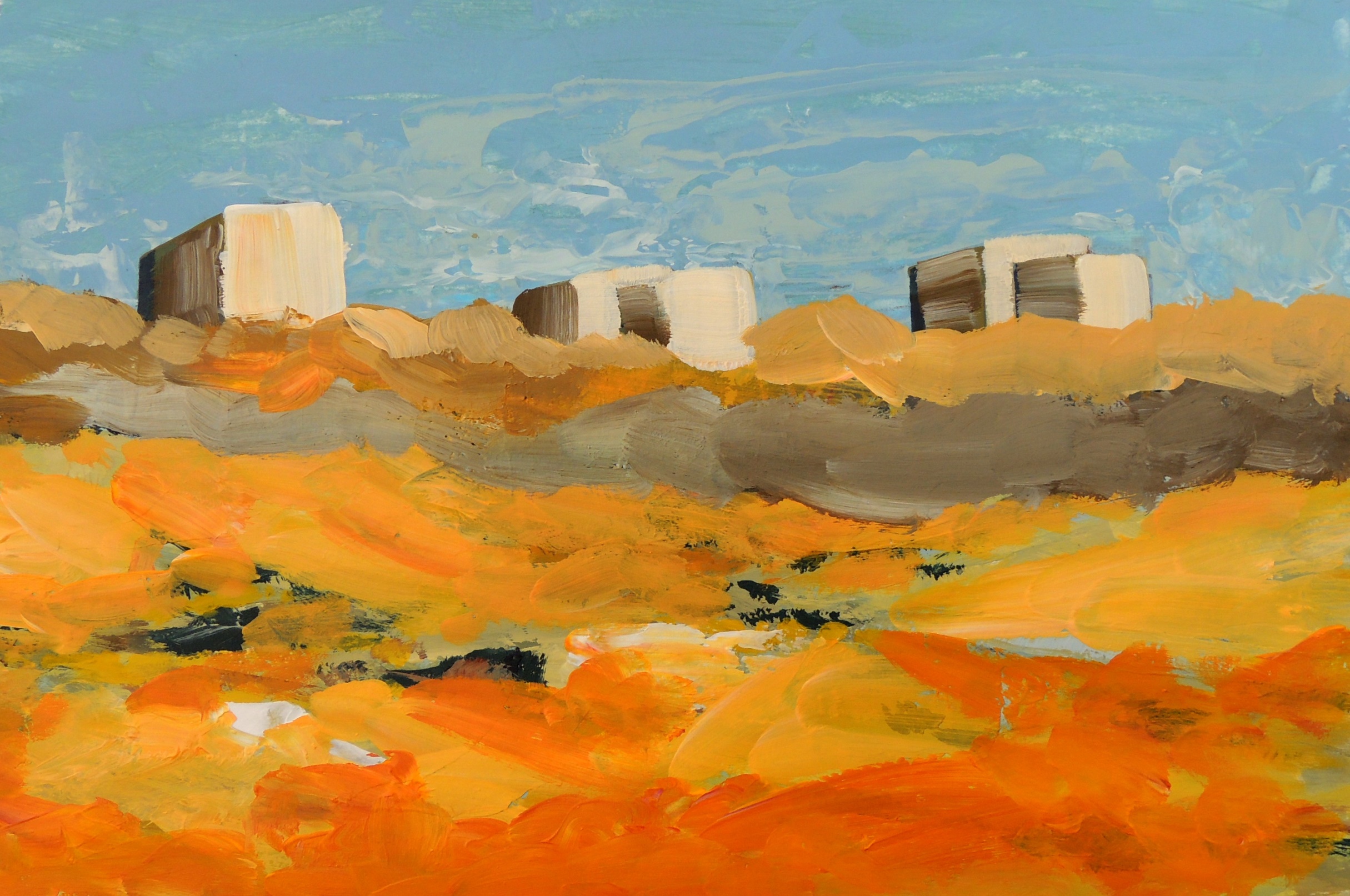
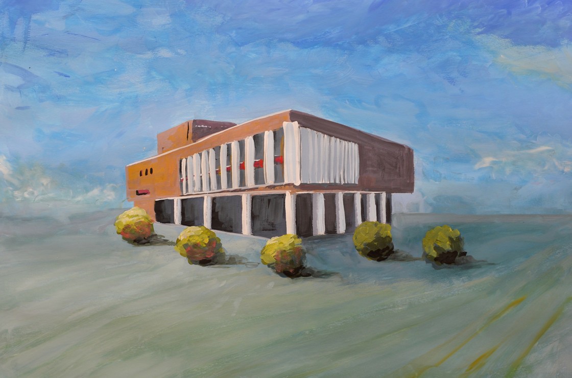
The architecture study 1

M1
Gouache on paper, 42 x 59 cm

This administration building is located on one of the central squares not far from my place of residence and I wanted to capture its almost proud setting, standing on its own. The square itself is very spacious and quite open and I aimed to encapsulate its essence accordingly. When you stand there you are completely surrounded by the sky and feel incredibly small… but not intimated though, as many large constructions can often induce you to feel.


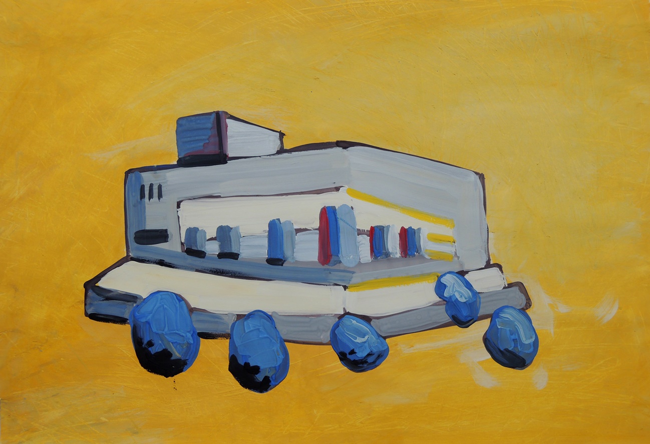
The architecture study 2

M2
Gouache on paper, 42 x 59 cm

This is an abstract progression from the Architecture Study 1 on the following day. This time I used yellow for the ground (sky) to represent the sunshine and to give a hint of the temperature in Kazakhstan… erm… to say that it can be hot wouldn’t even describe it!