Category Archives: _Patricia

Patricia: December

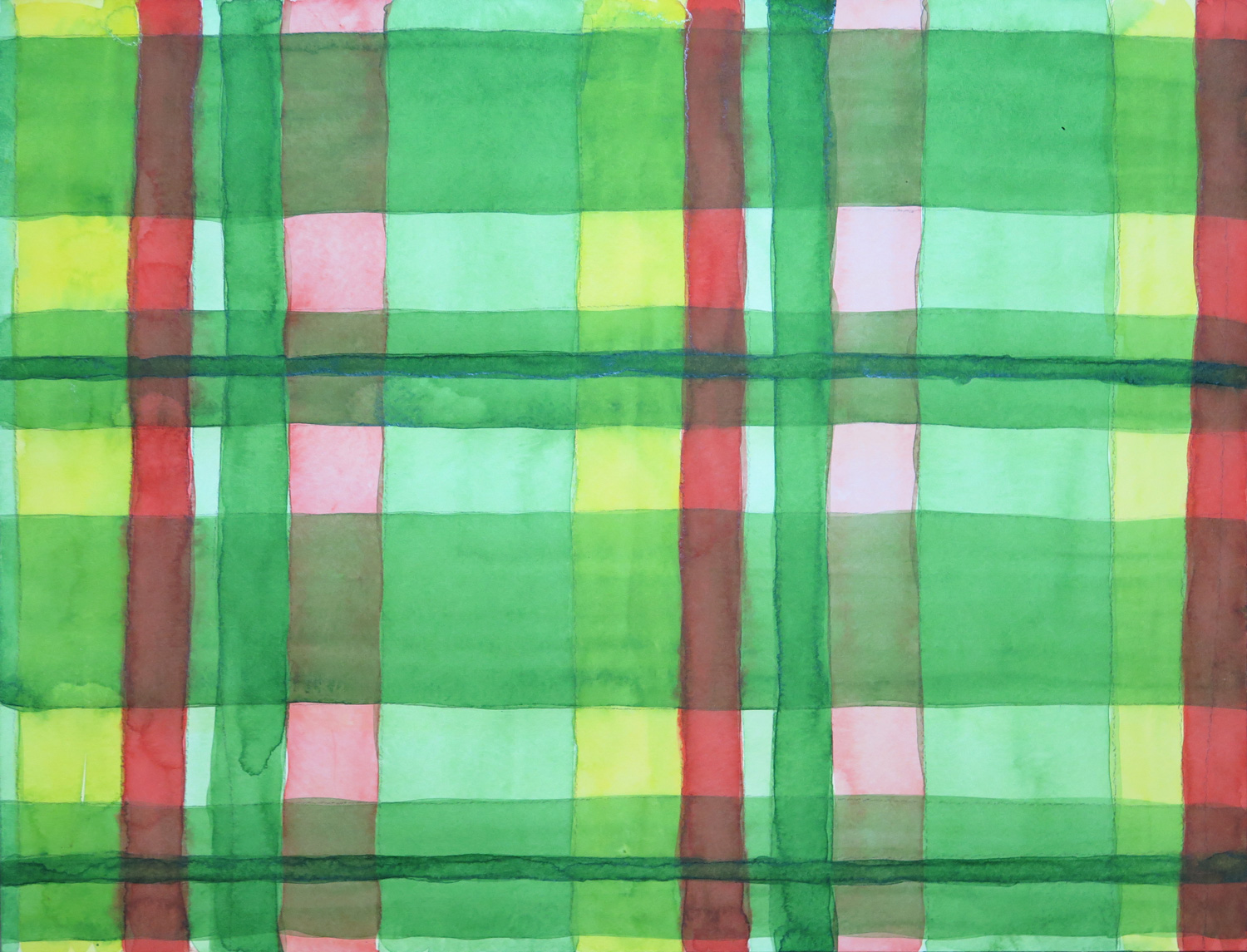
Transparent Green

img_6259
Watercolour on paper, 33 x 43 cm

This piece was inspired by an exhibition poster of the Paul Klee show currently running at the Metropolitan Museum of Art. I wanted to experiment with different intensities of green and combinations with yellow and orange. My piece is a lot less interesting that Paul Klee’s… I still like to look at it, as there are some interesting effects of depth resulting from painting transparent layers.


Transparent Blue
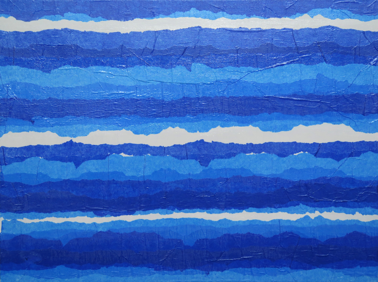
img_6261
Collage on board, 38 x 50.5 cm

Staying with the theme of transparency, I experimented with tissue papers. I used light and dark blues in layers and was interested in the different nuances of blue I could achieve.


Still life (my desk)
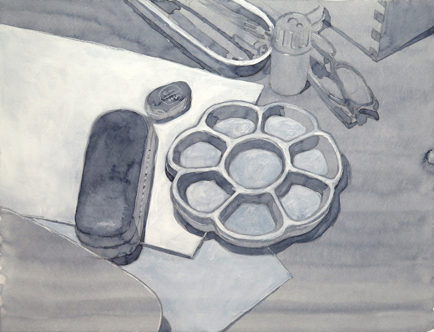
img_6263
Watercolour on paper, 33 x 43 cm

A monochrome study of the items on my desk. I used indigo pigment in layers to achieve darker values and partially overpainted them with white acrylics to bring back the lights. The aim was to simplify the values to dark, medium and light.


Christmas with cats at home (R)
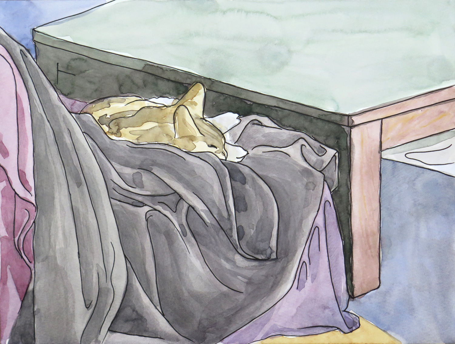
img_6265
Watercolour on paper, 22.5 x 30 cm

This motif was inspired by Natalie’s Armchair (November 2016). Originally I wanted to follow up the idea of a line drawing, but then my sketch developed into a tonal drawing which I subsequently coloured. I became hooked to depicting the tonal variations of the throw on the sofa. To me, the image captures the peaceful atmosphere at home with my cats for company.


Untitled (R)

img_6268
Mixed Media on paper, 30.5 x 45.5

This collage is a response to Natalie’s Mariner (November 2016). My starting point were the metal sheetings behind the mariner and the little bolts that fixed them in place. I used craft paper which I folded and glued onto the support, then decorated the edges with dots so that it looked like a decorative seam on denim trousers. The stylized eyes are potato prints of white over black acrylic paint. My work process followed my intuition while I was trying to develop a lively abstract composition.


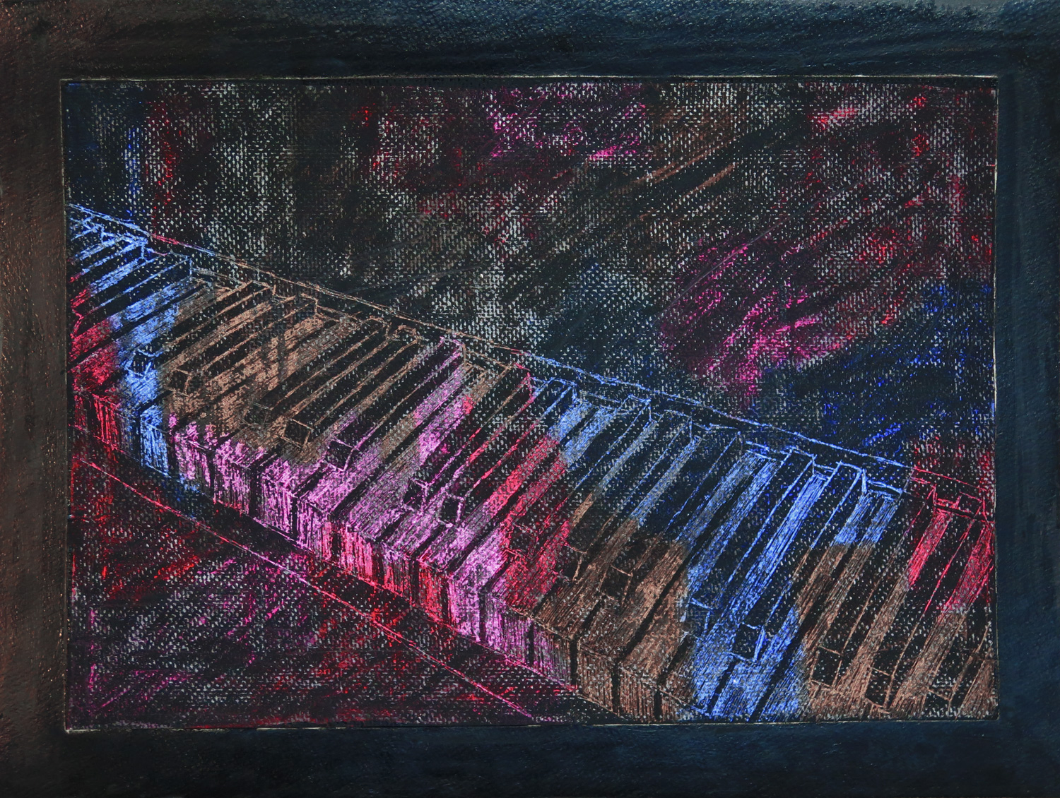
Farewell (My friend the pianist has died) (R)
img_6267
Mixed media on board, 38 x 50.5 cm

Visually, the piece is a response to Natalie’s Jars (November 2016), as I started out with the idea of simple elements outlined before a dark background. It inspired me to use a sgraffito technique with oil pastels. While I was building up the layers, my mind wandered off to thoughts about a friend about whose death I just had found out. He played the piano very well and also worked as a piano technician and tuner. I’m so sad that he’s gone.
 

Patricia: November

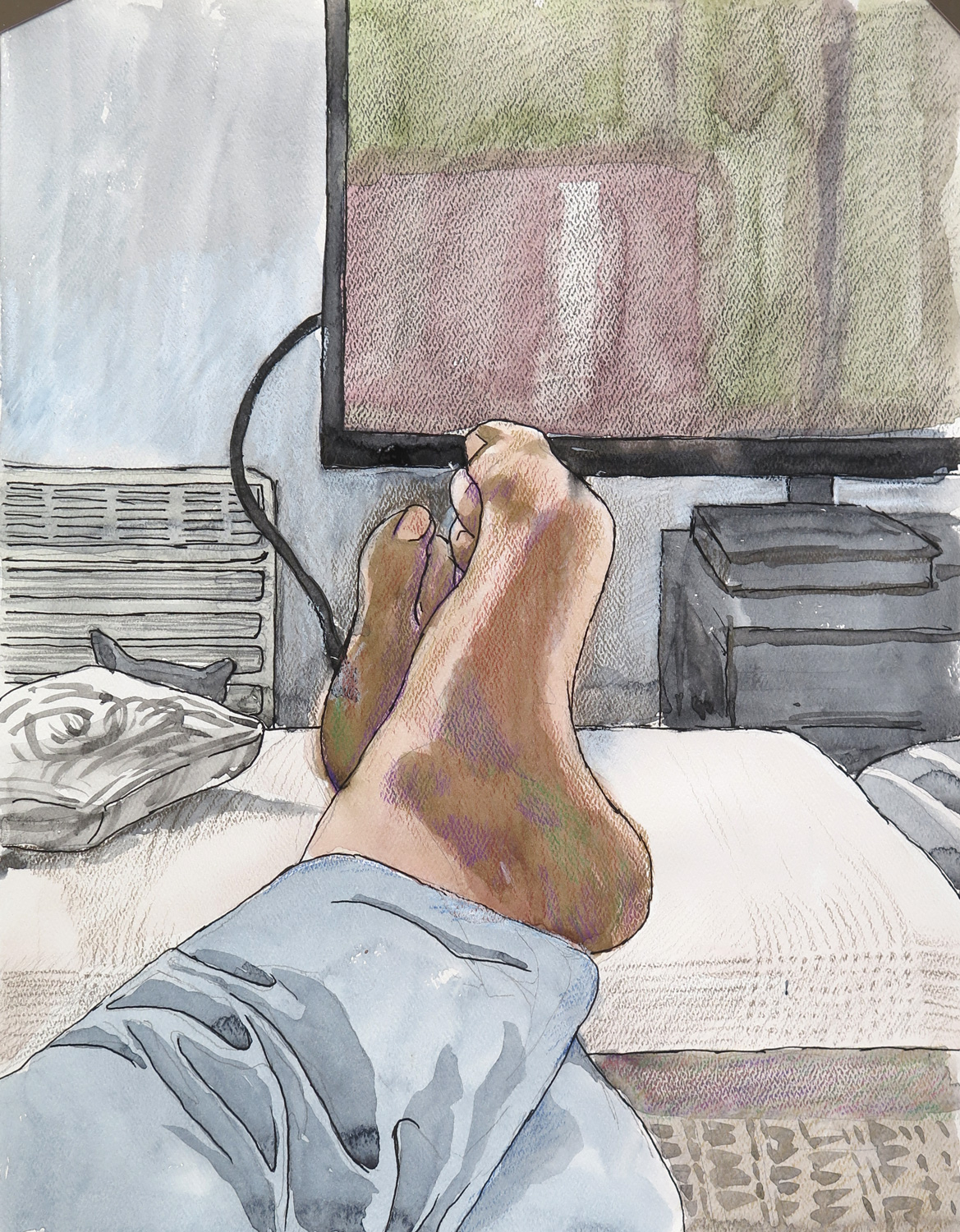
Home

img_6139
Mixed media on paper, 38 x 27.5 xm

This started out as a sketch of my backlit feet and developed into a kind of interior view. I reworked the initial watercolour painting by adding outlines and emphasizing contrast with coloured pencil. Somehow I feared that this image of my feet was offensive because it’s so private. My main interest was the light reflection on the feet, maybe I should have focused just on that and treated it in a more abstract way, rather than including so much realistic context.


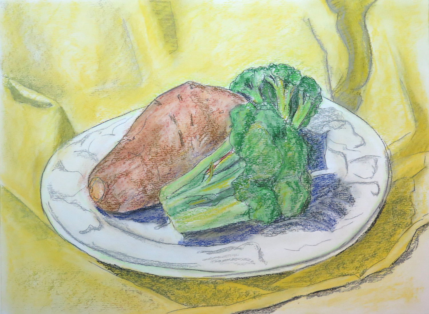
Still life with sweet potato

img_6167
Pastel and charcoal on paper, 28.5 x 38.5 cm

A naturalistic still life drawn from nature. I feel that this kind of study is a bit boring and technical but sometimes I want to get back to skills training. I found handling the pastels quite difficult, it’s not really a medium to depict fine detail. The study was a preparatory piece for a later painting.


A strange relationship

img_6169
Oil pastels on paper, 36 x 47.5 cm

This piece was made in an art therapy approach. I wanted to express my feelings about a relationship with someone I once loved. The romantic relationship did not work out because we were not compatible. I tried to visually express how our personalities clashed, despite or because our similarities.


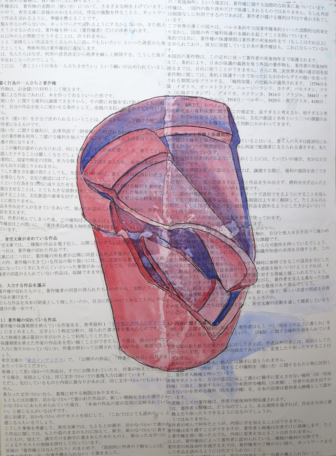
I love my broken pot (R)

img_6172
Watercolour over paper collage on board, 50.5 x 38 cm

My piece was inspired by the colours and the incorporation of text in Natalie’s ‘Consumerism or Merci de Votre Fidelité’ (October 2016). The colours evoked associations with the Japanese flag which inspired me to use printouts from a Japanese software manual for my background. I also wanted to have a red central object and chose a broken ceramics pot. I keep this broken pots because I use their pieces to cover the water hole in planters when I set new plants. It hadn’t occurred to me that the broken pot was also visually interesting.


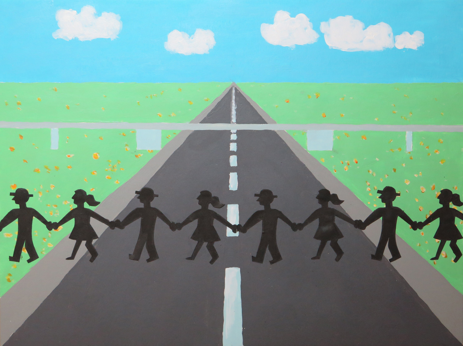
Autobahn (R)

img_6174
Acrylics and collage on paper, 30 x 39.5 cm

This piece was inspired by the vertical stripe shapes in Natalie’s ‘Dark Forest’ (October 2016). I associated linear perspective in a landscape and came up with the idea of a roadway. The initial composition was very graphical and looked lifeless. Therefore I added some flowers to the greens and the cutout of the people crossing the street. I think the result is a fun piece. I’m not sure what to make of it.


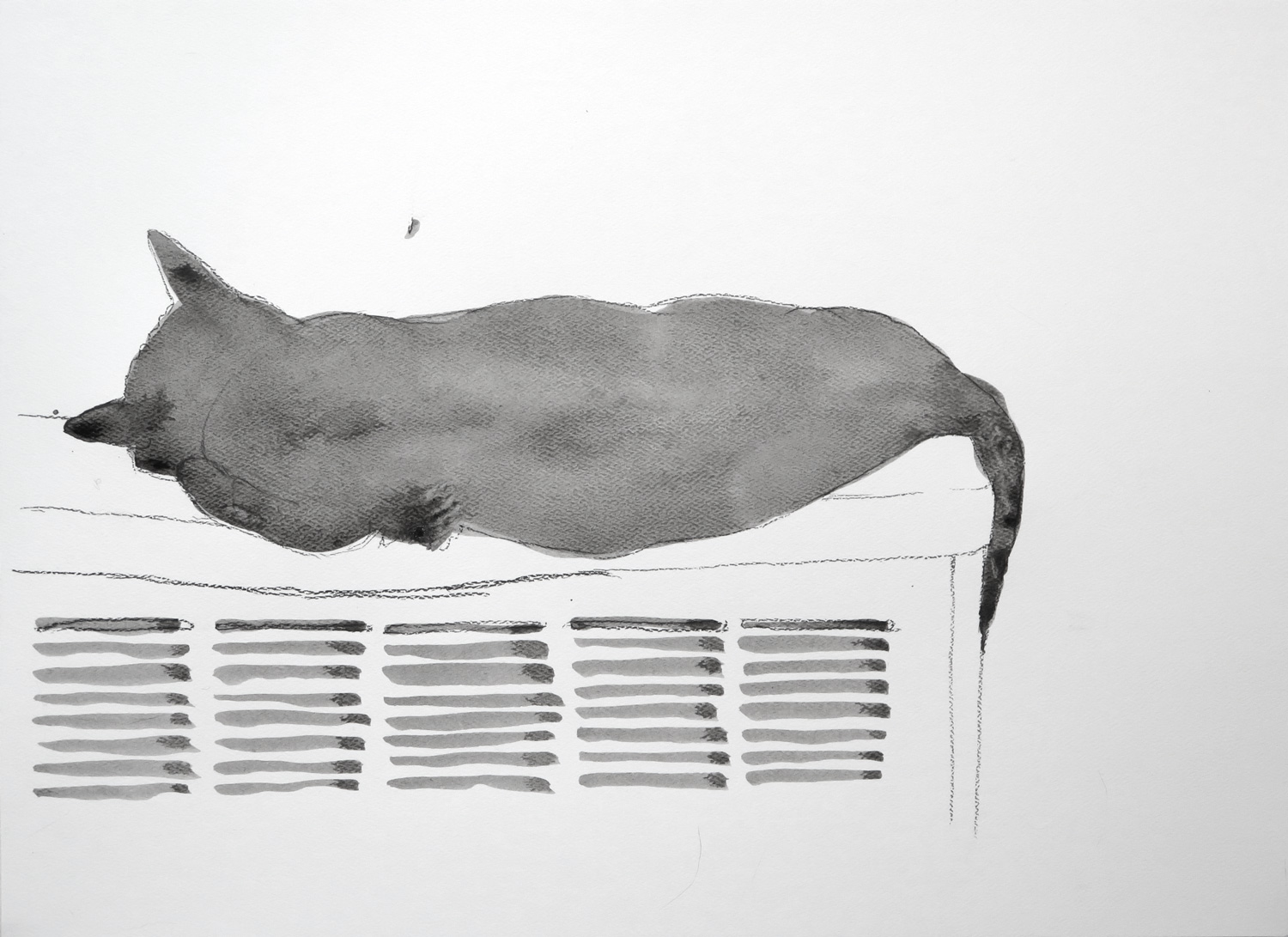
Cat sleeping on the radiator (R)

img_6176
Ink wash over charcoal on paper, 28 x 38 cm

My response to Natalie’s ‘Anonymous’ piece (October 2016). I took up the idea of a dark silhouette and tried to express the cat’s posture through the silhouette of her body.


Patricia: October

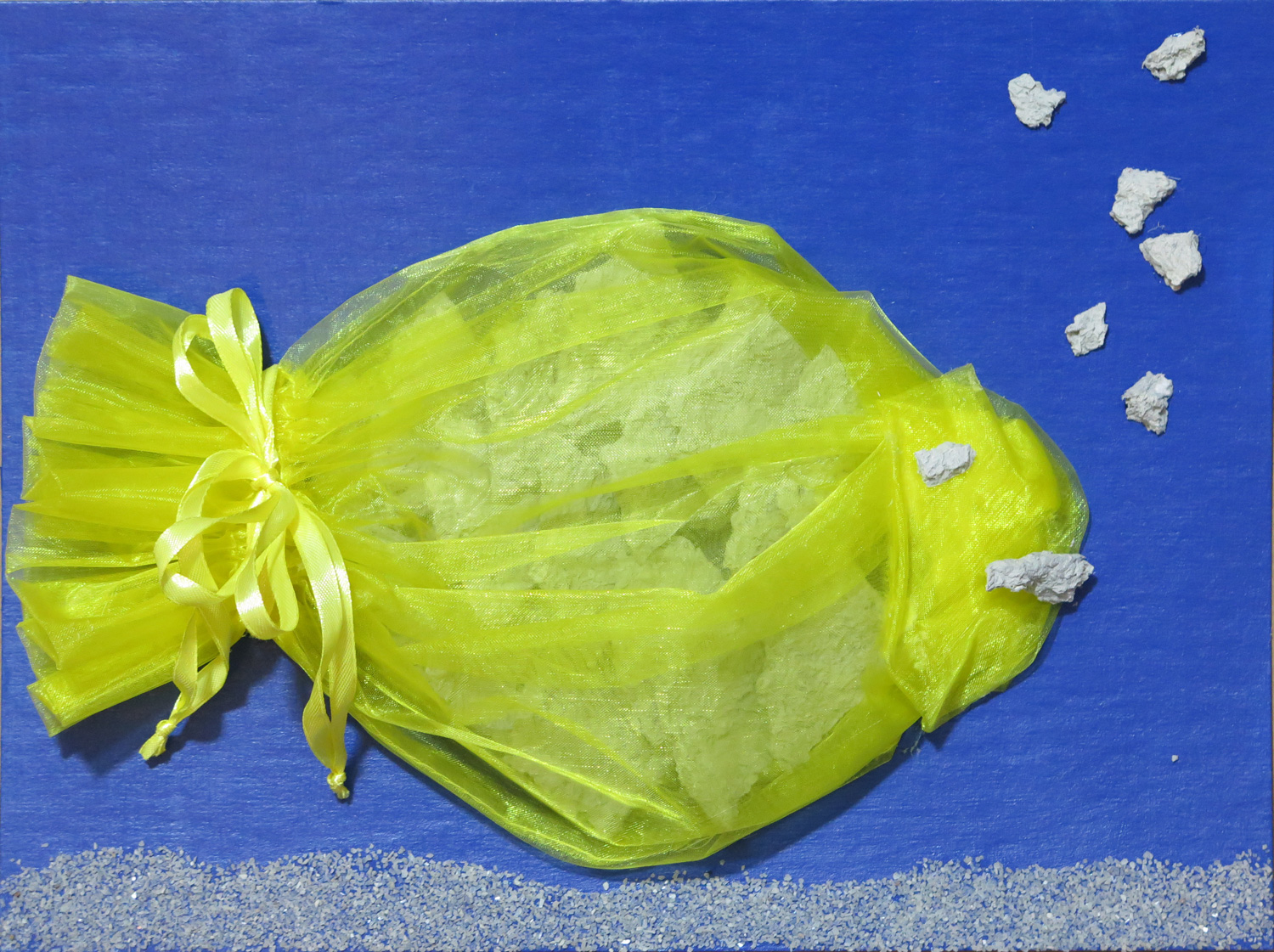
The fish

img_6028
Materials collage on cardboard, 22.5 x 30 cm

I continued with the “Aquarium” strand of ideas started in the September submission. Here I made use of leftover paper machée which I had spread out to dry in the shape of a plate. I cut them into triangular shapes to represent the skin, arranged like shingles on the support. I wanted the fish to be a bit glittery and wrapped it into a shiny, transparent little cloth. The fish face, some bubbles and sand for the ground was added for decoration.

I’m quite happy with the symbolism of the image. The shingles could point to the rich interior life of the creature which is covered, at the same time revealed, by the transparent skin overlay.


The woman

img_6042
Painted materials collage on board, 35.5 x 28 cm

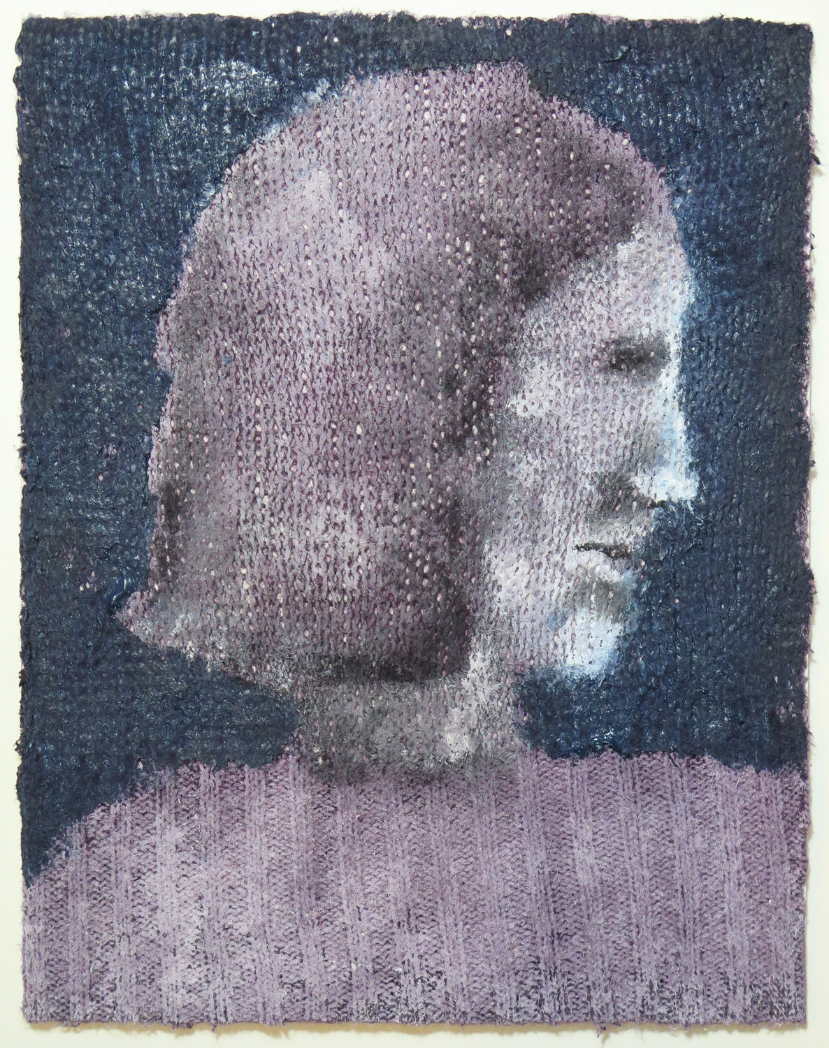
An experiment with textured ground: I glued a piece of a knitten sweater onto board and used it as my painting ground. It’s an imaginary portrait and I recognize myself in it, the quiet observer. The style reminds me of Marc Chagall’s poetic phantasy worlds full of longing for something far away.


Bottles

img_6031
Charcoal on paper, 35.5 x 27.5 cm

A still life made in my kitchen.


The high bed (R)

img_6034
Mixed media on canvas, mounted on board, 38 x 51 cm

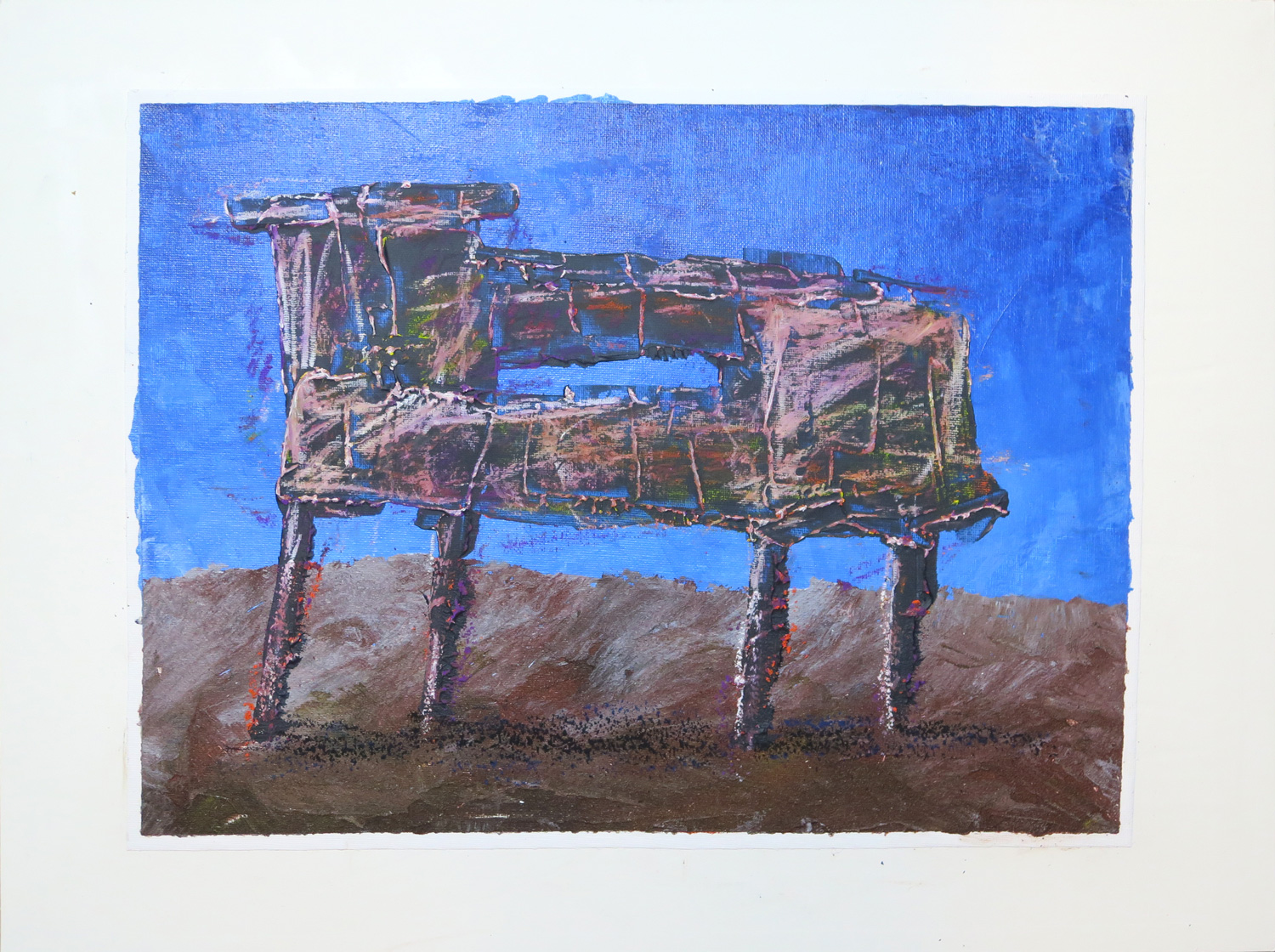
This painting was inspired by Natalie’s ‘Old ship structure’. I made a simplified composition with an imaginary object standing in a landscape to experiment with paint quality: Plain, textured, and heavy body. It’s a painterly alternative to my materials collages.


Keeping things together (R)

img_6038
Painted materials object, mounted on board, 49 x 39 cm

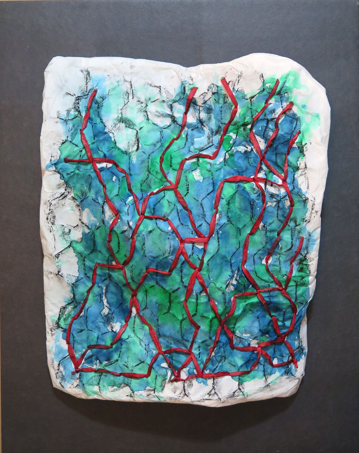
A piece that’s hard to explain – I followed an intuition which I did not really understand. Technically, the piece is two layers of Kozo paper around a piece of chicken fence, connected with double-faced stiches in red band. The paper is painted with blue and green watercolours. The entire structure is three-dimensional – I shaped it into several waves and bumps, so that it’s lifted from the support and only connected to the board at three points. It was inspired by Natalie’s ‘Imaginary trees’ for the stitching and additional painting of the surface, but otherwise the piece is a mystery to me.


Who is Charlie Sheen, actually? (R)

img_6043
Mixed media on paper, 35.5 x 27.5 cm

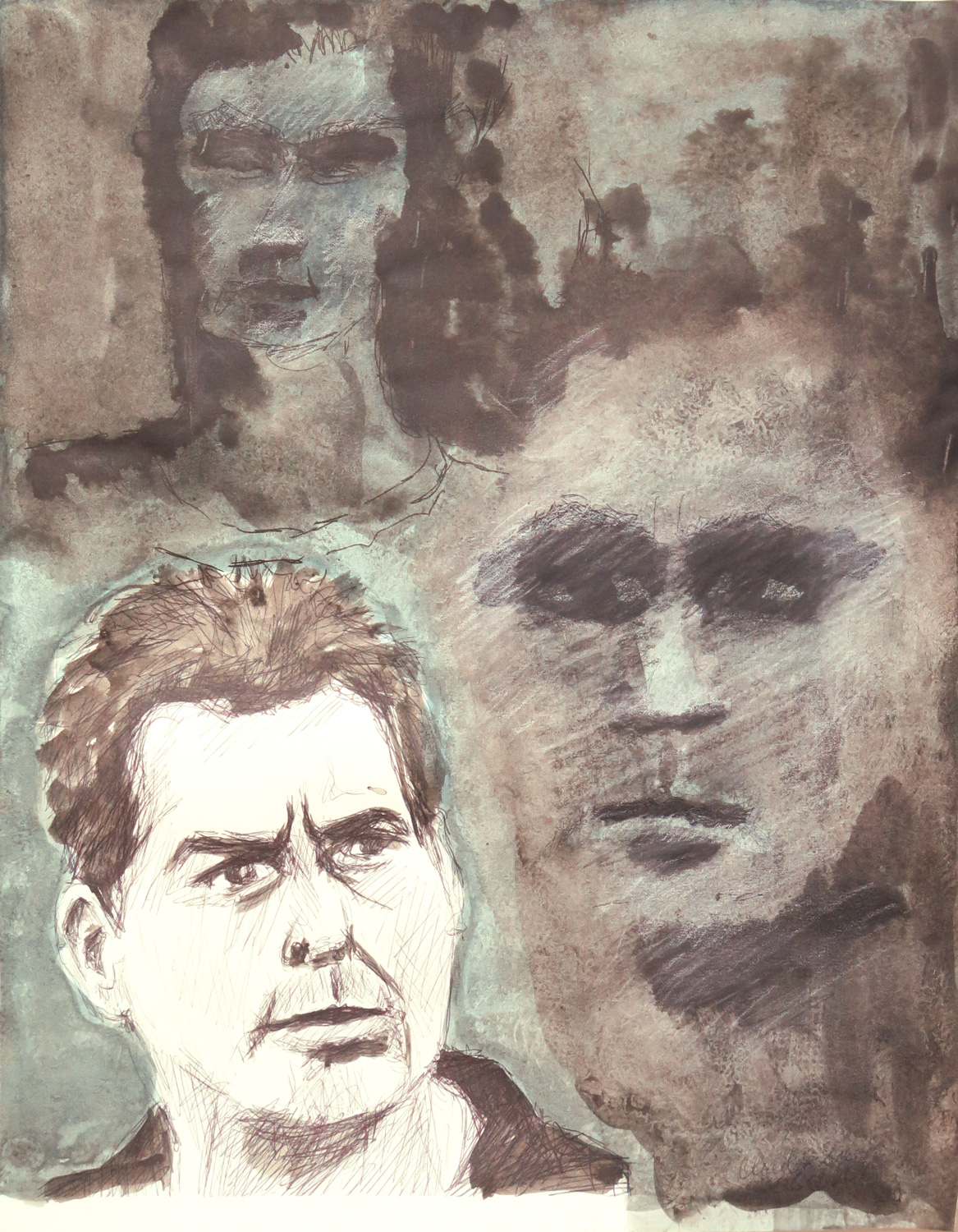
This drawing was inspired by Natalie’s ‘Catching a lamb’ – I started with the concept of ‘people’ and set out to sketch some folks. Currently I enjoy watching ‘Two and a half men’ which features Charlie Sheen, and chose this for a start. I tried sketching from television, but this very difficult because of film cuts every few seconds, and my first two sketches remained very vague. Then I switched to a photo for a third sketch on the paper. To bring out more clearly the portrait from photo which has more likeness, I dimmed down the initial sketches by overpainting them. The resulting composition conveys how I perceive the lesser known, difficult parts of Sheen’s personality, they are like demons luring in the dark. I imagine being with Charlie Sheen, you never know who you’re actually talking to.

Save

Save

Patricia: September

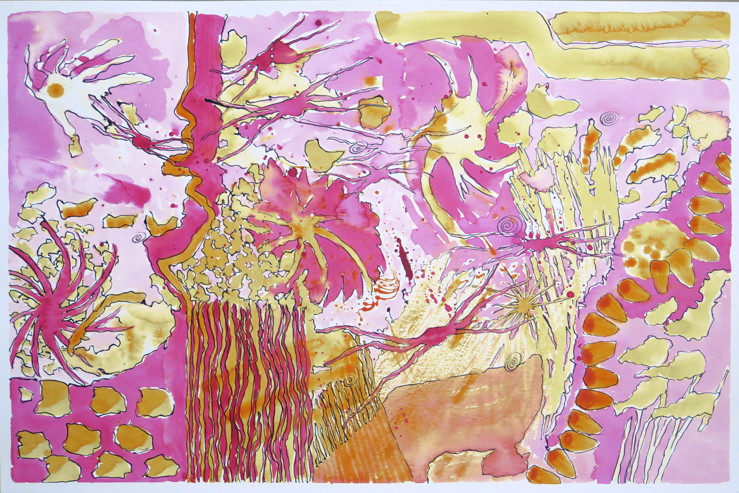
Fantasy Aquarium I

img_5994
Watercolour and ink on paper, 30 x 46 cm

This started as a watercolour doodle where I explored mark-making using just the two colours magenta and yellow in liquid watercolours. Then I followed the shapes and forms that developed with ink lines to create a sense of definition. The result reminded me of strange underwater creatures foating in water, hence the title.


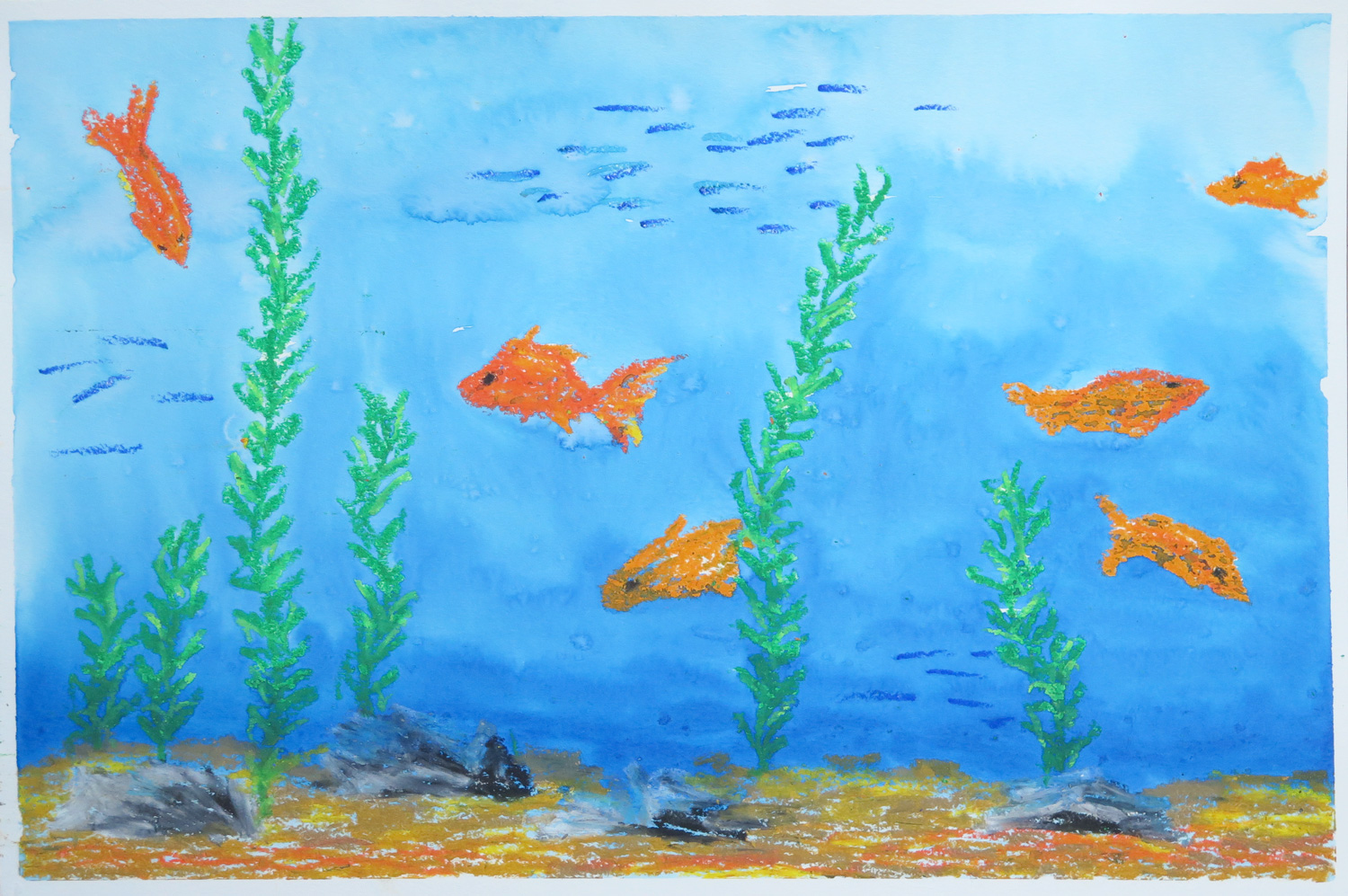
Fantasy Aquarium II

img_5995
Oil pastel and watercolour on paper, 30 x 46 cm

Taking up the aquarium topic from the first painting, I took a different and more literal approach. I remembered the goldfish aquarium I used to have as a child and created an underwater scenery with different kinds of fish and some sand and stones. The oil pastel elements served as a resist when I painted the blue wash on top to represent the water.


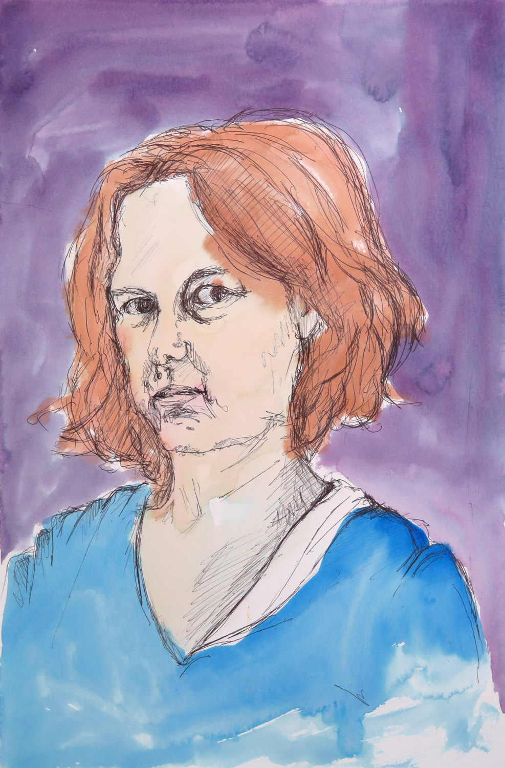
Self Portrait

img_5997
Pen and watercolour on paper, 46 x 30 cm

Self-portraits tend to be a difficult subject for me, both technically and emotionally. The idea was to overcome the hesitation by making a quick and unpretentious sketch, not worrying too much about likeness.


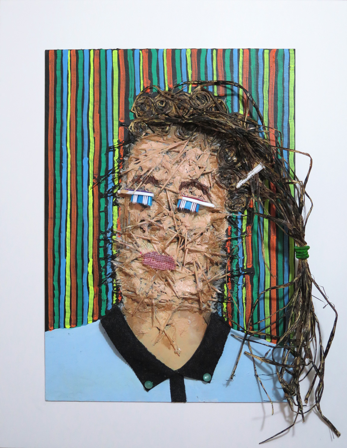
Rejection of Identity (R)

img_5991
Painted materials collage on board, 54 x 42 cm

This self-portrait was inspired by Natalie’s ‘Expectations’ portrait (August 2016). I took on the idea of emotional expression and developed the piece intuitively as a materials collage which was then painted. The face was created from toothpicks and paper machée, then overpainted for a more human-like appearance. It’s a visual representation of how uncomfortable I feel in my skin in my current professional identity, while trying to pretend that I’m playing the game.


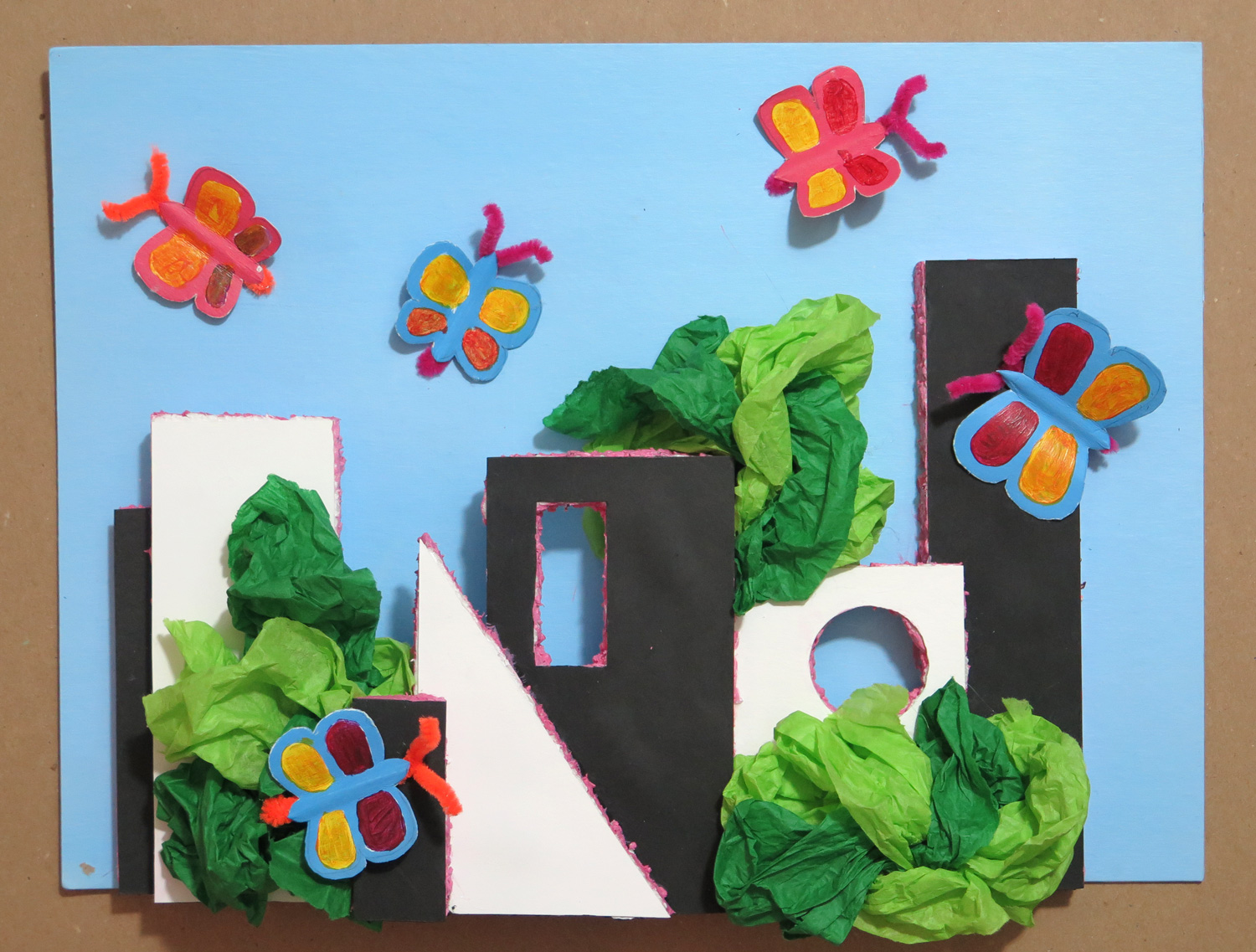
The Friendly City (R)

img_5990
Painted materials collage on cardboard, 28 x 38 cm

This piece was inspired by the visual elements in Natalie’s ‘White house’ (August 2016). Geometric paper shapes were glued on styrofoam, then cut out and assembled into a citiscape. They were decorated with green tissue paper for trees and bushes, and with painted paper butterflies, to create a friendly and joyful environment around the austere geometry. It is my response to being in the big city of New York, always searching out the spaces with greenery which make the city livable.


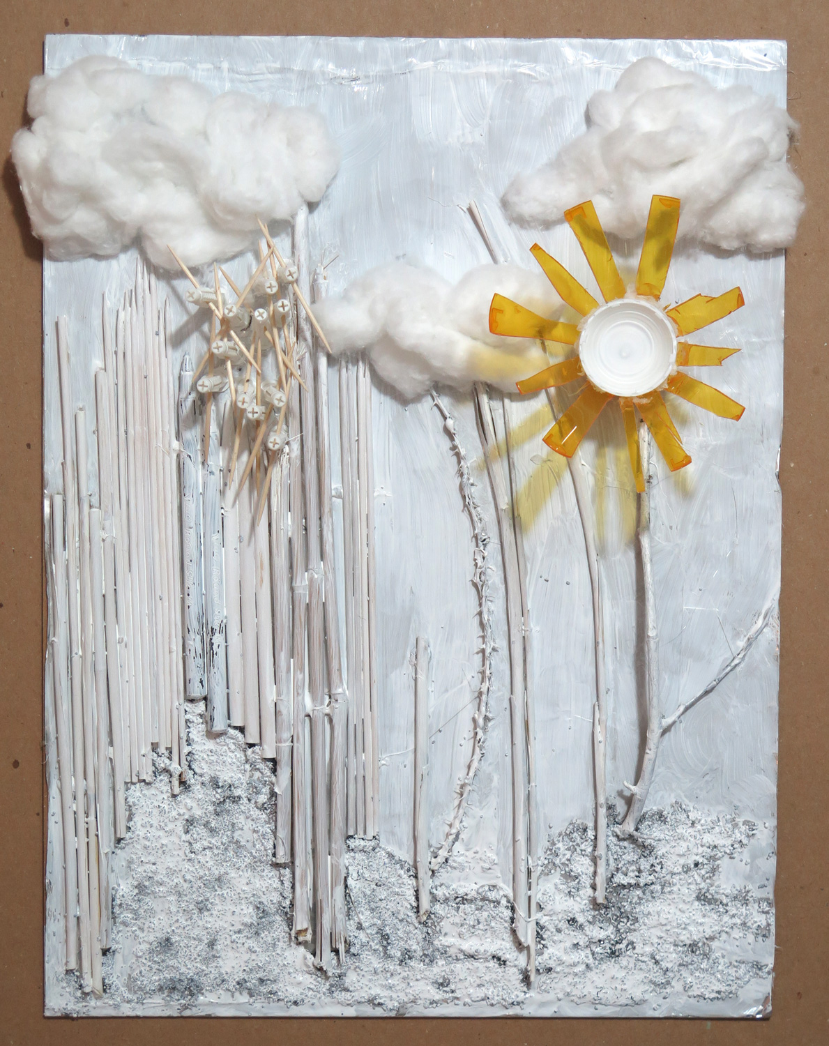
Landscape with tubular elements (R)

img_5987
Painted materials collage on cardboard, 41 x 30.5 cm

I responded to the visuals of the long tubular shapes in Natalie’s ‘Inside the cupboard’ (August 2016) and transferred the abstract concept into an imaginary landscape. In my piece, I focused on shapes and textures and tried to include interesting visual and haptic contrasts.

Save

Save

Patricia: August

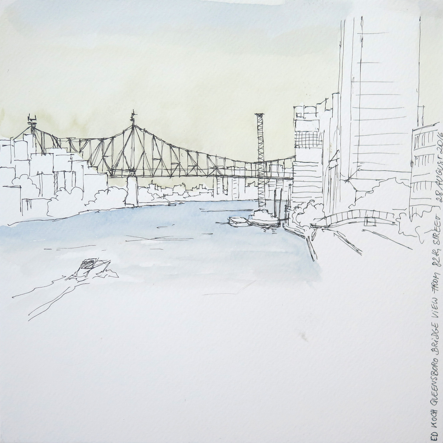
View towards Queensboro Bridge

IMG_5897
Watercolour on paper, 25 x 25 cm

An Urban Sketching approach, depicting the bridge over the East River from Manhattan to Long Island City. I’m experimenting with coloring my sketches only partially to set accents.


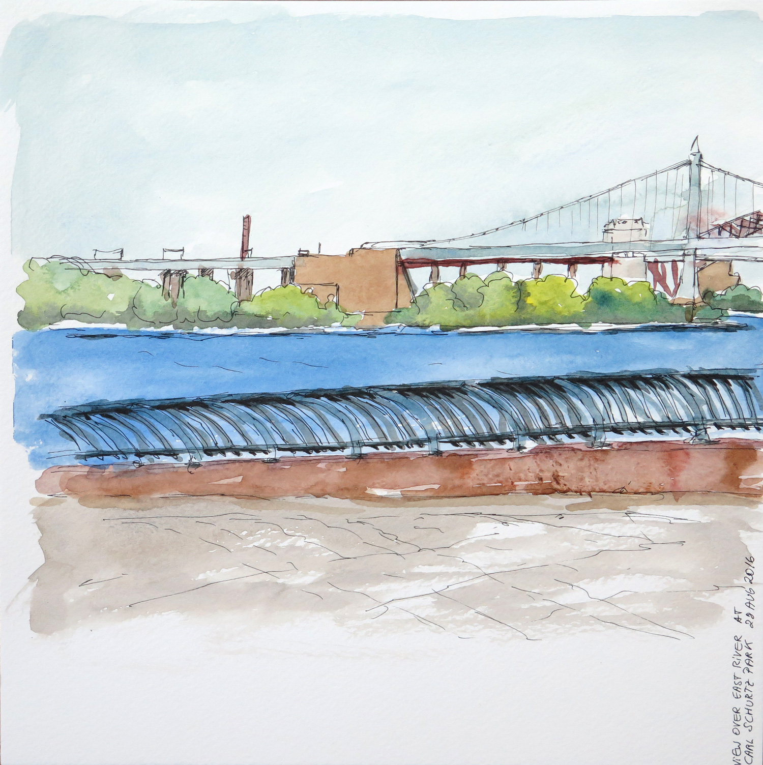
East River at 92nd Street, Manhattan Upper East Side

IMG_5899
Watercoloour on paper, 25 x 25 cm

Another Urban Sketcher’s view over the East River close to home. There are quite a few steel construction bridges in the area. I might try to draw them from closer one day because I’m finding them fascinating.


Girl from the 1950s

IMG_5901
Watercolour on paper, 25 x 25 cm

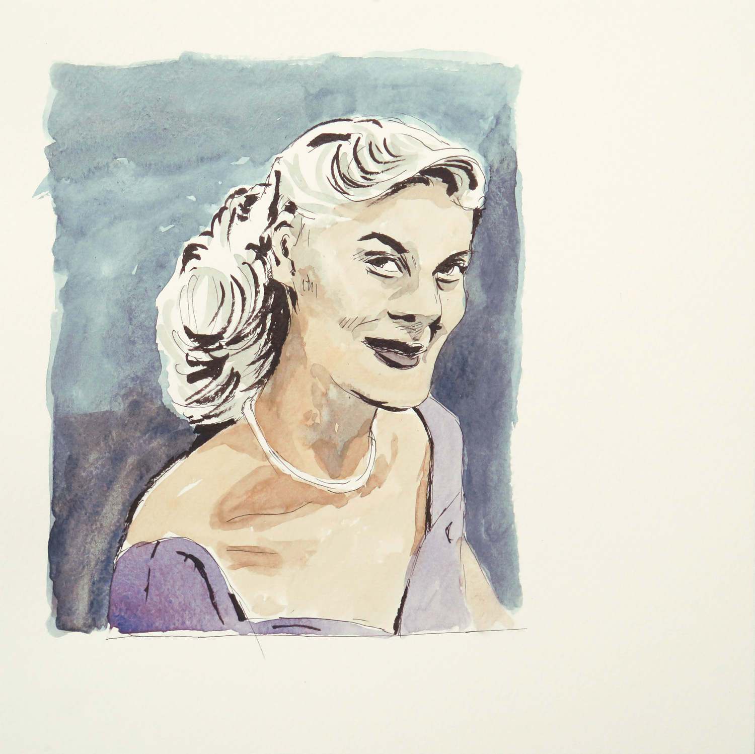
Sketched after a photo by Frank Larson, North American photographer whose work has only recently been discovered. While the photo depicted a sweet girl, the sketch brings out a certain wickedness in her traits, which I found quite interesting.


Blue movement (R)

IMG_5903
Mixed media on board, 36 x 45 cm

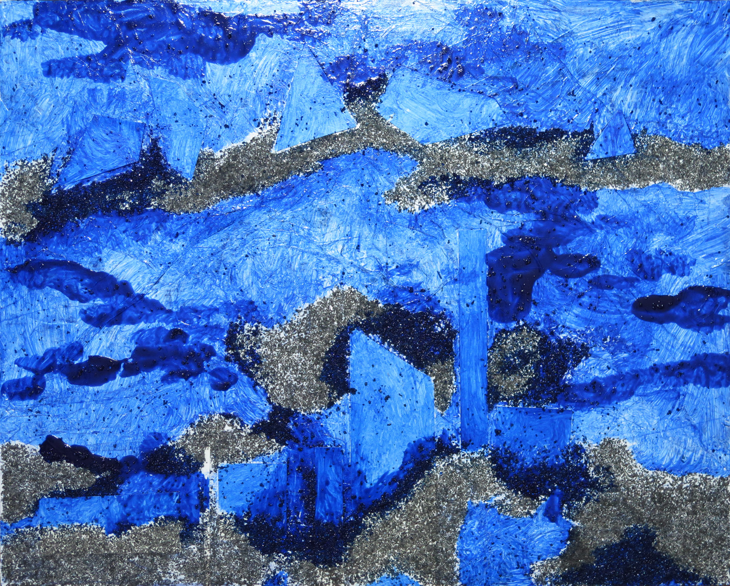
Experimenting with mixing materials into paint and using paint in different opacities. The piece was loosely inspired by Natalie’s ‘Abstract composition with yellow 2’ (July), in the leisurely approach to composition.


Stripes (R)

IMG_5905
Oil pastel and ink on paper, 28 x 38 cn

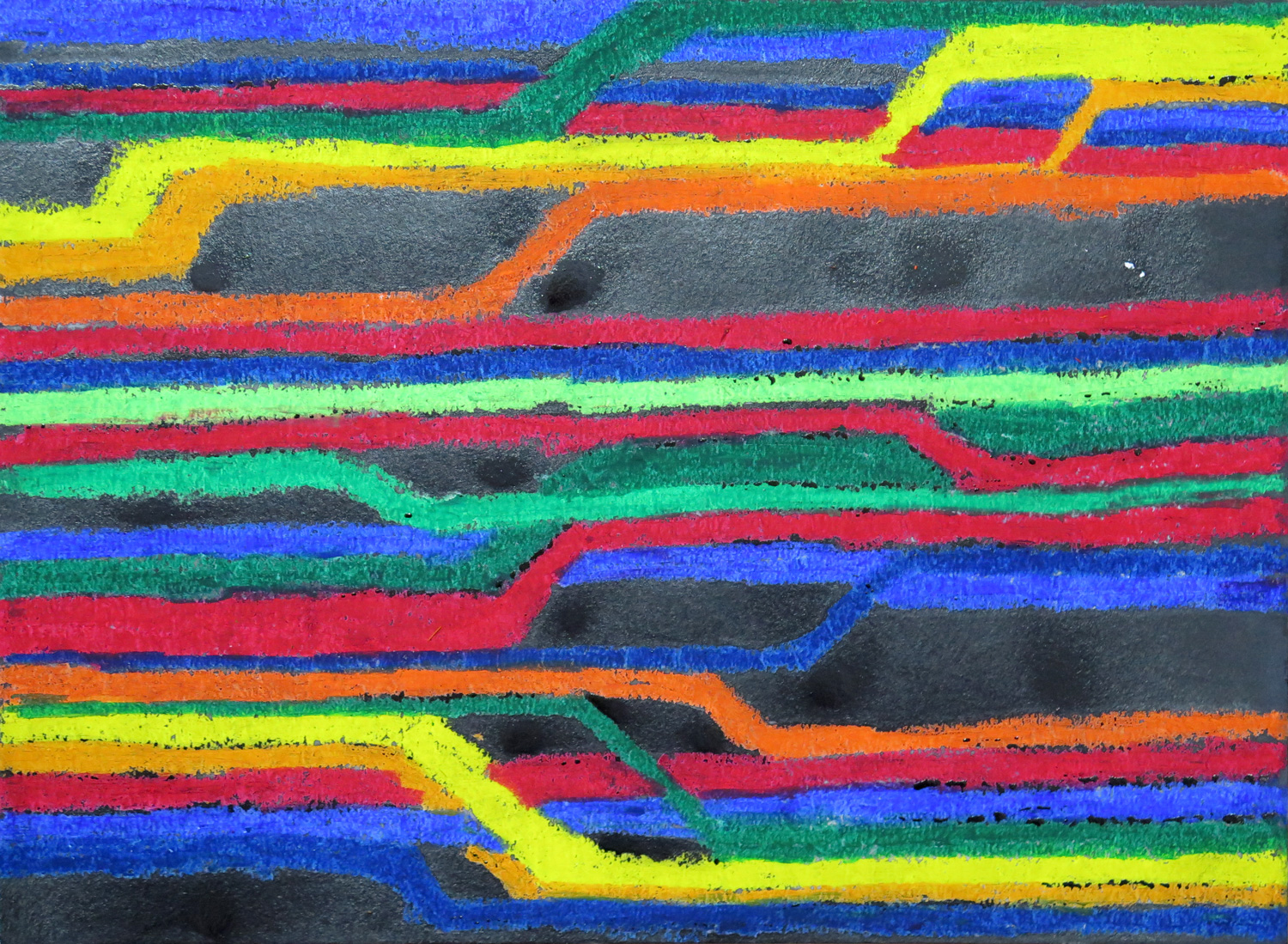
Inspired by Natalie’s ‘Drifting boats 2’ (July), where the stripe elements were my starting point to experiment with strong colour contrasts between oil pastels and black ink.


Transparent circles (R)

IMG_5907
Watercolour on paper, 25.5 x 45.5 cm

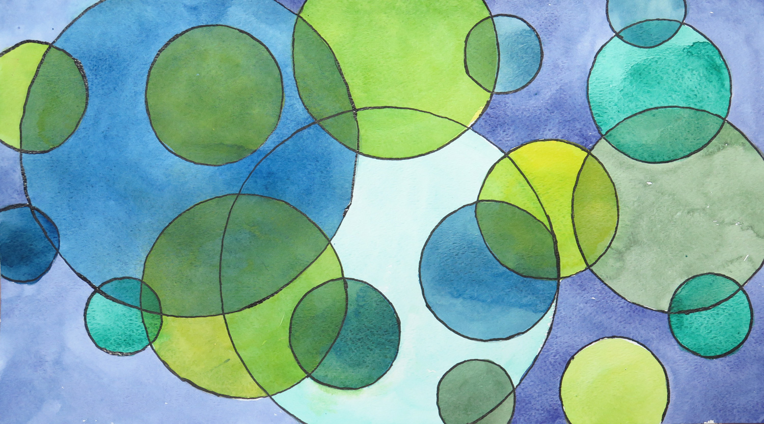
Inspired by Natalie’s ‘Cherry Stones’ (July), I used round shapes for an abstract composition.

Save

Save

Patricia: July

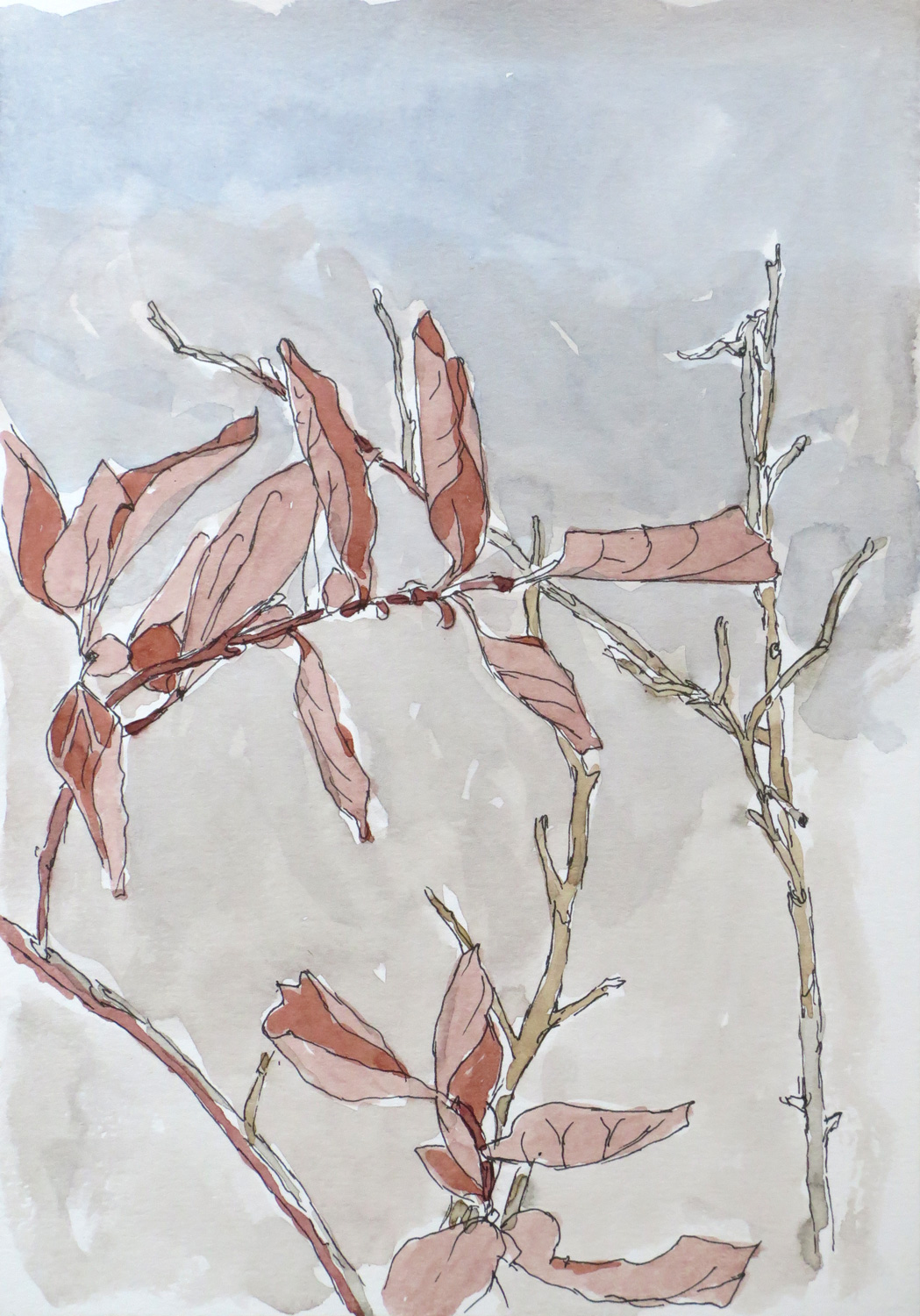
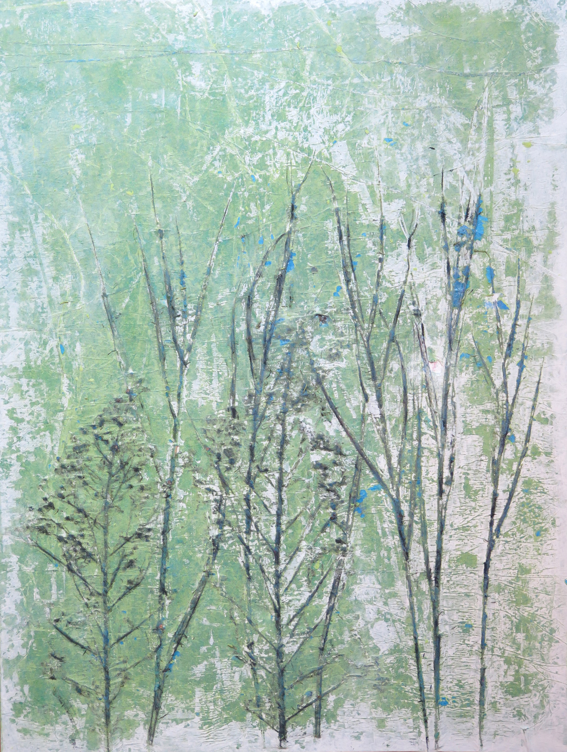
Twigs

IMG_5823
Ink and Watercolour on paper, 21 x 14.5 cm

The summer draught has killed my blueberry plants. Of course it’s my fault because I did not water them enough. The dried leaves are all that’s left of them.


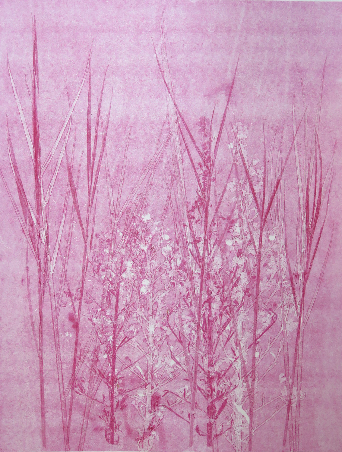
Grasses

IMG_5830
Monoprint, 46 x 33.5 cm

Experimenting with textures created from plant materials. I used plants to texture an inked plate and took a print of it. Then I used the plants themselves to print a second layer in the same red colour, creating the deeper tones.


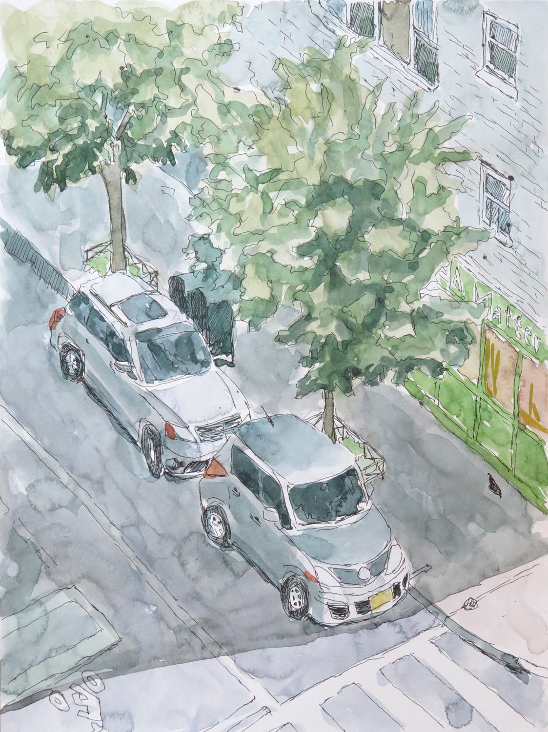
77th Street

IMG_5826
Ink and Watercolour on paper, 30 x 21 cm

A view from my terrace down to the street:


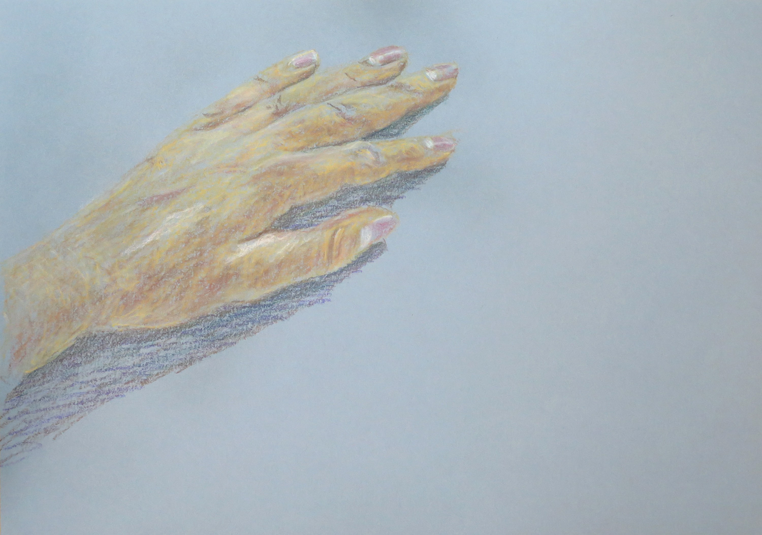
My Hand (R)

IMG_5831
Chalk pastel on paper, 21 x 30 cm

Inspired by Natalie’s ‘Creation of God Box’ (June), I tried a painterly depiction of my left hand.


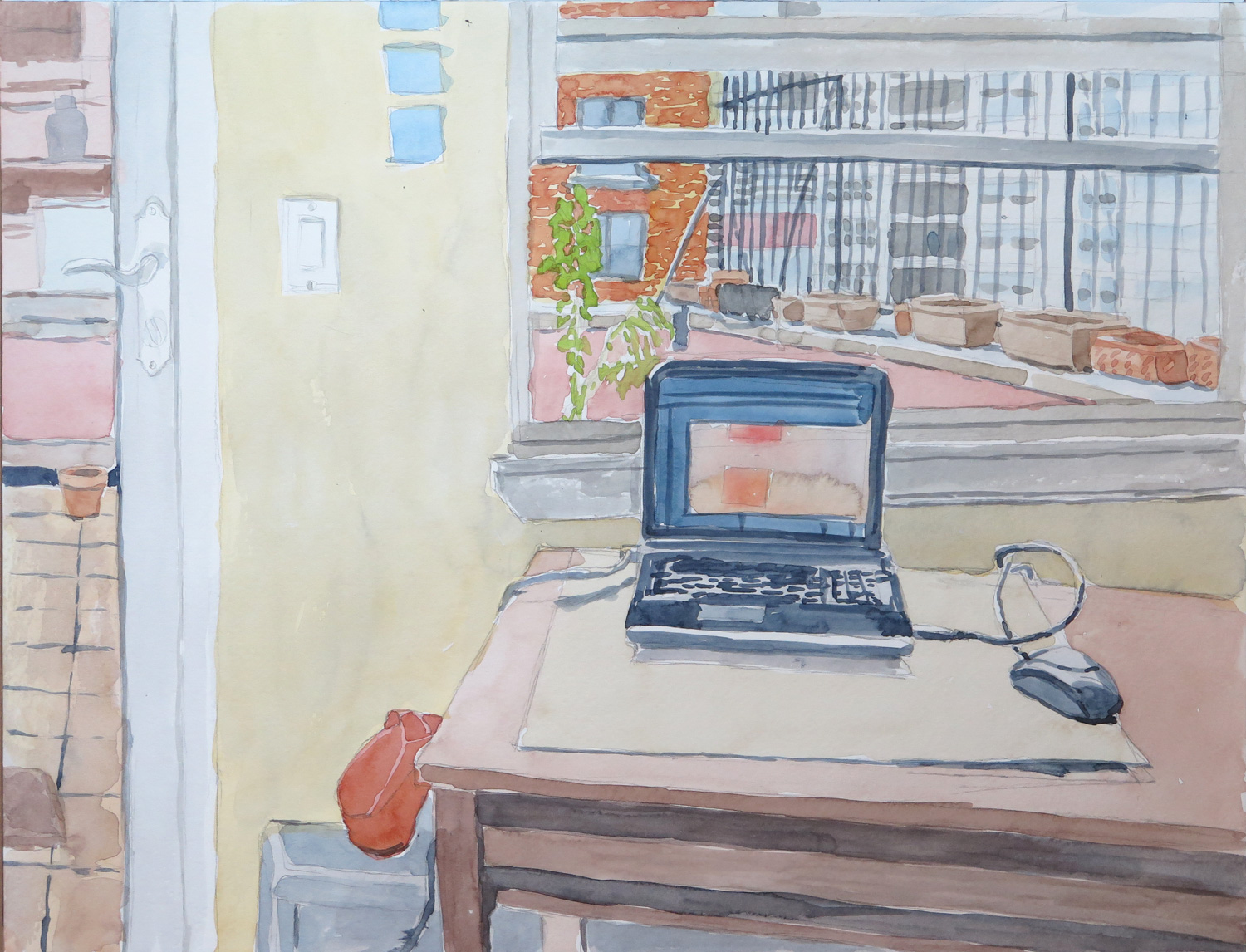
The Studio (R)

IMG_5828
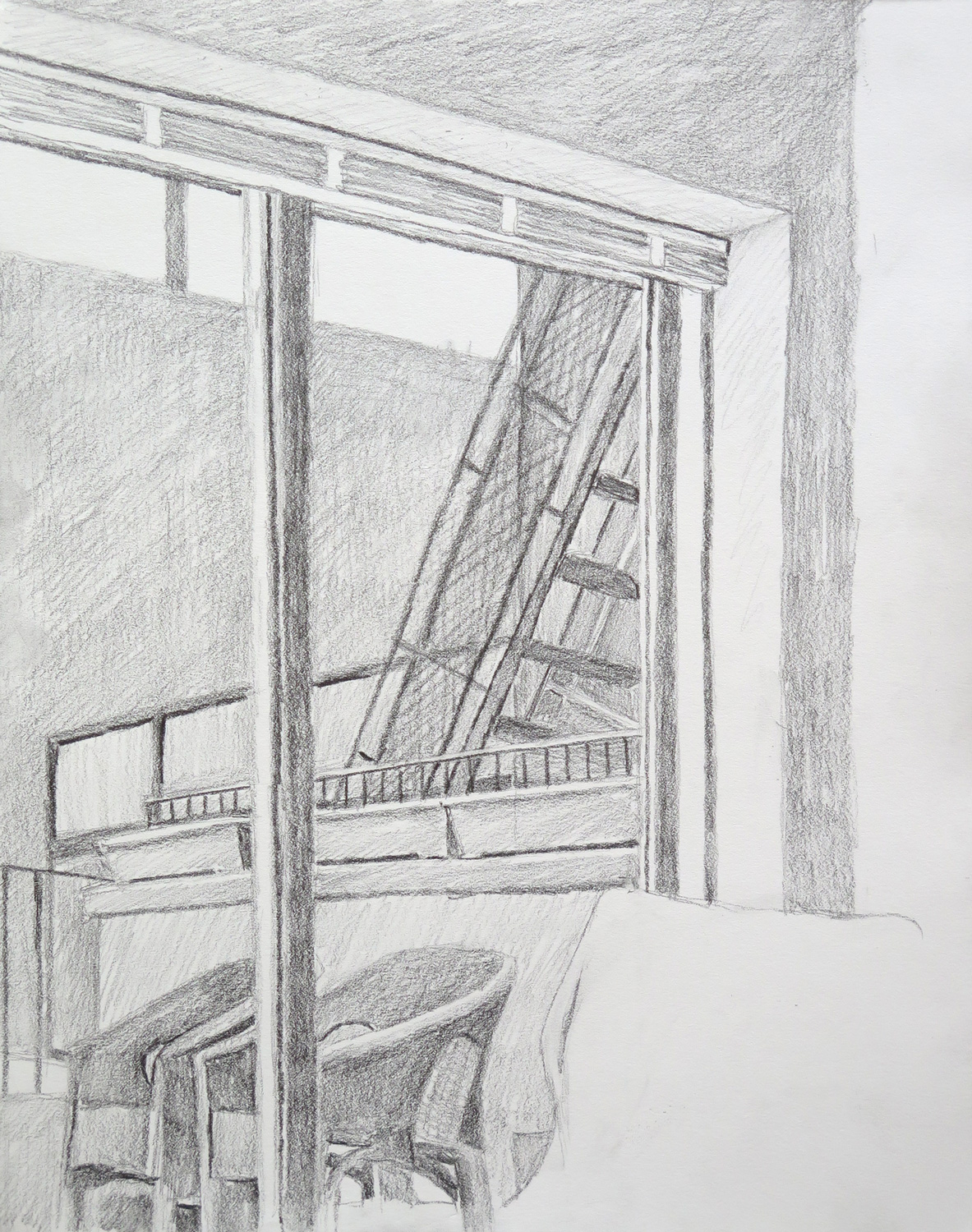
Pencil and watercolour on paper, 33 x 43 cm

Inspired by Natalie’s ‘In the Room’ (June), I set out to draw a simplified and abstract version of a view in my studio. But then I took off towards a more realistic depiction of the actual view.


Grasses II (R)

IMG_5834
Mixed Media on board, 51 x 38 cm

Inspired by Natalie’s ‘Under Control’ (June). I was attracted by the chaotic linework in the background of that piece. I used the pressed plant materials from the monoprint for this piece, covering it with tissue paper and painting with acrylics and charcoal on top.

Save

Patricia: June


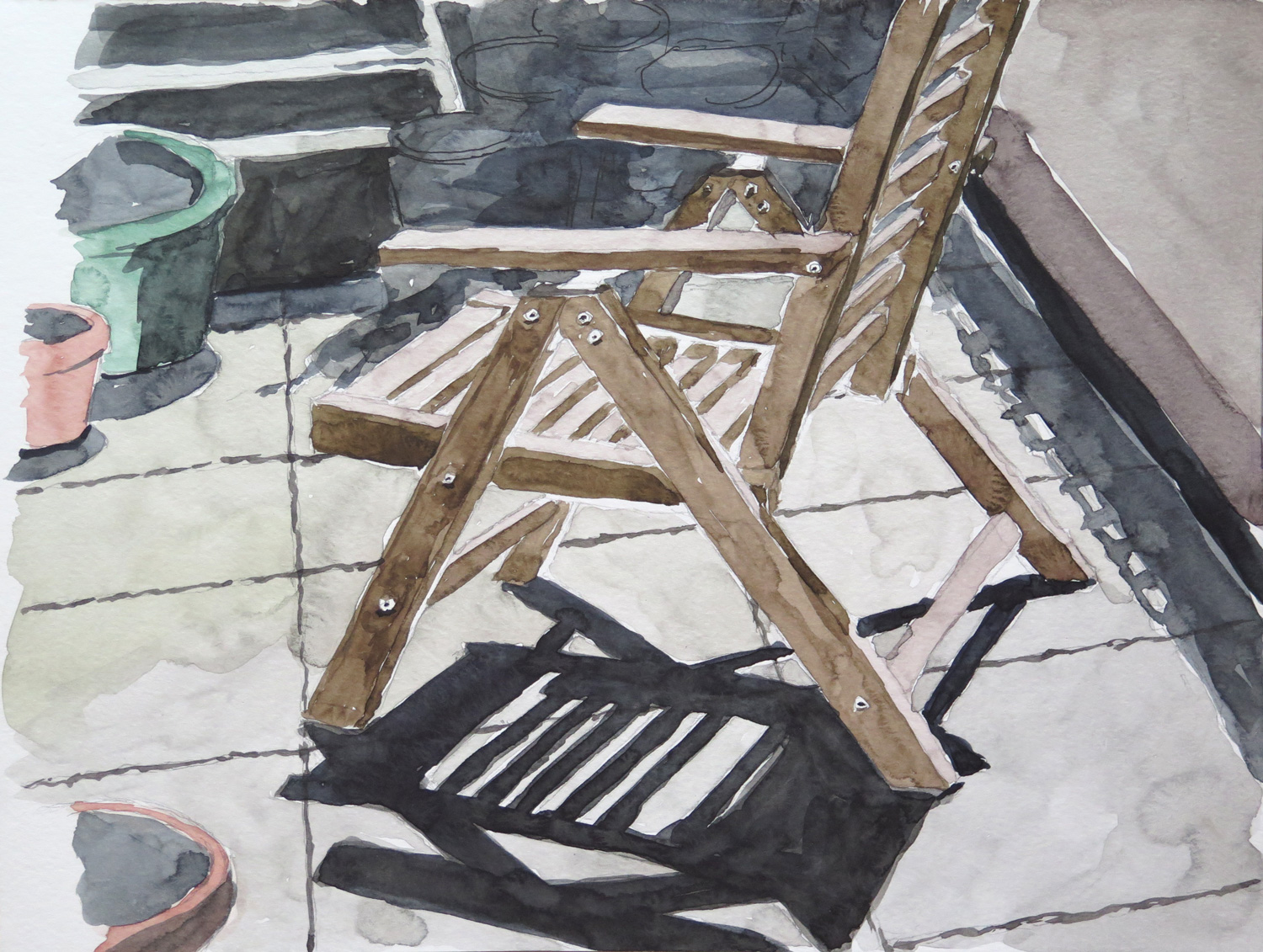
Chair on the Terrace

IMG_5666
Watercolour on paper, 23 x 30 cm

The shadow pattern on the floor and the strong contrasts in this view of the terrace were my main interest in this study.

Planters on the terrace

IMG_5668
Watercolour on paper, 23 x 30 cm

Normally I’m not so willing to depict the unorderly collection of things on my terrace, but I liked the composition of this view.

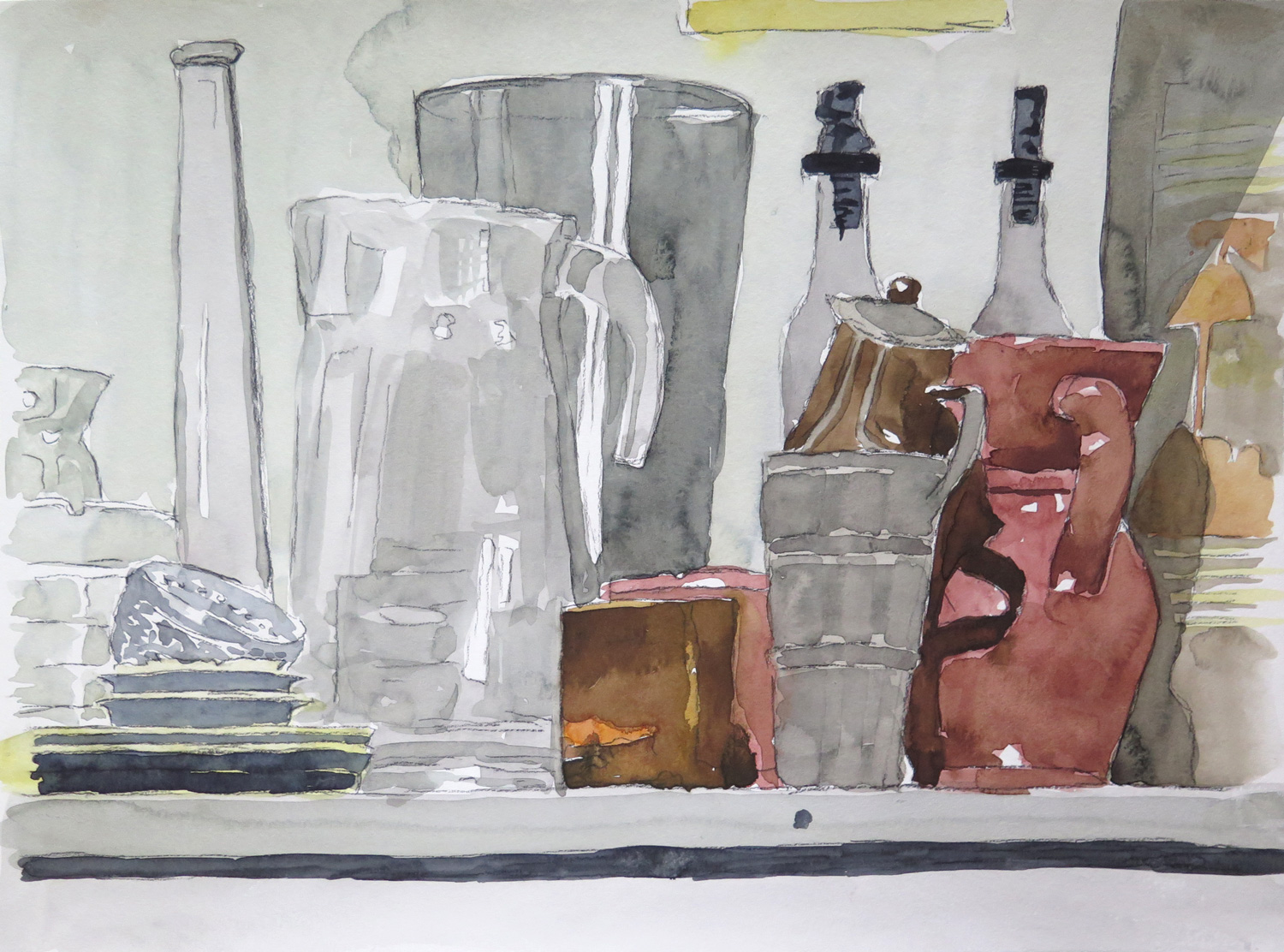
Still life with pitchers

IMG_5670
Watercolour on paper, 30 x 46 cm

The transparency and reflections on the glass objects caught my attention. It was a found still life, not arranged. I tried to depict the different materials: glass, metal, and ceramics.

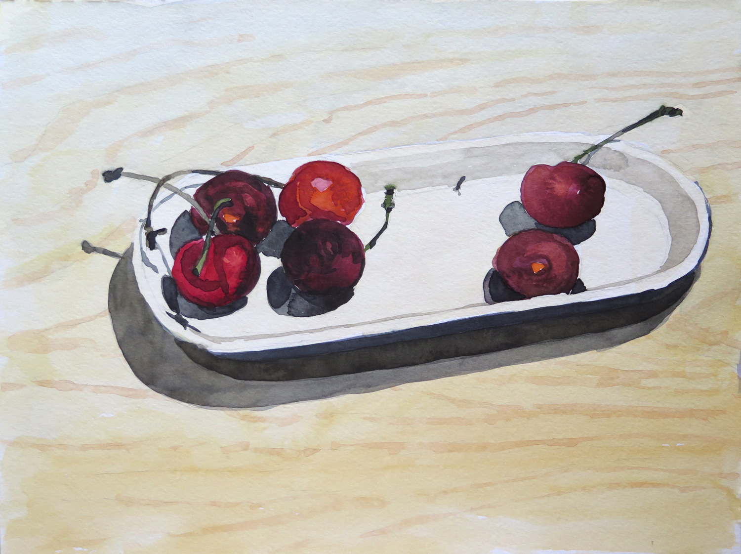
Cherries (R)

IMG_5672
Watercolour on paper, 23 x 30 cm

Inspired by Natalie’s Collage with fruits (May 2016), where I particularly liked the dark purple grapes, I chose a few cherries for a close-up study.

Staten Island Ferry Station (R)

IMG_5665
Oil on paper, 40 x 50 cm

A view from the boardwalk area behind the ferry station. I liked the bold colours of the ferry boat next to the blue water and was also attracted by the industrial character of the backyard which isn’t directly accessible to the public. (Inspired by Natalie’s Shipyard 2, May 2016)

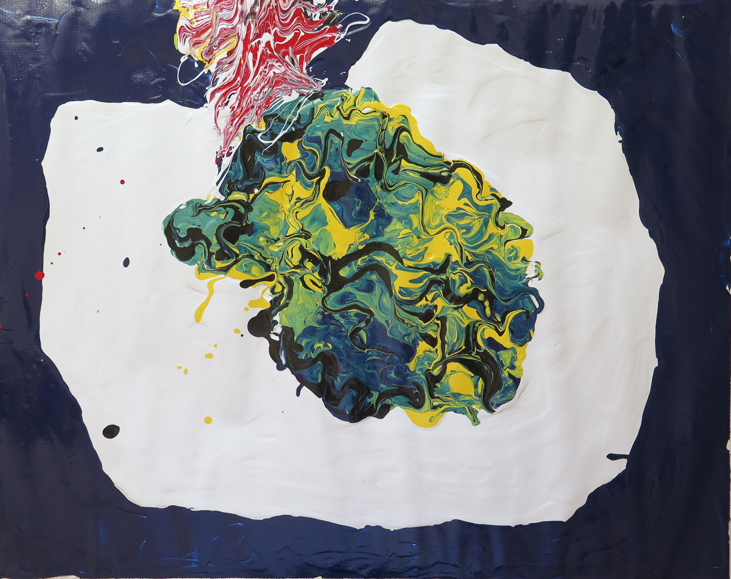
Abstract composition (R)

IMG_5674
Latex enamel paint on paper, 40 x 50 cm

I was attracted by the wiggly lines and the yellow to green to dark blue colours in Natalie’s Salad on a table (May 2016). It inspired me to do a poured paint abstraction using a spoon and knives to spread out and mix the thick paint directly on the support.

Save

Save

Patricia: May

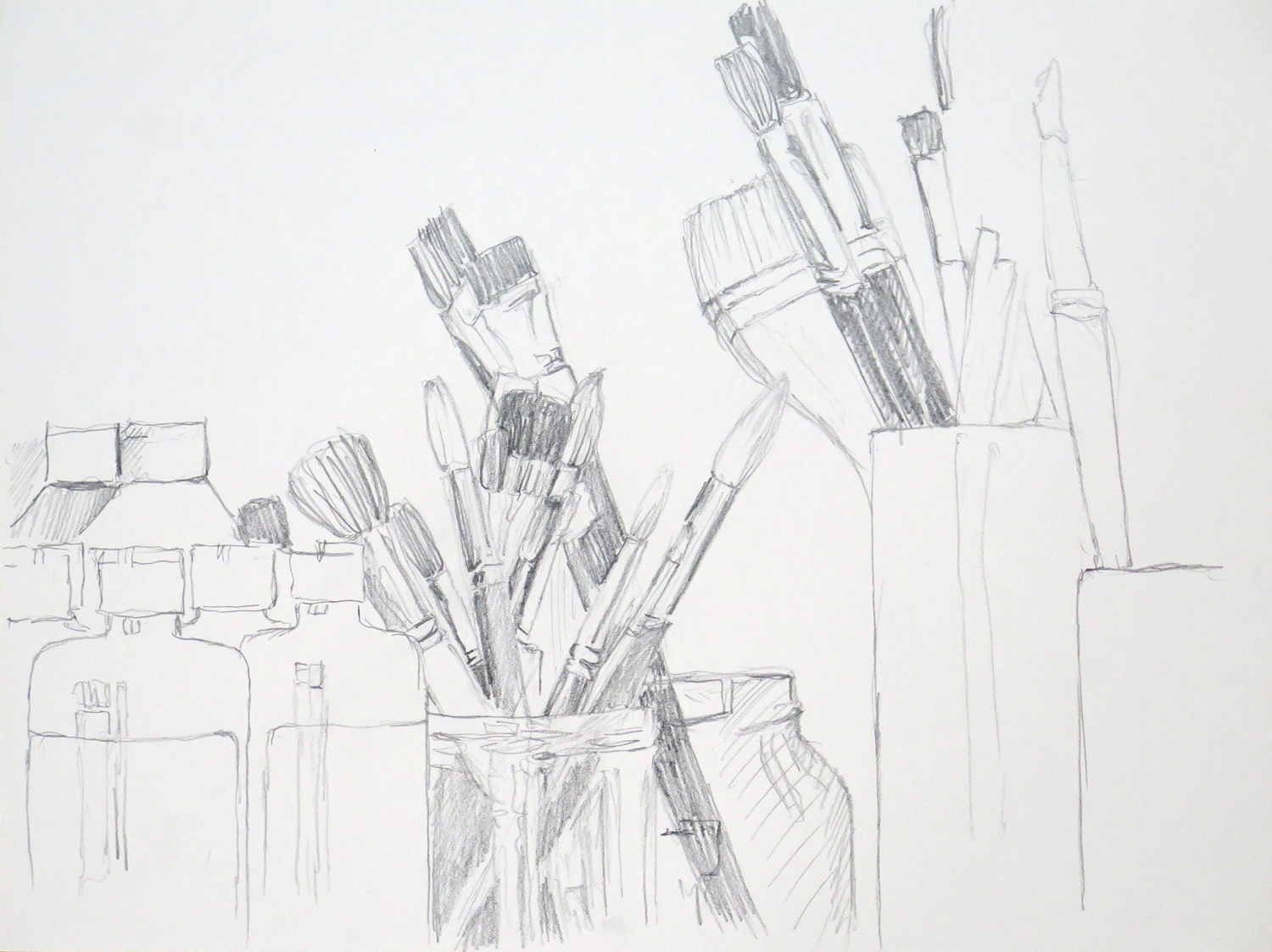
Paint and Brushes

IMG_5377
Pencil on paper, 23 x 30 cm

A view on my painting utensils in the cupboard. I used a viewfinder to determine the composition. I wish I had stronger emphasized the contrasts to achieve darker blacks.


Accident

IMG_5379
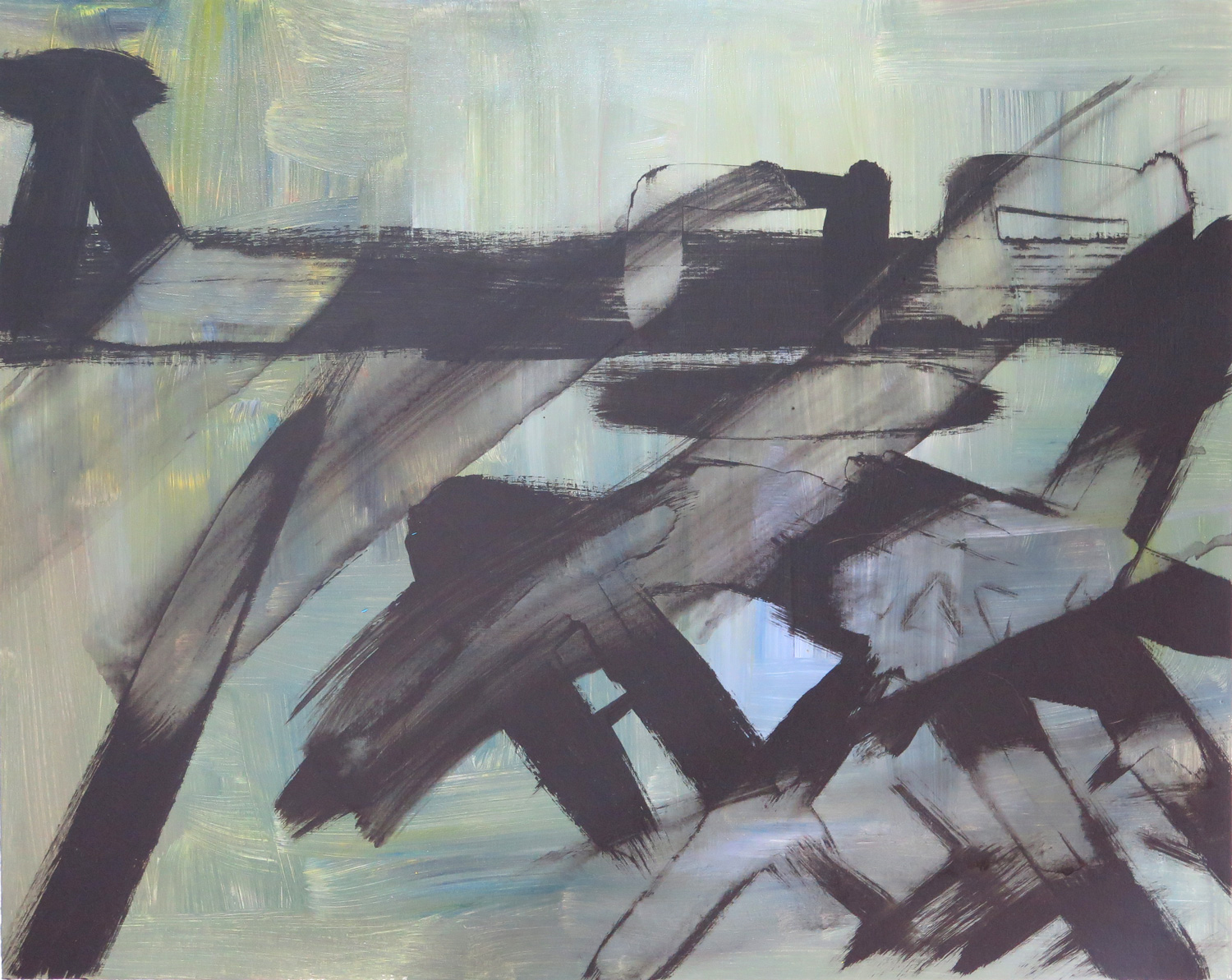
Acrylics on canvas, 40.5 x 51 cm

This piece was inspired by Franz Kline. I was thinking of his huge black and white paintings that look as if they were made with strokes of a single, huge brush. I wasn’t satisfied with my black marks and attempted to wash them away, which resulted in an interesting visual effect.


New York, Flatiron Building

IMG_5382
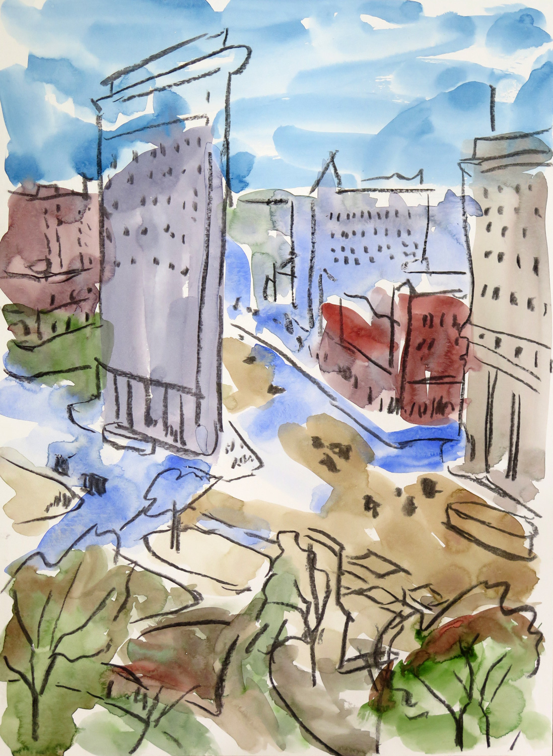
Watercolor and charcoal on paper, 38 x 28 cm

This was made after Samuel Halpert, The Flatiron Building, 1919. I wanted to stay very loose in approach and also took care to not rework into the watercolour brushstrokes. The charcoal lines on top give the painting structure and hold it together.


The boy (R)

IMG_5383
Colored charcoal on paper, 35.5 x 28 cm

A pice made after a photo on a psychological magazine issue that focused on race relations and the perspectives of young black people. The expression of the boy fascinated me – so much skepticism in his attitude, and somehow I sense that same thing in the portrait. Using charcoal was inspired by Natalie’s dead bird (April submission). I responded to the atmosphere of that piece.


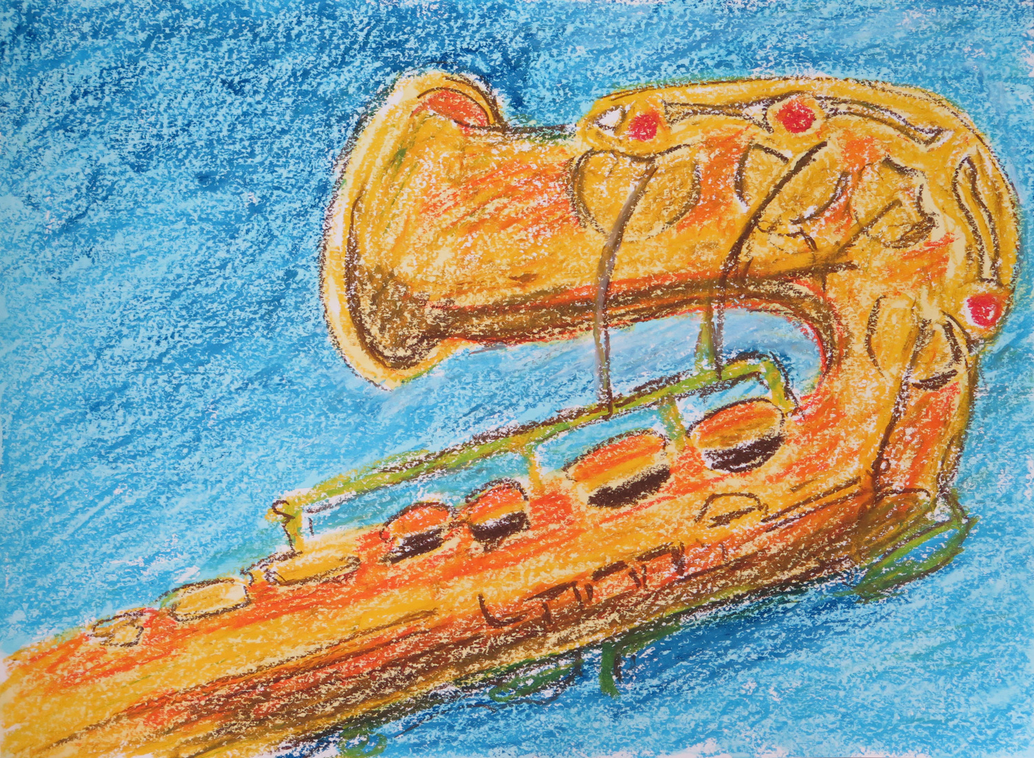
Saxophone (R)

IMG_5385
Oil pastels and watercolor on paper, 34 x 46 cm

I was inpired by the color choices in Natalie’s Entrance piece (April submission) and got back to the topic of my saxophone. I would like to develop this topic further towards abstraction – I’m very attracted by the technical details of the  instrument which reminds me of an era where elaborate steel constructions like the Eiffel Tower were created.
 

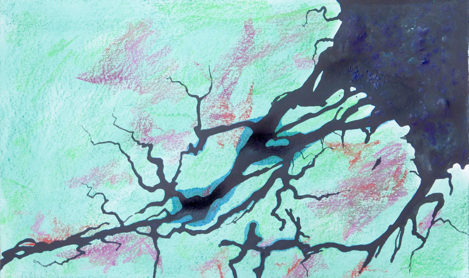
Amazonas (R)

IMG_5388
Dry pastels, ink and acrylics on paper, 28 x 46 cm

A response to Natalie’s Drifting Boats (April submission) I took the idea of a view from above as if from a satellite and worked after a satellite image of the Amazonas delta in Brazil. What fascinated me was the meandering of the intensely black-blue water into the landscape.
 

Save

Patricia: April


Geometrical composition

IMG_5344
Acrylics on paper, 30.5 x 40.5

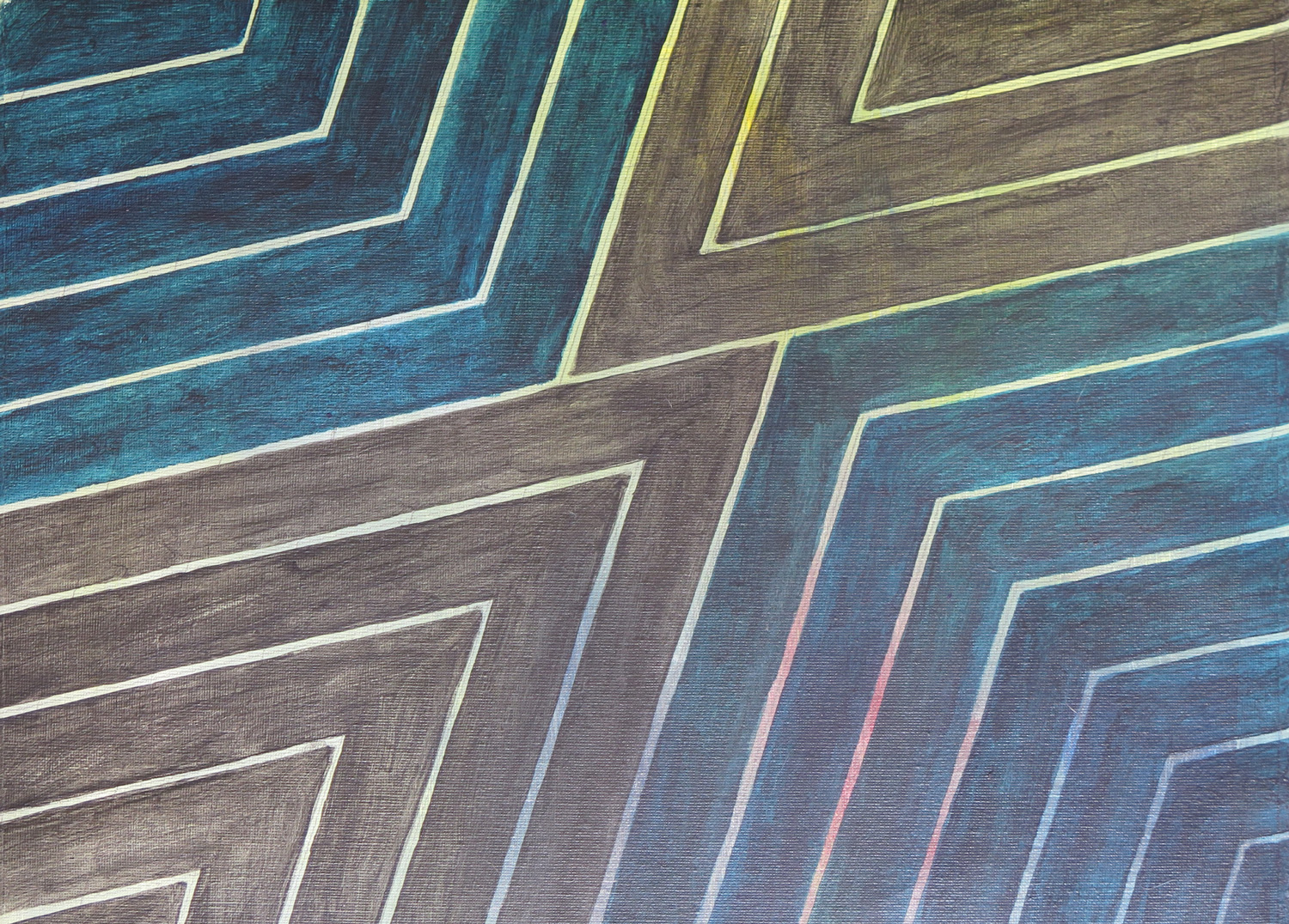
The painting took up an idea I developed while working through MoMA’s abstract expressionism course on Frank Stella. It was inspired by the geometrical structure of Stella’s “Empress of India” (1965). I was interested in the transparency of my paint which permitted the coloured background to shine through.
 

Terrace textures

IMG_5363
Coloured graphite on paper, 45.5 x 60.5 cm

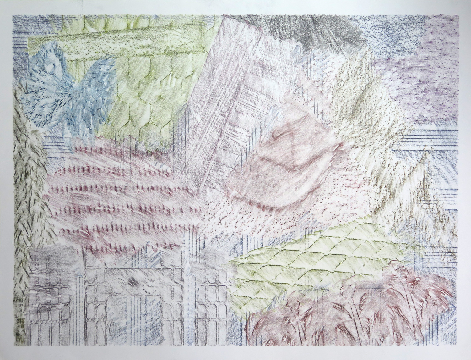
This piece features the frottage technique. I went out on the terrace and rubbed off all kinds of textures I found: Stone, wood, terracotta, basket, plastic, wire mesh. Using different graphite colours, a kind of abstract composition developed.


Saxophone detail

IMG_5364
Pencil on paper, 35.5 x 43

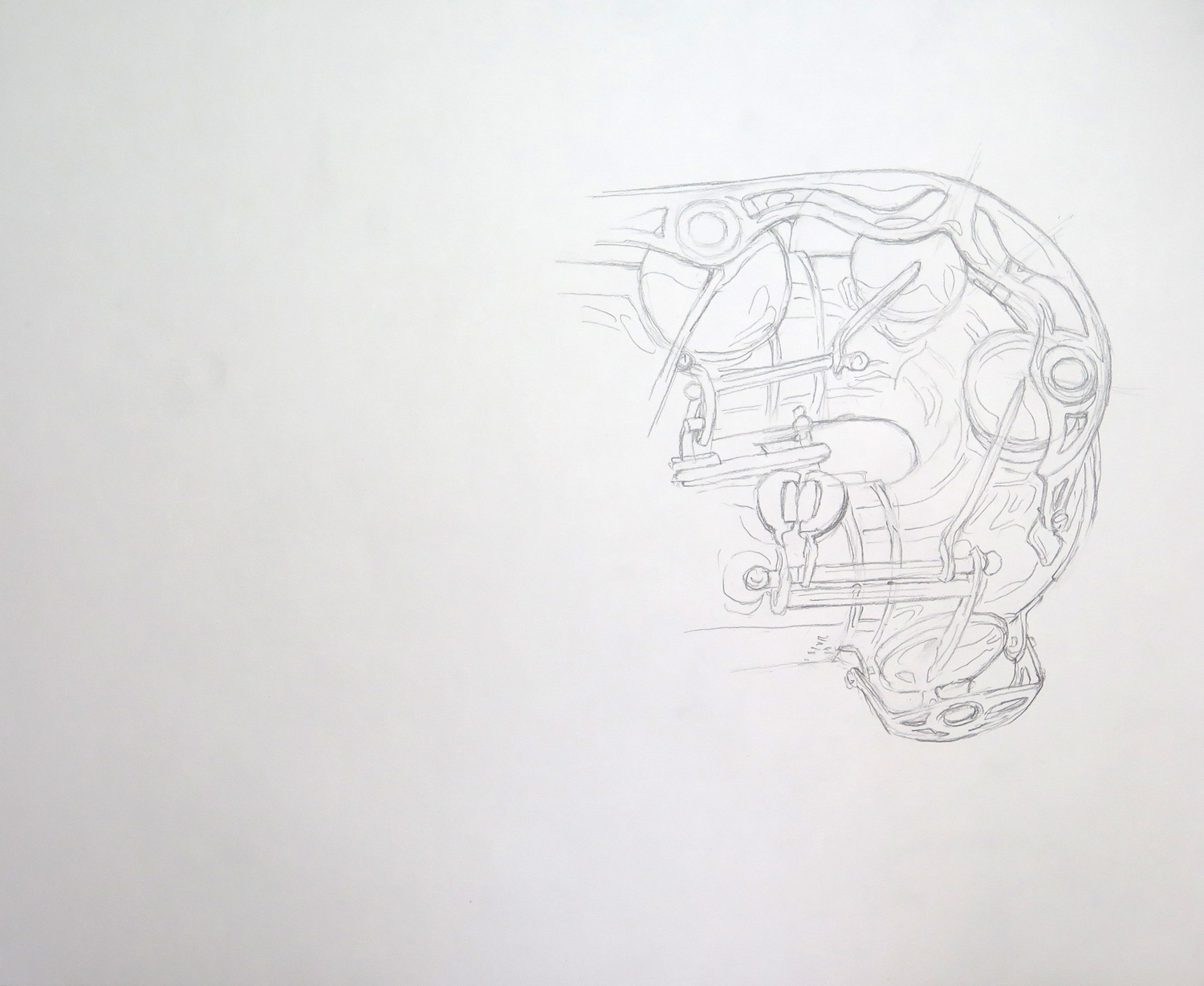
The saxophone is a really complicated object by its construction, and it comes with a very shiny/reflective surface. I attempted only a section and focused on line, trying to capture both constructive details and some of the reflections without recurring to shading.


Dark texture (R)

IMG_5366
Monoprint on paper, 39 x 56 cm

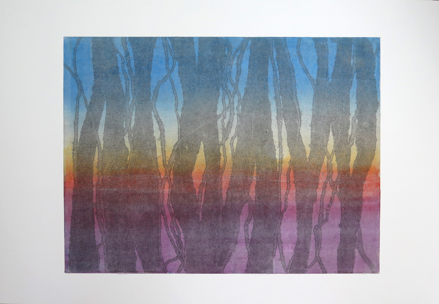
The piece was inspired by Natalie’s ‘Colour relations’ (March 2016), which I perceived as influenced by Jackson Pollock in the elements of dripping and strong primary colour contrasts. I started with the idea of having a black texture over coloured ground and developed a two-layer monoprint. The process was relatively complex and I wished the black ink would have come out somewhat stronger.


Highrise pattern (R)

IMG_5369
Ccoloured graphite on paper, 22.5 x 30 cm

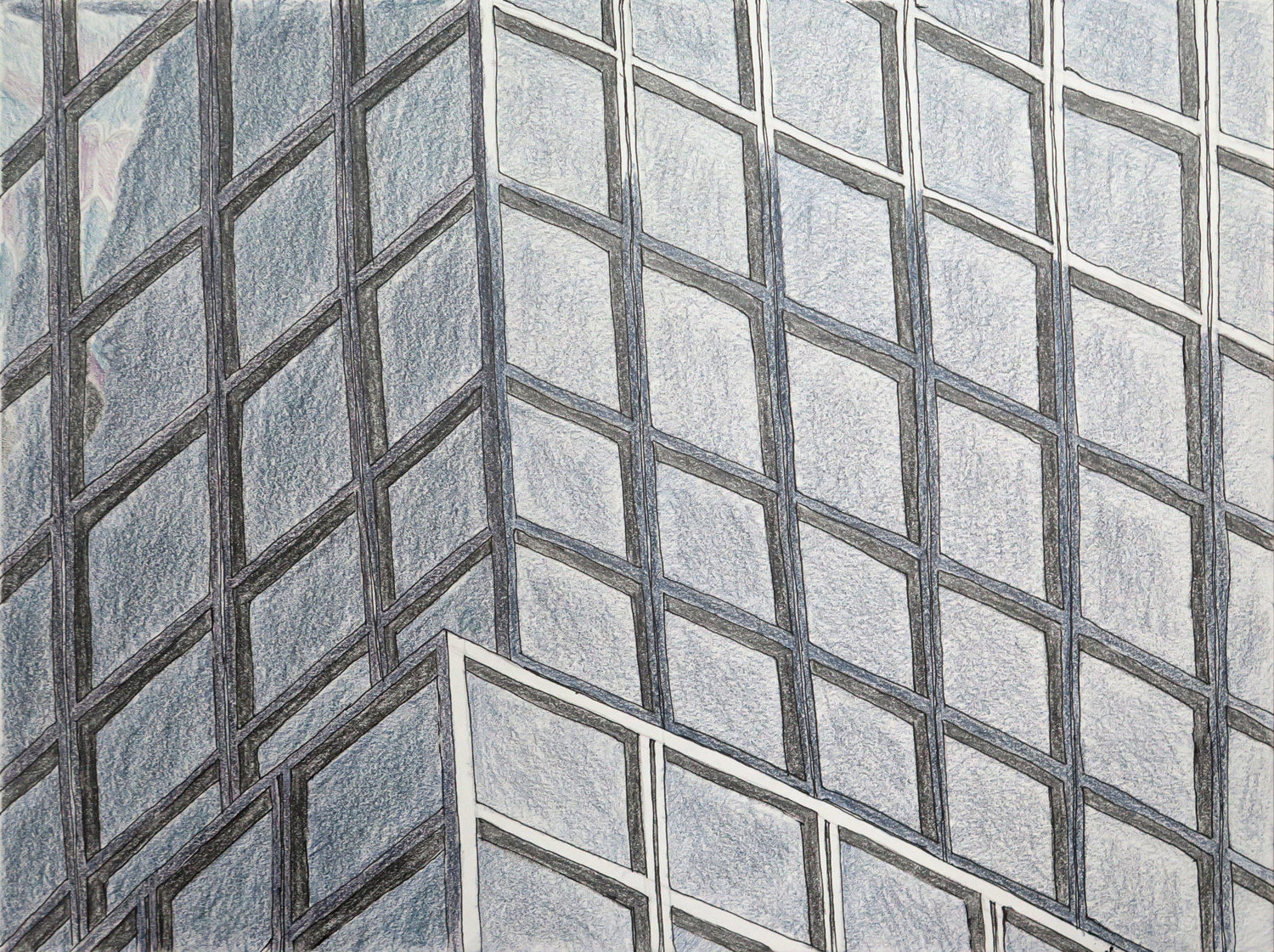
This piece was inspired by Natalie’s Architecture study 1 (March 2016), which reminded me of my obsession with the glass and steel facades of the highrises in New York City. I had approached the topic earlier with the more comprehensive image of a skyscraper skyline (January 2016, Manhattan Highrise surface fabric), but my fascination is more with the detail patterns of individual buildings. This piece focuses on the geometric pattern in a section of a larger building.


Twigs (R)

IMG_5370
Watercolour on paper, 30 x 22.5 cm

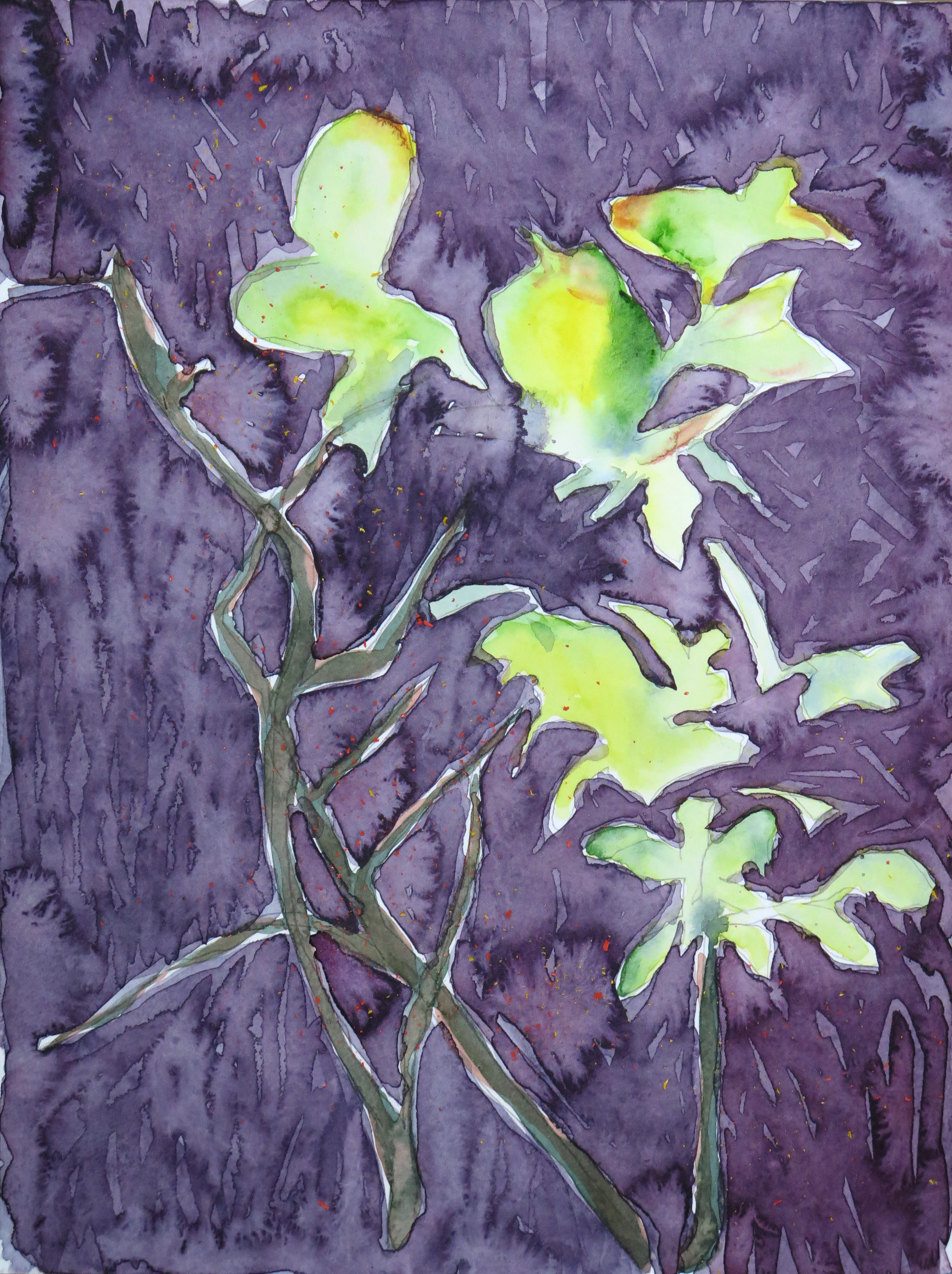
The twigs are based on a quick continuous line drawing of a plant on my terrace. The piece is a response to Natalie’s ‘Sunshine’ watercolour landscape (March 2016). My main focus was on watercolour effects and experimenting with wet-in-wet and wet-over-dry techniques.


Patricia: March

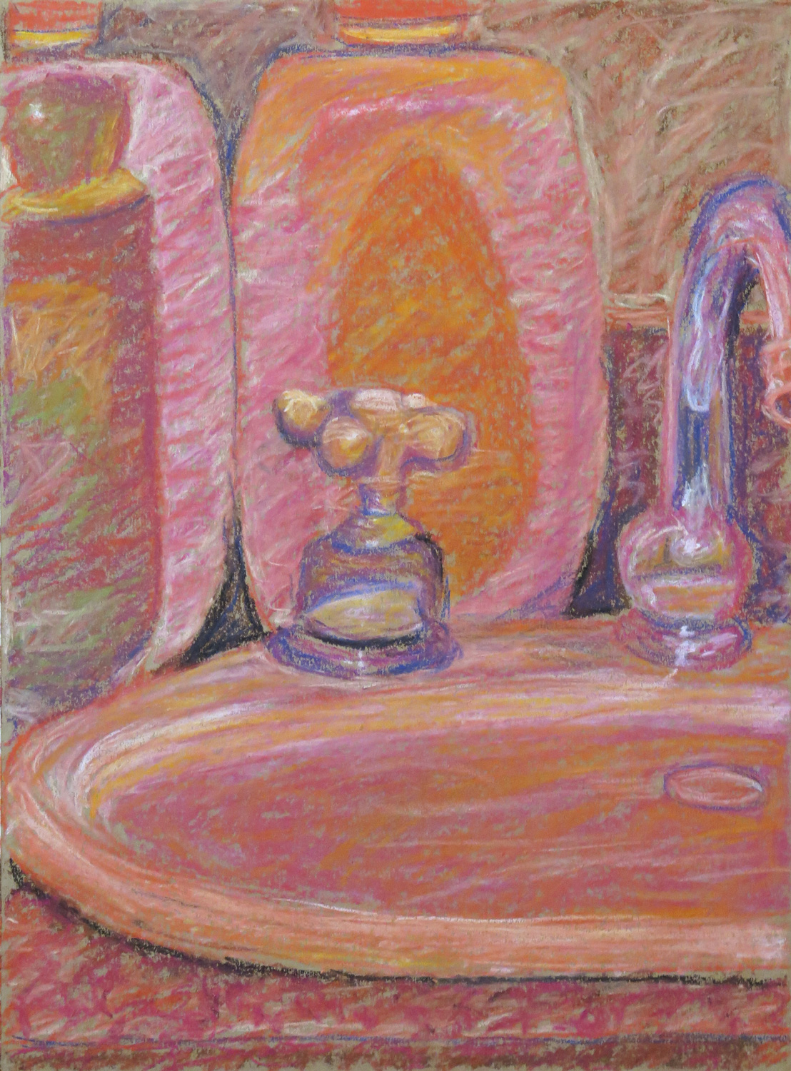
Bathroom still life

IMG_5295
Pastel on paper, 41.5 x 30 cm

Inspired by Ad Reinhardt, I was working towards the idea of making a monochrome red painting. In this sketch I tried to depict the actual colours and the values of the objects in different red tones.


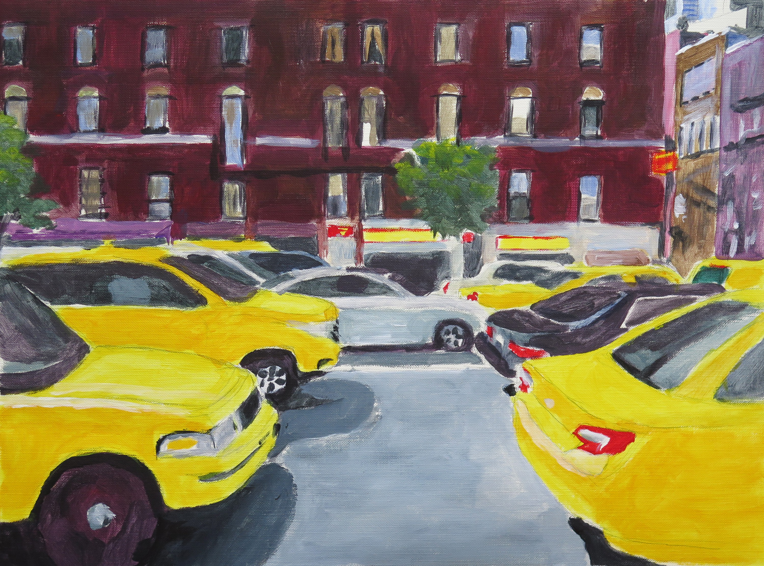
At the bus stop (R)

IMG_5297
Acrylics on paper, 31 x 31 cm

Response to Natalie’s A little walk around the town (Aktau, February 2016). I liked the casual treatment of the cars and went from there to make a painted sketch of a city view. Initially I wanted to capture the movement of the cars through blurring the painting, but then liked it as it was and retained the clear outlines.


Terrace

IMG_5300
Pencil on paper, 35.5 x 28 cm

A study for a possible later painting where I’m aiming at abstracting from the objects towards a focus on the geometrical nature of the composition..


Deep water

IMG_5301
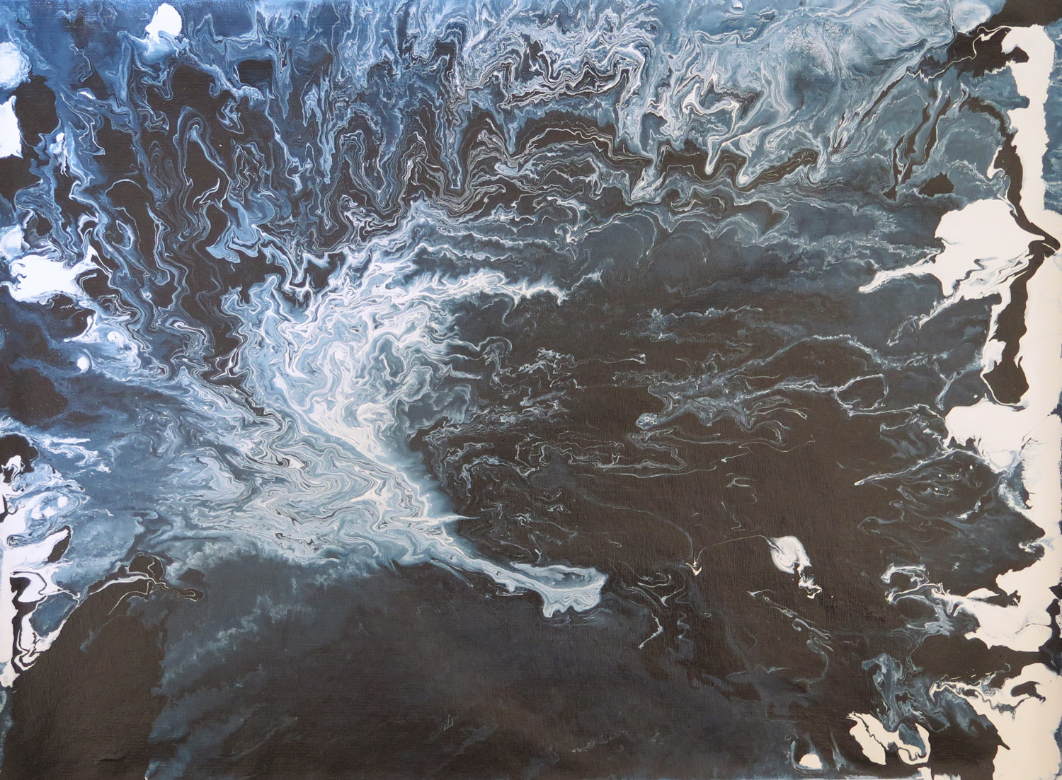
Latext enamel paint on canvas, 45 x 60 cm

Taking up an earlier idea to depict fluidity by pouring paint, I experimented with enamel paint thinned down to different degrees. Pouring on a flat surface and lifting the canvas to an angle made the paint follow gravity and move across the canvas.


Looking out (R)

IMG_5306
Acrylics on paper, 23 x 30.5 cm

Responding to Natalie’s painting ‘Abandoned site’  (February 2016) and bringing further the idea of abstracting from an outdoor view. The painting is also related to the ‘Terrace’ sketch as it is a first step towards the idea of geometrical abstraction from real objects.


Floating shapes (R)

IMG_5308
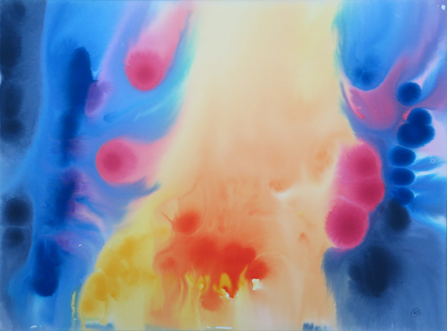
Watercolour on illustration board, 38.5 x 51 cm

This piece is a response to Natalie’s sunset painting (February 2016). I took up the idea of a gradation in colour which I wanted to achieve through a wet-in-wet technique. The paint behaved differently from what I expected but I found the effects interesting. The shapes look like cells from a living organism.