Category Archives: June

Patricia: June


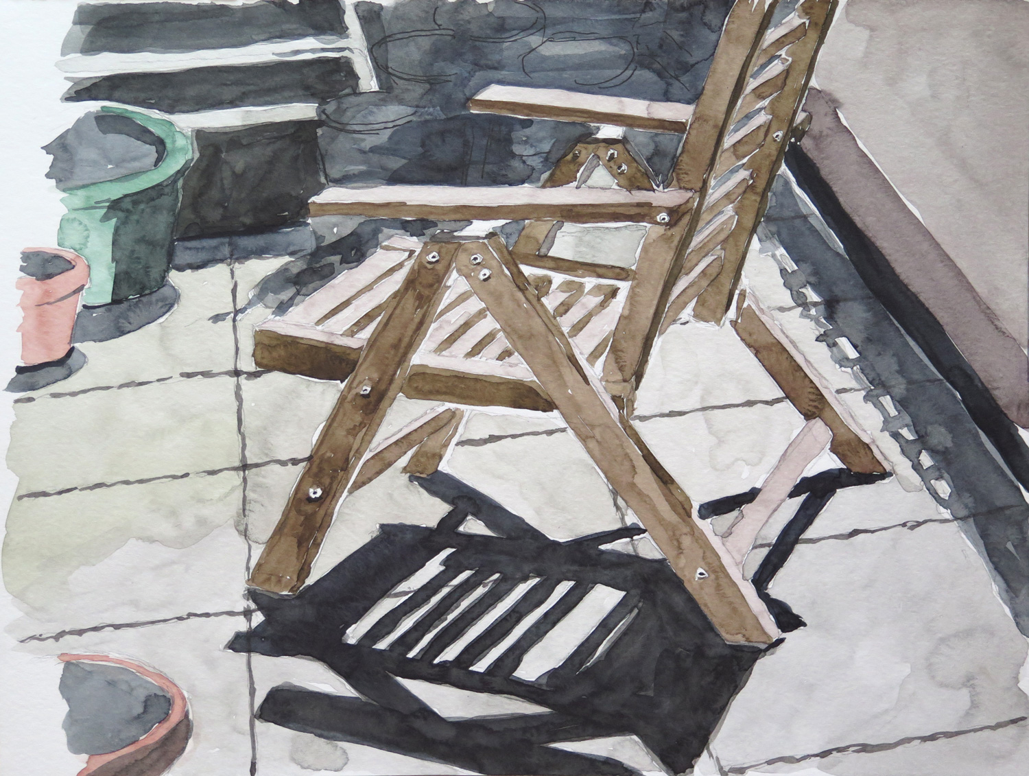
Chair on the Terrace
IMG_5666
Watercolour on paper, 23 x 30 cm

The shadow pattern on the floor and the strong contrasts in this view of the terrace were my main interest in this study.

Planters on the terrace

IMG_5668
Watercolour on paper, 23 x 30 cm

Normally I’m not so willing to depict the unorderly collection of things on my terrace, but I liked the composition of this view.

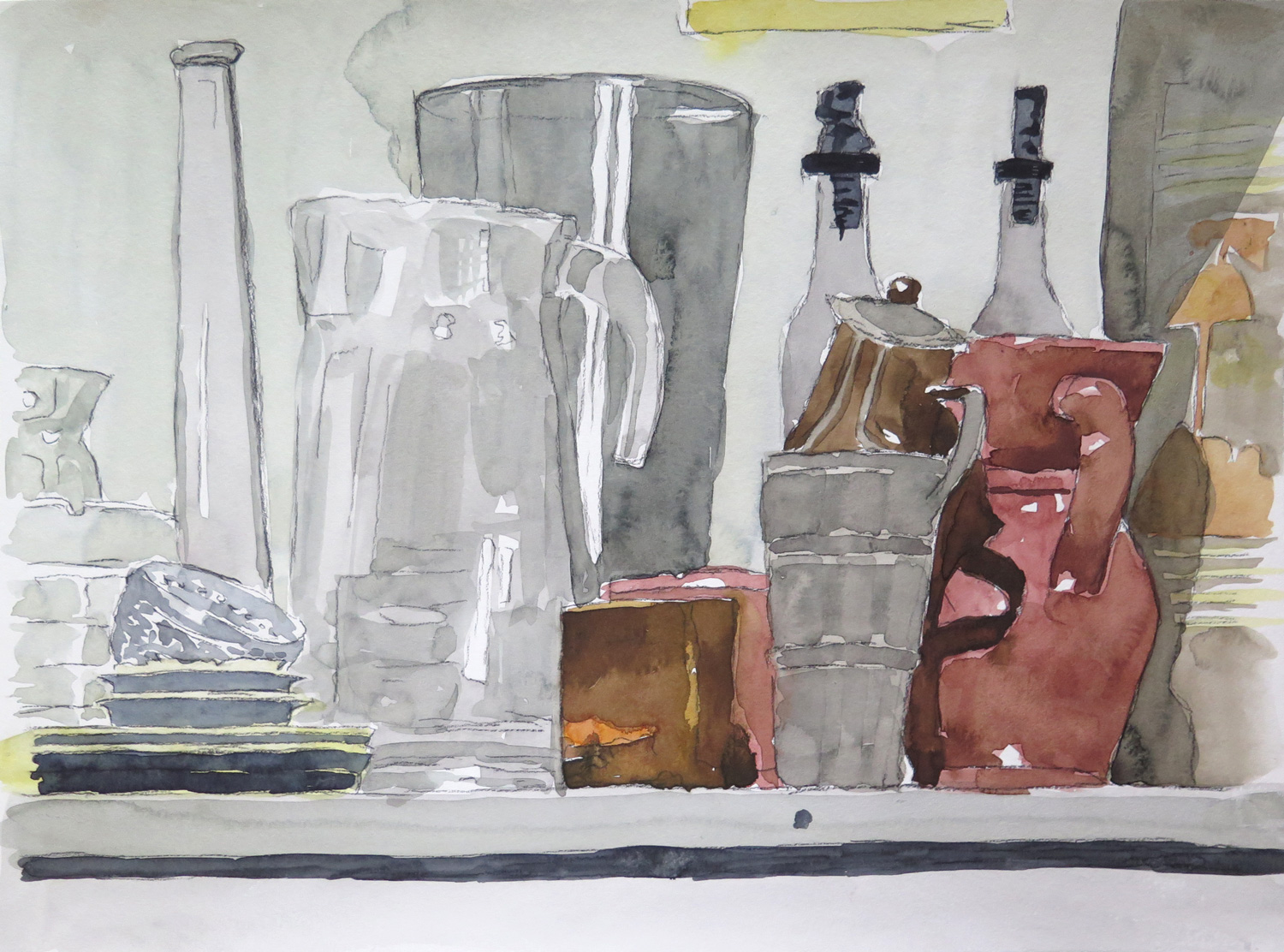
Still life with pitchers
IMG_5670
Watercolour on paper, 30 x 46 cm

The transparency and reflections on the glass objects caught my attention. It was a found still life, not arranged. I tried to depict the different materials: glass, metal, and ceramics.

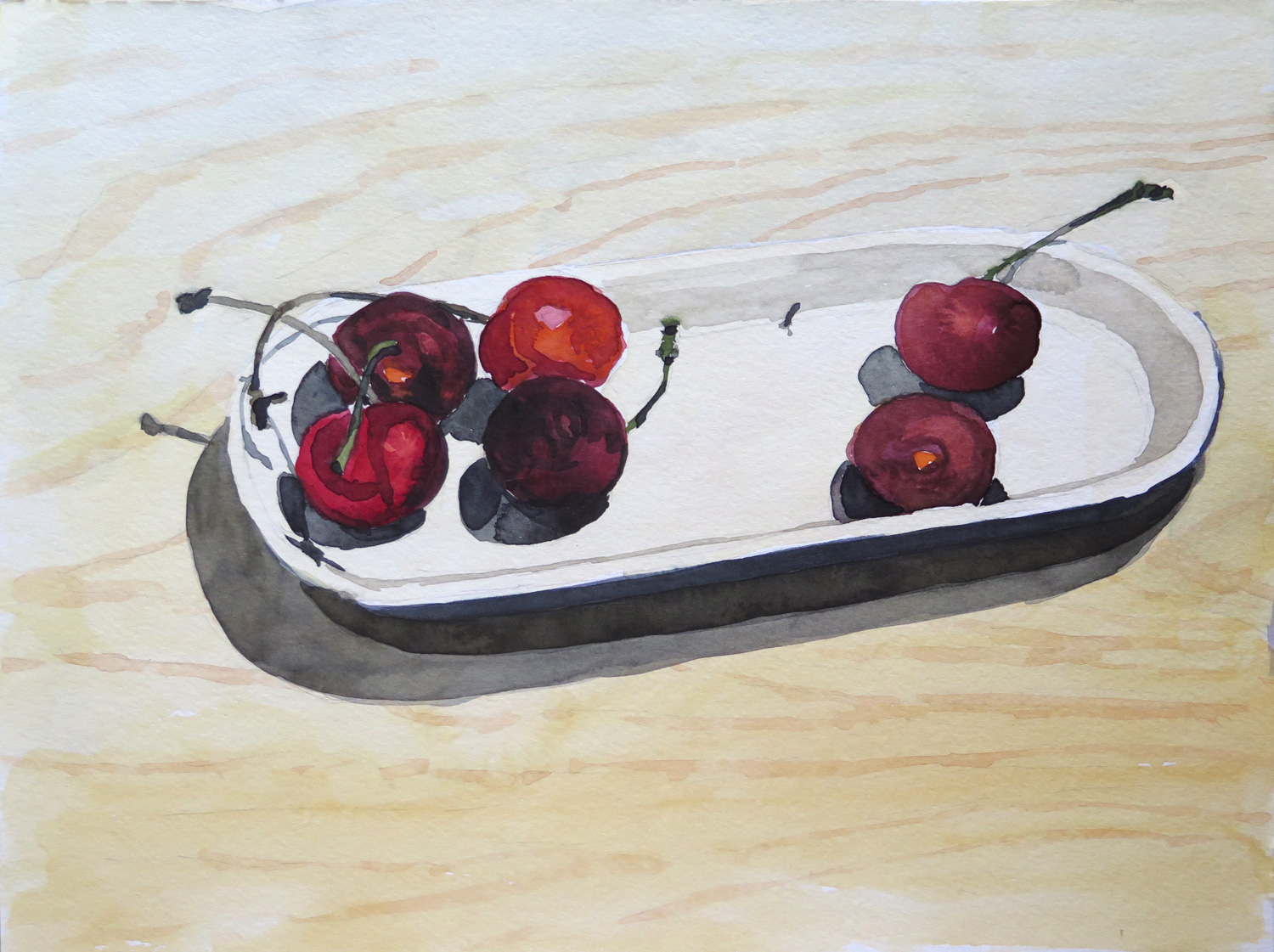
Cherries (R)
IMG_5672
Watercolour on paper, 23 x 30 cm

Inspired by Natalie’s Collage with fruits (May 2016), where I particularly liked the dark purple grapes, I chose a few cherries for a close-up study.

Staten Island Ferry Station (R)

IMG_5665
Oil on paper, 40 x 50 cm

A view from the boardwalk area behind the ferry station. I liked the bold colours of the ferry boat next to the blue water and was also attracted by the industrial character of the backyard which isn’t directly accessible to the public. (Inspired by Natalie’s Shipyard 2, May 2016)

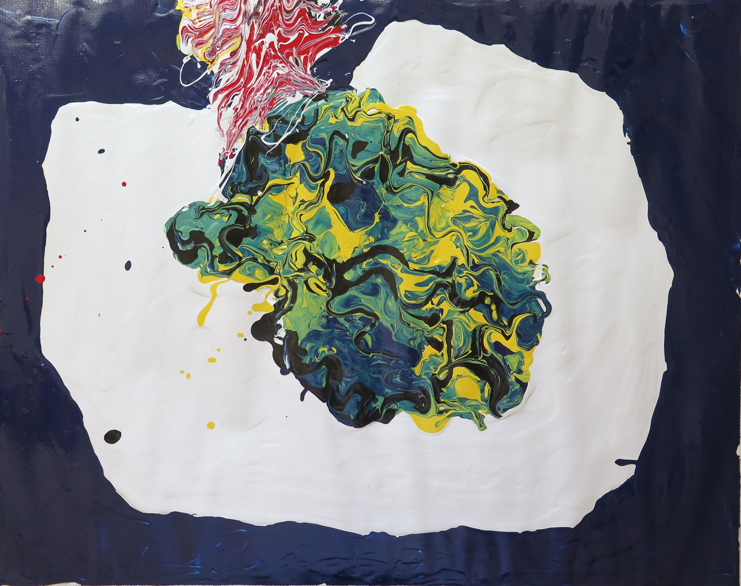
Abstract composition (R)
IMG_5674
Latex enamel paint on paper, 40 x 50 cm

I was attracted by the wiggly lines and the yellow to green to dark blue colours in Natalie’s Salad on a table (May 2016). It inspired me to do a poured paint abstraction using a spoon and knives to spread out and mix the thick paint directly on the support.
Save

Save

Natalie: June

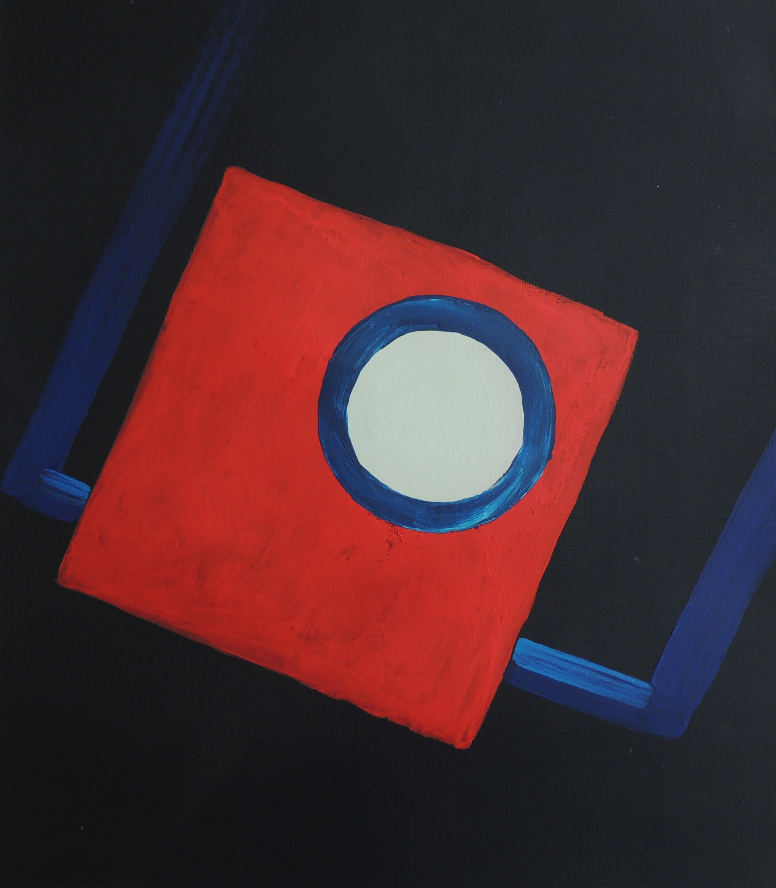
Dark Room

June 3
Acrylic on paper, 25,5 x 29 cm

This painting is concerns the expression of my childhood memories. My father used to take a lot of family photographs, which he developed himself (as a hobby). We are talking about the 70’s. He used to teach me how to use the equipment when I was about 7-8 and I wanted to recreate a sense of the developing room. The red square represents red light of the dark room, the white circle is the photographic enlarger’s lens and the blue rectangle represents the trays containing the liquids where the actual images are developed.


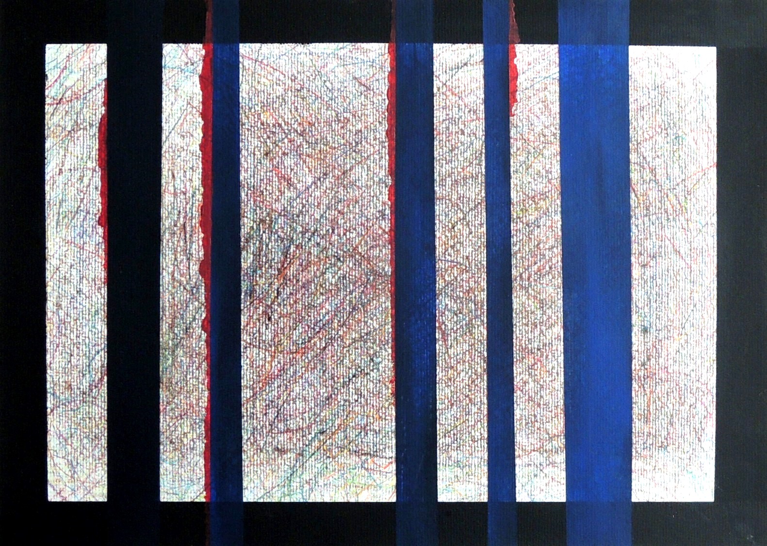
Under control (R)

June 2
Colour pencils, acrylic on paper, 29,7 x 42 cm

This is a response to Accident (Patricia, May, 2016). I wasn’t sure whether Patricia’s title referred to an ‘’accidental/experimental’’ outcome using paint or to the presentation of the actual life event. The title itself took over the visuals for the first time in my response, and towards the its most extreme meaning. I wanted to represent human suffering under the fully controlled and manipulative actions of others, i.e. no accidents, but a fully controlled events.


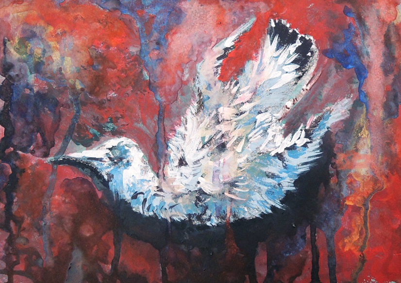
Dead bird 2

June 1
Watercolours, soft pastels, gouache on grey paper, 21 x 29 cm

This is a continuation of the Dead Bird study (March, 2016), but in colour, to emphasise the dramatic events of life and death.


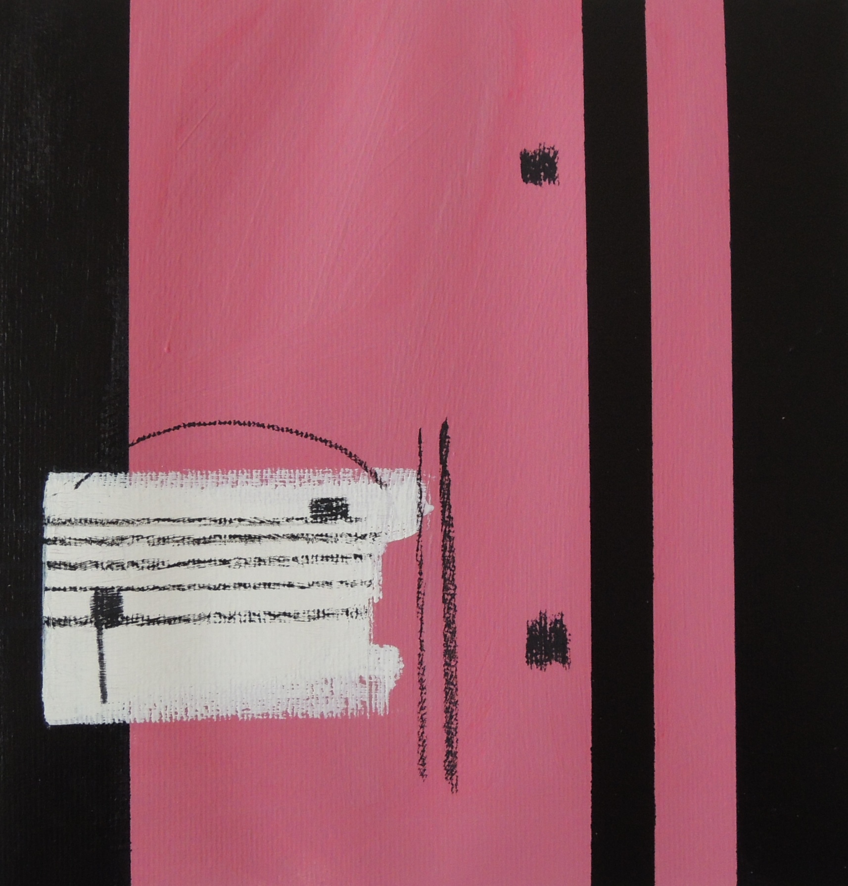
Repeat (R)

June 6
Acrylic, oil pastels on paper, 27 x 28 cm

This is my response to Patricia’s Saxophone (May, 2016). If a musical instrument is present then the sheet music is never far from it. The two dots and the vertical lines next to them (on the right) is a musical sign for ‘repeat’. It is usually placed at the end of a particular section that the composer wants to be repeated one more time (sometimes twice or more).


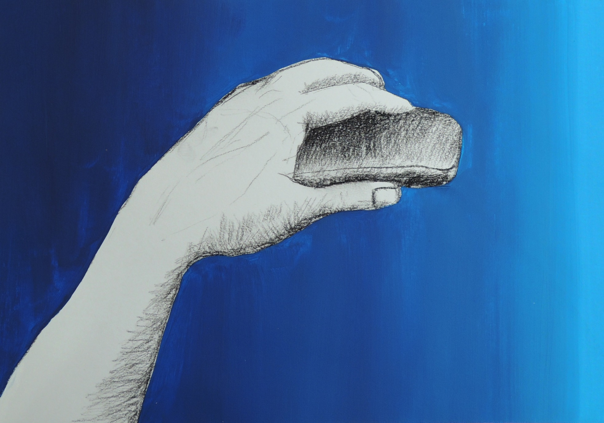
‘’The creation of God Box’’

June 4
Charcoal, acrylic on paper, 21 x 30 cm

The initial idea was to study a hand with a small remote control in it but soon it was turned into a pop art. The title came afterwards and part of it was borrowed from Michelangelo’s Creation of Adam painting (fresco).


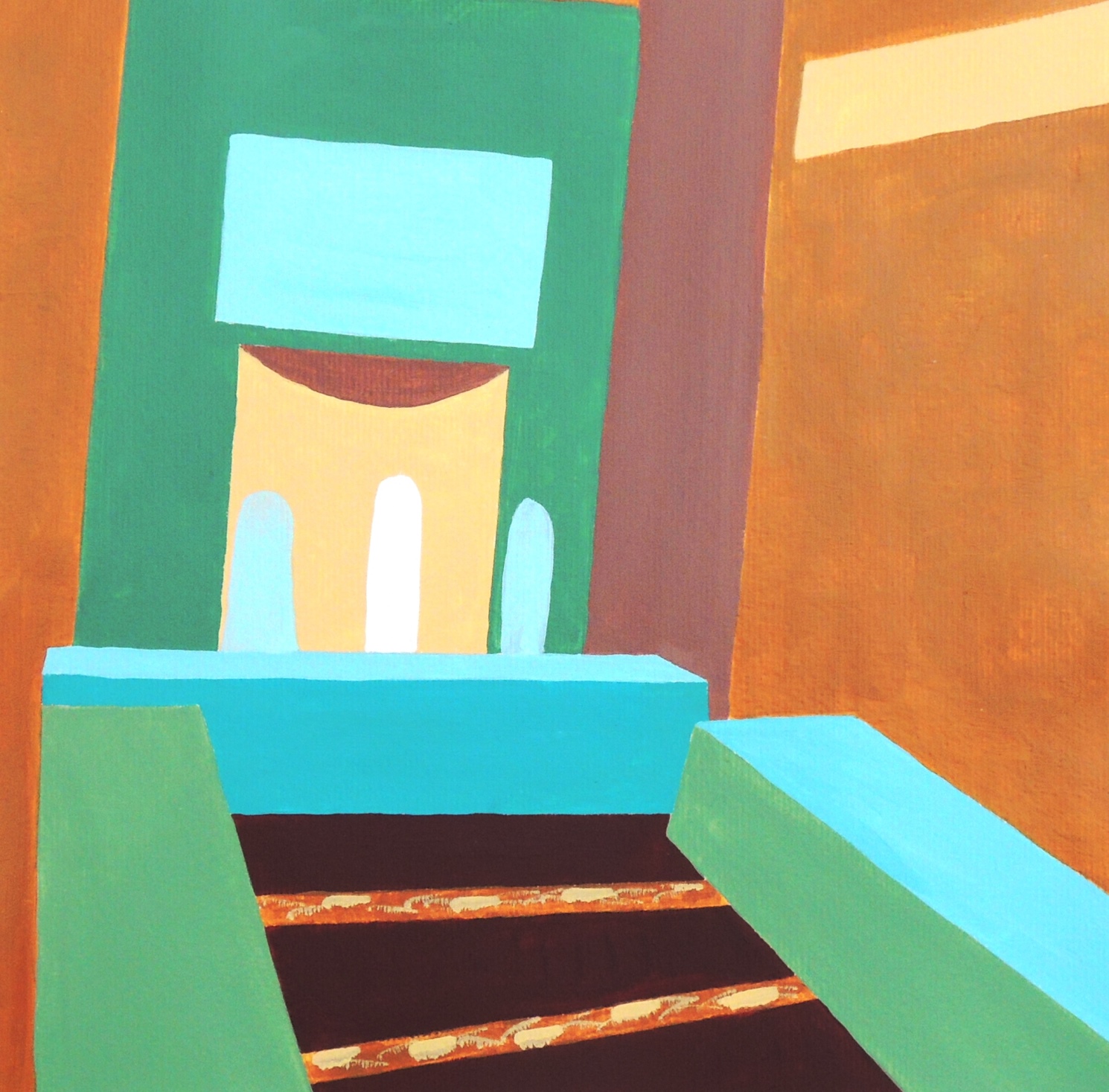
In the room (R)

June 5
Acrylic on paper, 28 x 28 cm

This is my response to Patricia’s New York, Flatiron Building (May, 2016). I used an image from the local news as a source of inspiration. It represents an interior in one of the local mosques and I found its colour scheme quite fresh and calming. I would like to mention that the original colours of the place are much lighter and with a white background instead of the yellow ochre, and in general it’s far more delicate than my study attempt. I would like to come back to this subject later again.