Category Archives: April

Patricia: April


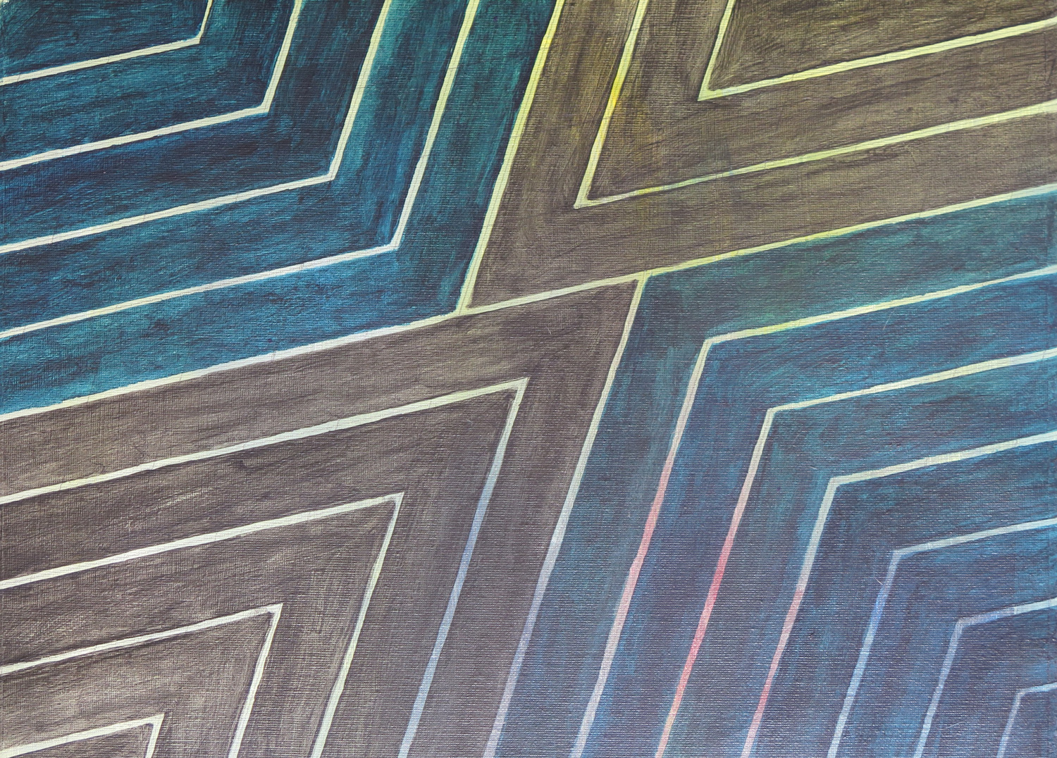
Geometrical composition
IMG_5344
Acrylics on paper, 30.5 x 40.5

The painting took up an idea I developed while working through MoMA’s abstract expressionism course on Frank Stella. It was inspired by the geometrical structure of Stella’s “Empress of India” (1965). I was interested in the transparency of my paint which permitted the coloured background to shine through.


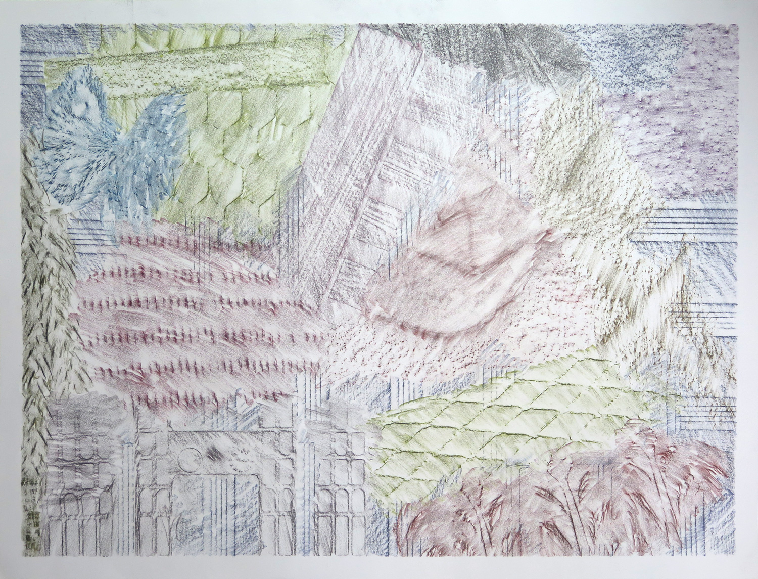
Terrace textures
IMG_5363
Coloured graphite on paper, 45.5 x 60.5 cm

This piece features the frottage technique. I went out on the terrace and rubbed off all kinds of textures I found: Stone, wood, terracotta, basket, plastic, wire mesh. Using different graphite colours, a kind of abstract composition developed.


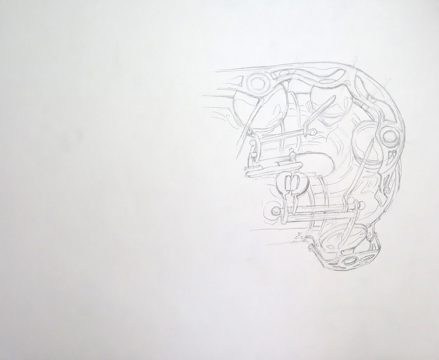
Saxophone detail
IMG_5364
Pencil on paper, 35.5 x 43

The saxophone is a really complicated object by its construction, and it comes with a very shiny/reflective surface. I attempted only a section and focused on line, trying to capture both constructive details and some of the reflections without recurring to shading.


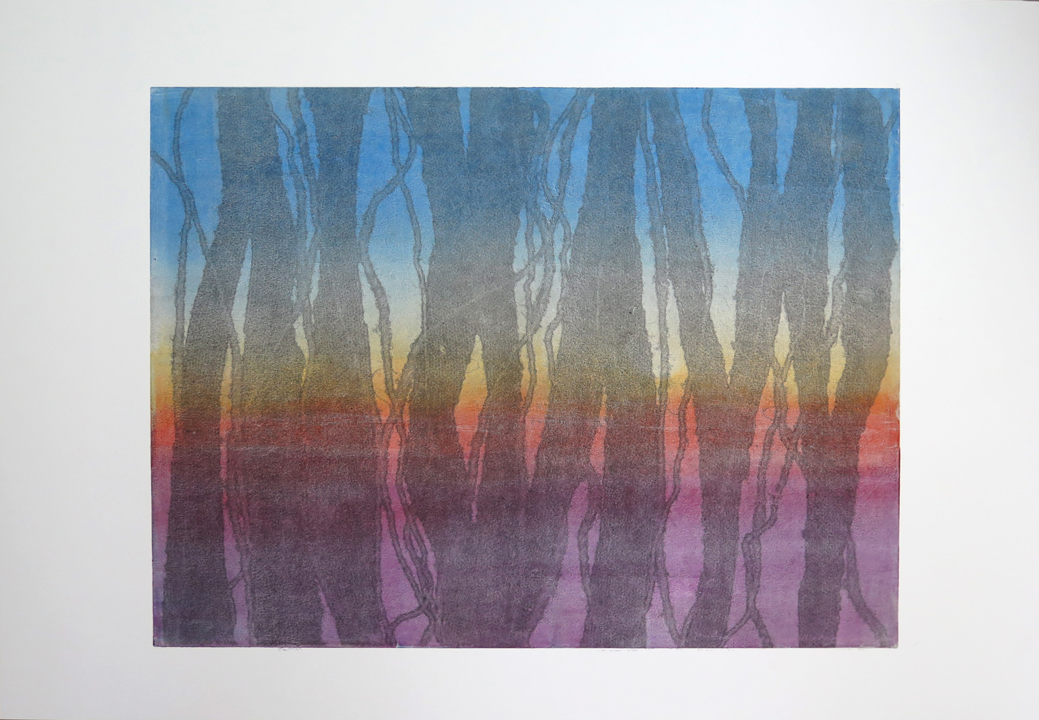
Dark texture (R)
IMG_5366
Monoprint on paper, 39 x 56 cm

The piece was inspired by Natalie’s ‘Colour relations’ (March 2016), which I perceived as influenced by Jackson Pollock in the elements of dripping and strong primary colour contrasts. I started with the idea of having a black texture over coloured ground and developed a two-layer monoprint. The process was relatively complex and I wished the black ink would have come out somewhat stronger.


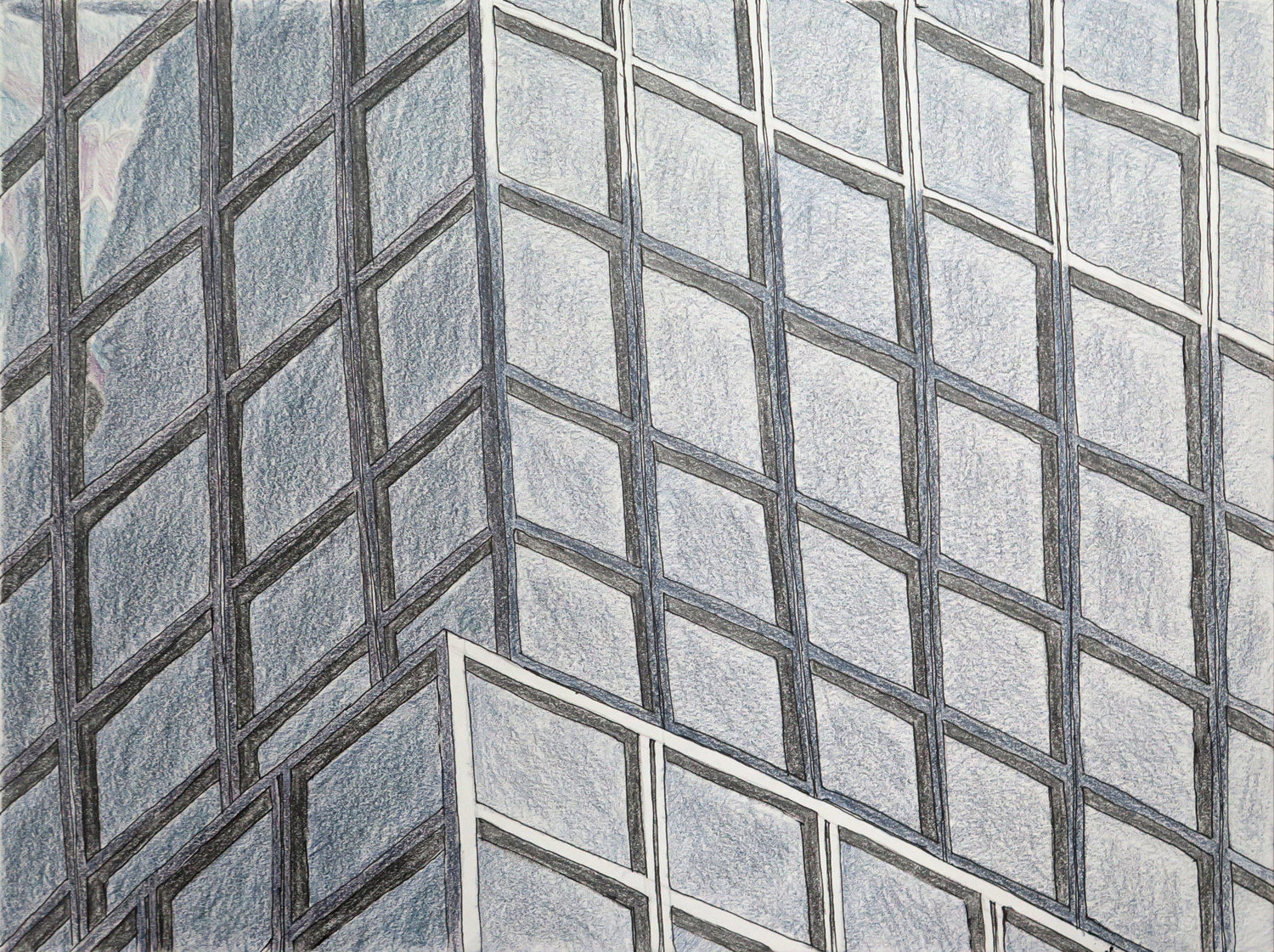
Highrise pattern (R)
IMG_5369
Ccoloured graphite on paper, 22.5 x 30 cm

This piece was inspired by Natalie’s Architecture study 1 (March 2016), which reminded me of my obsession with the glass and steel facades of the highrises in New York City. I had approached the topic earlier with the more comprehensive image of a skyscraper skyline (January 2016, Manhattan Highrise surface fabric), but my fascination is more with the detail patterns of individual buildings. This piece focuses on the geometric pattern in a section of a larger building.


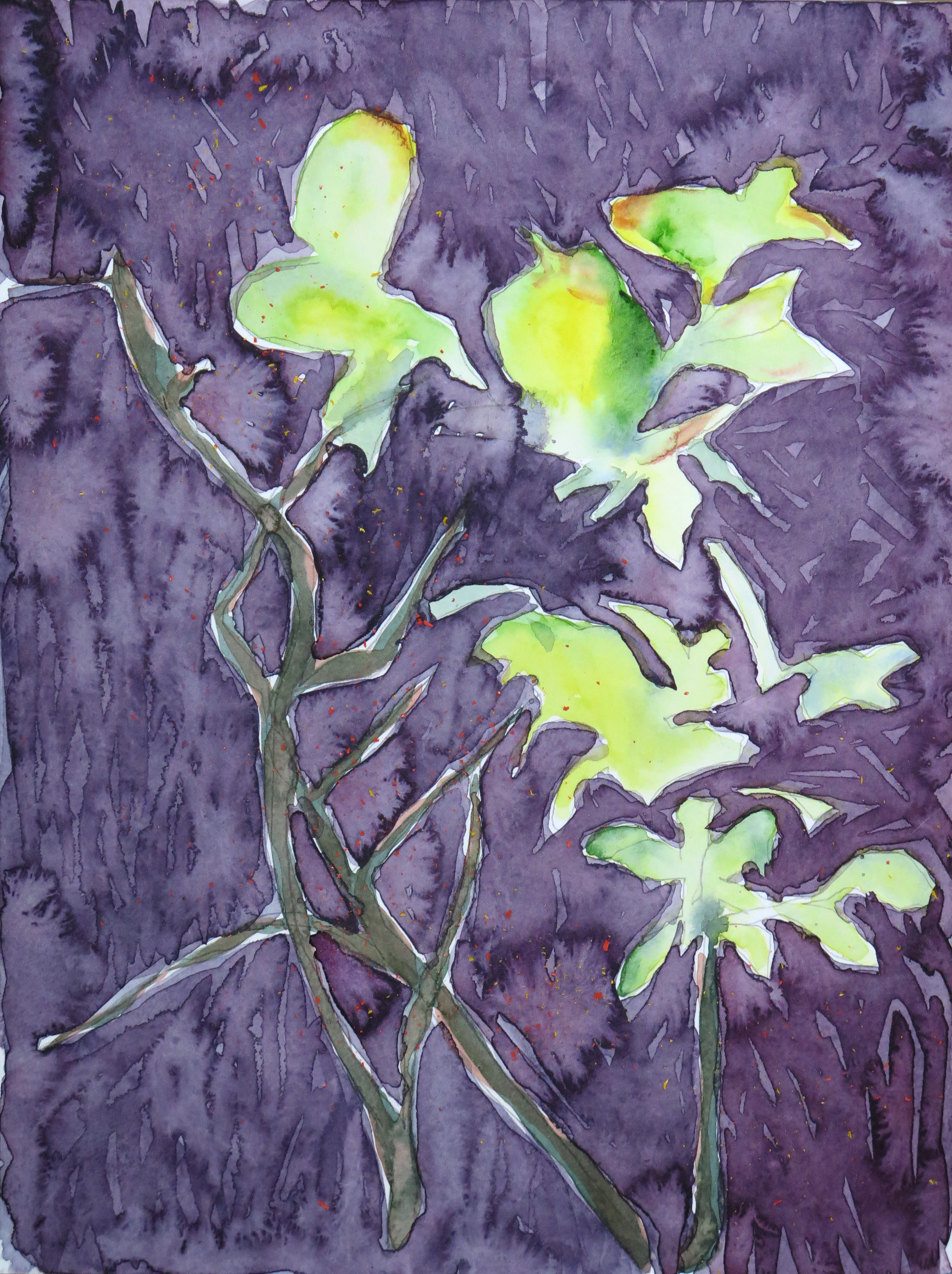
Twigs (R)
IMG_5370
Watercolour on paper, 30 x 22.5 cm

The twigs are based on a quick continuous line drawing of a plant on my terrace. The piece is a response to Natalie’s ‘Sunshine’ watercolour landscape (March 2016). My main focus was on watercolour effects and experimenting with wet-in-wet and wet-over-dry techniques.
 

Natalie: April

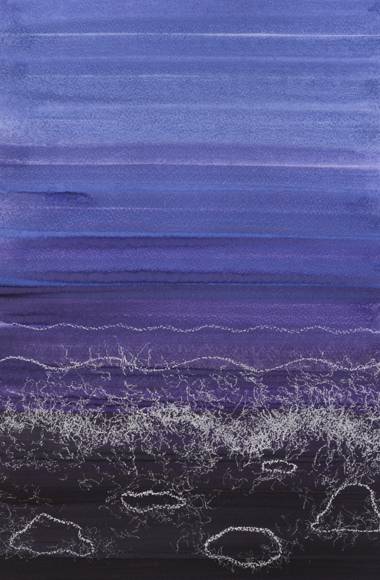
Seashore (R)

A3
Gouache, soft pastels on paper, 30 x 42 cm

This was a response to Patricia’s Deep Water (April) which has an incredibly organic appearance. I immediately wanted to form a rejoinder to continue the sea theme. I decided to create an abstract sense of waves and water bubbles, but through a fully controlled dry medium.


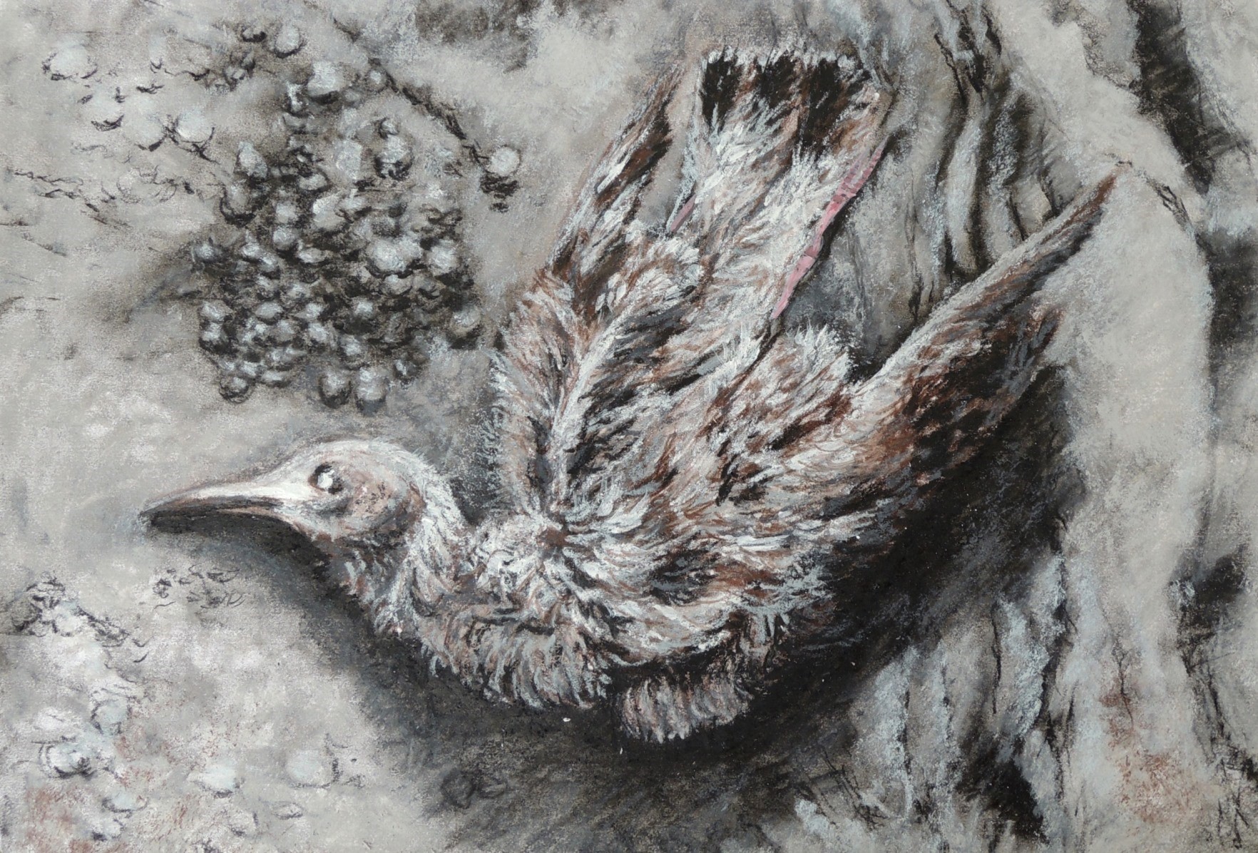
Dead bird

A4
Charcoal, soft pastels on paper, 21,5 x 29 cm

Whilst walking on the beach I saw a dead bird which I wanted to use for a more detailed study at home. I accordingly worked from a photograph and decided to use a limited pallet only.


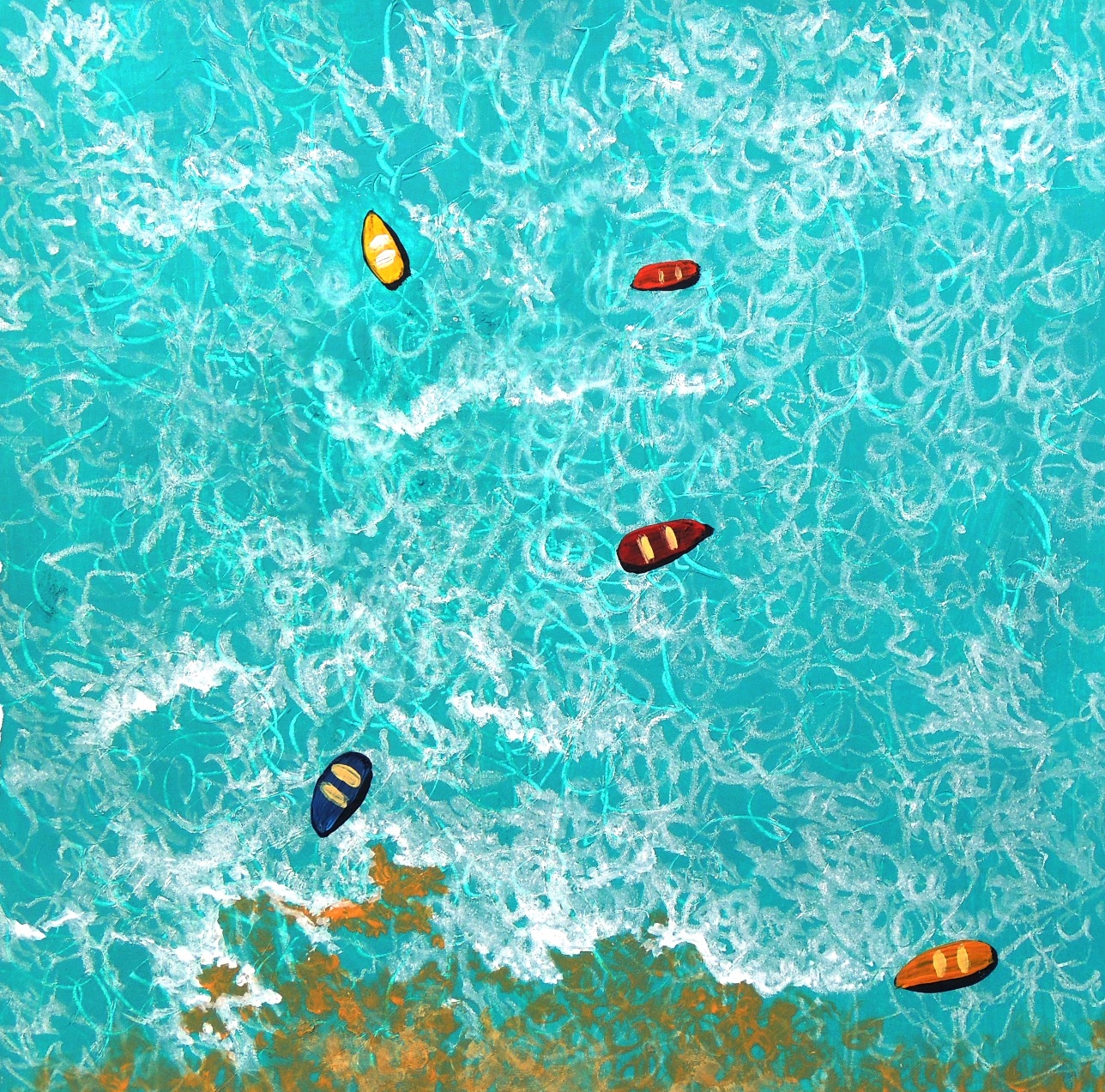
Drifting boats (R)

A3
Acrylic, soft pastels on paper, 20 x 20 cm

After seeing Patricia’s Floating Shapes (April), the first thing that came into my mind was a continuation of something swimming in the space. Since I was already working on one of the responses related to the sea theme, it was a rather natural progression to carry on with the subject matter. I really enjoyed working on these two in particular and I might come back to it again at a later time.


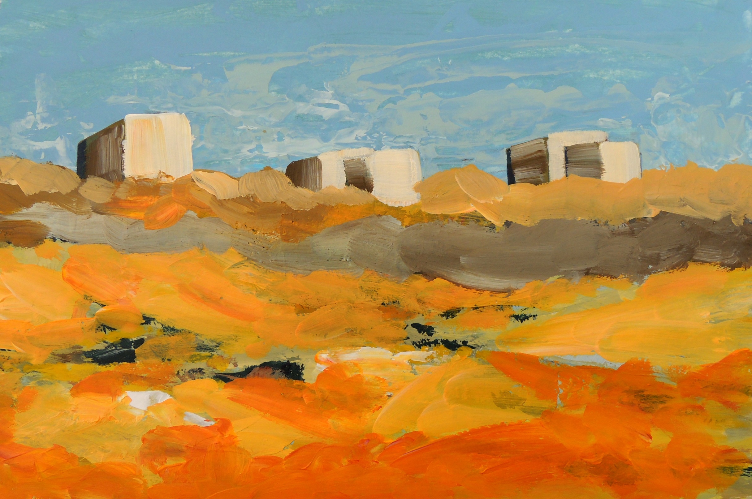
In the park

A2
Acrylic on paper, 21,5 x 29 cm

This study was in particurar a real struglle for me. I wanted to capture some dominant colours in the local park, but in a more realistic style. However, I didn’t like my first result as I found it too dull (colour wise). In the end I completey covered the original (dark) layers with, perhaps too bright and not entierly realistic (for this actual park) colours, but I was satisfied with the ‘’artistic license’’ that helped me to finish this work.


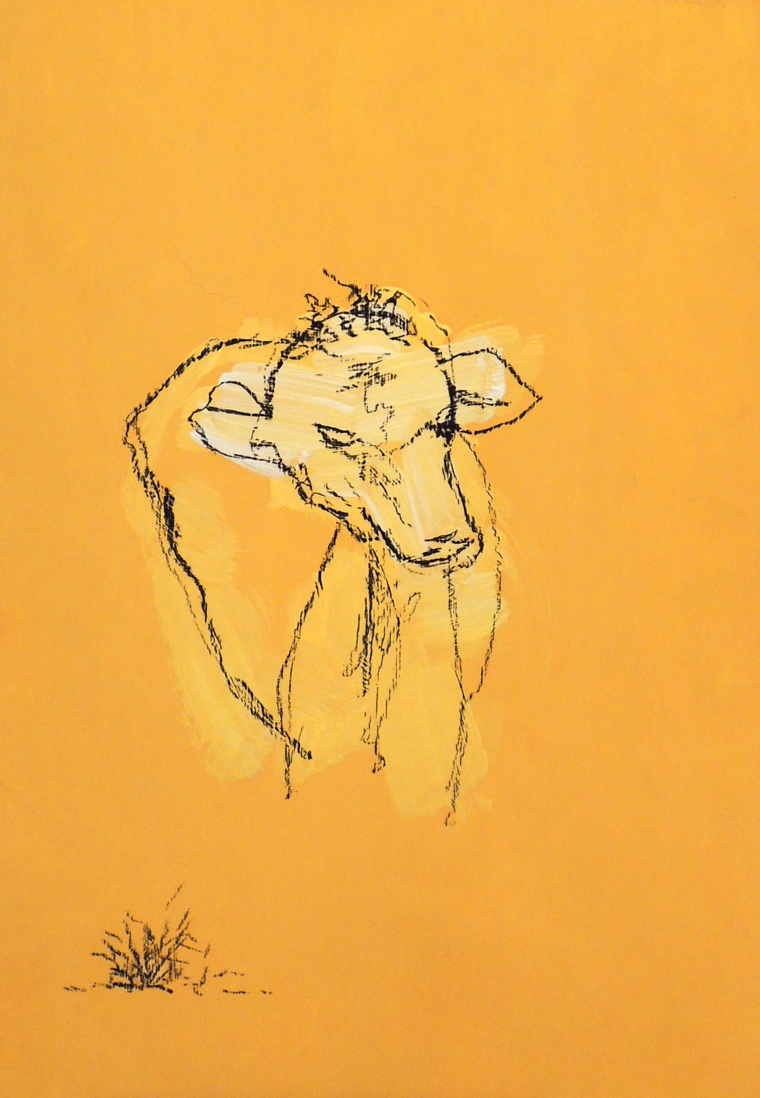
Cow’s head

A1
Acrylic, charcoal on paper, 14,5 x 21 cm

This study was one of the experimental line drawings, which I would like to develop further. I deliberately used a one colour pallet in order to maintain my focus on the actual subject itself.


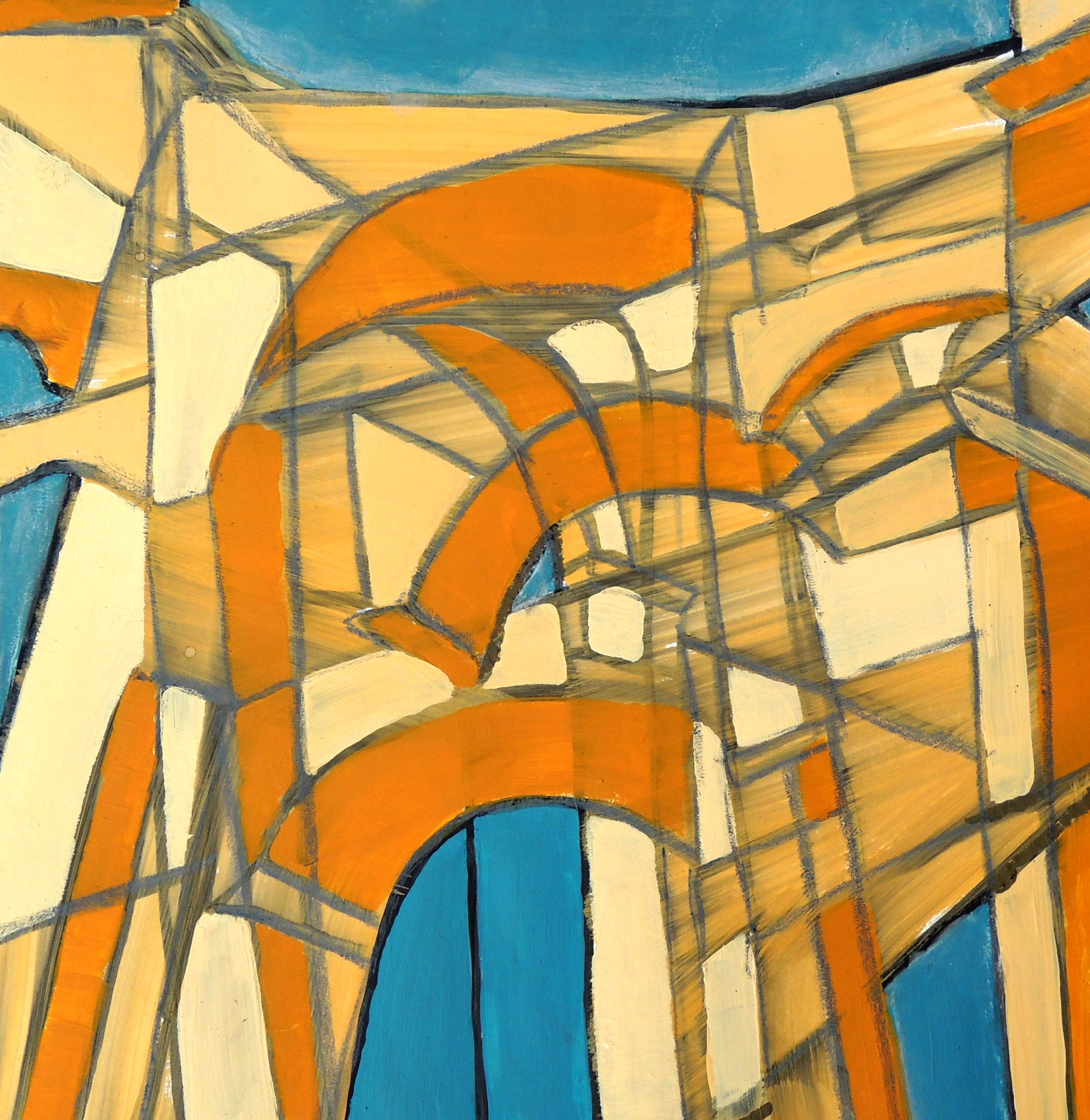
Entrance (R)

A6
Gouache, acrylic, soft pastels on paper, 20 x 20 cm

This small study was inspired by Patricia’s Terrace (April) drawing. I took several photographs of the Arch that serves as the main entrance into one of the local parks and then merged its different angles into one image in order to achieve a sense of eye movement when looking at the construction whilst approaching and passing under it.